Lyra

I have specific pens, pencils etc that I use. Of course I constantly challenge myself by using lesser quality equipment, it makes using preferred stuff feel easy. As far as travel kits, i am forever tweaking that, the cases and holders all my equipment goes into. I always have three kits; the one for just bopping around the city. This is the smallest and its just a refillable pocket pad, retractable pencil and in the pocket sleeve of the pad a blender or two. This is used as I sit in cafe or bar locally, just doing quick guerilla sketching. As a side note, this is always within reach of my hand and has been around the world with me. I realized that because of the pandemic, it saw zero action for a year plus! It has sat in drawer of one of my tabourets awaiting its chance to see some action. My other kit is for short trips four days or less of being away from home. This is pocket pad, 5×8 pad few traditional pencils of different degrees of hardness and two types mechanical pencil & blenders. It’s still fairly compact, easily carried in book bag. Short trips, I do not bother bringing any painting accoutrements. My last kit is for longer trips week or more and this includes paints etc. The long trip kit is the one i tweak the most often as it’s important for me to work but very quickly space within a suitcase can be taken up.

I discovered during the pandemic a small company that made cases geared towards road warrior artists. The case was very flat and it came loaded with “free” pencils, erasers and all kinds of other sketching swag. Obviously I have not had chance try it out on road. I did try the pencils and sharpeners. All of it was of such low quality it got thrown out. It contained a small cellophane pouch inside of which was three short, pudgy graphite sticks. It reminded me almost of tailors chalk. I had never used it before, so decided try for hell of it. I enjoyed challenge of it and was actually pleased with pieces i did. My way of thinking was that if I could make something happen with low quality version, then using some made by a quality company would be even better. I started doing some research. One thing i found was that the Lyra graphite sticks were said to be basically the same thing, with benefit of being able to sharpen to a point where as the sticks were basically short rectangles.

I had bought one along with a sharpener ages ago but had not used it. I started messing around with it and found i really liked it, the pieces I did were loose and had a painterly effect. Lyra also makes water solvable ones. I bought one to try. It is a game changer for me. It fits in my pocket and all i need is that and one brush and I can do monochromatic watercolors. This will allow me to paint on short trips and not have to up the equipment i take. The actual process is quicker than my normal painting and best of all, I do not need sunlight and can actually do these at night. Two things not possible with my regular painting.

here are my first tries with it. I am sure that the more I do this, the better i will get but I am already pleased with results.

This Little Piggy

I greatly enjoyed creating my last collage “To the Sea”. I decided to further explore the use of a limited color palette.This piece is a companion piece to my last one in wanting to go by the same “rules”. (limited color palette, utilizing my two main techniques within one piece to equal degrees, smaller sized paper)

As usual I only used photos which I took, my trusty scissors and adhesive applied with a brush. The sort of Maxfield Parish coloring comes from the times of day that I took the photos, all Pre-Raphaelite luminescence playing upon the neighborhood but for a few minutes at a time.

For all my work regardless of medium I prefer a certain amount of density. Especially with my collages, I like the effect of the viewer being able to find new little things with each viewing. An open ended narrative which leads to one’s own personal daydreams.

“This Little Piggy” 11×14

thislittlepiggy


Tan Lines

9×12 watercolor & paper

During having to stay home she took sun baths on her balcony. From there she could see into my studio window, watching me work. Hers was one of many faces who while away the time taking in the mellow rays of the sun, which after an hour or so almost managed to trick the body into thinking everything is all right,  watching me work. when I finished a piece I would turn it towards window so she could see what I had been working on. shyly at first, she started informally modeling.

To me, the real is always beautiful. It facilitates emotions which in turn allow the viewer to return to a work over and over without becoming bored.

The size of my works is intentional. Their size helps bolster the feeling of happening upon a scene from an open ended story. Shelter in place has shown a lot of us that our living space is smaller than we realized. The wall sized pieces so often emphasized make a collector live under the piece and not with it. The larger size and familiarity also eventually creates the effect of a work just becoming first visual static, then merely a wall. My smaller pieces engage the viewer as one is making the choice to look at it rather than having it loom over them.

I also keep in mind the burgeoning collector who is just starting to collect. Large pieces, especially for an apartment dweller can dictate the style of the collection while also limiting the amount which can be displayed. I want my works to be able to be included in a collection as it and the collector’s tastes grow.

Ultimately bigger is not better, there is just more of it.


20200516_124023Tanlines


Left Bank

What makes for a good trip or proper travel is not checking off a list of places to see with their associated objects;

The Louvre, Mona Lisa….

It is absorbing the feel of a place, ambience of scents, sounds..In taking time to do this, one notices how others live their lives & what is important to them. It also allows for a deeper memory retention of the entire experience which then adds to the “you”. It is what is actually meant by “Travel broadens the mind”.

For artists there is even more of a potential benefit.

Every artists works & travels differently. I am always “working” regardless of where I am in the world. The only variation is what equipment I am utilizing. Short trips will find me leaving the paints at home, filling my coat pocket with my trusty pocket pads as I like to travel as light as possible and most likely would not have time anyways.

Any give place should effect an artist. Not in the most obvious way such as “I am in London, I painted Big Ben”.

It is ambient light, the lines of architecture, they become further accoutrements to the palette. It does not mean that one enters artistic phases ala Picasso and Cubism et al. Rather, work done in one place  does not look exactly as it appears back home. The artists voice is ever present but there are different components to the fore, mixed in with some of the more familiar.

If you have never been or only as part of a tour group, then every place in France is lumped in together. Despite some commonalities, each area is distinctive with their own cuisine and habits. It is the same with the ambient light.

Aix-en-Provence is all beautiful yellows punctuated by bursts of trees and the sounds of fountains. Lyon is soft pinks as if the buildings are made or at least coated with the delicate charcuterie which they are the masters of making. Paris in itself is diverse. From arrondissement to arrondissement, from the Left Bank to the Right .

People, myself included, proudly proclaim themselves of their side of the river and which number arrondissement.

I like even some of the seemingly “ugly” streets with their time worn dirty gray and fatigued creams. These areas tend to be where some of my artistic heroes lived, cheap rent and every third door a no nonsense bar having been the draw.

I like working with colored pencils on gray or brown paper. I limit my palette intentionally as a challenge to myself. Getting the effects that I want in this way makes it “easier” when using paints. Although I use mainly pinks, it is realistic in that in the real world there are seemingly limitless colors but go out on street  look at buildings and the street. On encounters a fairly limited palette.

These pinks, urban children of Fauvists, remind me of some parts of Paris. Not that this color is found there but it is same effect, translated in my minds eye. This little corner I continue to pass almost daily. It has been there forever and i do not think it ever had any straight lines about it.

I initially encountered it when staying at my first great apartment. It was en route to my groceries and favorite bars. Four floors, impossibly winding stairs that made you drag your shoulder against the wall as you ascended since the light was always broken. The biggest part of the place was the bathroom, with a large old tub, frosted glass windows which opened up onto a shadowy verdant courtyard with its cracked flagstones. I kept the primitive hi fi in the bathroom doorway since it was connected to the bedroom. Only music with a minimal of voices sounded good as it was a mono player. Mostly Zoot Sims duets and Lester Young trios.The neighbors would lean against their window boxes of geraniums smoking and slowly nodding their heads to the music. Dark silhouettes with one wavering orange eye-dot that would flare with inhalation.

Hard work and I was fortunate to be able to trade up apartments. I remained in my neighborhood just moving a few streets down. The building has become one of the visual shorthand for the deep affection that I hold for the every day in Paris and those first exciting years.

W.Wolfson ’19

Left Bank 9×12 colored paper and pencil


20190712_073738


Face Dances

For Sharon Anderson

I had an acquaintance in Toronto who fancies herself a shutterbug. She walks all around the city snapping photos of whatever catches her eye. She does this on her own, with friends and as part of an informal group.

The city has some vibrant graffiti and murals. Someone had done one of Prince, which she snapped a photo of. Prince as he was in the first flush of mega-stardom, decked out in the white ruffles and purple sequenced jacket. The problem was, it looked almost nothing like Prince. The outfit was correct and served as a visual clue:  “you are looking at Prince”.  Had he had no shirt on (or a different outfit) as occurred in some promo photos and videos, then no one would have had any idea who it was.

A lot of stars, especially artists,  have one or two  images  ingrained in the public’s conscious. This is even more so for musicians of the pre Instagram age.  Record companies, Dj etc all had to have the promotional photos/packs. The publicity photo a pre requisite but not too often updated. Jim Morrison is forever fitting into his leather pants, shirtless or with white pirate shirt, starring back at the camera as he wonders whether it is all worth it, forgetting that Rimbaud gave up poetry to become a white slaver. Jimi Hendrix is caught up in a spider’s web of bandannas and clashing colors as he lights Monterrey Pop on fire. And Prince had the ruffles at the throat and purple sequenced jacket different in color but similar to what Pete Townsend, light years away stylistically from the purple one, wore in the sixties.

So much rock was born out of rebellion, which is why every generation still holds it dear. Lazily resorting to visual shorthand of well known outfits reduces them down to a sort of uniform, very anti-rock (rebellion).

The best art tied in to musicians/artists, they should be recognizable in a different outfit or even just the face.

What makes for an even more worthwhile work is not their recognizably but rather does the work radiate an emotion which in turn makes the viewer feel something. The handicap of doing the visual shorthand of obvious outfit is even with some of the better works, you are freeze drying the emotion(s) to what was offered up in the photo. All photos are the souvenir of a dead thing as the moment has come and gone.

Faces, not necessarily of famous people, have always called to me. To conjure up a face on paper is an important part of what I do. Emotion coming through is the most important facet of what I do.

Here are several faces, done on different types paper. The inherent properties of the papers adding themselves to my voice like spice(s) to a stew.

All are 9×12

20190619_07492220190621_07103220190623_07561420190629_072850

New pencil stroll

I had been to one of my favorite art supply stores. It’s one of three oldest remaining in Paris. It is very small. I always like the ones which are tiny but organized.

There is the perfume which excites, a melange of pencils, cardboard and that scent paint gives off which in itself is a marriage of several things. The close quarters gives the feeling of being in a warren similar, with  variations, to what each artist will return to with their treasures.

I stood behind a woman whose slowness made the wait seem interminable but which was indicative of the personal service offered up to each customer.

While waiting I grabbed randomly, a fistful of pencils by a company that I knew to be good but had yet to try.

My turn, the heat had made me drowsy. When I’m old and shrunken, if it’s not busy, I will ask to curl up and sleep atop one of the taboret like a cat. For now though, I went afterwards to Marc’s to wake up with some ice cold sancerre  and good conversation.

I did not immediately give any of them a try, nor did I even know exactly what I had grabbed. They were all various “B” (soft lead) pencils.

I greatly enjoy Blackwing Palominos, which i would describe as semi soft with a creamy property. I constantly mix it up with what equipment I use but there is always a Blackwing in my kit too.

The Lyra 669 5 B is made in Germany. It had an easy glide across the paper. I noticed that the first portrait I used it for on 9×12 70lb paper, it had a very graphic look.

I have a thing for pencils which have their own distinctive voice.  It’s great fun to learn when  its specific  properties will best suit collaborating with me on a piece in the same way a musician uses specific instruments for certain type of song.

9×12 quick sketch portrait

20190606_064101


New Companion

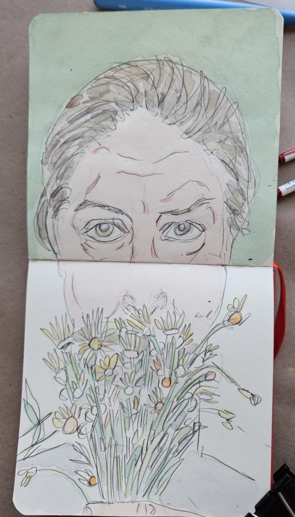
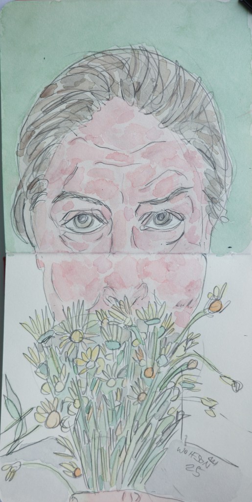
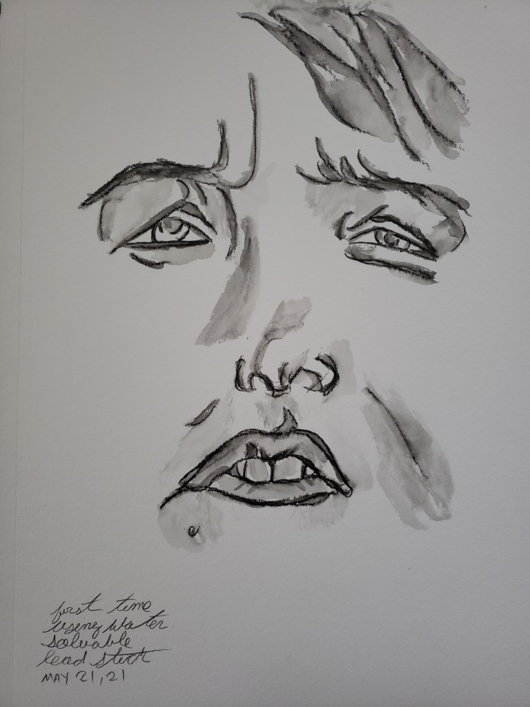
I can borrow a pen from a waitress to mark up a paper place mat or the nubbin of a pencil and some scrap paper and be satisfied doing my thing. The results need not be frame worthy or even worth saving (after seven years,  having moved my long term studio, I am now of the mind that i need not save every single foot, hand etc woodshedding sketch that I do). The pay off has become the process.

Although I no longer feel the need to save every bit of visual minutia that I birth, ego does demand it still look good, even knowing that  some of it is mere exercise destined for the barrel.

I like to challenge myself by trading off what equipment i use, even for mere woodshedding, every few days. The (proven to me at least) theory behind this is that, regardless of what equipment I have on hand, I will be able to make something worth while as I am not rigidly dependent upon specific things to create.

Even with my flexibility, I feel out of sorts and naked were I to leave home without at least my trusty pocket pad on hand. I travel with various amounts of equipment and sized paper, the specifics being dictated by location and length of stay.

The constant is always my pocket pad. Called “The Passport” on account of its size, it is from Midori. Before seeing one in person, there had been a huge push on some of the sites i interact with, especially Flicker. There were beautiful photos of these notebooks sitting on a well turned out desk next to some great fountain pens and other accoutrements. Or on a bedside table at the Ritz by a pocket watch, brass Art Deco key chain and cigar cutter.

In each case, the photos made me want not  just the notebook but most of the things in the photo.

I have no idea if they were the first to come up with it but Midori notebooks used The Midori system. They were refillable, and highly customizable. You could get all kinds of extra sleeves, charms, pockets and all kinds of other things not all of which are necessarily practical if, like me you are going to constantly be using it off and on throughout the day.

They come in two sizes, the traveler (6x 4.4x 0.09) and the passport  (3.86x 5.28). I got the passport. Upon initially looking at it, I was far from enamored. The paper it came with was too thin for sketching and was not easy to get at the time nor cheap for someone who could easily go through at least a pad a week sketching.

However, the system itself was clever. It was a leather square folded in half with a slit at the halfway mark. Going down this slit was a thin elastic permanently held in place by a lead disc which has become a recognizable part of the midori aesthetic.  There is also a smaller elastic loop pushed through one side of the cover held in place by a knot. This loops around the book to hold it closed. Midori offers these elastics in all kinds of colors now.

The center elastic slips over the center page of the book where the staples are. You can add as many books as you want by pressing covers back to back and putting standard elastic through the center page.

As much as I thought that the actual notebooks looked far nicer in the photos and the paper was not a good match for me, I did like the system. I made my own booklets to slip into the cover, usually grouping them together in threes.

Midori offered among other things, plastic zipper pouches. They are attached the same way as you would a booklet. I go three booklets with one zipper pouch containing a bunch of pencil blenders and tiny Blackingwing eraser along with one extra elastic in case one ever breaks.

No matter where I have been in the world, at the end of the day my Midori has been in my pocket or resting at night by my bedside table. It gives me an odd comfort but also inspiration.

I have large collection now of pocket pads and while the midori is not the nicest nor any longer the easiest (I have many now where pad slides into covers and also lays far flatter than the midori which forever wants to close even as I use it) I would feel strange not having it on me even were I to have another pad too.

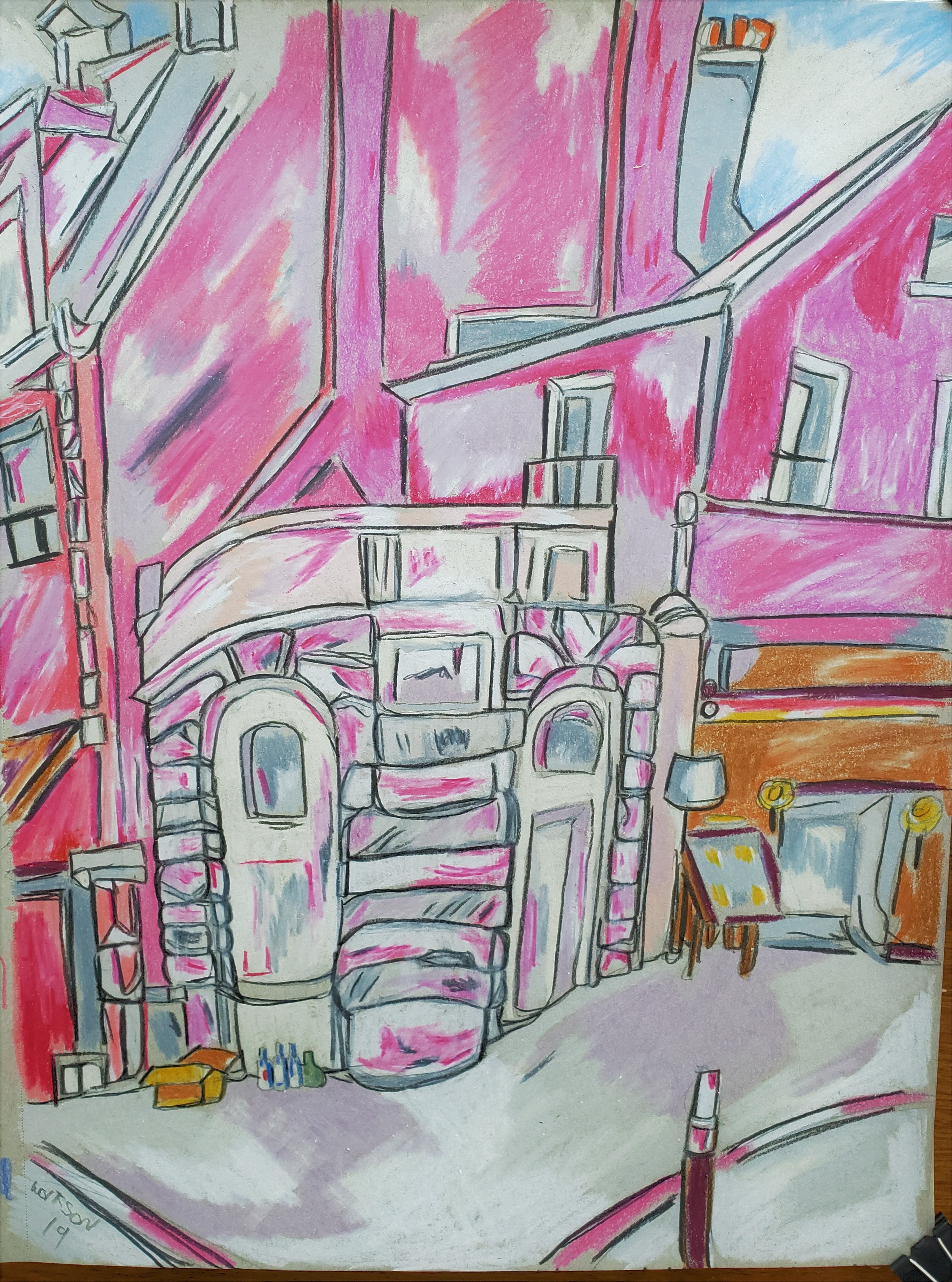
The Place Maubert market in Paris. There are great kiosks selling all kinds of foods. The scents of spices and meats takes one away to places even further afield than being there. Also to be found are small tables selling everything from typical flea market junk , to shirts and pullovers in  Breton Sailor style. Wedged between tables of cheeses being kept fresh by straw and pastries made from honey and rosewater are artisan tables.

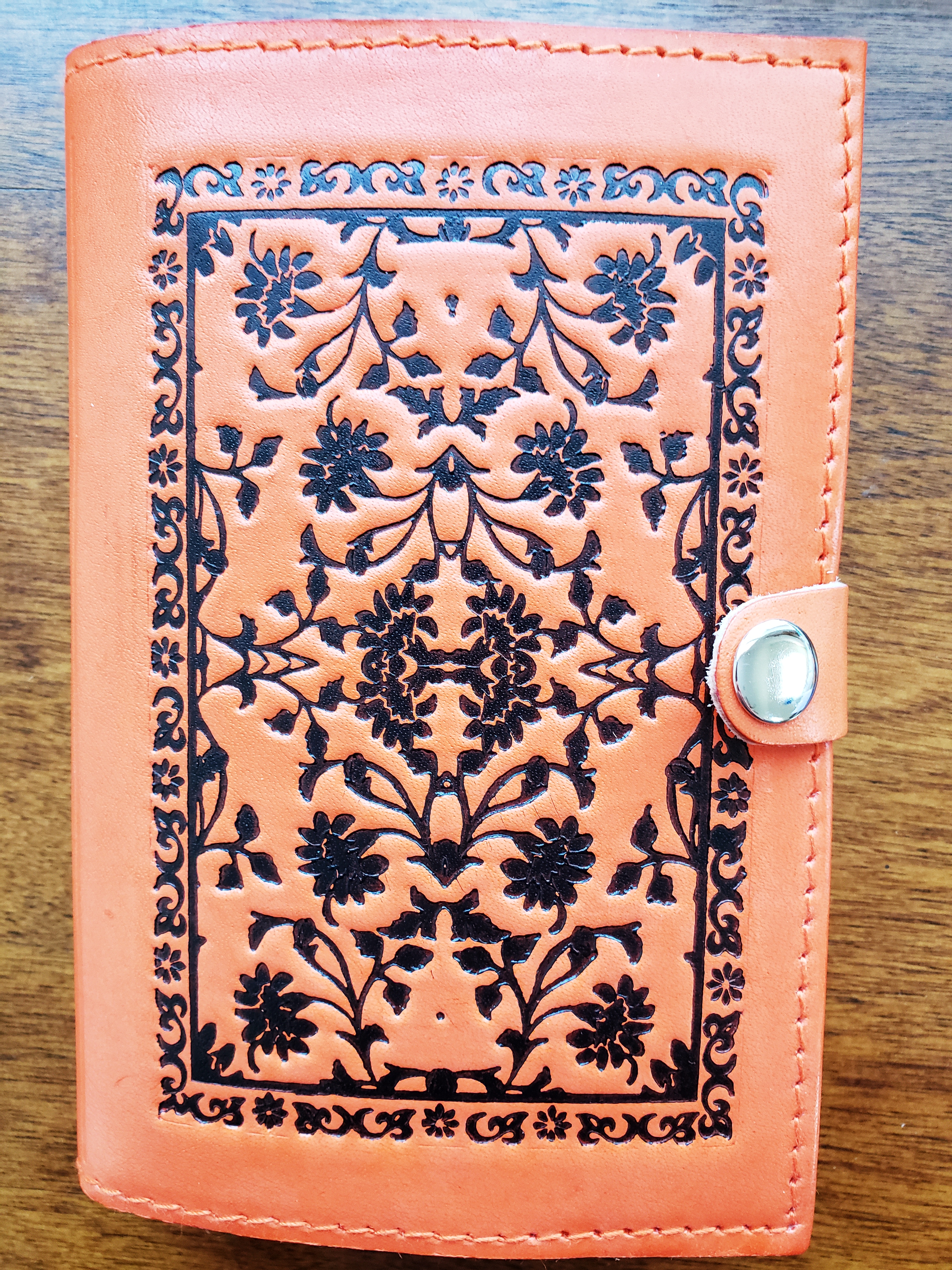
This year I met a man who handmade leather journals. He did it all using old school hand tools. The styles wildly varied, some of it clearly aimed at the tourists. Regardless of size, they all snapped shut and the blank pads slipped into the cover/holder. The paper it came with is surprisingly nice, blank booklets.

We chatted a little. I showed him my little Midori. He pinched the leather cover between thumb and index finger and while he maintained  politeness he also seemed to feel sorry for me. I fought the defensive urge to tell him of my large collection.

One part of his table was full of comparably sized notepad. Being handmade, they were surprisingly inexpensive. He threw an extra blank pad in my bag.

Although it is a different manner of holding the paper than my midori, I was able to use a similar trick, slipping elastic in middle, to have this new pad hold one of midori zipper pouches. Seemingly this gives me the best of both worlds but I do not see myself retiring the midori ever completely as he has been too good a friend, having seen everything without shock nor complaint.


20190530_07360720190530_07473720190530_08262320190530_082600

Two

I have a definite methodology to how I work. But on the road there are variations. This is an aspect of how I feel a location should subtly add its flavor to work being done (there). In the states, I do my hour or two of woodshedding at night, the end of my day.

In Paris the lighting is better to do it in the morning with my coffee.

Even in my stateside studio, different times of year present better hours to paint by, as I use natural light to do so. It takes anywhere from three days to a week to really nail down what hours to pick up the brush. I am lucky though, that there are some aspects of a piece that I can do in less than ideal lighting.

I do not go to museums every time I am in France, as I know that I will always be back. Sometimes all I need is the poetry of the streets to inspire.

There is the constant though, of chatting with my peers.

While here, a huge sale by a post-pop artist got us all talking. The question of “Is it art?”

Eventually we all got bored with gnashing our teeth and started discussing nudity in art and the conected social mores in North America.

There is a cyclical debate of what seperates art from eroticism (“dirty” or “porn” labels)

Some say it is merely a matter of intent. This is too simplistic and facilitates filling the room with devil’s advocates and semantics.

Of course,  intent is always important as proven by Duchamp, but a more reliable yardstick which also keeps in mind a modicum of rationality are the components and concept of the work.

A work can seduce or excite but is it doing so because a main componant is titillation? The same question can be asked of shock value. If a work happens to induce heat, then regardless of why, it can’t be “dirty”. Someone setting out first and foremost to excite makes it so that a different label may be appropriate to apply.

Courbet’s L’Origine du Monde comes to mind. It is graphic to some but beautiful, there is no question that it is art.

The first question being asked should never be “Is there nudity?” nor even necessarily “is it art?” but rather, “is it good ?”

Having to ask if it is art is sort of like  guestioning yourself if there has been too many drinks to safely drive home, it becomes almost besides the point.

I used my canson watercolor paper 140 lb. A thing which appeals to me about it is that it’s not temperamental, being effected by wet weather as the French cotton ones that I used to solely use was.

For photos of my work I am just using my phone and as the paper has little tooth, the photos (I never work any digital magic on pics) gives accurate gist of a piece.

Song & Bellissima 5.5 x 8.5 watercolor and paper


20190519_08160620190524_183336

Raspberry tart

Where a painter who eventually becomes famous worked/lived does not necessarily reflect their posthumous reputation.  This is because more often than not the factors in no particular order are location, price and availability.

Not apparent from the work with which he became known, Paris was very important at the start of painter Ellsworth Kelly’s career. Several years ago, address in hand, I hoofed it over to this first studio (which remains just an apartment, having probably passed through dozens of hands since he lived there).

It looked just like all the other apartments arround it, neither more spacious nor with better light.

This year having read Jed perl’s excellent book on Alexander Calder, I decided to take a look at where on of his studios was. Once again, it was the same thing with the added touch which I think he would have appreciated, of a Chinese restaurant below his place.

Most people, when they think of an artist’s studio are imagining a large space, perhaps with a skylight or two. Or at the very least something which will look suitably dramatic and cinemesque upon seeing it after the fact.

For every Cezanne studio museum, there is Kelly’s or calder’s.  This is because no artist is thinking in terms how it will look once they are famous and gone. Calder liked most of his Paris studios because they were an easy walk to the cafes he frequented and his friends, yet slightly set back as to avoid the noise keeping him up.

Kelly’s motivation  had been the even more pragmatic financial one.

Another aspect of the painter life which many give no conscious thought to is the personal visual lexicon. This ever growing vocabulary is made up of the intentional such as portraits but also the instinctual. This is the every day as encountered by the painter, not made dramatic but rather it’s beauty drawn out. Cezzanne’s apples, soutine’s elevator operator et al.

The painter is not bragging of the incredible life lived a la some instagrammer’s vacation or food photo. They are recording the every day encounter(s) whether it’s the view from a studio window or some utilized necessity such as hat or groceries waiting to be put away.

I had no ambitions towards this as I had been unaware of the phenomenon until I started practicing it. The concept of “draw/paint from the guts” doesn’t mean to viscerally go at it until some sort catharsis is achieved. This misconstrued point is more about conveying the true, the reality without over thinking it nor worrying about drama.

Now one of my greatest pleasure in life is capturing on paper some little thing as it is from my daily existence. As ever, serving the process has become the pay off to me.

This is my second Paris painting this year. A dessert I had meant to try for a while, which was delicious.

I used 5.5x 8.5 spiral bound canson watercolor  paper 140 lb. When i first started painting i used exspensive blocks of french cotton paper. This was initially my practice paper. Although the paper’s “voice” is inherently different, I have now long used it for fully realized pieces, espcially when traveling.

Raspberry tart

20190515_134535

Paris Painter

I have said time and again, for me truth is beauty. I am interested in the real, real bodies real emotions. Even and espcially those which seem counter to traditional ideas and portrayal of beauty.

This honesty has  always been the facilitators of the emotional resonance that is my raison d’etre for all my work.

By no means am I doing something new. From Lucien Freud and Jenny Saville back to Tintoretto and courbet, honest portrayal of people has been utilized to create a powerful, real beauty made even more so because of the seeming imperfections.  Proudly, I am merely adding my voice to the chorus.

Traditional beauty bores me except in the smallest doses. It’s akin to the frosting flower off of a cake. I’m not adverse to now and then taking a bite, but it’s sweetness has no true flavor.

The thought of using my work merely to shock or insult is anathema to me. I work too hard on my chops and conveying my philosophy for such things.

This is my first painting back in my Paris studio. Unintentionally approp as today is mothers day in North America.

It has been overcast. The sun would come out, then retreat like a shy friend, then blaze too bright to see the paper properly.

I had to go slow,  it ate into my record buying time, but I am pleased to the extreme with the results.

5.5x 8.5 watercolor and paper

Michelle

20190512_170304 (1)