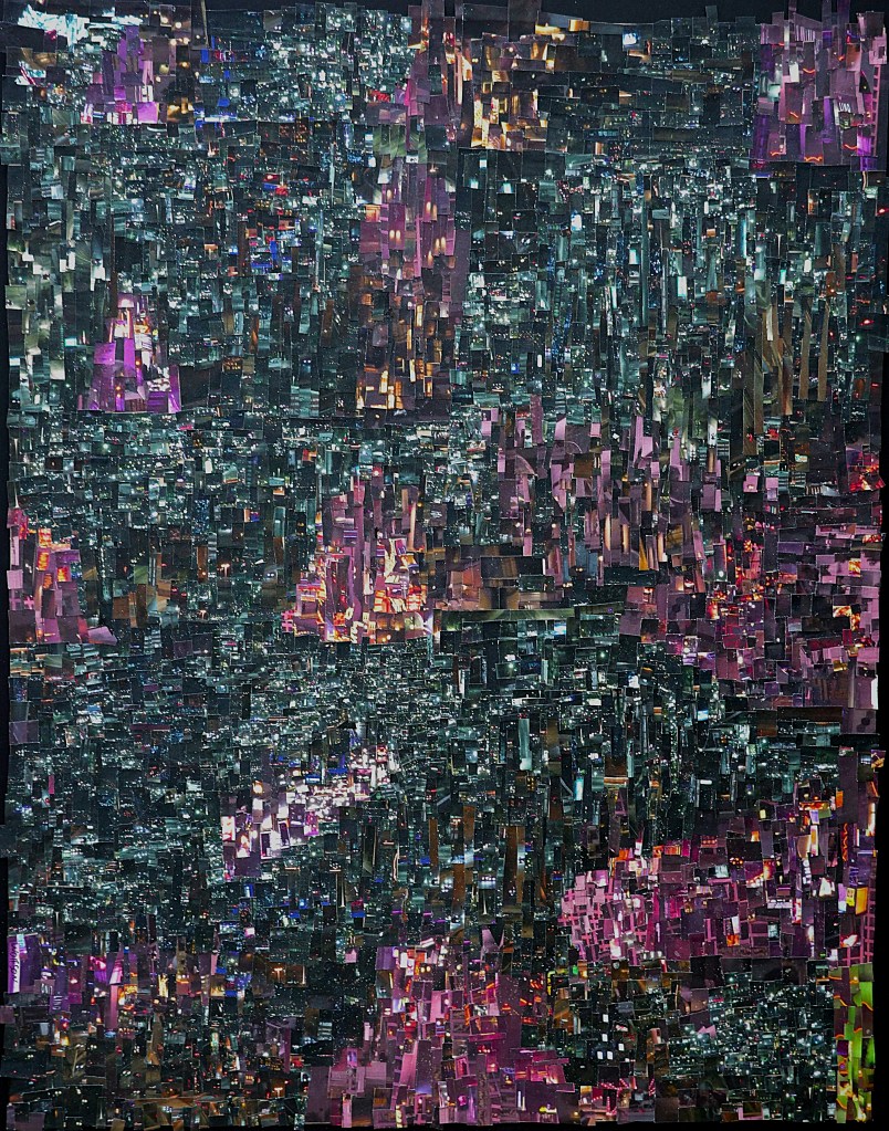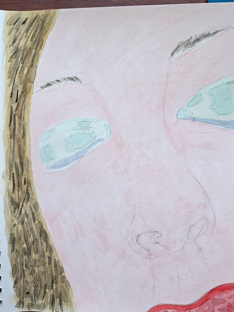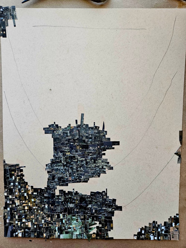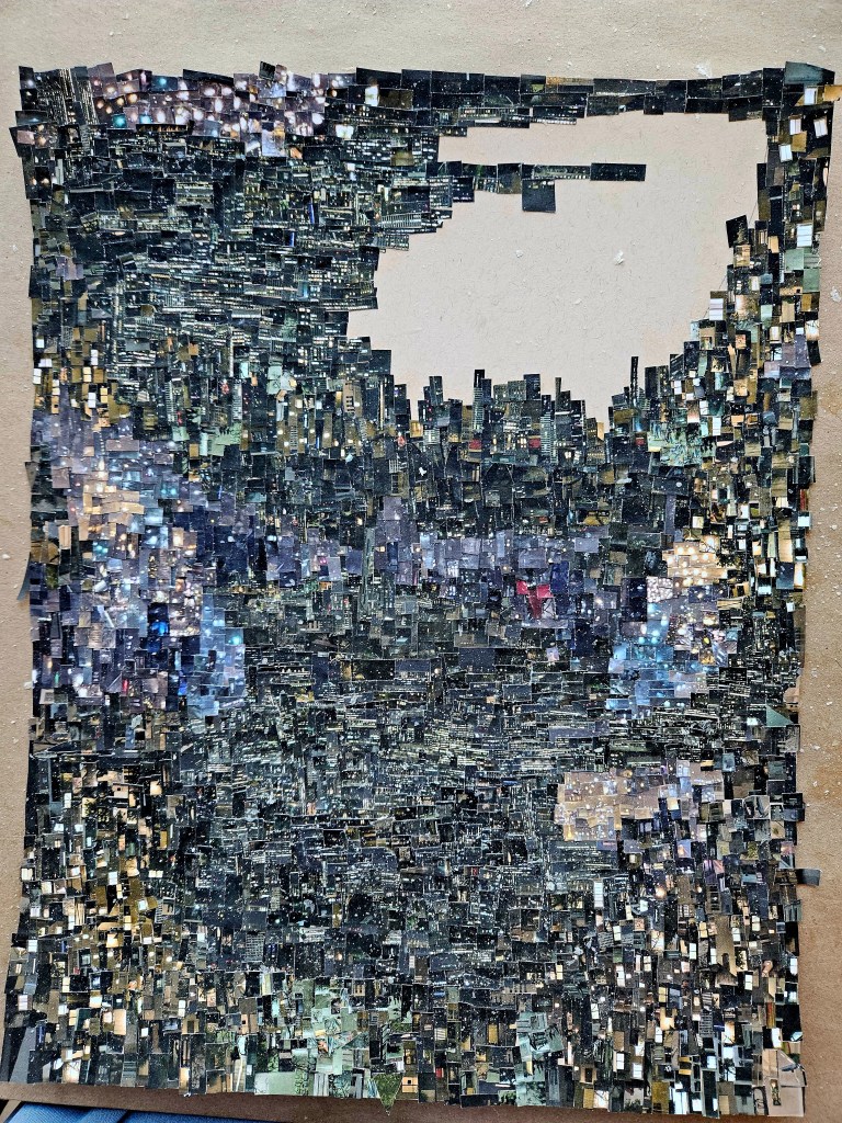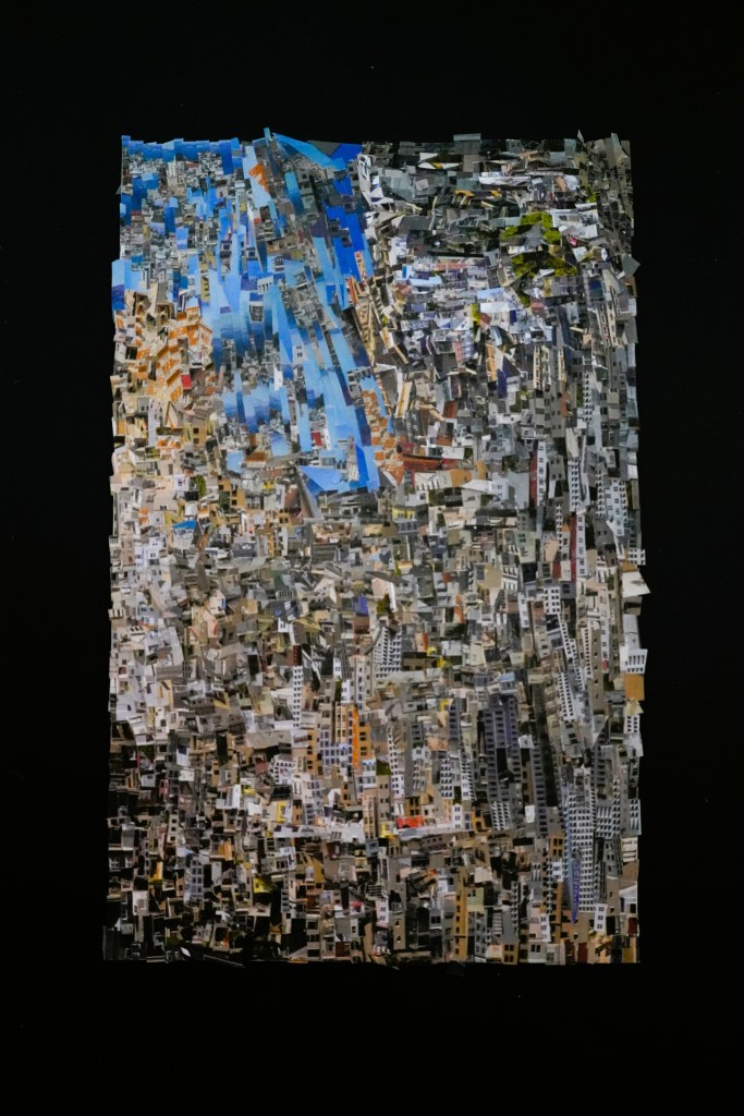
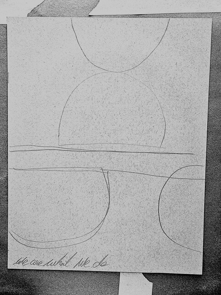
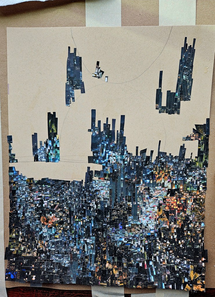
Finally finished my latest CINEFIELD®. Although it felt as if it took forever, I am very pleased and proud of the results.
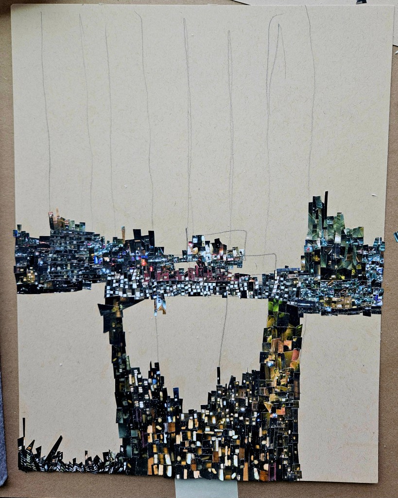
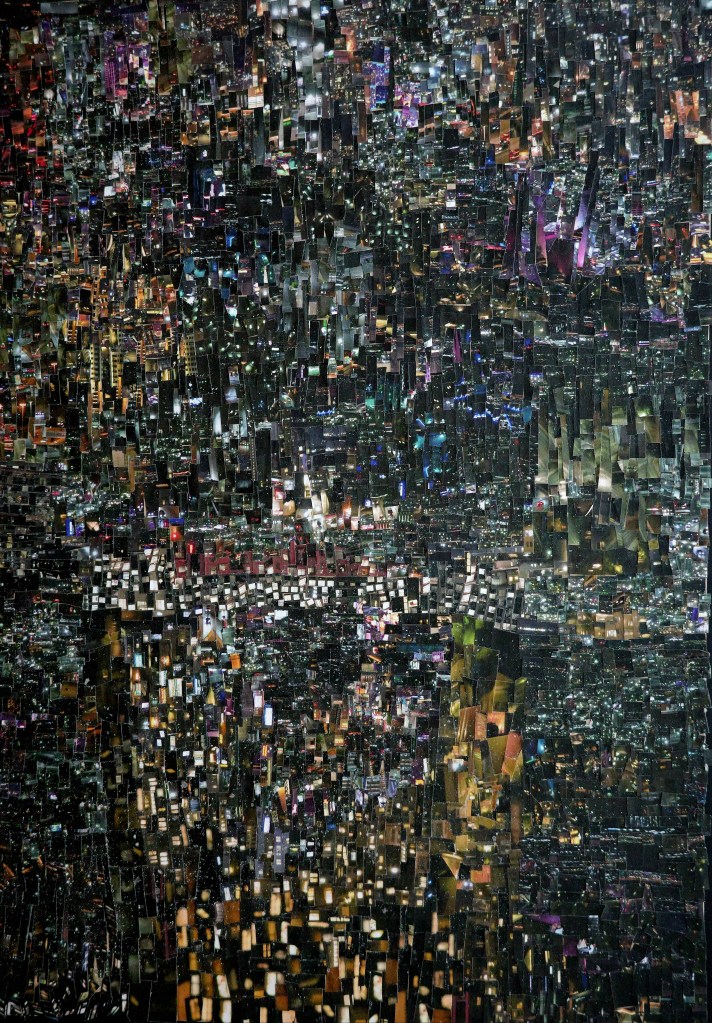
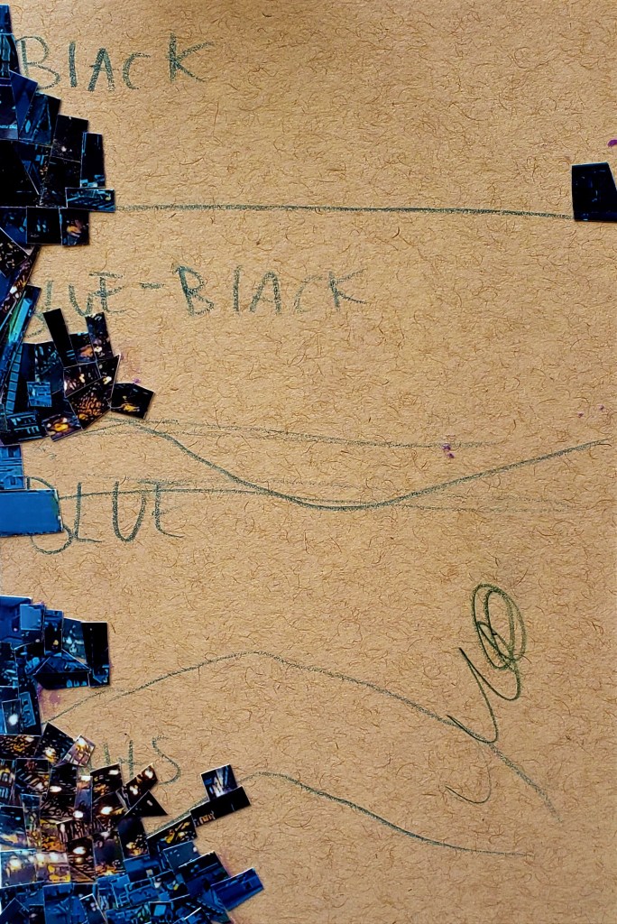
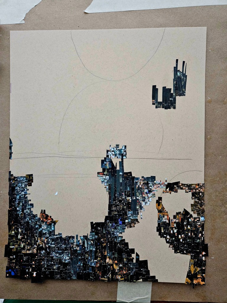
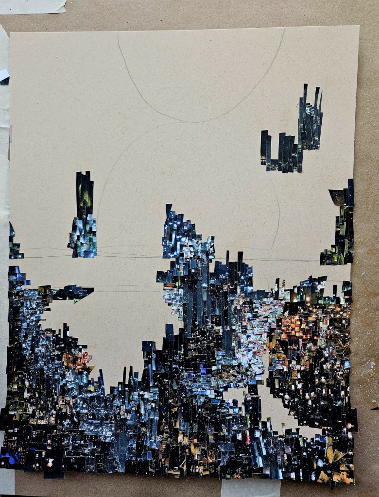
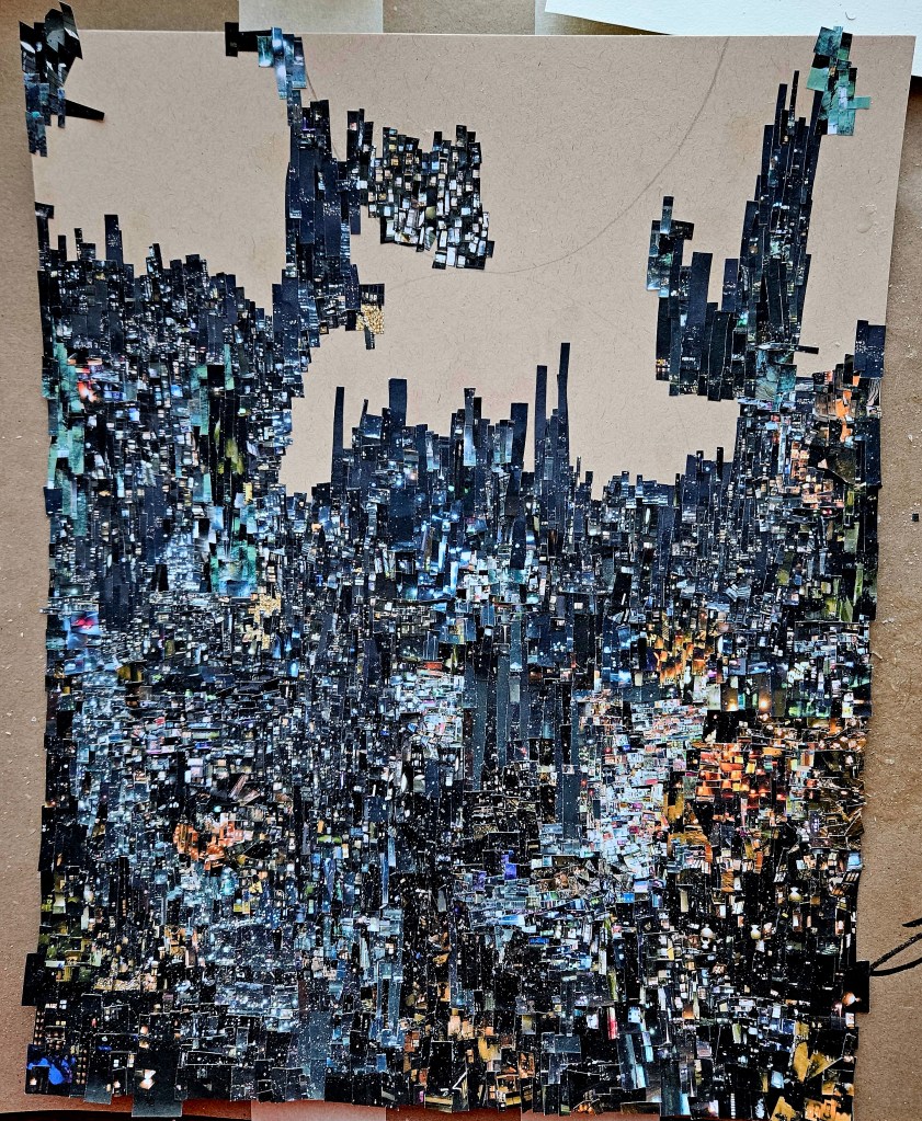
The entire piece is from a single photo which I personally took and then printed up many times. I used my trusty pair of (tiny) scissors to cut out the pieces and then glued them to 11×17 piece of paper using adhesive and small brush.
My goal was to offer up a work that one could go back to many times and notice a new thing each time. I always have the design in mind beforehand but which piece I use where is completely discovered in the moment. I cut out sheets of tiny shapes which are arranged on a table by what will become the work. In this way you can look at all my complex CINEFIELD® as completely improvised.
(I’m the Charlie Parker of collage)
Northern Symphony 11×17 (C) Wayne Wolfson. Not for use without permission


Addendum: I used to live in a city that often had weekend “art walks” or art & wine block party type things. There would be kiosks for photographers etc who had “art” but each thing was reproduced hundreds of times and in various sizes. There is nothing wrong with this so long as you realize it is less buying art and far more in line with buying a postcard/poster/print.
I have CINEFIELD® prints available but each print is only done twice and one of the two is for my own archive. My site goes into all technical details. I have gotten emails asking what is available as the site currently only lists a few as available. If there is a Cini you are interested in get in touch with me, it could be that I just had not had prints made yet.