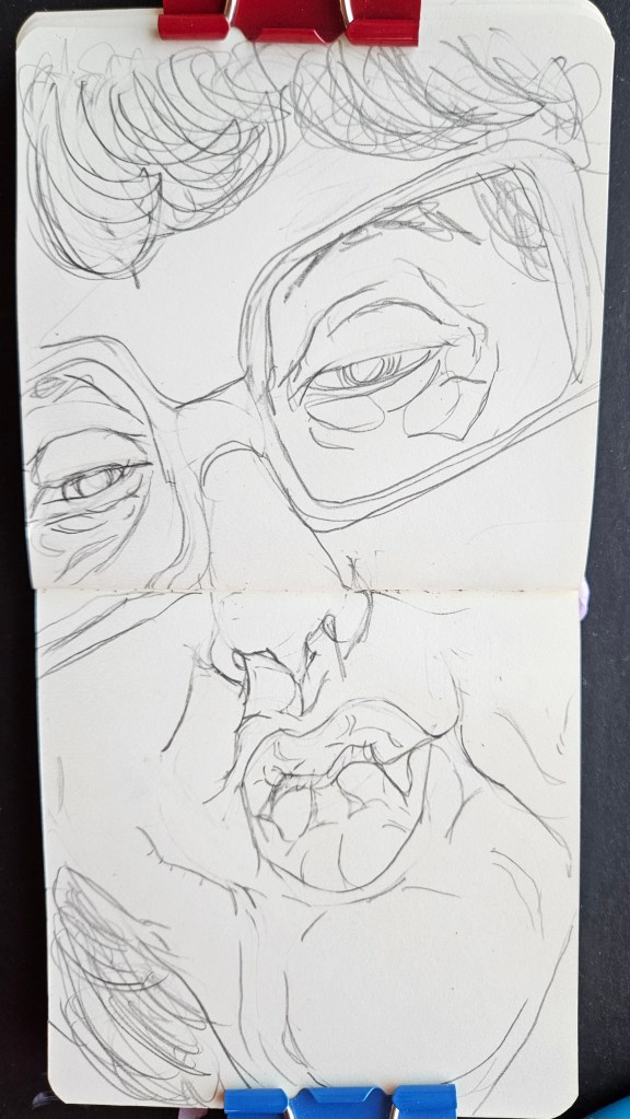
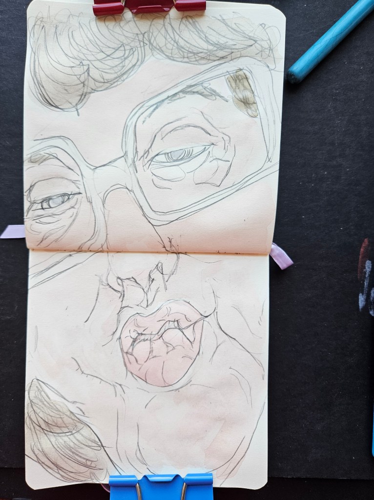
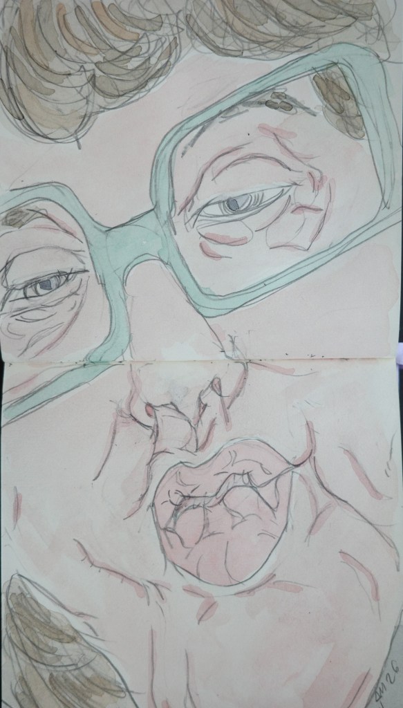
As I get closer to the release of my next story/essay collection I have continued to explore pastels. I have done about nine of them in-between my painting and drawing. I enjoy the medium and each one is better than the last. I am still in my naissance and so have not even begun to explore the different types of papers & pastel companies yet.
I will be systematic about it first using up what I have then furthering my explorations.
I am about a week or two away from my next short story collection coming out. As usual I continued to paint and now, further delving into pastel medium.
For my paintings, I usually do them in twos and one always in my trusty pocket pad.
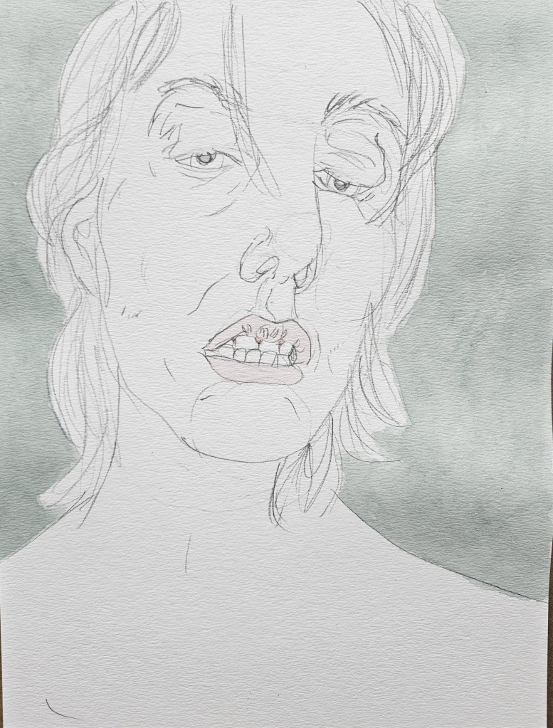
Chloe 5×7
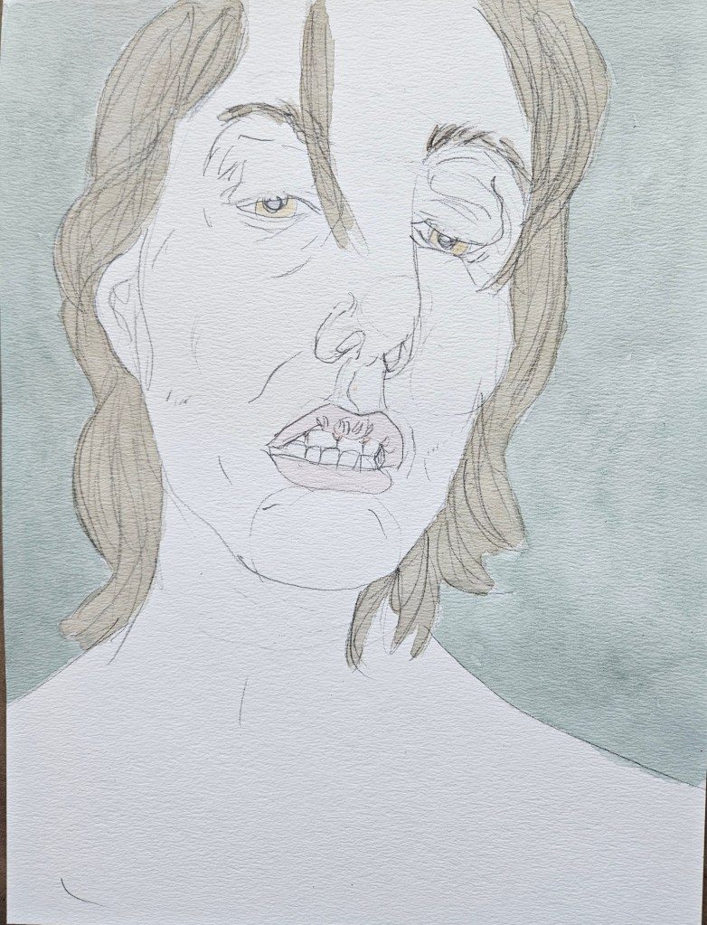
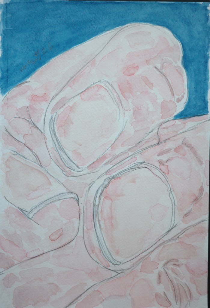
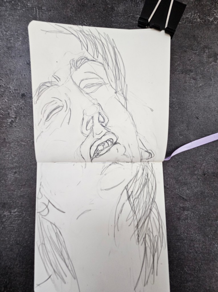
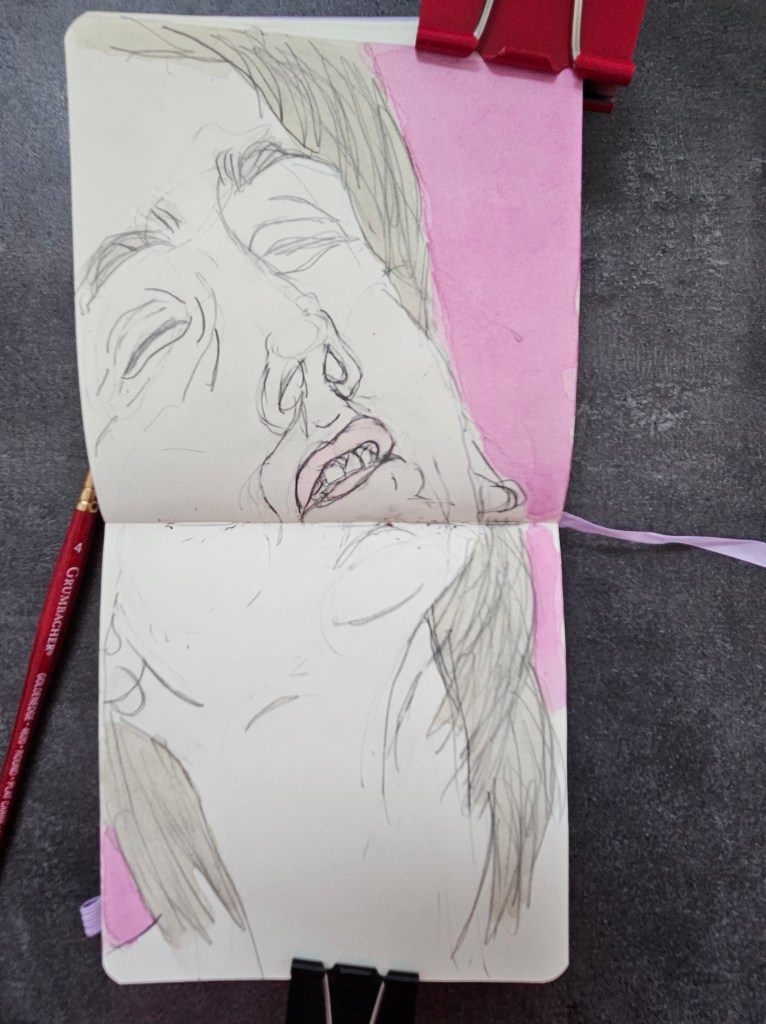
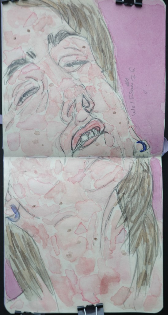
Not Shy II 4×4 pocket pad
Fourth of July Prayer
Thomas Paine, Herman Melville, Ralph Waldo Emerson, Henry David Thoreau, Edgar Alan Poe, Jelly Roll Morton, Lois Armstrong, Duke Ellington, Charlie Parker, Bourbon, Rye, Jazz, Stetson Hats, Skyscrapers, Hank Williams, Robert Johnson, Bill Finger, Zippo Lighters, Ralph Ellison, James Baldwin, Langston Hughes, Kodak, Coca Cola, Baseball, Babe Ruth, Joe DiMaggio, Muhamad Ali, Rap, Hip-hop, New School of Journalism, Chuck Berry, Bo Didley, Fats Domino, Blue Jeans, The Automat, Bob Dylan, Noir films, Humphrey Bogart, Ernest Hemingway, Edward R Murrow, Gene kelly, Fred Astaire, Harley Davidson, Maverick Directors of the 1970’s, Patti Smith, George Gershwin, Cole Porter, New York School of Painters, Andrew Wyeth, Dashiell Hammett, Jim Thompson, Edward Hopper, Hedy Lamar, Louise Brooks, Carole Lombard, John Lewis, MLK, Rosa Parks, Jack Kirby, Steve Ditko, Golden Age comics, Robert Williams, Blue Note Records, Pinball Machines, Judy Blume, Fred Rogers, Life Magazine,
Our differences are our strengths. Until we drop the pervading tribalism and fear from being prime motivations for our actions, we will continue to be a shadow of what we had been and what we can still be. This limitless potential is another strength.
It is up to all of us. And, this is perhaps the one remaining aspect, for now, of our former Greatness.
I just finished reading Jean Paul Sartre’s essay on Baudelaire. While I didn’t agree with everything he said, it was very enjoyable. Baudelaire very much lived a solipsistic life. As I am not a huge fan of his work and knowing history of France during his era, I think to some extent his attitude was to the determent of his art.
It definitely can be no fun, you go to a concert and in-between songs as you wait to hear a favorite the singer starts preaching or having the work in service of specific message for an artist’s entire oeuvre.
However, it is also weird to be living through turbulent times and make no comment upon them ever. Like most important things in life, there is a delicate balance.
Previously, I have made comments, so and my mission is humanistic not political. I will only say now that I hope my work serves as a brief respite from all daily troubles and bleak news we all must deal with.
Edie Talen Art Creations Multi Media pocket Pad 4×4 inches
I had been talking to someone about what appears in my works. More often than not it is someone from my inner circle or a thing from my life not staged but as is (a shirt hanging off the back of a chair, a demi tasse with its dregs offering up a fortune-tell). What had made the impressionists radical more than the naturalism of how they portrayed color/shadow/light was their portrayal of people and things.
In lieu of the typical historical and mythological subject matter were people from their lives and every day objects. Back then, this was more radical than it seems now.
There is a weird dichotomy with painting now though. We accept the everyday as subject matter but also because of movies & television, expect things connected with painting whether it is a work’s creation or the painter having a chop bump up to be dramatic, moviesque.
Half-pan watercolors at least for me with the exception of the few colors I use in every piece, last me. Often I would finish a piece and have paint left in my palettes. I started doing smaller pocket pad pieces with what was left. There were few motives behind this.
It is sort of pagan, my way of honoring/offering up thanks to the process I will spend my life happily serving. This (at least in my mind) is akin to when Romans would offer sacrifice before or after a journey or successful battle. I have the money and it’s not cost prohibitive to just dump what little paint is left each time out, although cumulatively it would add up. This is my version of the great chefs who have the “use every part of the animal” philosophy.
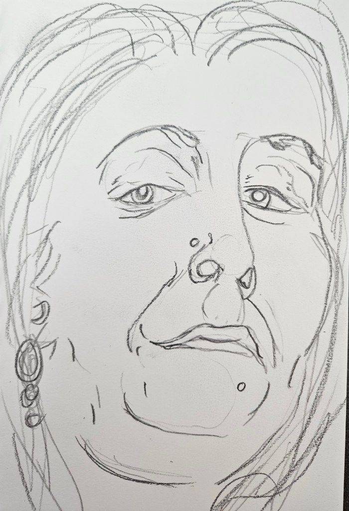
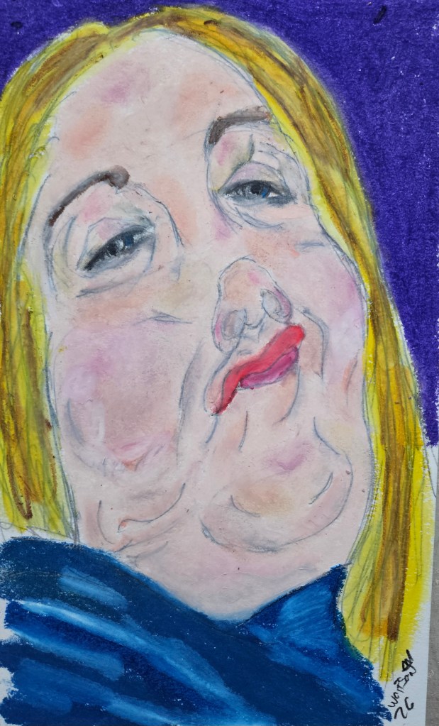
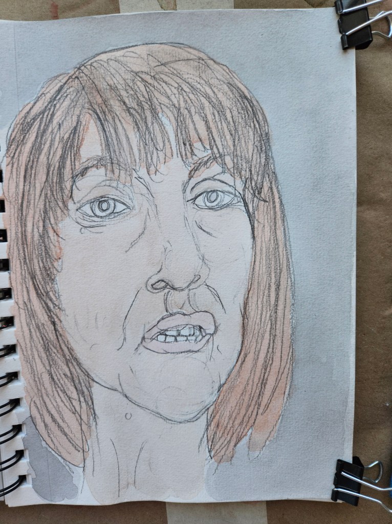
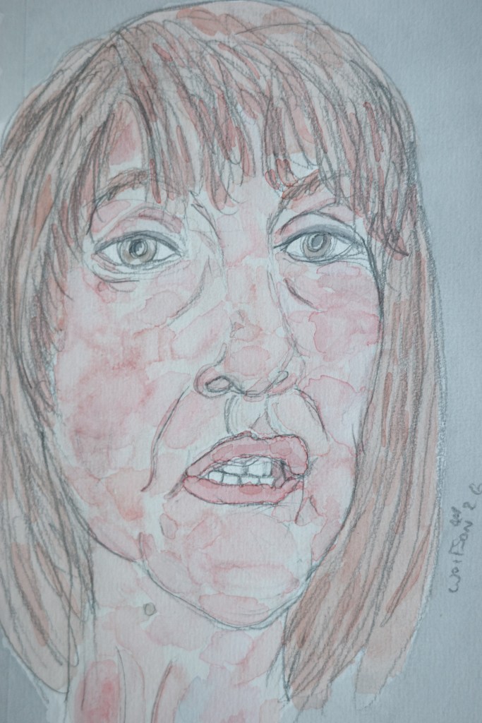
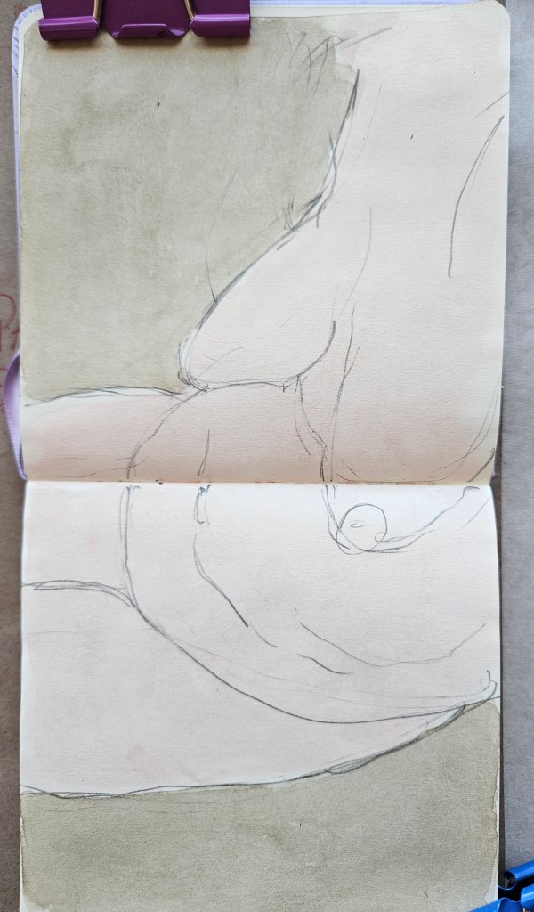
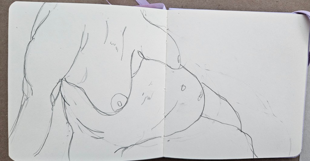
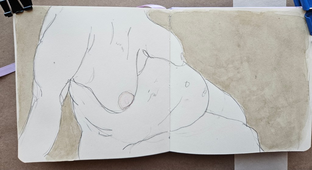
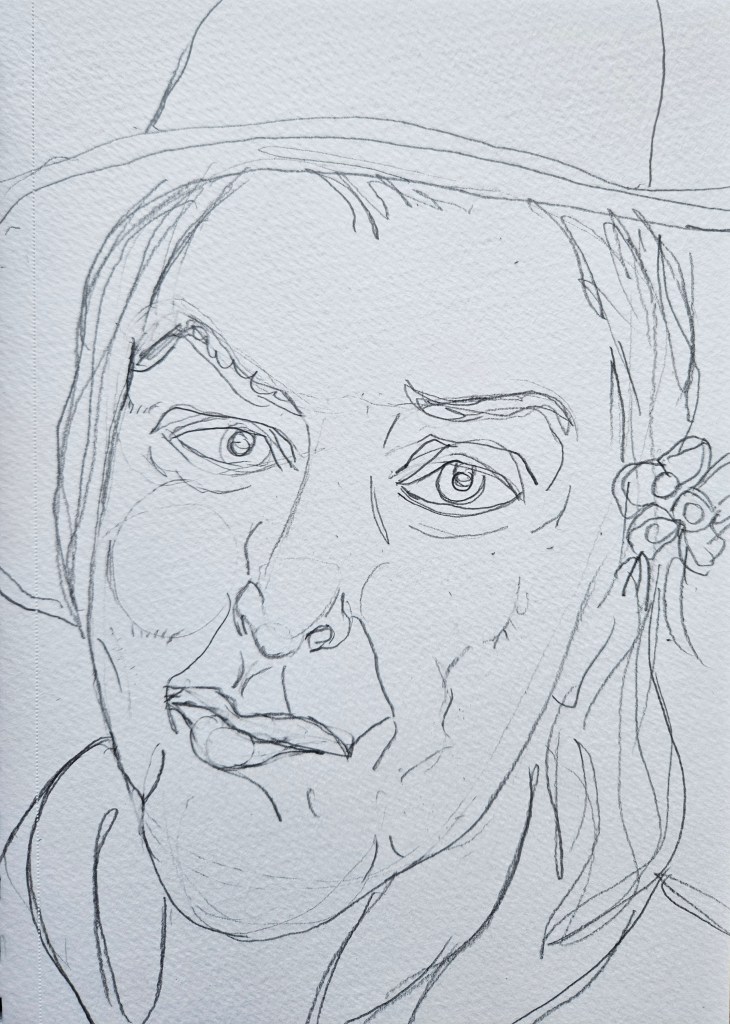
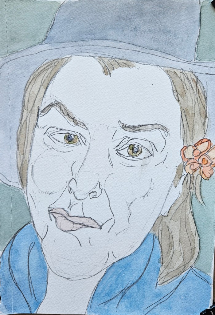
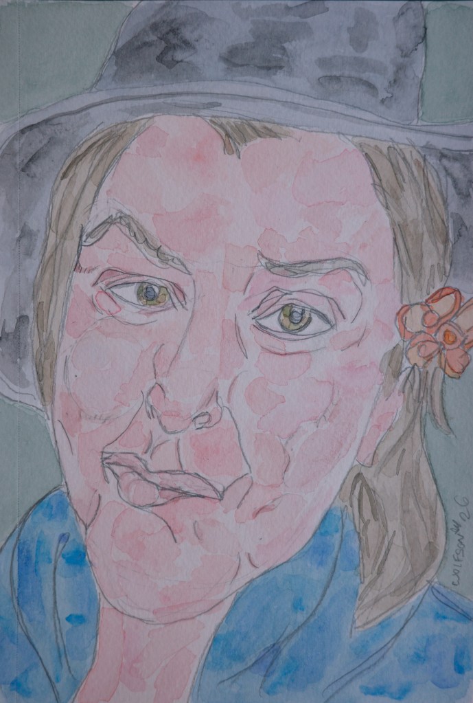
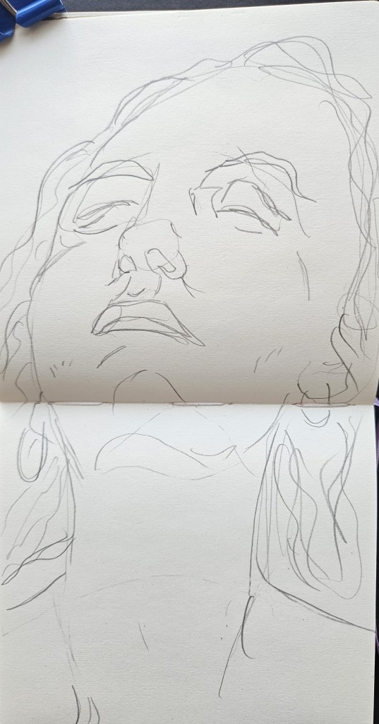
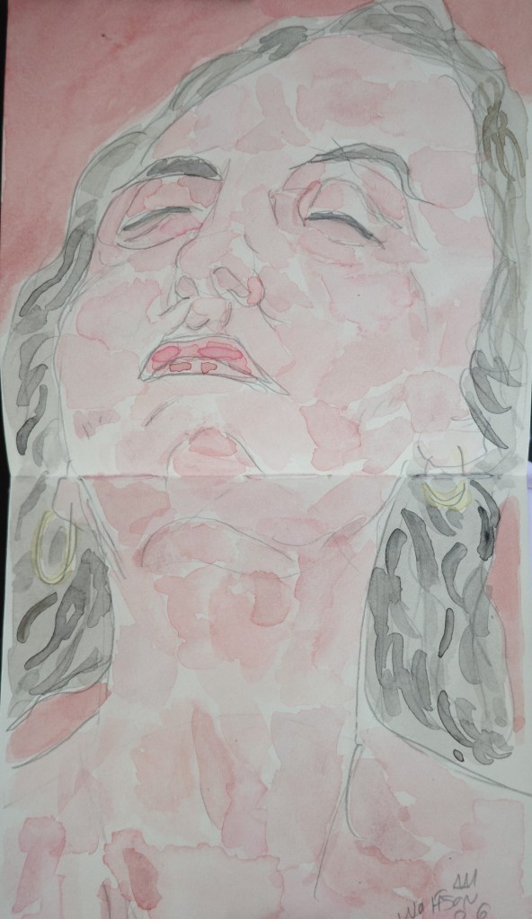
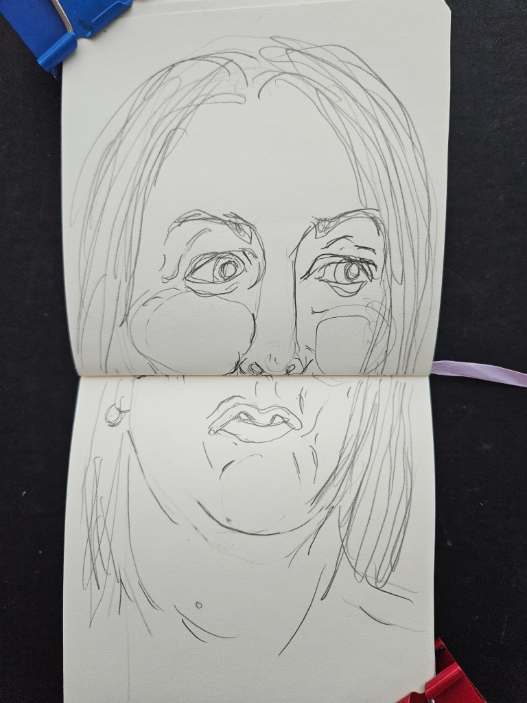
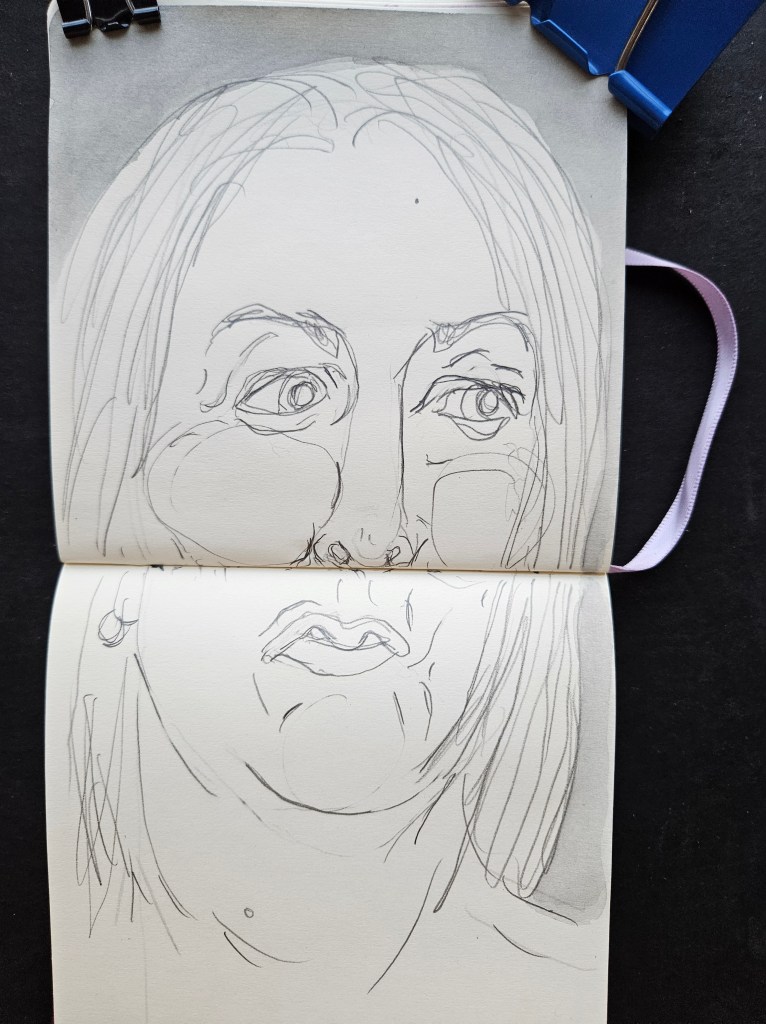
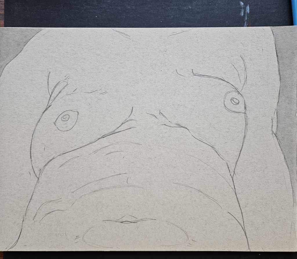
I have my methodology down, I do pencil for both paintings, the start to work on the larger first. With these two, I had only done the smaller as I had been in middle of final edits for my next story collection. I finished, very pleased, and then realized that I had given no thought to the second painting.
With the luxury of no deadline nor expectations I decided to experiment and do second piece radically different in every way. I used bigger paper which I randomly grabbed out of a tabouret, I worked on it in completely different way. These challenges created by leaving the comfort zone of the established are a way to foster growth & chops.
When I first started doing the water soluble graphite works, it added to my painting and then it ping-ponged where that medium was added to by painting. I recently took up pastels and although I am still very new to that, I see some added technique to my painting. That and this spontaneous challenge have definitely added to my painting even if not necessarily apparent to the viewer.
“Not Shy” Talen Art Creations Multi Media pocket Pad 4×4 inches
It has always been of interest to me how the media (television & movies) portray what encapsulates the life of an artist, in any medium. Now, it has been reduced down to all tropes and often one of two types of narratives.
A musician in some prestigious venue pressing forehead against wall in a dressing room as the crowd roars their name. And then the story slingshots back to them as a child starting out and you watch how they came to that moment. The movie ends back again in the present with them opening the dressing room door.
Or, someone who is slightly different from everyone else, children on a playground playing in a scrum while one little boy is off by himself doodling or taking notes. You then see this outsider stick to his guns and in the end gets the girl, gets some acceptance from society in general and walks by shop window with their book prominently displayed or perhaps walks down vast stone steps of a museum the camera pulling back to show a banner with their name on it.
An artist’s life is always portrayed in this manner as you would loose the audience if it was largely them standing in front of an easel or sitting at a desk doing their thing hours on end in solitude, which is far closer to the reality but lacking in outward drama.
Some of my friends have children now of age where they have to start seriously thinking of what they want to do, if not when they grow up, then at least to focus on for uni.
“Maybe tell them a little bit about what the life of an artist is like?”
It sounds corny but it is a calling. There is no “making it” as is conceived in the minds of anyone who has ever watched a bio pic. You feel good and you are working, you are feeling sick or sad or stressed you are still working. The money and exposure of one’s work may increase but the “win” is in the serving of the process which you have been doing already anyways.
Phillip Guston once said that with every painting he created, at the start of it everyone he knew was there in the studio with him and as he worked on it, all these phantoms dropped away. My experience is, as I paint everything drops away except the act of painting. I finish work for the day or i complete a piece and there is that familiar joy, then slowly regular life reasserts itself, the pinch of salt to the sweetness. Then next day I chase that away by getting back to it. That’s how it is in some manner for all artists.
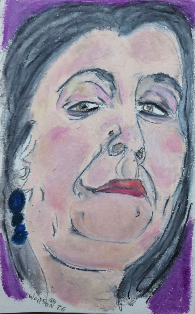
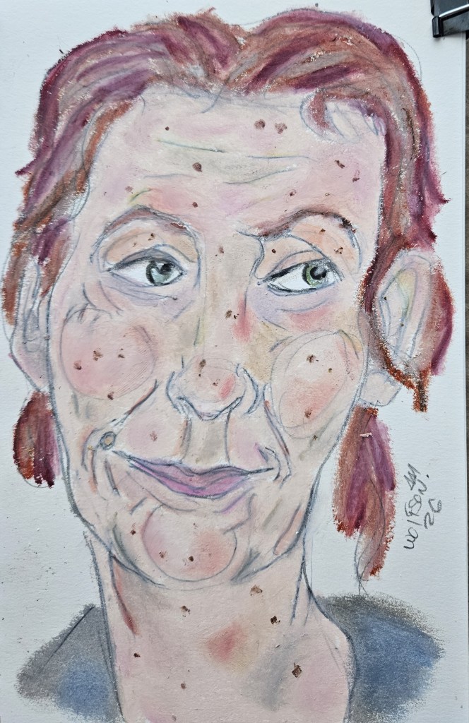
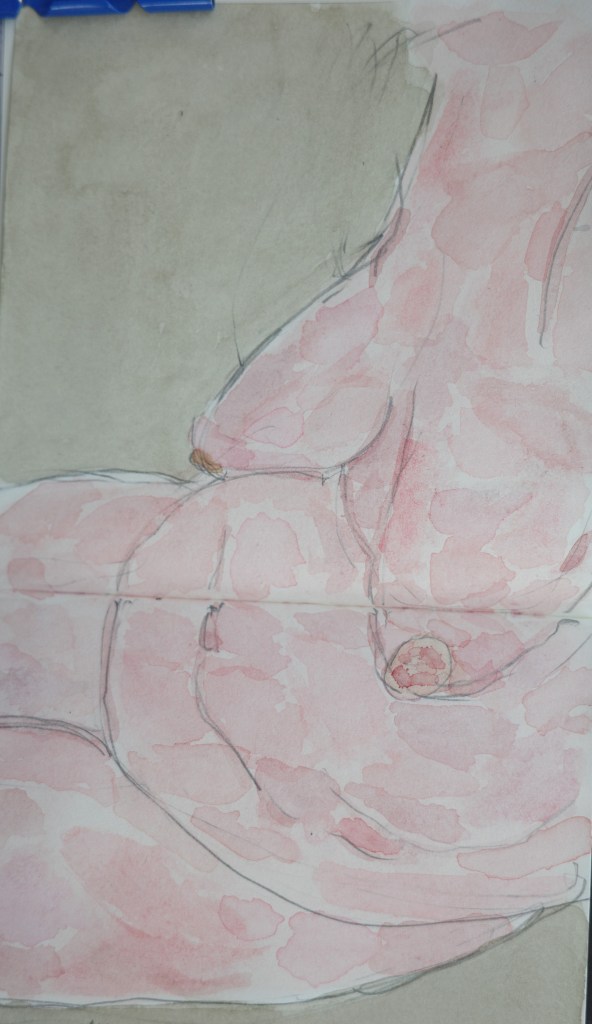
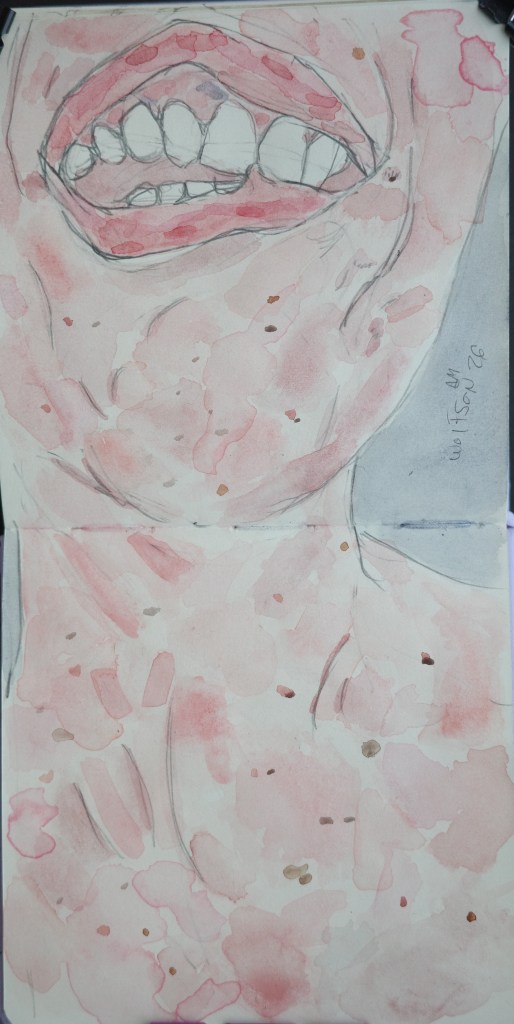
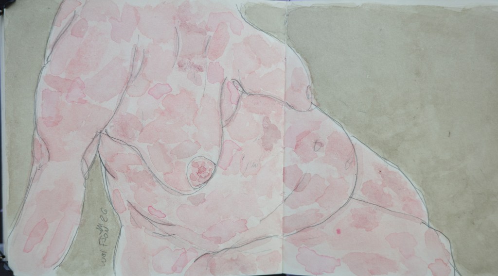
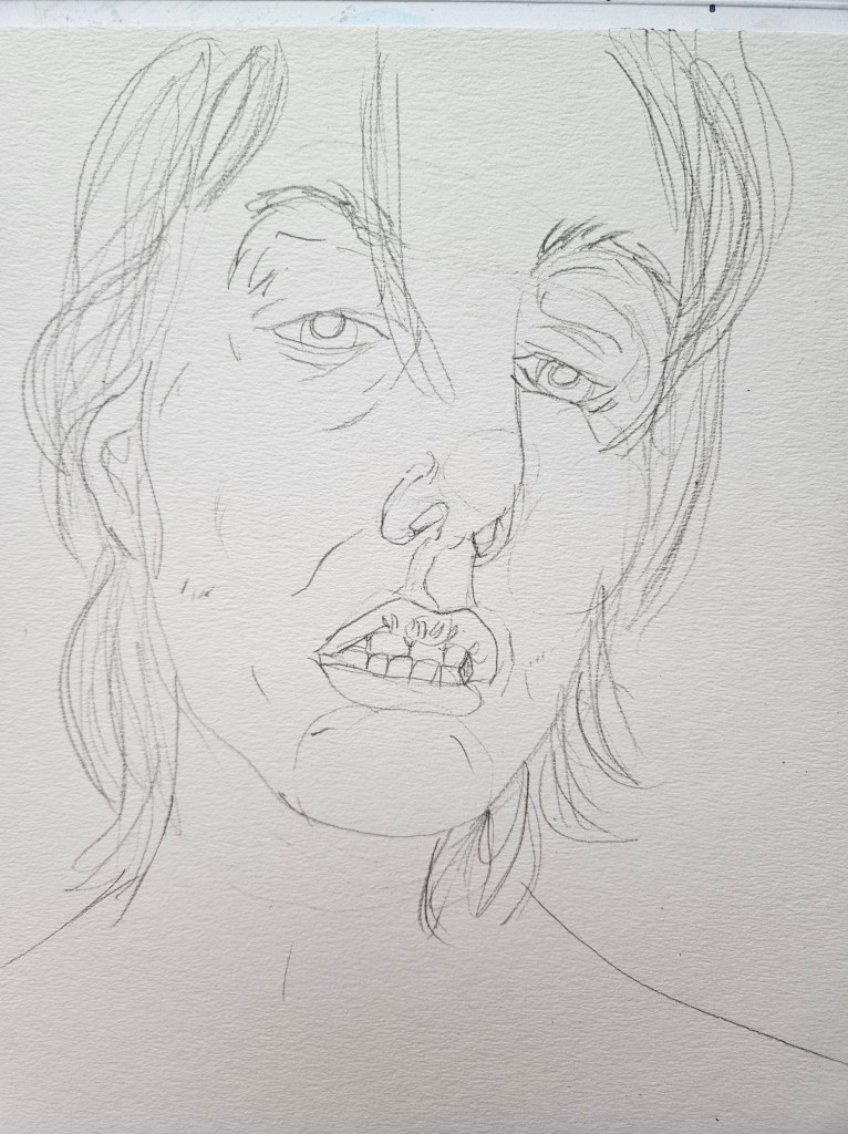
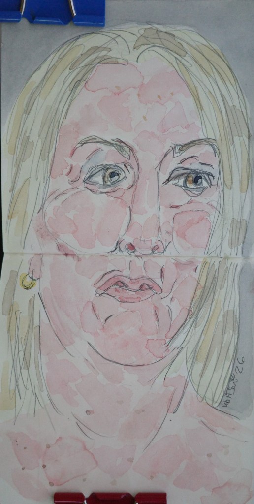
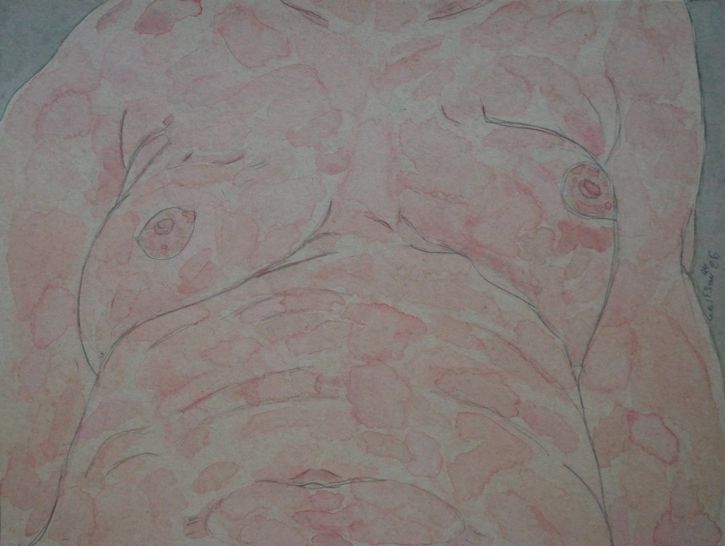
I got locked into a groove and was able to get three paintings done. Each was a different size and paper. For the largest, I tried something different eschewing my normal volume and mass effect for the skin. This was not an arbitrary decision, it is how I saw the piece in my head beforehand. I like the difference in the piece from my others.
The new issue of Furious Pure Magazine #8 has a nice overview of my work along with a diverse and talented group of other artists.
My painting output has been going at a steady tempo which is both pleasing and a little surprising given all else I am in the middle of doing.
In chaotic times it is important that artists regardless of medium do their work. It offers up a reminder that there are things which unite us all and which we can aspire to. Great works of art transcend and outlast the times in which they were made allowing each successive generation to reassert their humanity. All of those seemingly grandiose ideas aside, at the very least they can serve as a brief respite from the daily grind.
MD 5×5 watercolor & paper
AD my ever present Talen Art Creations Multi Media pocket Pad 4×4 inches
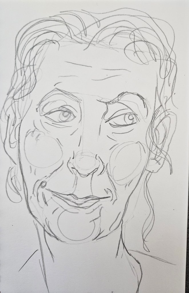
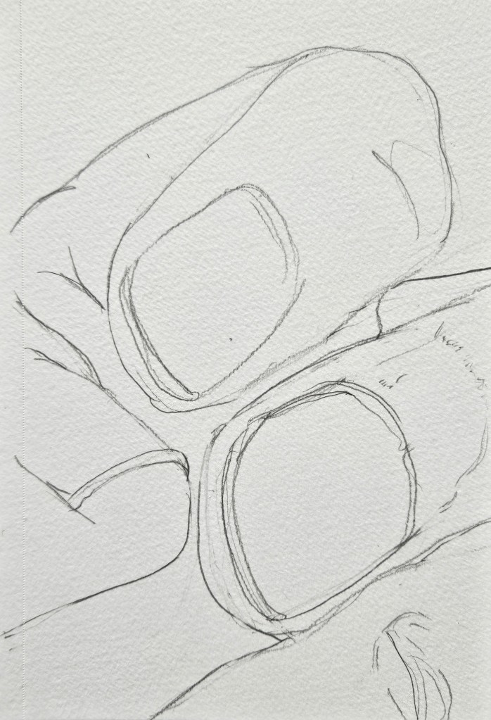
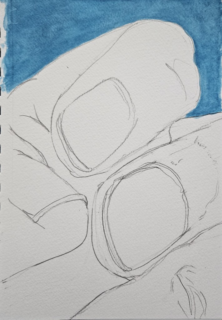
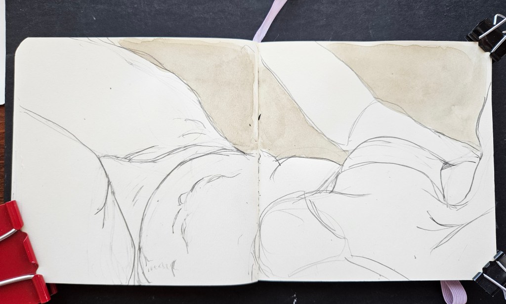
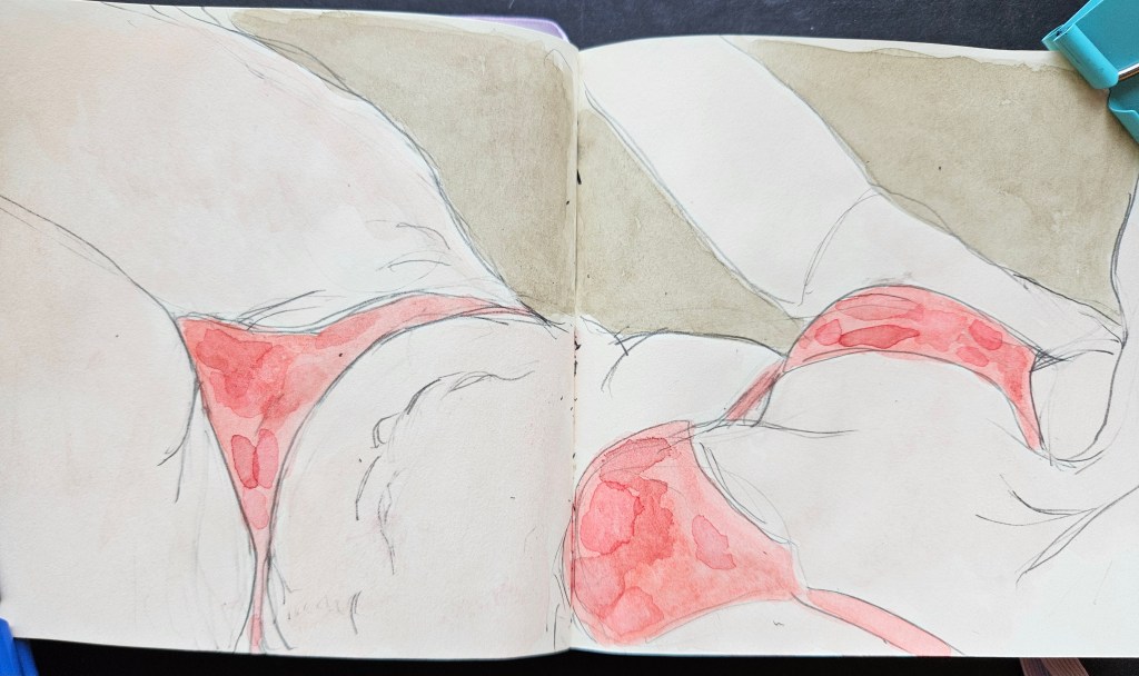
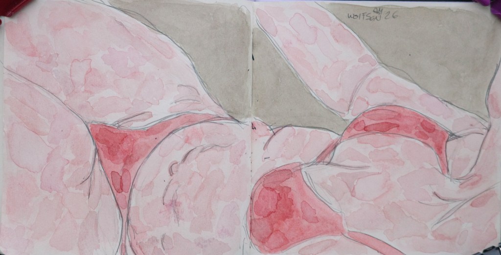
As I continue to edit my novel I have been able to go back to painting. As has always been the case, I like to mix it up a little as to avoid stagnation. This is achieved by giving myself little challenges, different types and sizes of paper and in this case for the second and third painting, only using paint left in the palettes.
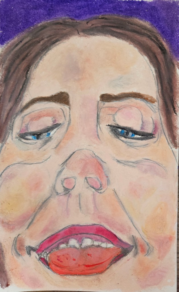
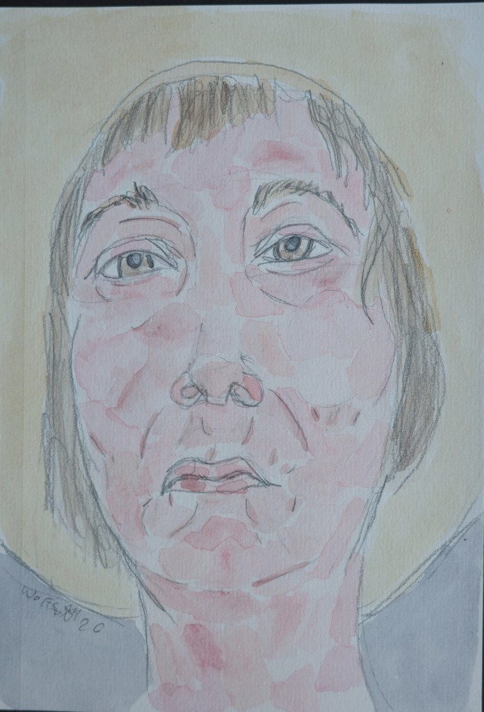
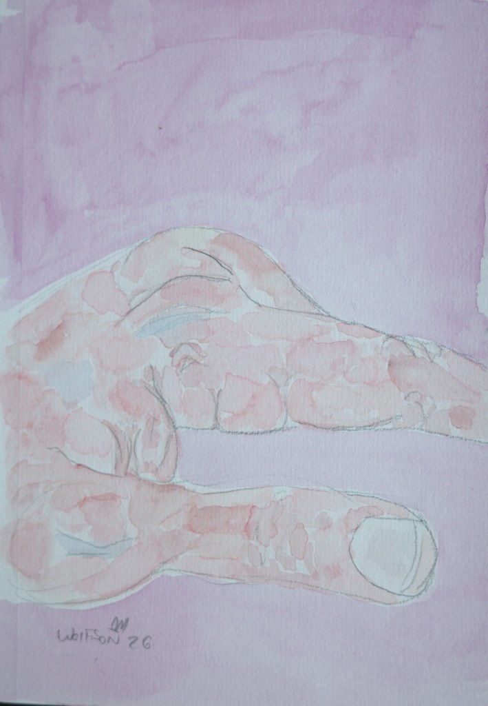
Myself 5×8 cold pressed watercolor paper with my normal studio paint set up
Truth or Dare I used my ever present Talen Art Creations Multi Media pocket Pad 4×4 inches
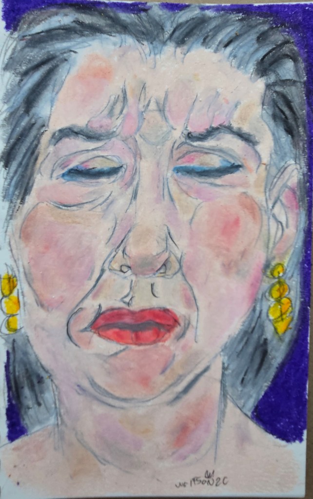
Sandy I used my ever present Talen Art Creations Multi Media pocket Pad 4×4 inches
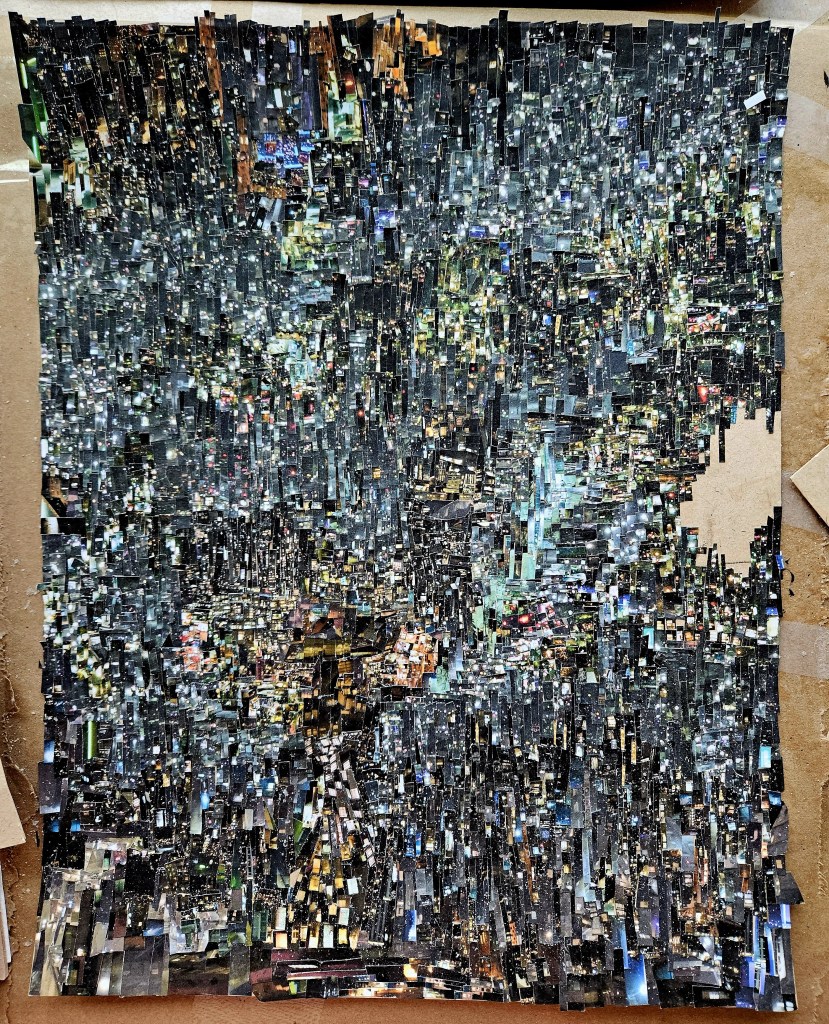
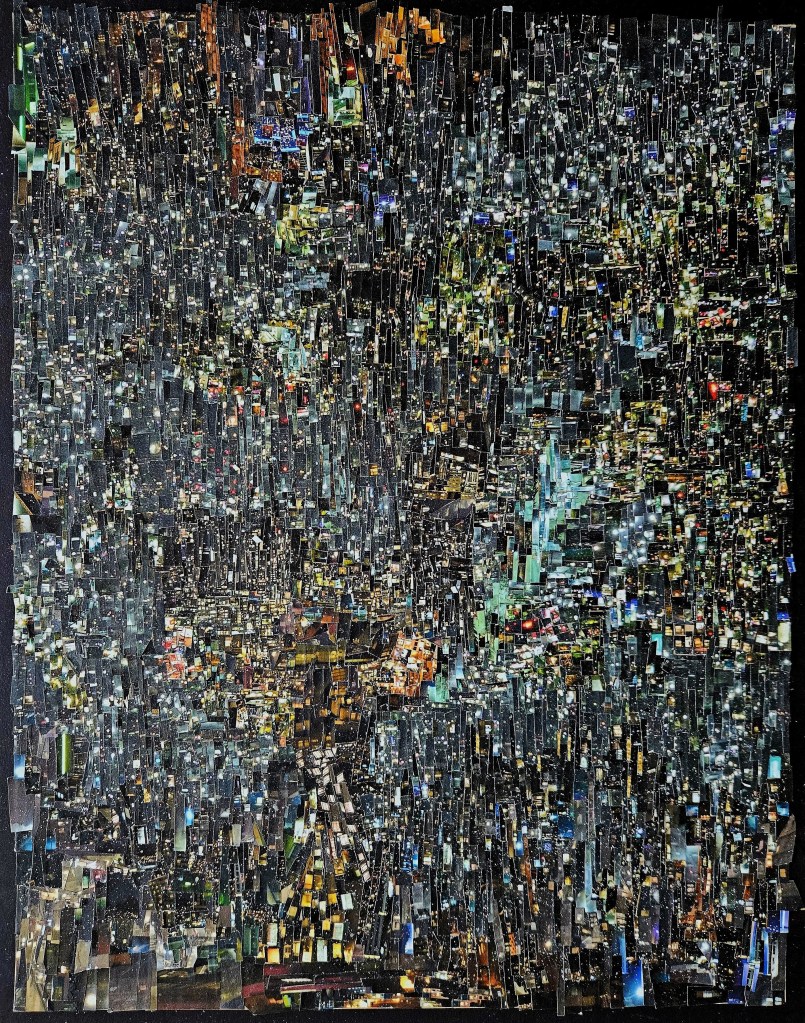
After much hard work I finally finished my latest Cinefield® Pensees de lumiere. While I still enjoy my past pieces, I do feel that with every one they seem to get better and better. For each piece I have a different mission. With this one I sought to make it my most rhythmically complex. For the viewer, I offer the gift of every time it is looked at new things will be noticed.
I started each session listening to specific things which in my head were in line with the piece’s density and rythmic complexity. (when one of these initial first albums ended I would vary my listening to things not on the list depending upon my mood)
Miles Davis Nefertiti
Stravinsky conducts Stravinsky boxed set
Debussy Pelleas et Melisande
The late piano works of Morton Feldman
DJ Cam Underground Vibes 30th Anniversary Edition
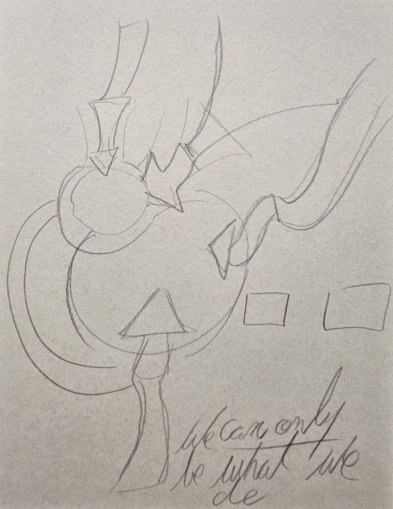
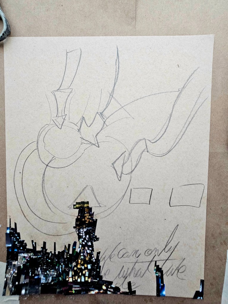
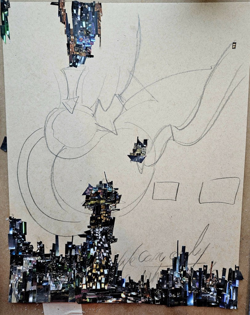
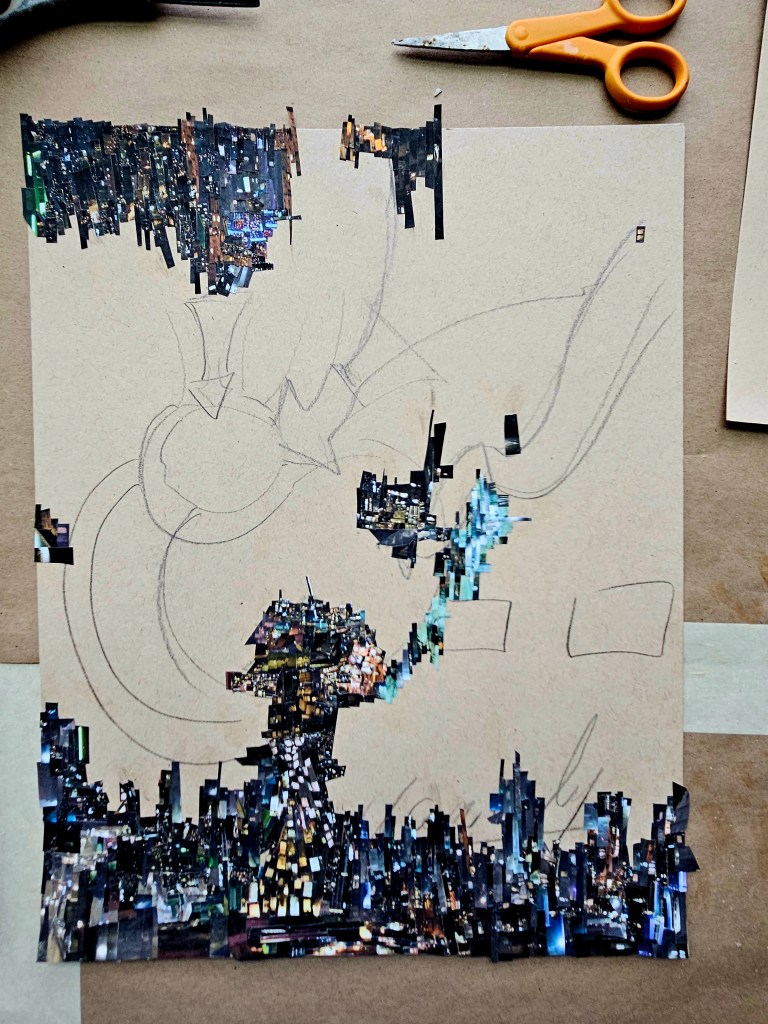
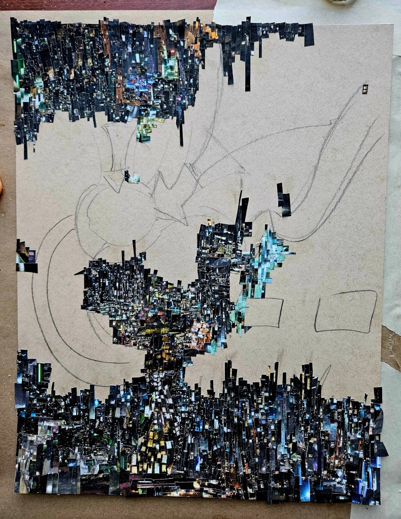
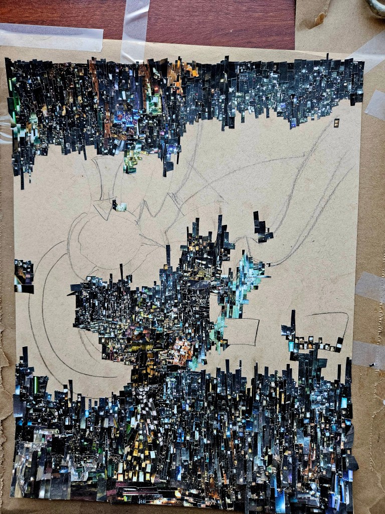
The way I always work for the creations of my work in this genre: I go on a photo safari. I look for a photo or two that I intuitively know will be the raw material for the Cinefield®. For any given piece I do not use more than one or two images. For this one, it was a single image. I print up a few times. Using tiny scissors I cut out equally tiny pieces from the image.
Always beforehand I have a general idea of what the piece will look like, the overall design. On a piece of heavy tan 11×17 paper I freehand draw the design. Then begins the slow task of using adhesive with a brush to the pieces which i glue down.
Not to brag (really): The design is thought out, but what piece goes where is a completely non-stop improvisation. One piece will dictate what next goes down but there is no way to prearrange anything and so every laying down is decided in that moment. Because of this I do not work top to bottom, left to right. The muscle memory for just being able lay pieces down and the fact that when cutting pieces, it’s completely abstract, is a feat. With the cutting out, it is not as if there are stated objects or shapes i.e “cut out all the circular shapes, cut out all the short buildings” etc etc. The size of each piece varies, but non would be described as larger than small. Once I am well into creating, at any given time there are multiple sheets of cut out shapes ready.
I use no digital wizardry for these and I lament the fact that in North America people are giving equal value to what is essential machine made images that a person fed some parameters to.
Pensees de lumiere 11×17 inches. (C) 2026 Wayne Wolfson not for use w/out permission
single piece (o the larger side for this!)
To Own a Cinefield® Print:
Every major city, especially in the warmer months has weekend Art & Wine Festivals. It is sort of like a farmer’s market but with kiosks of photos and etsy style nick-nacks.
Some of the photos are not bad but they are printed up by the hundreds and in multiple sizes. To buy one, if you like the image and would be happy to view it on your wall every day, that is fine. However, it is akin to buying a poster or mass produced print as can be found in World Plus Market, Pier One imports et al.
I have been selling prints of my Cinefield®. There is a difference though aside from the quality of print & frame. I am only printing up two copies and one is for my personal achieves. This is art, not mere decoration.
My site has the technical info. If you see a piece on my blog but it isn’t listed drop me a note as I have not had every single one pre-printed space being at a premium but would be happy to do so knowing one was going to a new home.
I am in the middle of two bigger projects, editing my novel & my latest Cinefield®. I do not have studio space to do full sized paintings. In the interim I am doing pocket pad pieces which allow me to pint without leaving palettes of paint out.
The methodology of this is different than how I usually paint and I enjoy the challange.
Stacy Says Watercolor & Talen Art Creations Multi Media pocket Pad 4×4 inches
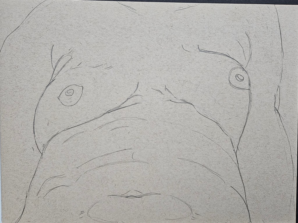
I want a discernable style but to avoid ever lapsing into mere mannerisms. To prevent this while also growing my chops, I constantly mix things up. I use different styles of paper, various pencils.
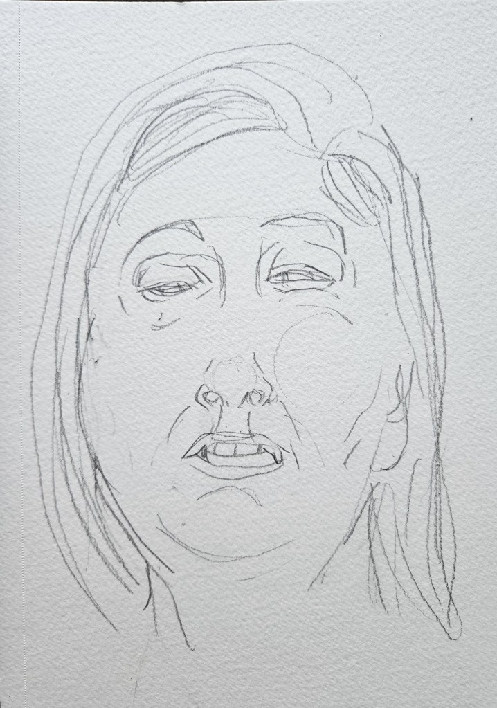
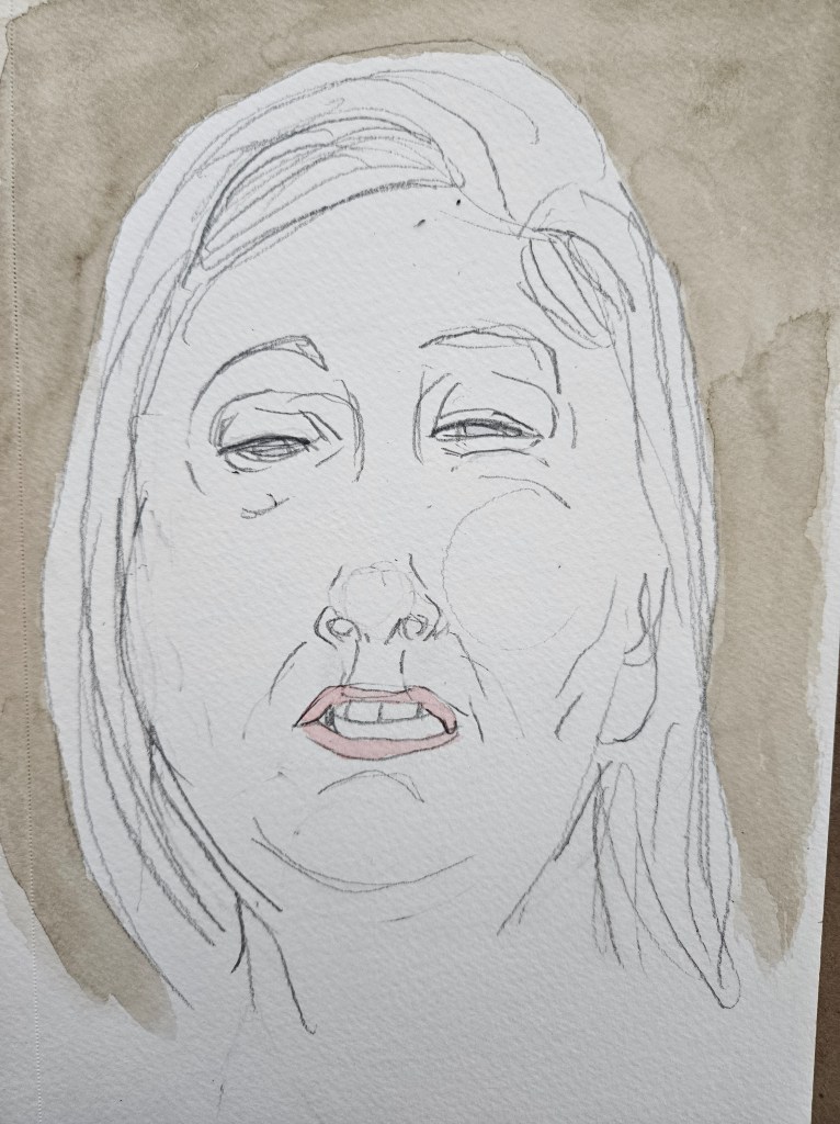
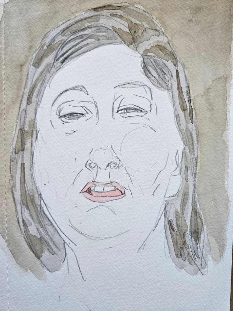
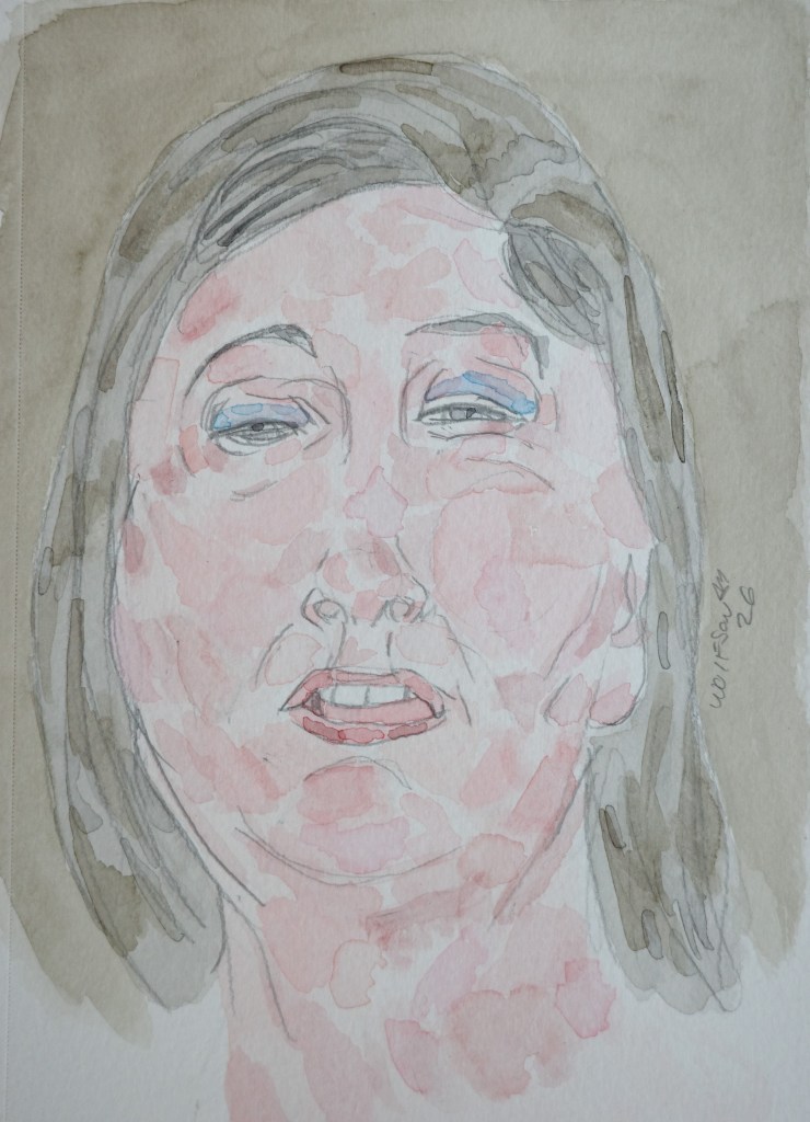
It had been a while since I used tan multi-media paper. For this piece I returned to it but in a smaller size.
Much like the motivation behind using pencil extenders, deep affection for serving the process, I enjoy the challenge of doing a smaller piece with whatever paint remains in my palettes.
Verse One Watercolor & Talen Art Creations Multi Media pocket Pad 4×4 inches
Verse Two Tan Multi-Media Paper 9×12
Always looking for interesting people to draw, email for details