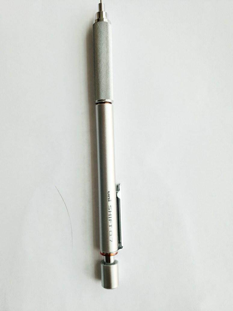
Ages ago I had received a 5 MM pentel mechanical pencil whose lead sleeve retracted into the barrel. On first look, i did not like it. This was back when the aesthetics of my equipment were still a major factor in my choosing of what to use. Aside from the retractable lead sleeve, the other feature often promoted were the soft rubber bumps all over the area your fingers gripped. These were supposed to provide an anti slip aspect along with preventing your hand from getting tired as quickly. At the time I thought it further detracted aesthetically from any potential appeal the pencil might have held for me.
Once you are doing something all the time, for long stretches of time, any feature of it which can be specialized as to make the process less arduous is a must. Does the trumpeter who plays in weddings and parties on weekends as reprieve from their regular nine to five work week need a special custom mouth piece? No. Did Miles? Of course. I now spend seven days a week, hours on end with pencils in my hand. Anything I can do to lessen the negative aspects of this from the type chair I use to what pencils, I will. While I still like the look of my equipment to be pleasing, functionality is now the main consideration.
Now wherever in the world I am, I have one of my preferred pencils in my equipment case, but I also have one of the Pentel. This is because on the road i do not necessarily go out all the time with my trusty book bag, I can throw it in a pocket and not have to worry about the lead sleeve being bent, nor having it punch a hole through a pocket. An added appeal for me is that, while the pencil is by no means “hard” to use, it does not work with same intuitive ease as my preferred ones. However, getting the effects I want and doing good work with it makes using my preferred pencils feel all the more easy. I enjoy the modicum of challenge and will sometimes use this “lesser” pencil even at home in the studio just to stay limber.
For Christmas, I just received a new kind of retractable pencil made by company that makes my favorite to use. Aesthetically, it’s nicer looking than the pental. As with the Pentel, it does not operate as easily as my preferred type but I do enjoy using it. And I have already found that much like the Pentel, if I can make the magic with this pencil, then the preferred ones are even easier. The whole effect I would compare to when a runner trains with weights on their ankles, the day of the race removing the weights to run unfettered feels easier. The retraction mechanism is different from Pentel, neither better nor worse but just different. Pentel you press on the pocket clip and the sleeve retracts, with this one it is a twist and lock.
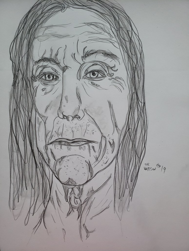
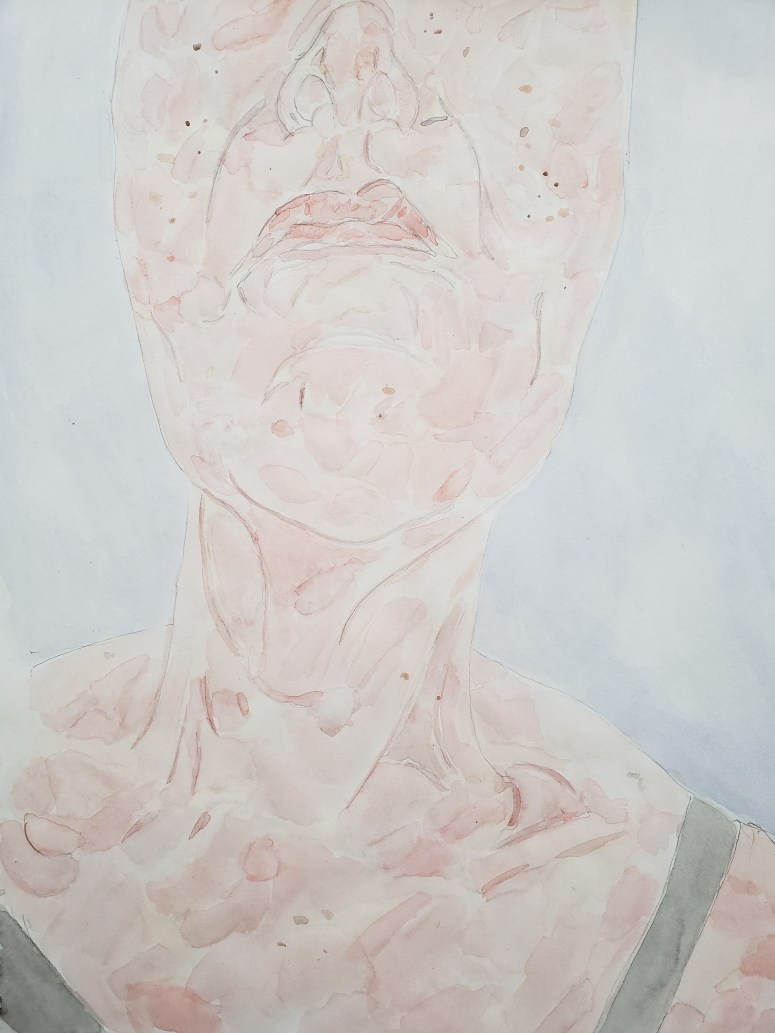
This is the second drawing I did using the new pencil. 9×12
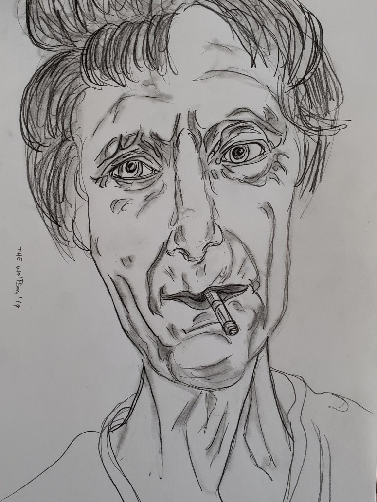
It was worth paying for his drink if only because he tried getting a free round by telling the bartender:
“I have crossed rivers of time to find you.”
W.Wolfson’19