Sequence: Trudy

To do something a little different I did a series of drawings which emerged from an in motion sequence. The pieces can be enjoyed on their own or looked at in any order although there was a definite order as I was doing them. All are quick-sketch impressions

Each 9×12 graphite & Paper


20190927_08073420190927_08051420190927_080601

Tan Lines

Between all my recent travel and getting ready to go on the road, I realized that I had not done a piece on my French Cotton paper in a while.


“As a child I spent my entire summers barefoot, right up until the day before school started. I think that’s why as an adult I like beaches so much, they are very different in Europe. ”

French cotton paper & Watercolors 7×10


20190917_14021020190919_13542320190920_142344tanlines

Dior Glasses

There is a pleasure to exploring when on the road. A different but equally satisfying thing is to have places all over the world where one is known, a regular. This is a self portrait of me at one of my favorite places while on the road.

Watercolor & Multi Media Paper 9×12


20190910_08511620190910_13420220190911_16043820190911_16043820190914_072139

Caro Diario

On the road. This paper was just laying around. Although it was generally being put to use as scrap paper, it is landscape style. It was nothing fancy nor great but I decided to improvise part of my trip diary on it. It is not whether something is frame worthy or selleble but the process itself which brings me joy and is the personal payoff for me. I was pleased with the results.

20190907_135740(1)


Tani

First painting from on the road. I am very pleased with this, even more so as I had far from ideal lightening and worked on a counter.

Tani 5.5×8.5 watercolor and paper

20190903_113843

The Sea (for Kini)

I used to do large paintings, acrylic on canvas. Door sized things. I was not very good at the time and I sometimes think the real art was in the making of the pieces as I often had an audience. Everyone liked the works but I think it was being caught up in the moment or after the fact, remembering the time.

I got serious about painting, I got good. I am far better with watercolors than I ever was with acrylics. I got rid of 95% of my old works.

My paintings and drawing tend to be far smaller now. my largest graphite pieces are 9×12 with the paintings being 7×10. (more often than not 5.5×8.5)

I have a logic to this. I want the viewer to feel as if ease-dropping in on whatever scene I am putting forth. As important as the emotional effect, i have the first time or new collector’s in mind.

When  first getting into art there is a vague sense of what one likes. The more you delve into art, the more exposure you have, the palate becomes fuller formed. To get one of the larger pieces so en vogue when first starting out, you run the risk of it dictating the timber of a burgeoning collection.

I want a collector to live with my works, not under them. For people where space is at a premium, the now seemingly typical big-boys dominate a room. The real big pieces, you have to almost put goggles over the mind’s eye, you stop noticing it except for rare instances and this defeats the purpose of having art.

With my now firmly established voice, I have no idea if my technique would even work with large pieces. As a challenge for myself I have decided to do a few larger (for me) pieces. Regardless of whether I can make it work, I still do not see myself going as big as is popular. Bigger is not better it is just “more”.

This is my first “big” piece.

The Sea (for Kini) graphite & paper 14×17


Thesea1Thesea2Thesea3thesea

Collarbone

This piece is 9×12 Watercolor on multi media paper (98 lb) . I am very pleased with the results. I do not work any magic on the photos of my work. I  only use my phone as the photos are meant to give the gist of a piece, often in person there is even more going on with a work.

Collarbone pencilcollarbonecollarbone detail

Mis-Beckett(ed)

The best art in any medium has the effect of feeling extremely personal to each person who enjoys it even as it touches a multitude. Everyone has “their” author/painter/band/musician. This thing is recommended  to friends or in general conversation akin to how a proud parent talks of their child.

We all make totems of artists & their work. The more levelheaded ways are when we associate it in to the memory of the place/time/person(s) of first discovery. The work/artist can serve as inspiration or a brief respite from daily life with all its mundane commitments.

This is all fine so long as an audience keeps in mind that, although it may not be broadcast, the artists has an intent or idea behind the work which is the absolute truth beyond what one may make of the work. Its true meaning and intent.

Samuel Beckett has always been a favorite author of mine. His work often possesses a density whose meaning on the surface may seem a little open ended, but which is rarely the case.

Anyone with boho or intellectual leanings knows of Waiting for Godot. As for the rest of his work, with the advent of social media Beckett is often reduced down to bumper sticker aphorisms. This reduction is made worse by how often orphaned from the rest of the text, the use and meaning is wrong.

I was once again reminded of this via twitter which is 40% people posting quotes & material by others as to assert their individuality, 40% memes/gifs also by others and 10% original material.

It was the end of the night so I decided to peel off a portrait of Beckett. I used a Blackwing Palomino pencil I wanted to show the depth of his eye sockets and crags without having to rely on heavy shading. This pencil always lends a graphic feel to the work but also allows for volume and mass to come through.

9×12 Beckett


Beckett


Serenade

Emotion is the most important aspect of all my work, regardless of subject matter. Once one has an artistic mission or aesthetic in mind, next comes putting it into practice.

In chatting with some of my direct peers, something which seems obvious is reiterated throughout our ongoing conversations. We all approach the craft of painting differently.

For myself, i see the painting in my head done before starting it. Some of my pals know what they want to do but feel their way towards it as they go. With one piece they want to convey joy or sadness, established subject aside what will they do over the course of creation to facilitate it is what they feel their way towards while creating.

They get great joy in seeing what happens over the course of working. I would not want to work that way but they like the unfolding mystery aspect of it. To them, it would seem boring to know largely in advance whats going to appear out from under the brush but i never feel at shortage of joy when painting.

The one thing we all have in common is joy in the process regardless of how different it may be for each of us.

I want a discenible style/voice but to never lapse into mere mannerism.One way i avoid this is by challenging myself. I see the painting in my head, i know that a certain color is perfect for the background or I can get effect of dappled light on skin using a favorite yellow. I purposely will then use a different color and make it work. Like some of the dissonance in a Prokofiev piece, it works despite itself and becomes an important, naturally integrated  aspect.

Often when giving myself one of these challenges, during break I will be chatting with someone.

“I am trying some new stuff with this piece (my shorthand for one of my self challenges)”.

The finished work often does not look terribly different from any of its siblings. A potential dramatic let down to whomever I might have mentioned it to. Personally though, it is of great value. I got what I wanted without having to resort to now established methods & tricks.

I used French cotton paper for this piece. It is 7×10. It behaves different from both the multi media papers I use and the watercolor velum 5×8 which has become a favorite. The soundtrack was largely Rahsaan Roland Kirk’s “I Talk with the Spirits”


In a Moment

Renaissance painters largely did Royal/High Society  portraits along with the obligatory religious work. It was important for the portraiture to look like the subject. However, there could be subtext either positive or negative in the clothes the subject was wearing, the accoutrements around them.  These send their own narrative out into the world.

The painter locked in the subject’s position, then worked from there. Now, with camera/photos, people expect, if the subject is leaning their head to the left, then paint it exactly that way.

I have often written about the relationship between artist & model and audience expectation. Another aspect which has changed is positioning.

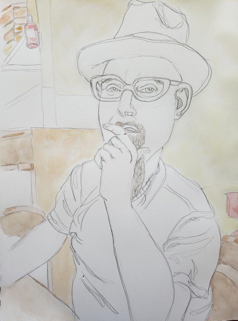
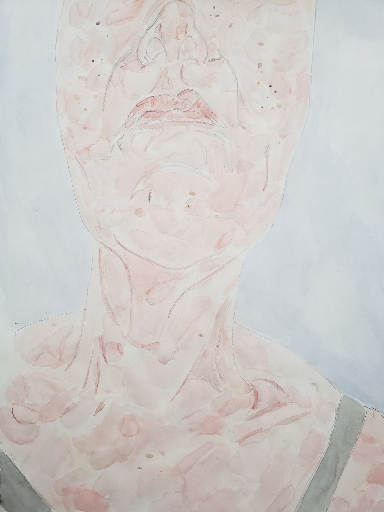
I want my portraits to look like the subject and I include every little bit of minutia that I see, from a blemish to an about to fall off button. when not working from a live subject, I do not rigidly adhere though, to position offered up in the photo .

Once I did a commission, working from a photo. When I was done, it was the spitting image.

“Oh, my head had been tilted back slightly more in the photo.”

It had not been a flattering angle, chosen because it decreased a chin but increased nostrils as focal point. A strange argument to me, as angle aside, it looked just like her. Most people would never see both the photo and the portrait.

Not by way of excuse but as part of my usual modus operandi, I do sometimes slightly alter an angle. It is as if I am capturing the moment before or right after that in the photo. Depending upon the naturalness of the pose, at other times I do not alter a thing.

She took possession of the portrait. Upon hanging it in her home, she snapped at photo of it on the wall. At one of the fuller cocktail parties she faux-casually brought up her portrait. Wanting some justification for her initial cool reaction she had been eager to show a party goer or two  the photo I had worked from and the finished portrait both of which rested within her phone.

“Oh, that is great, it looks just like you, especially in the eyes!”

After a few more comments like this, she felt better. She put away the photos of twins, born a minute apart.
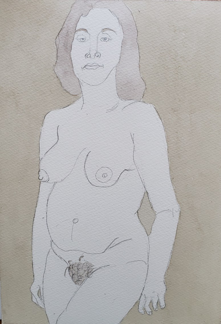
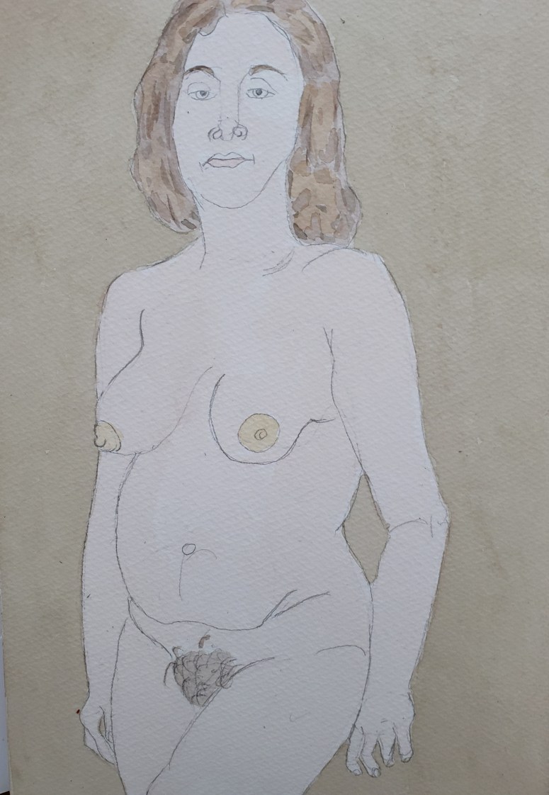
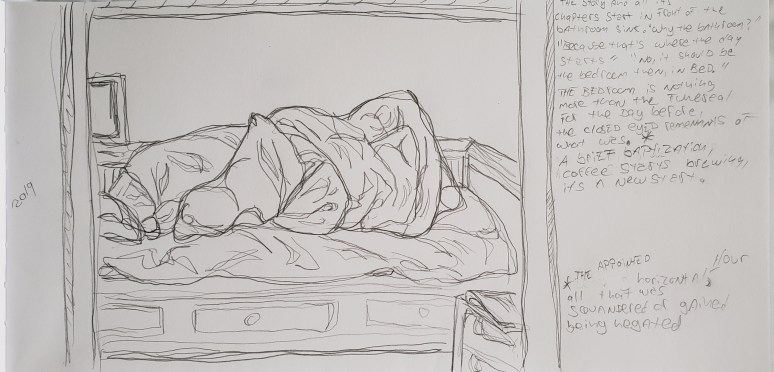
 

“Blue Pillow”

Watercolor & multi media paper 9×12