Not Capri

“Calamari, some campari & soda. We will eat while listening to the surf smash against the rocks.”

She hoped the fishmonger still had some available as after a night of us all mixing drinks while throwing our arms around one another in song & passion she was getting a rather late start.

She would have asked me if I wanted to come with but there were things needing her attention as to mull over their true meaning. The added benefit was that she looked the better person for allowing me to work for several hours uninterrupted in my makeshift studio.

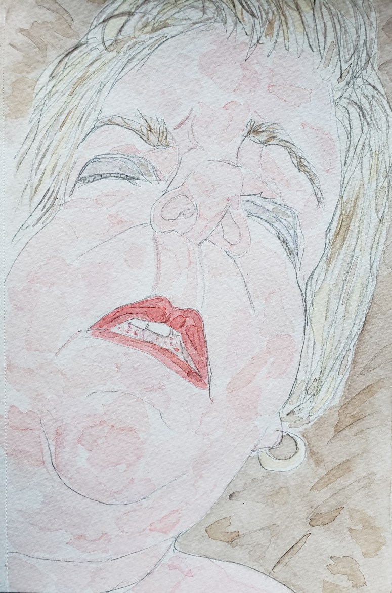
I noticed she put on the earrings she had been wearing last night, normally not worn except for on special occasions.
They were thick circles of shining gold that tightly hugged the bottom of her lobes the aesthetic for some reason making me think of long gone Romans.

It was a way to get an extra dig in to Gina who had not been invited last night and who had for years been refused the lone of the earrings regardless of the occasion.

There was every chance to believe that she would still be at the market, purposely waiting to run into her as to wrangle an invitation to whatever we had planned next.

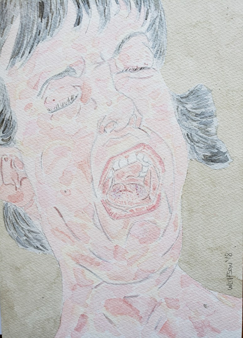
Later we take a walk as she did not like the thought of me hunched over my drawing board all day.
“What do you call that flower, the pretty one with all the prickers on it?”
I tried to pronounce it several times, my tongue not complying with the dialect.
She laughed kissing my cheek.
The word was said again three times in quick succession.
“Ah, “friendship”.”

W.Wolfson’18

“Not Capri” 5×8 Watercolor & Paper


NotCapri

Black Lingerie 2

This is from a new series. I wanted to create a lyrical, delicate work. There will be five pieces in the series which will form a sort of loose knit narrative, with the paintings having the ability to be arranged/viewed in any order. The order dictating the narrative.


Black Lingerie 2 9×12 watercolor& multi media paper 98LB  & face deatil


Reel #3

<metallic sound of film spool plinging as projector starts its lopsided spinning>

The screen is taken up by circle in which focus shapes in gray and numbers counting down from ten as clock like hands spin all accompanied by a beeping.

Slurred orchestra of Nino Rota is heard as an office comes into view.There are gilded edged books in green and red leather under glass barrister bookcase glass, a hat rack on which a trilby hangs at a steep angle as to indicate that its positioning an intentional joke. The camera Panning right, a large mahogany desk whose surface in only broken up by a green blotter and big mouthed ashtray in which two dead snake looking matches lay.

Viewed from profile as he looks out the window, a man awkwardly sits on the corner of his desk , one leg extended, foot on the floor while the ankle of other foot digs into its knee.

He turns towards the camera, taking his pipe out of his mouth, putting it in the ashtray:

“Oh hello, i didn’t see you there.”

The rumples in his cardigan are smoothed out. The music turns playful with the flute taking the lead. An image of rabbits or some other smallish animals rolling around in a tangled mass among the grass is conjured.

“Well…”

The music turns ominous but the reel has too much slack and so slurs which only adds to an abstracted danger.

“Notice the nostrils flare and quiver in anticipation of <inaudible>.  Indubitably, the female of the species is the more deadly than that of the male. Even more so for the unwary  for whom pleasure has become more than merely a matter of biology. Notice how the lips part just slightly as if to wordlessly say…”

A white hole appears at center of film getting larger and larger, the edges of  frozen image becoming a mountainous relief map of burnt celluloid before retreating further back to allow more whiteness to appear.  The unpleasant smell of something man made burning.

W.Wolfson’18


“Rachel” Watercolor & Cotton Paper  7×10


rachael


‘Chelle

The idea of my works giving the effect for the viewer of ease dropping on a scene appeals to me. Even more so when what is being seen is sort of open ended, open to interpretation.

This piece was watercolor done on Canson Multi Media Paper 9×12 (98lb).

michelle


Seattle

Smaller works of art might be of ideal size for where it is going to be placed. There is resistance to this though, as on a subconscious level (at least),  some people equate “more” of something with it being better.

It is faulty logic, unless a work’s size is an intentional component, bigger to near on point of domination of a space, is not better. Bang for your buck should never be a cultural consideration.

In the age of consumerism, a sort of forced perception resulting from faulty logic.  Just as physically bigger books with higher page count are automatically deemed harder reads (most of the densest books I have read all have had relatively average page counts, it is ideas and style that create density) it is letting the wrong factors inform opinion.

More and more I lean towards smaller works. They lend themselves to lessening the “I am looking at art” sensation while furthering the “I am feeling something/something from this”.

It could be a generational thing, I am wary of deflated attention spans and lapsed concentration of gallery goers. People having become used to necks bent in worship of i phones or tablet will do a cursory look at larger piece, eyes flitting across the canvas to capture “the point” of it at cost of all the other things going on which contribute to a work’s tension & release.  Smaller works, there is no dead space all the poetry and flavor is enmeshed with “the point”.

I do vary the sizes of my works but with the largest being 11×14, no one will ever call any of them big.

Seattle 5.5×8.5


Seattle

Lion Alone

I was safely ensconced in my hotel room and ready to work. There was heavy marble topped table on wheels atop of whose curved feet I put my own while painting.

In between, i would walk up the hill for drinks and let strangers make confessions to me as i swirled the cubes in my glass counter clockwise with my left hand.

No one here would call to see when i would be out and about which then delayed the process. Instead I would see on the peripheral, people who surprisingly quickly, had learned where I liked to haunt, waiting.

My first stop would always be the record store. Everyone was always telling me that they were willing to accompany me. While it might have been nice to have company on the way, I had a process. I had learned with Tania that it was not enjoyable for anyone but myself. The record store was too hot, to my surprise after having walked back and forth between several bins, upon leaving I had spent way longer inside than I had realized.

I showed up to the cafes and bars with my brown paper wrapped purchases, ready to build an empty glass cityscape upon the tabletop with whomever had been waiting for me.

I am not anti drama, but I think organic things and beauty have more power. A pleasure for me is the ability to take some thing from my daily existence and then conjure it into my work.

It is not necessary and also has the potential to become a trap if an artist uses their personal lexicon of totems and symbols for every piece. But once in a while, the organics of it make for art which resonates emotion. Not necessarily as upfront dramatic as an artificially induced thing, it is of a more lasting impression to the viewer.


Lion Alone watercolor & paper 5.5×8.5


Lion Alone


Selfie

There is the age old tradition of the painter doing self portraiture. How a painter sees themselves often gives insight into how they view their work. I go for a sort of truth that allows the organics of it to facilitate emotion.

The size of my works is keeping in mind people for whom space is at a premium. Collecting art should never have to be a thing for only those with “X” amount of square footage. I also think of burgeoning collectors whose aesthetics and eyes are just developing. I want them to live with my works not under it. I desire too that the direction their collection goes in is not dictated by a first piece dominating a room/area.

The smaller size also helps further garner the feeling of the viewer sort of ease-dropping into a scene.


Selfie 5.5×8.5 watercolor & Canson Artist Paper


selfie

Herbert West Sings Songs of Romance

This piece upon initial glance can seem an arresting or slightly off putting subject. Continued observation allows for awareness of the delicate coloration and despite subject matter, a beauty.

This dichotomy is what I was after.

The piece is part of an ongoing series “Drinking with Doctors”.
The paper is a mixed media paper 98LBs It is my second ever painting using this paper


herbertwestsongsromance


A Perfect Circle

For my paintings I change up both the type of paper and size with every piece. This keeps things fresh and makes me have to think differently for compositional balance. Were I ever to only use one size, eventually i would inherently know the proper choreography. The properties of color too can change with the size of a piece.

There is an established range of sizes for me though. The smallest being 5.5×8.5 to the largest 11×14.

Each size of paper is different from vellum to French cotton to mixed media to American cotton.  All the different materials posses their own inherent properties which call for slightly different touch from one medium to the other.

The mixed media paper is the most unforgiving. I enjoy the challenge and  much like a runner training for a race using ankle weights, when I use French Cotton paper which I find to be my preferred, it seems “easier”.

Visually I still get the effects & results I want with the mix media paper. It looks slightly different from when I am using cotton paper. My voice still ever present it is similar in effect to the effect of playing different venues for a musician.

I use three different sizes of mixed media paper but all had been the same brand, Canson.

By happenstance I just came across another company when at the art store to buy pencils. Strathmore in the same size and weight as my Canson.

It seems obvious now, but I had not thought to vary or explore companies with my mixed media paper.

Right out of  the gate I enjoyed the Strathmore. My first piece gave me results I wanted.

With all my paper I just mentally have them arranged in a circle, each has a number and there is no thought given to which paper to use next as the subject matter may be up in the air but the type & size of paper is already predetermined. I will now add the Strathmore to my perfect circle of paper.


“Absinthe Eyes” 9×12 Strathmore (98lb) Mixed Media Paper


Absintheeyes


Giovanna

There is something sprite like and summery about Giovanna. The emotions which play across her face occur naturally and this organic component helps bolster the work.
I intentionally choose to work in smaller sizes. I have in mind people for whom space is at a premium. Also there is consideration for the new collectors.

When just starting out in collecting art, one is developing their aesthetic sense. Unlike larger works, smaller pieces will not dictate the timber of a burgeoning collection’s style.

Smaller works in different genres never look out of harmony even when sharing wall space.

Lastly, i want the collector to enjoy and live with my work, not under it. A smaller piece is akin to a good conversationalist who speaks softly so that attention is called for in listening.


Watercolor & paper 5.5×8.5


giovanna