Night Tides (for Craig “Doodlebug” Irving)

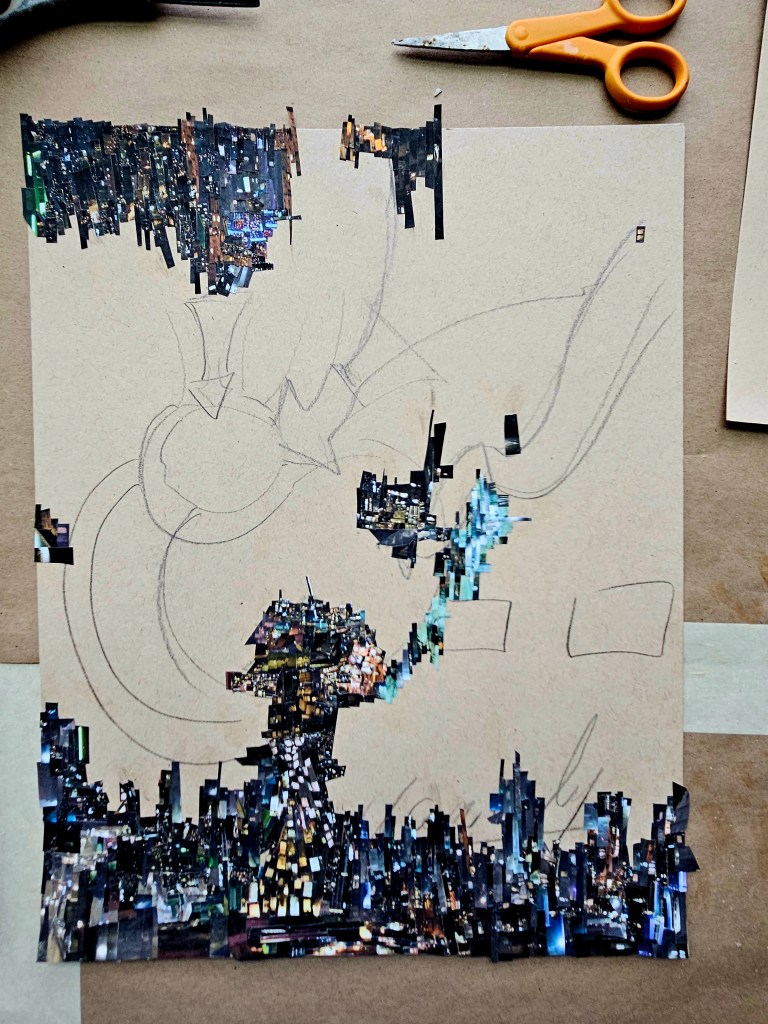
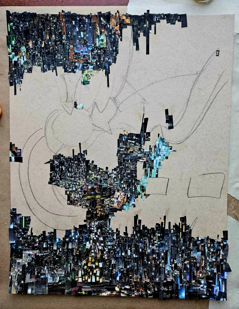
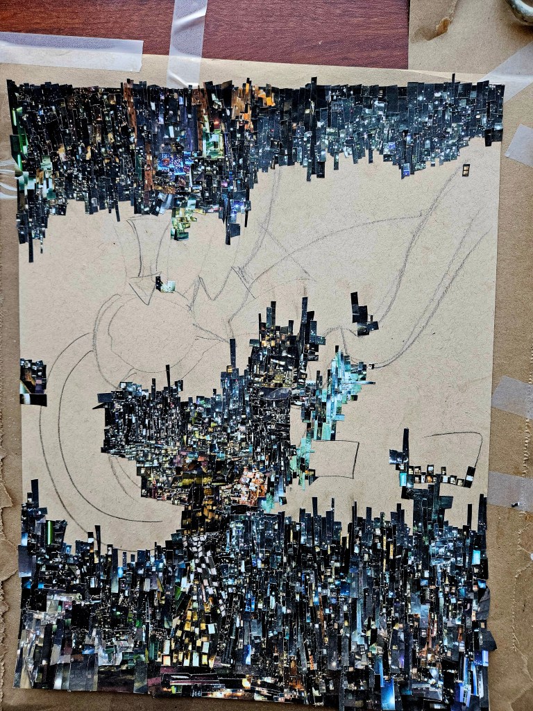
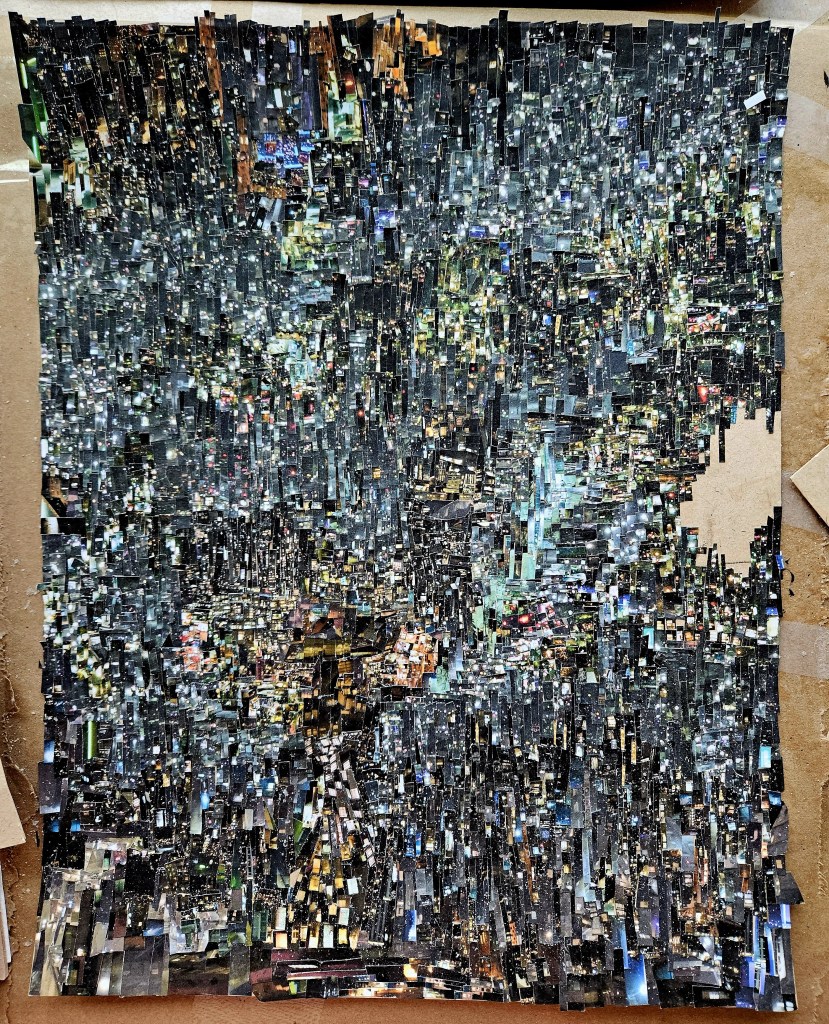
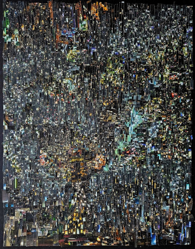
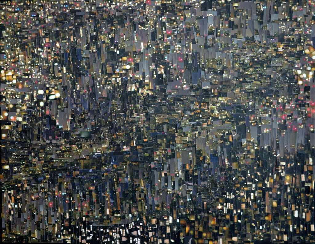
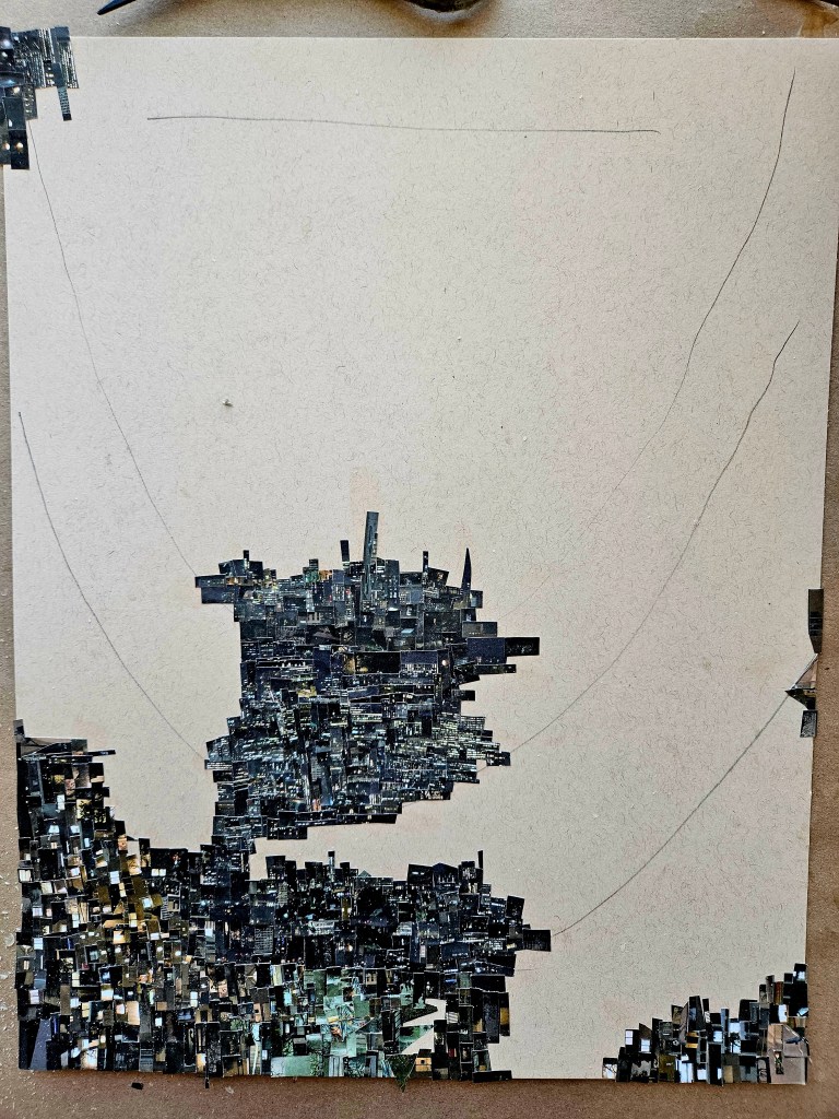
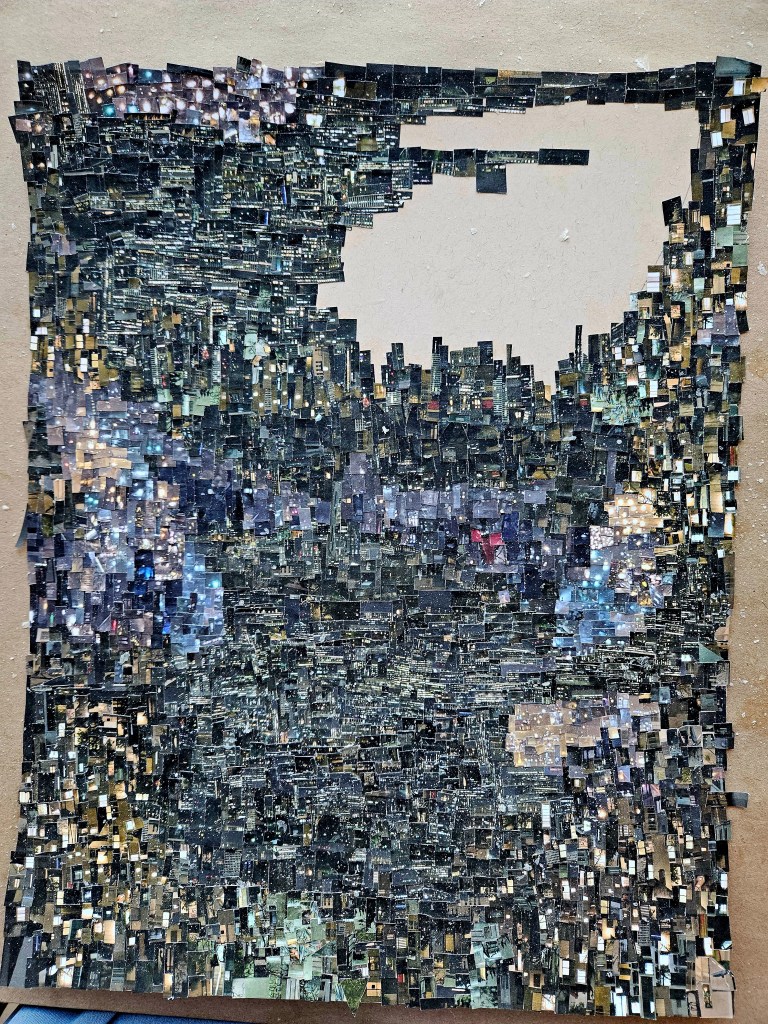
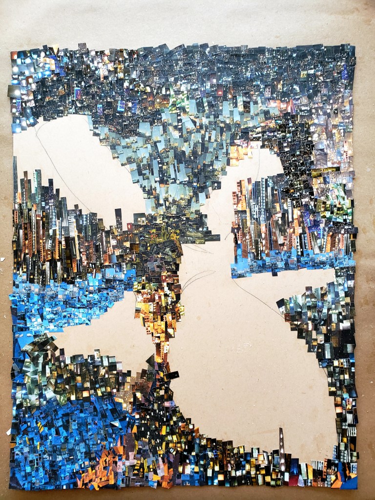
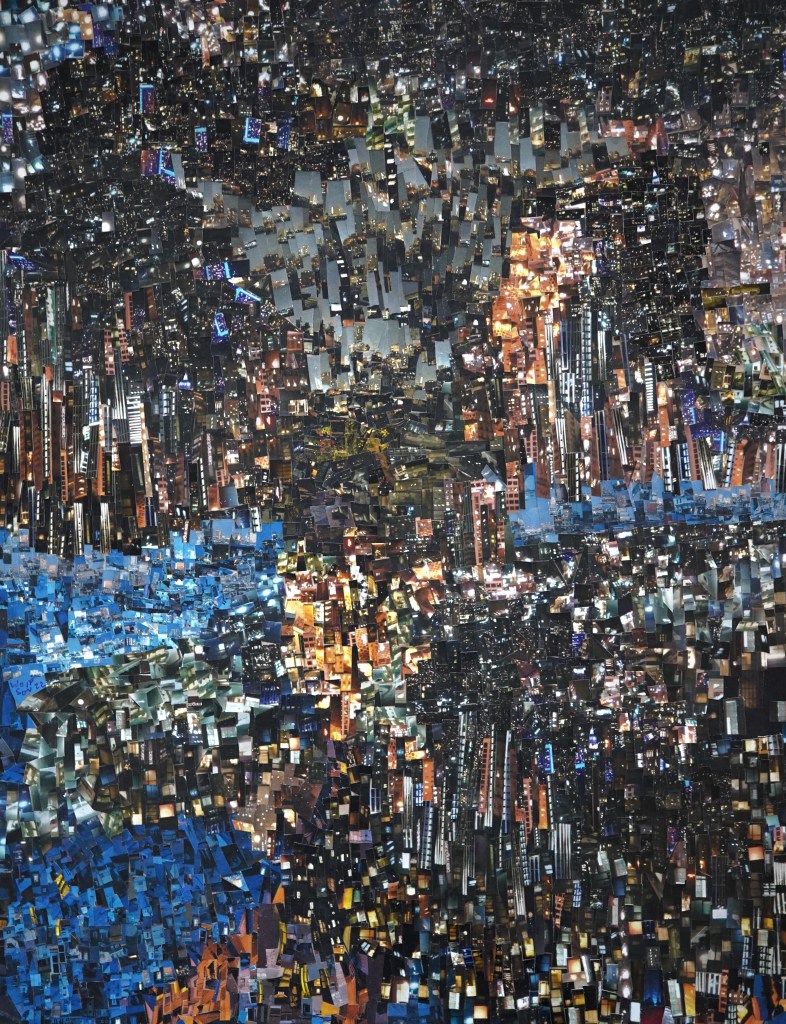
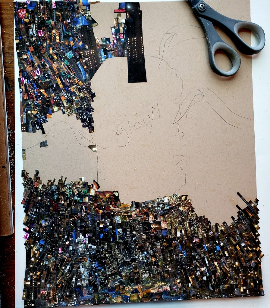
Finally finished my latest Cinefield®. For each one, my ambition is to make it better than the last in some way. In this case, it is my most rhythmically complex.

I seek to engage the viewer via creating works which offer new things to be noticed with every view. Ideally, I inspire (and maybe even awe) but if I only offer a momentary respite from the unpleasant aspects of daily life, then it’s all well worth it.

Aside from the labor intensive aspect of each Cinefield®, other information:
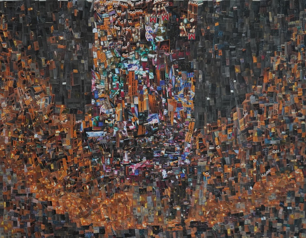
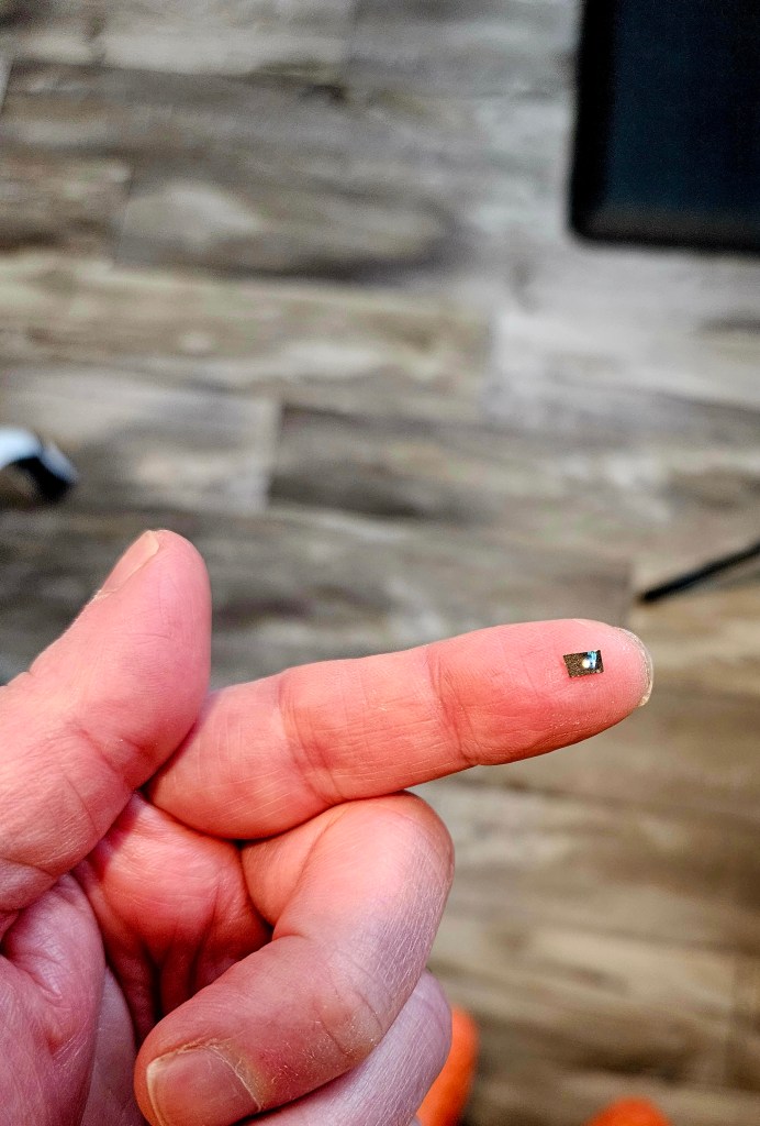
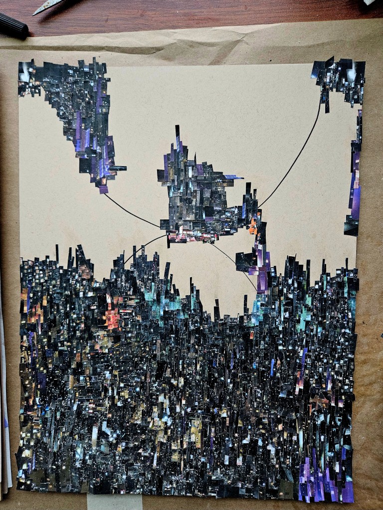
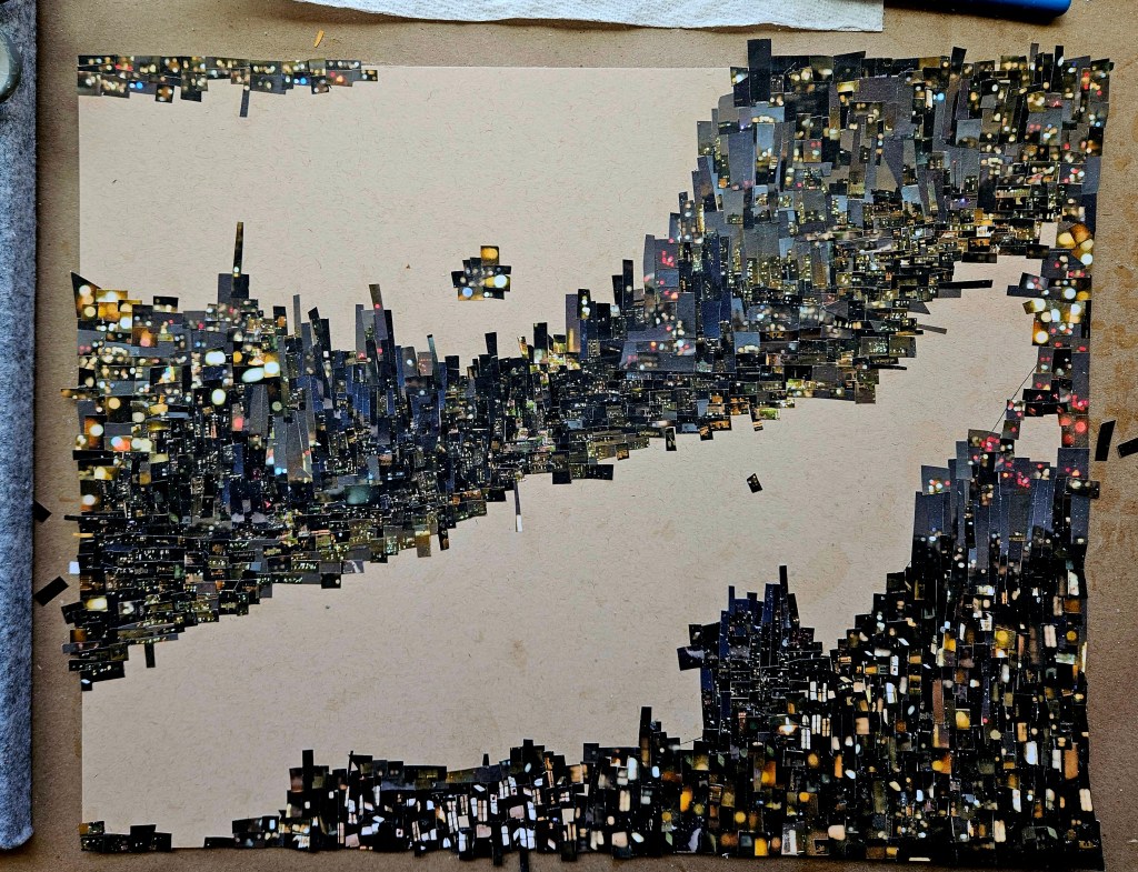
Each piece is comprised of one or two photos which I personally took. There is no digital magic, I use the old school method of my trusty tiny scissors and adhesive applied with brush on an 11×17 inch piece of heavy paper.

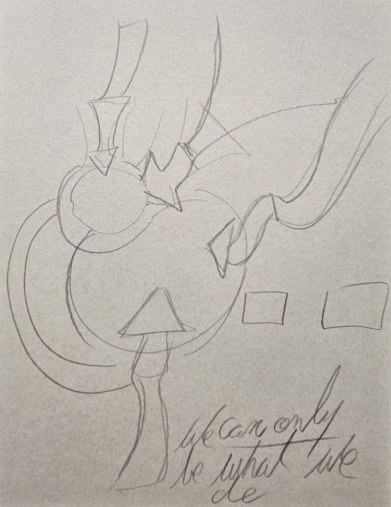
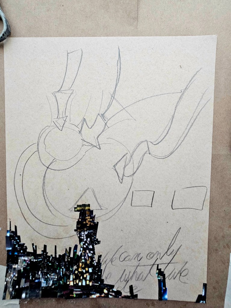
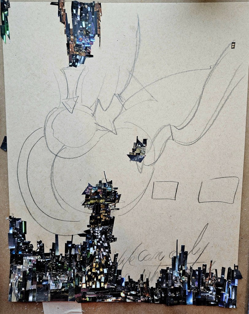
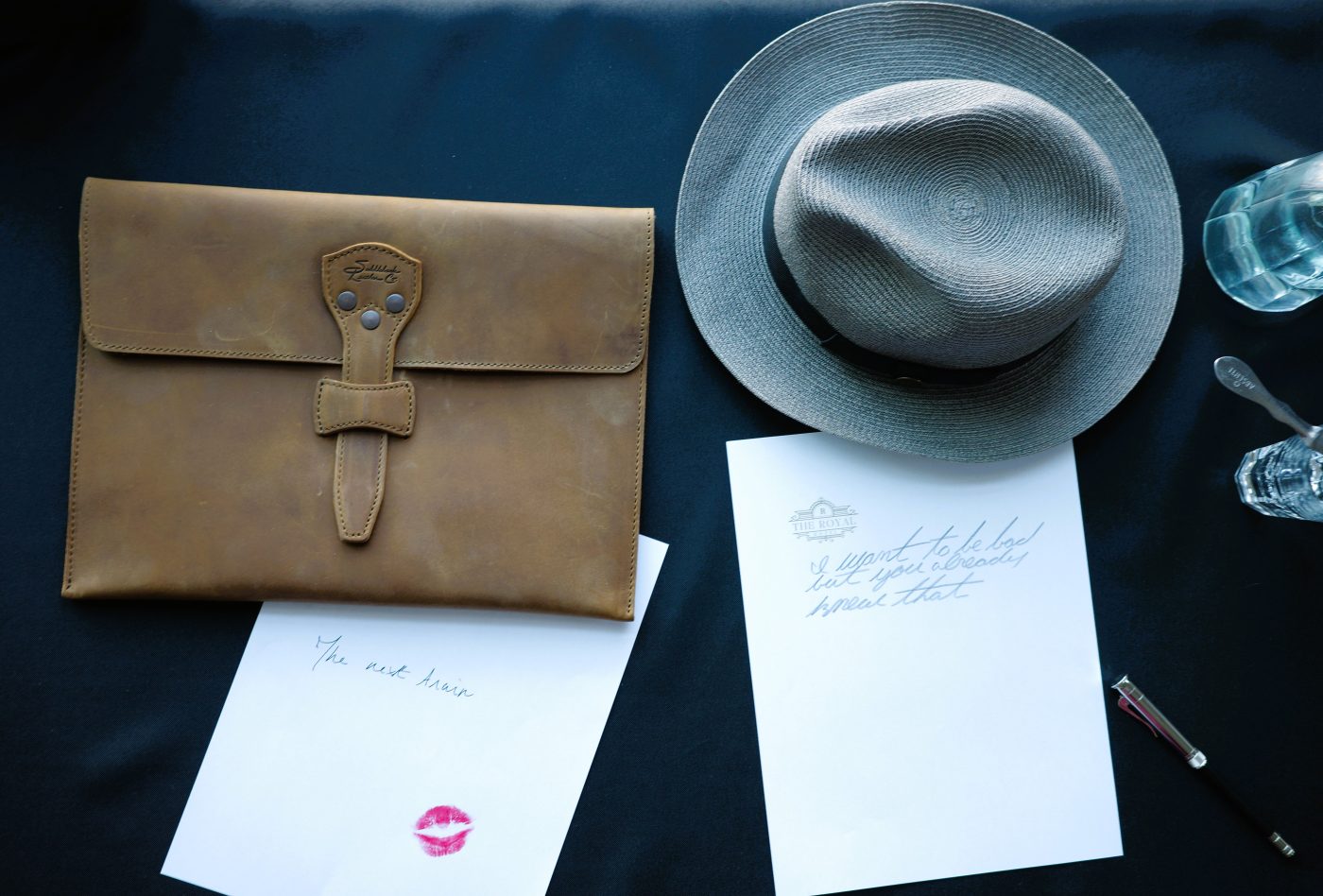
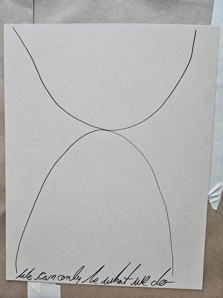
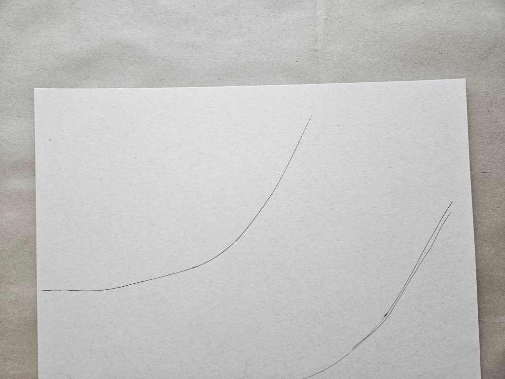
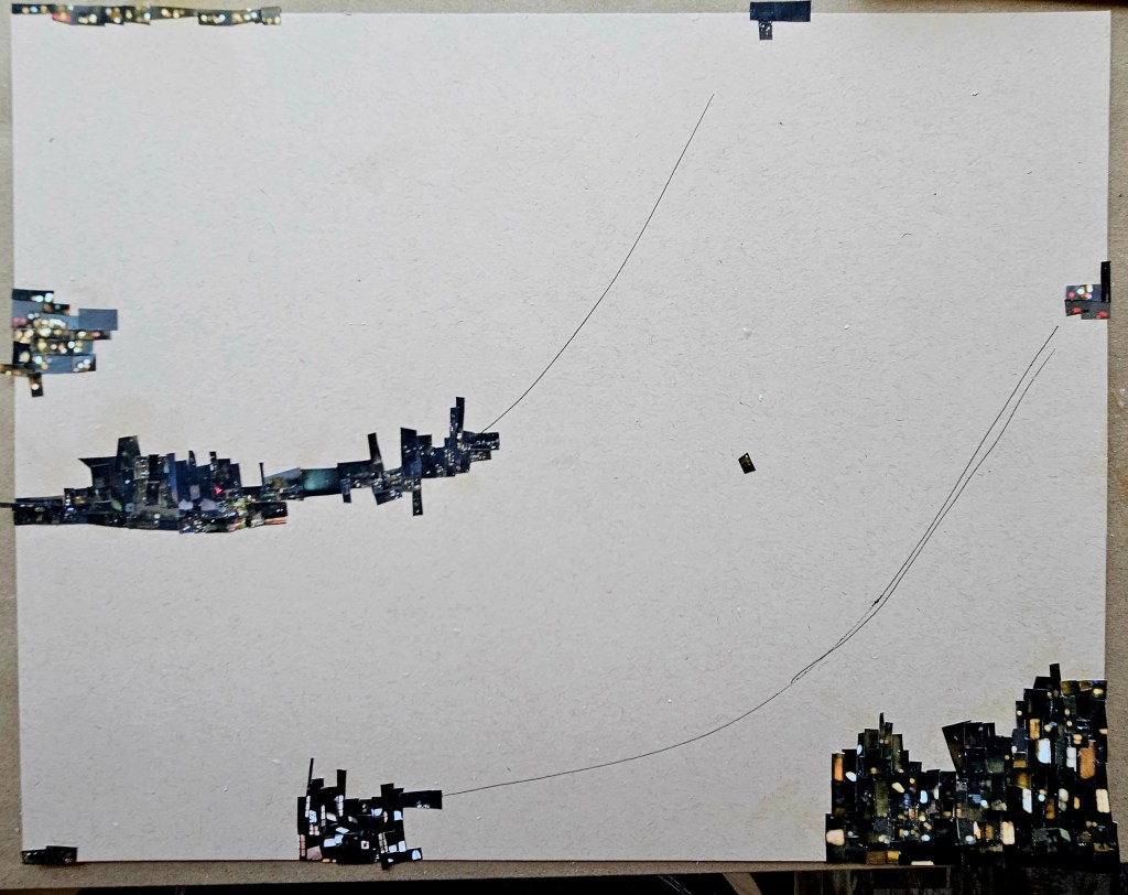
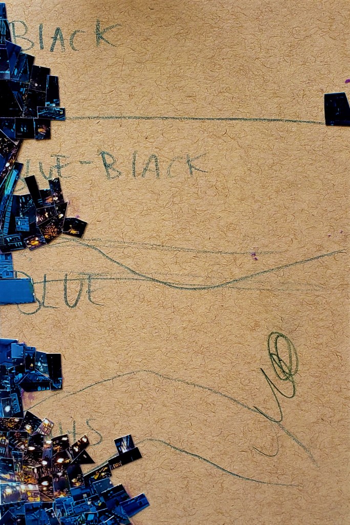
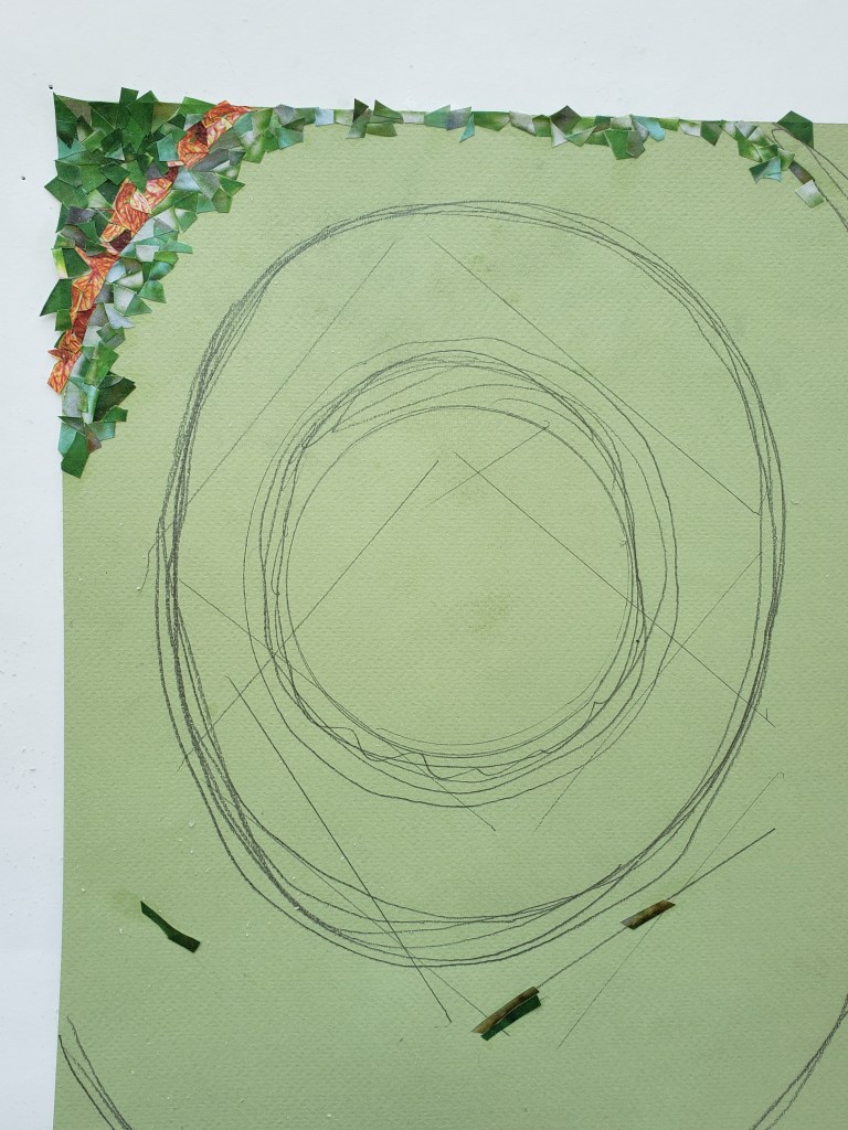
I always see the design in my head ahead of time. However, what piece is put where is in the moment improvised. I do a basic schematic on the paper the fine details reside within my inner eye. I also put a phrase which ultimately becomes hidden by the mosaic. The inspiration for this was the beautiful movie The Phantom Thread in which a master tailor did similar thing with his couture. There is such a call for meticulous detail in what I do and it’s so painstakingly executed that I have always likened it to the little old man making amazing shoes on Saville Row type of thing so these two things inspired me.

I cut up the photos into tiny, tiny pieces and they are carefully lain out on sheets. I look at the sheets as I work selecting what goes where in that moment. Do not ask me how i know, I just feel it, each selected piece seems right for where it is placed. The entire thing is very labor intensive, i see tiny paper snow flurries in my dreams often when halfway through a piece.

The work is copywritten and not for use without permission.

CINEFIELD® Carousing

Often when you read a biography on artists, in any medium, I have noticed a commonality. There seems to be a career sweet spot. This is when they have established their voice, have an audience and can comfortably exist while serving the process. They are not necessarily as big as they will become.

What makes this the sweet spot is the ability to still 100% follow one’s own North Star. No consideration is given towards audience nor critic expectations. New directions can be taken, old ones dropped.

The tragedy of all of this is that this phase is often recognized by the artist only well after the fact.

I am lucky to recognize that I am in the sweet spot. With no forced upon restrictions nor expectations, I experiment. Even when it is a direction I decide not to go in, this freedom fosters evolution.

My last Cinefield®, I wanted to make more rhythmic than previous ones. With this one, I wanted a greater density. I went with a more limited color palette as to make it more noticeable. I tried several new things with this piece which will now just be part of my regular process.

With all my Cinefield® works, I only use photos which I personally took. Another different thing for this one, I only used two photos (in general with these works I don’t use too many, but this is even less). The piece is 11×17 inches. No digital magic just scissors and adhesive applied with a tiny brush.

Errata: copyright. People, especially with visual work, prominently display copyright notices. Definitely copyright your work, before you post it anywhere, before you submit it anywhere. However, the watermarks and notices are a distraction and according to many gallerists and editors I have spoken with, the mark of an amateur. To have the notice on edge of paper, it can be clipped off. To have giant watermark, your are wrecking effect of your piece.

Some might complain that to copyright everything one puts out can be cost prohibitive. With drawings, things where an artists hand is so blatantly present, it is not necessary. As for the rest, it actually makes an artist assess their work better. No one hits a bullseye each and every time. If you are considering copyrighting a work w/its accompanying fee, you have to be more honest with yourself.

Copyright is not a forcefield which will prevent people from lifting an image you created. It gives you a quick recourse to take back what is yours. Generation Instagram feels that if it is online and they like it, it’s a victimless crime to use it as content. Copyright allows you to get it back quicker or really drop the hammer should someone actually be monetizing one of your creations.

Blinky

There was a slight gap of time between my Cinefields® . As much as I enjoy them, they are very time consuming and when in the process of creating them, they dominate my studio space.

For what would be the last one before returning to Europe, I wanted to stretch myself. I only used two photos which I knew would limit the color palette.

Not necessarily apparent, this is my most rhythmically complex piece. I wanted to present flowers of light. Vast unfurling urban fields for people to look at and do their own journeys.

As is always the case, I only used photos which I personally took. There is no digital magic, I used the traditional method of scissors and adhesive applied with a brush.

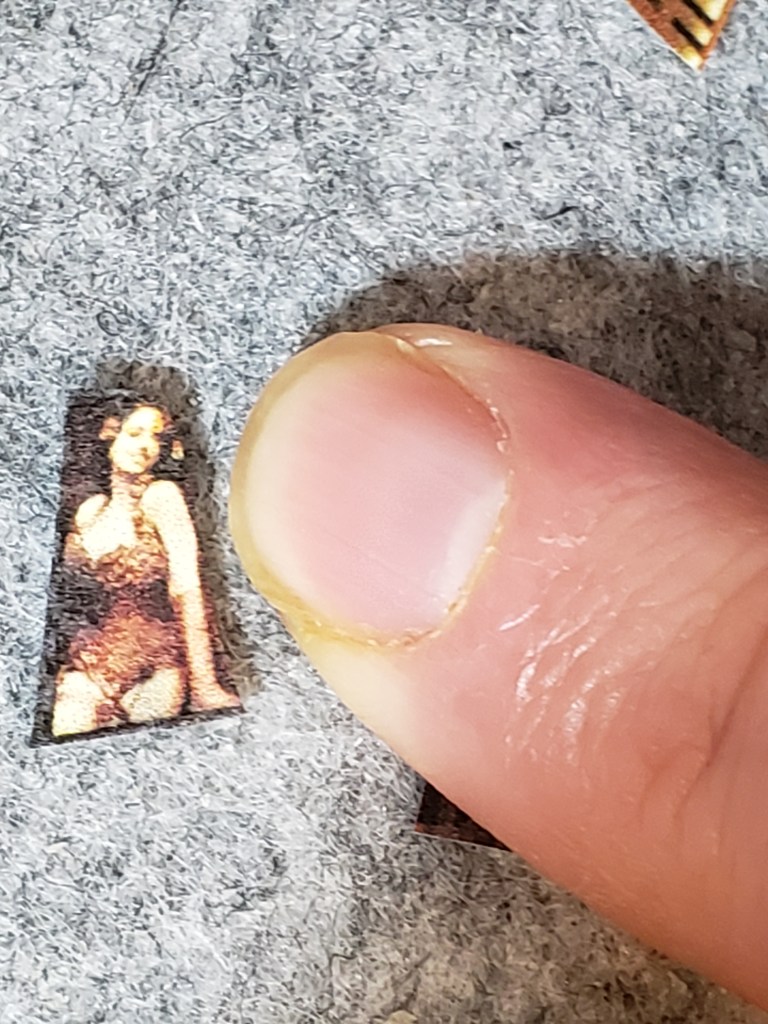
Blinky 11×14 (The photos do not give the sense of it, but each piece is tiny!)

Errata: There has been much talk of artificially created art. This, along with fact generation Instagram does not feel taking work they find online for their own content/page a crime, makes copywriting one’s work more important than ever. However, most gallerists, agents and collectors I talk to all feel to emblazon a work w/ copyright notice is mark of amateur. It also ruins the work. If someone wants to “borrow” your work, they are just going to crop the notice off or sometimes not even that. Then why copyright? Because it gives you quick recourse for when you do find someone using your work. I am not blasé about my work being taken, of course it’s upsetting but that notice is no deterrent. It will make whomever react quicker when you come across your work out there somewhere. It’s worth paying the fee, filling out the forms.

In the Eights: The Beautiful Orlov sisters

This is part of an ongoing series. The genesis of the project can be found here with new installments appearing throughout my blog;

I now have two printers. One is black and white and used just for text. The other is a high-grade/hi def photo printer for my visual work.

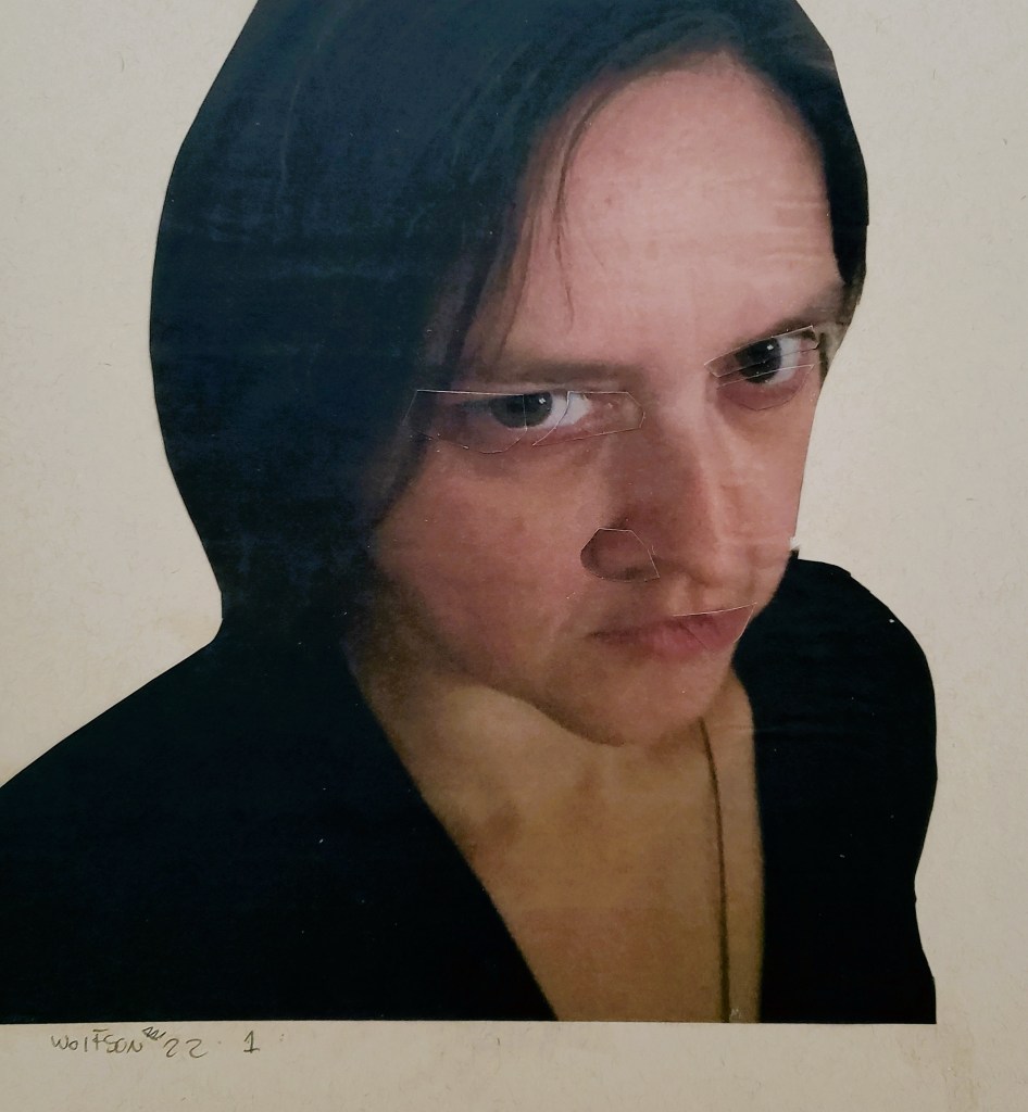
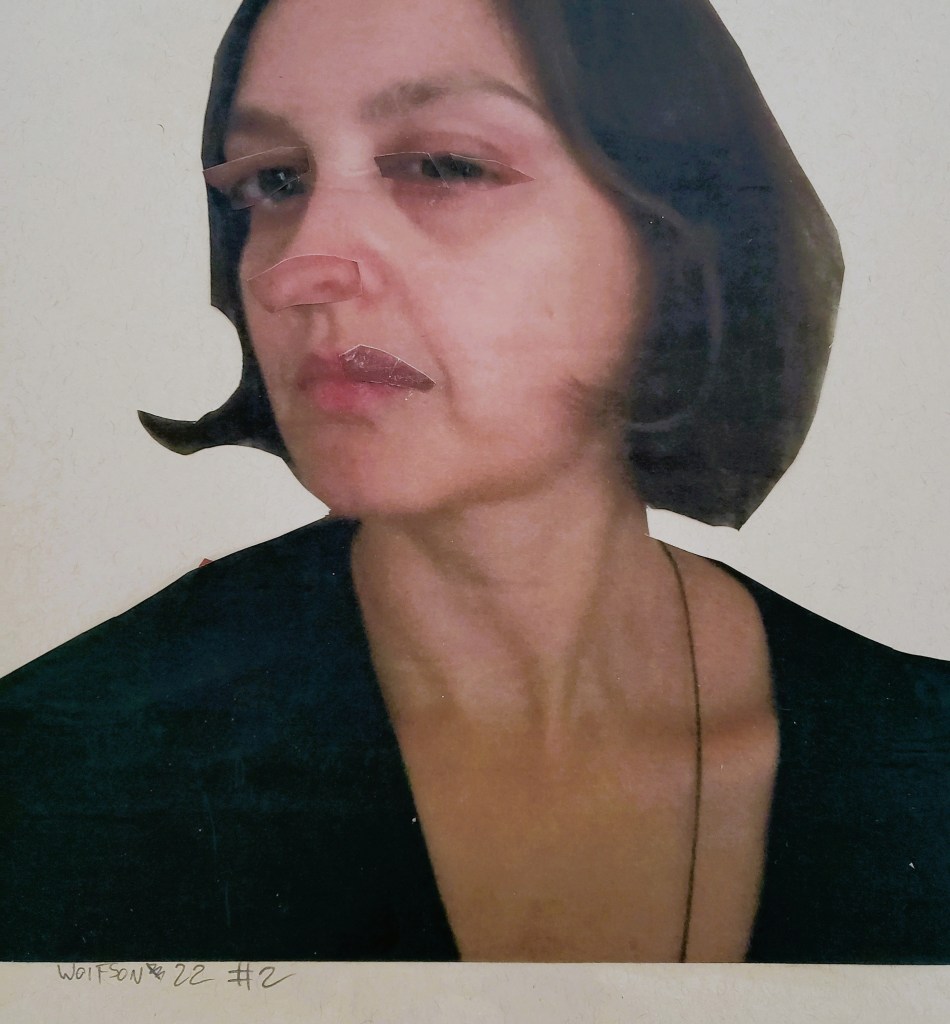
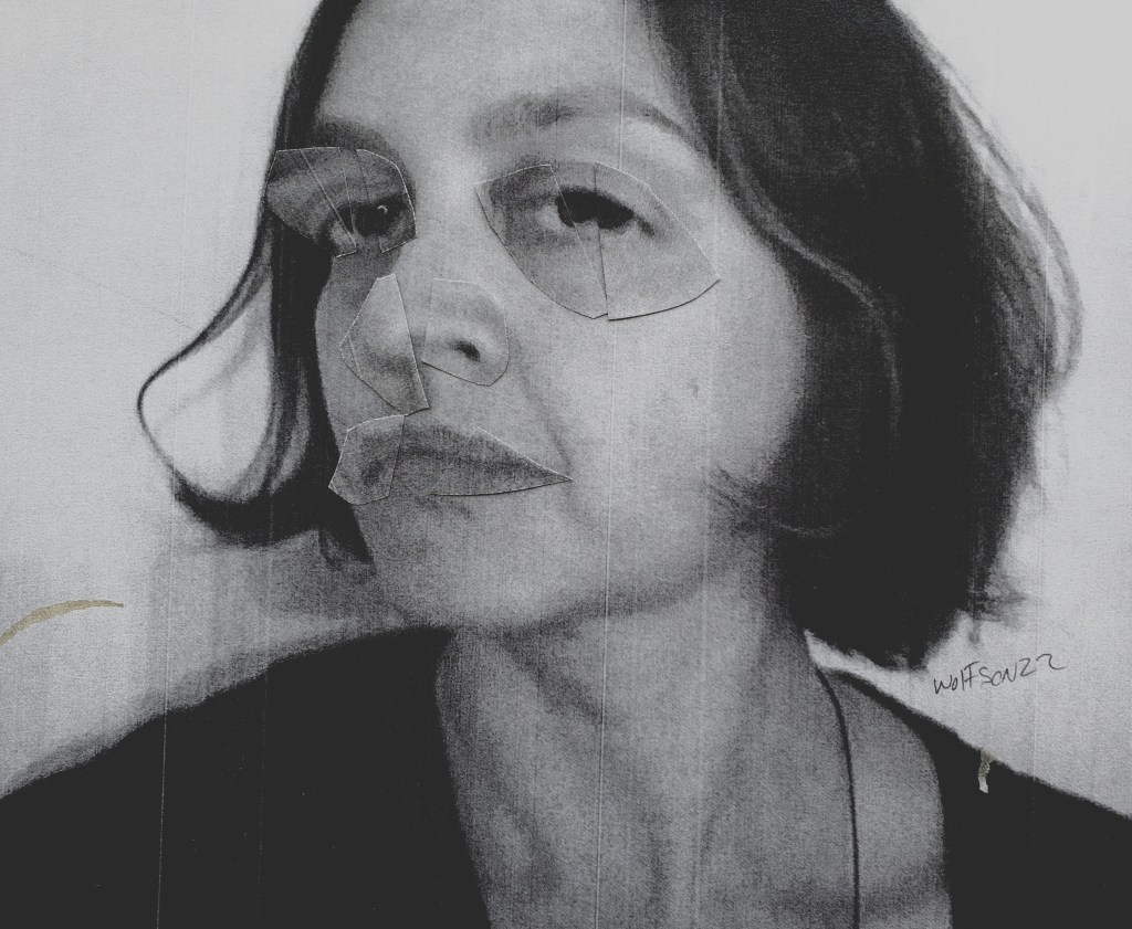
As I went to print up the first of these 8’s I forgot to toggle the switch so that it printed on regular paper in black and white. I actually liked it and so am including it here. The other black and white image was an element of chance occurrence, I lifted the paper up and the unfastened components formed the face. It’s looser than my intentional 8’s but I still liked it.

I am always seeking models for the series as it continues to be ongoing. When I am not the one taking the photos, they are done specifically for me (as opposed to found images). There’s no digital magic just my trusty scissors and adhesive applied with brush.

this was by chance composition when all parts not glued down slid during moving paper

Cinefield® – Oohma Polumbo

When I started this Cinefield® I had decided to stretch myself as I had no deadlines. I work no digital magic on my pieces, but the photos I use are of course kept on my computer. Being a little under quarter of the way done with the piece my computer of seven years gave up the ghost.

I wanted to research what best option was for new one as unlike last time i bought one, I had concrete ideas of what I was going to use it for and what I did not need it to do. The research was the first delay. Once I determined what I wanted, it would take about two months for them to make it for me. I cleaned up the paper chad snowdrifts, switched to painting and some of my other visual projects.

As I was not merely sitting on my hands waiting, I did not mind. My third delay, the computer showed up and upon getting it set up, my equally old printer died. The amount of work she had done for me (ships & printers are always referred to in feminine form) made it not so shocking. I had already been looking at new printers anyways. Knowing ahead of time what I wanted and needed made the wait for a new one shorter.

The printer I got is geared towards photo film too. I bought few different types to experiment with while working to finally finish this piece. I was curious if I would be prevented from getting the flush edged fit as happens with my pocket printer mini-cinis. That film is akin to instamatic camera film, this is not, so I am able get the flush fit.

Aside from trying for more diverse color palette a few things made this piece different. The components consists of the paper on the old printer I always used, new printer with different type paper and three types photographic paper also from new printer. It was very different for me too in that I have never put down a Cinefield® for more than a day or so. The extended time away from it was totally new experience for me.

As is always the case, all the images are from photos I personally took. I use my tiny trusty scissors and adhesive applied with glue. The piece is 11×17 inches.

Cinefield® – Kini (Blue is Cool)

About to head back to Europe shortly. I had previously written about being able to utilize a pocket printer as to be able to do Cinefield® pieces in my Paris studio. As I live right around many great art supply stores i am sure that I will be able to find adhesive. However, I have never been one to leave things to chance. So i have been experimenting with glues which i can bring with me and are not as outright industrial as my adhesive.

The nature of my pocket printer pieces is that they are small, index card sized at most, 4×5. The first one I did, I tried a liquid glue stick of Elmer’s glue. This wasn’t ideal as when it got on the front side of image it caused discoloration. Also it was so liquid-y that there was no way to really control it despite the fact it was in a pen like delivery system.

In an absolute pinch I could have made due. My final attempt was with the glue sticks with which school children work. This took a bit of learning curve as pieces and sometimes entire sections after the fact would pop off making a brief snow flurry of cut pieces upon my table.

I got a handle on how to best utilize the glue stick, although it made everything more labor intensive. The good thing about it is that I can easily pack a glue stick in luggage w/no hassle from TSA.

There is very little chance though, because of the nature of the glue, that pieces I do would last. The photo I take of the finished piece will be the work/the art. I can’t fully explain why, but there is a freedom in this.

Of course it may be non issue as I find my preferred adhesive once moved back in.

Like all my Cinefield® work, every image is from photos which I personally took. One can see more edge/line of each piece, that is the nature of using pocket printer. The printed material is akin to business card sized photos, there is the impossibility of seamless edge blending as i often achieve w/my regular paper pieces. this piece is roughly 4×4.

the highly technical schematic of the piece

Cinefield® – Where the Sauce is Deluxe

Throughout my oeuvre, emotion is my ultimate goal. I want the viewer to feel something. Music is my main source of inspiration regardless of subject matter or even medium.

I have pretty big ears, never restricting myself to one genre nor era.

Although I lean towards jazz & classical I do have some categorization defying things in heavy rotation too. Things like Kruder & Dorfmeister, Kina Rao and Funki Porcini.

Funki Porcini is an absolute favorite to whom I have listened to for years. His music encapsulates various moods. In lieu of one sonic voice ever present on every album which can lead to a feeling of heard one heard them all, he offers up instead, technique which he uses to great effect to create dense dreamlike works.

My Cinefield® vary, from cityscapes to floral explosions to abstracted colors and shapes. The commonality being their density and dreamlike quality.

I now have the pleasure of one of my Cinefield®  being used as a cover for the forthcoming full length album by Funki Porcini. Both share the same title. As is always the case with my Cinefield®all the images I used were from photos which I personally took. There is no digital magic, just my trusty scissors, I applied adhesive with a brush. One difference in my methodology was in only listening to a specific soundtrack comprised of a pile of albums including the new one and a few other favorite of his as I worked. The piece is 11×14 inches.

I will put up details on where the album is available once its out.

Cinefield® – Where the Sauce is Deluxe 11×14

There is a special multi-night gig associated with this going on:

We will be doing the album launch with the Laserium at commonground in Coventry, four nights 28-31st January.

Tickets HERE

1/29/22 The album is now out and available via all the usual digital platforms (amazon, bandcamp et al) bandcamp link:

https://funkiporcini.bandcamp.com/album/where-the-sauce-is-deluxe

These are not the small trusty scissors but the cut last minute chad ones


Cinefield® Tiny Annie Two Trips

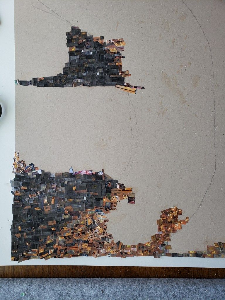
After finishing my last Cinefield® I started a painting. Weather conspired against me with heavy fog & rain. As they do not require same light situations, I switched to doing another Cinefield®. I wanted to make this one look painterly, a further evolution of chops & (artistic) mission.

It proved to be a labor intensive piece. At 11×14 it took me longer to do than some of my far larger pieces. As is always the case, I only used images from photos which I personally took, utilizing my trusty scissors and adhesive applied with a brush. There is no digital magic done after the fact. This is a personal favorite of mine, not just within my Cinefield® work but for my entire oeuvre.

This was by no means the smallest size of pieces I dealt with for this work

Cinefield®-Van Dyne Annulated

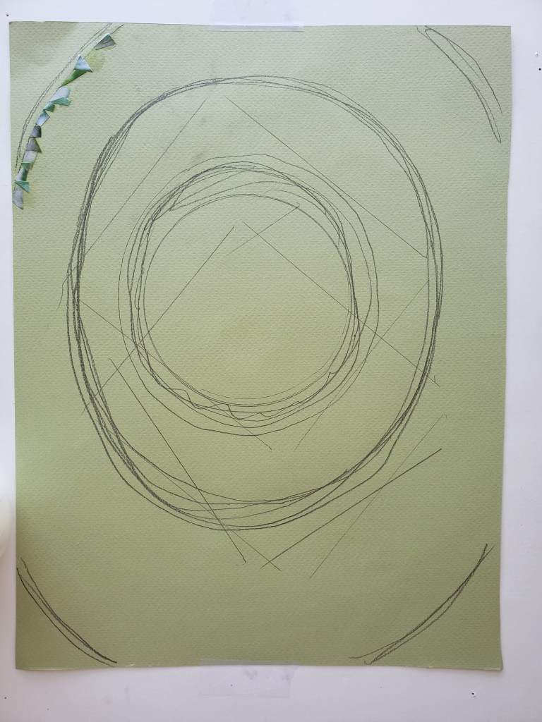
Once again, I sought to challenge myself with my Cinefield® as to avoid lapsing into mere mannerism. As with my last piece, I went with a limited color palette, in this case one reminiscent of some of the submariner greens Degas used. I also stuck to sea changing via my cutting, only one image.

I was pleased with the results. As is the case with all my work, I only use images which I personally took the photo(s) of. There is never any digital magic as I utilize the traditional method of my trusty scissors and adhesive applied with a brush.

Cinefield®-Van Dyne Annulated 9×12

CINEFIELD®- Bottle of Absinthe.

Artistic evolution is my constant mantra, with emotional resonance being my goal. I achieve if not both then at least the first by constantly challenging myself. I never want people to look at my work and after seeing a few pieces feel they have seen them all. Nor do I ever want to become the “…” guy in regards to what my voice is saying via images I use to do so.

Semi recently I started mixing it up with my Cinefield® works as I had previously been doing with my drawings & paintings.

The challenge I presented to myself this time was to use only one image and one of a limited color palette.

The initial wave of Pop art was portraying common objects or scenes, things which could easily be considered lowbrow of plebeian. It was not the objects portrayed which made a work Pop art, it was an ironic emotional detachment. Someone like Wayne Thiebaud often gets lumped in with the Pop artists for his wonderful paintings of cakes and other sweets. However there is painterly intent and definite emotion involved. He is not pop

He followed in tradition which started with the impressionists of showing objects that they encountered every day. Drinks and drinkers were often used as subject matter as cafes were de facto ‘offices” for artists and dealers.

Le Buver d’Absinthe (1859) by Edouard Manet

L’Absinthe (1876/6) by Edgar Degas

Buveur d’Absinthe (1901) by Pablo Picasso

Painted Bronze (Two Ale Cans) 1964 by Jasper Johns.

It occurred to me after I started my piece that I was working, a link in a long chain of artistic tradition. I had previously done flowers, faces and cityscapes and it was the novelty of subject which initially appealed to me though, not the tradition. Before anyone accuses me of pretension, I had gotten both a bottle of good whiskey and one of Absinthe for my birthday. I tried photographing the whisky bottle first but it was just a dark brown with no color variations, I next tried the Absinthe which worked better, this being my only impetus for using it.

I took three photos, not moving the bottle but standing in front of it, besides it and behind it. As is true with all my Cinefield® work, I only used photos that I personally took, working no digital magic. I used my trusty scissors and adhesive applies with a brush.

The work is 7×10. Soundtrack György Sándor playing Batrok’s Mikrokosmos books III-IV, kini Rao (various), Sun Ra Lanquidity.

Addendum: People are still under the impression that Absinthe was illegal either because of the wormwood or the high alcohol content. Neither of which was true. Some politicians in France had major interests in certain vineyards and importers/bottling concessions. Absinthe was cheaper and lasted longer so workers turned from wine to that. The outlawing of Absinthe was first and foremost a financial consideration.