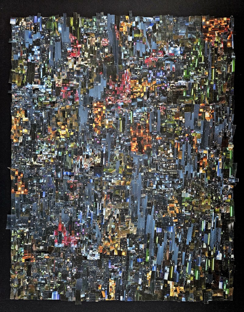
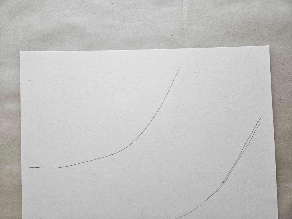
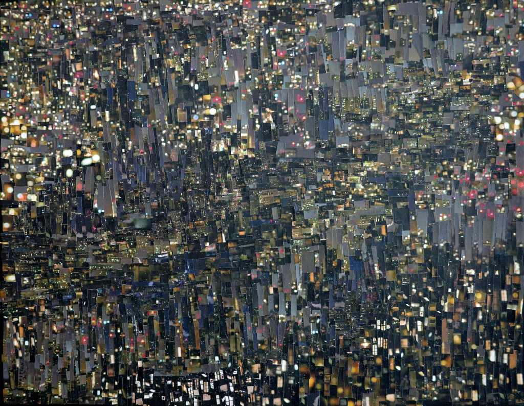
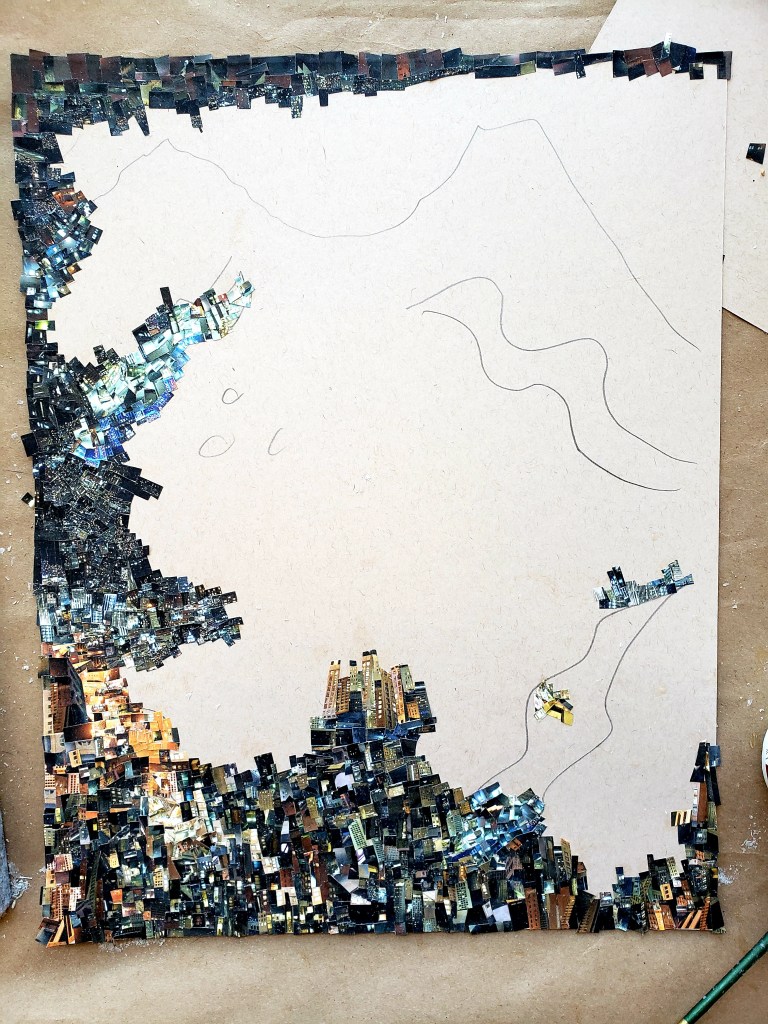
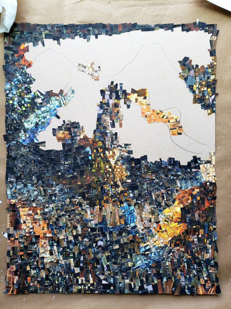
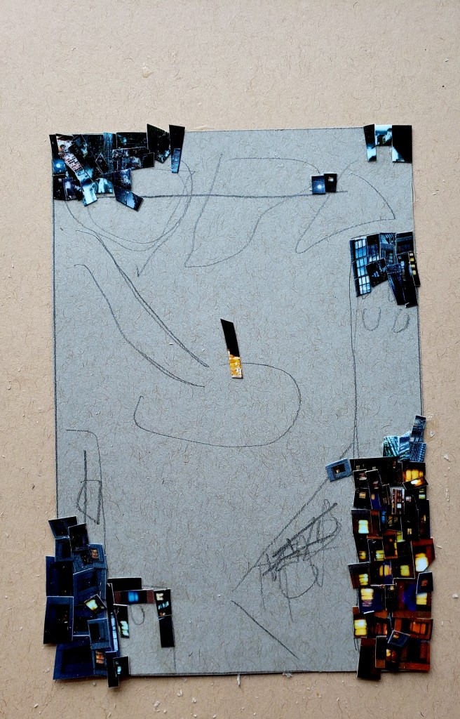
Just finished my latest Cinefield®. This is the most rhythmically complex piece I have done. I am very pleased with the results.
The piece is 11×17 inches. As is always the case, the images are only from photos which I personally took. I used the traditional method of my tiny, trusty scissors and adhesive applied with a brush.
For all my work, I’ve always had two main goals. To develop a discernable voice and to create works which in some manner effect the viewer. The first was achieved via lots of sweat and singular concentration, while the second will be a life-long mission.
The problem with having a recognizable voice is that one can either unintentionally or out of laziness lapse into mere mannerisms. This is to be avoided at all costs. It is the motivation behind my constantly leaving my comfort zone and trying new things.
For Miles I sought to make it different than what had come previous. It can still be recognized as a sibling of the predecessors as the medium does to some extent effect the voice. The mission for this one was that I wanted the viewer to be able to go back multiple times and find new little moments occurring within to notice.
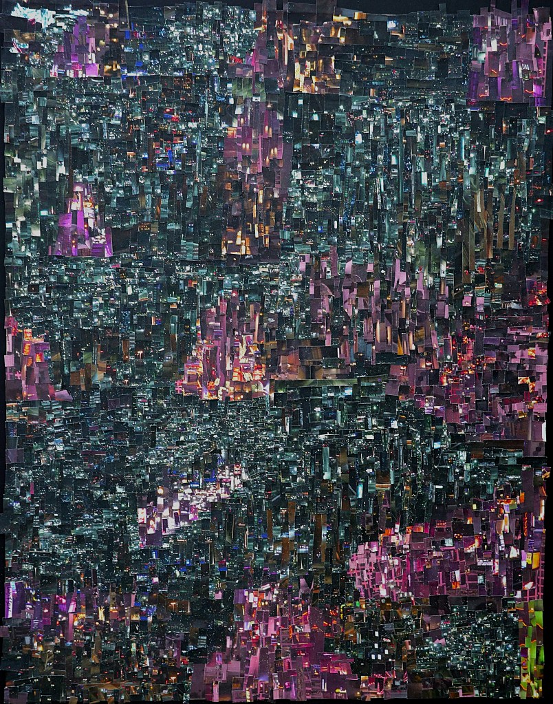
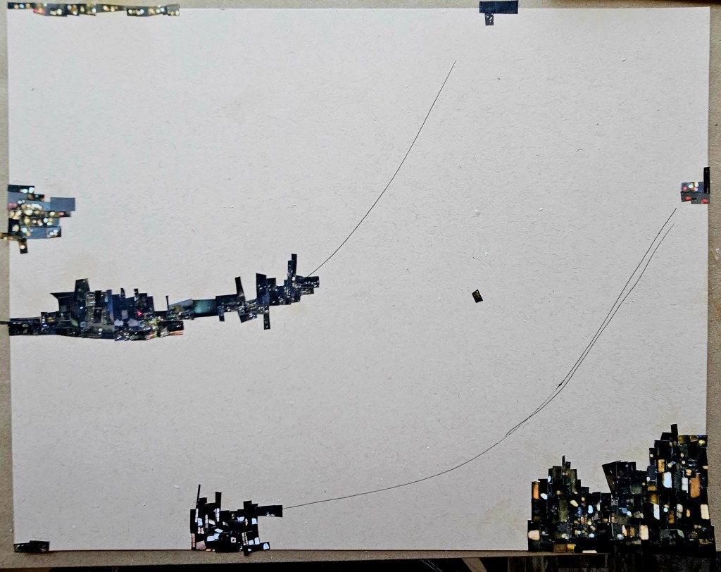
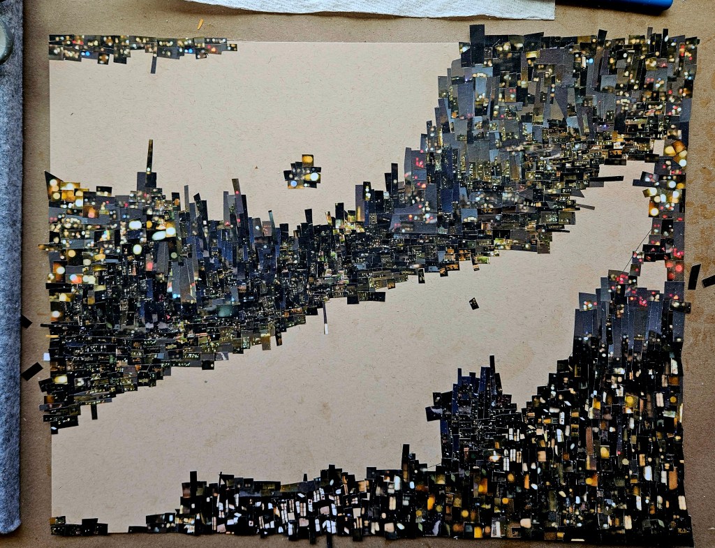
As is always the case with these works, I only use photos which I personally took. For this piece, I was fortunate to find an area which was trying to entice night people with entire buildings being lit up in purples and pinks. These colors being new to my Cini palette were a great way to further the newness I was trying to achieve. I would combine an overall different color palette with an increased rhythmic complexity.
There is no digital magic, I used my trusty scissors to cut out tiny pieces and a brush for adhesive. The piece is 11×17 inches.
I always have a sort of soundtrack when I do Cinefield® pieces. I do not merely listen to same albums over and over, the soundtrack is what i start out with and as the day goes on other things are put on. They serve as an initial mood setter. This piece’s soundtrack:
Miles Davis Big fun
The Soft Pink Truth Is It going to Get Any deeper Than This
Bennie Maupin & Adam Rudolph Symphonic Tone Poem For Brother Yusef
Mozart (Rene Jacobs conducting) La Clemenza di Tito
(C) 2024 Wayne Wolfson not for use without permission
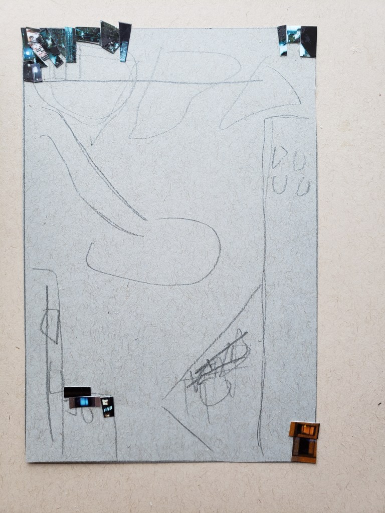
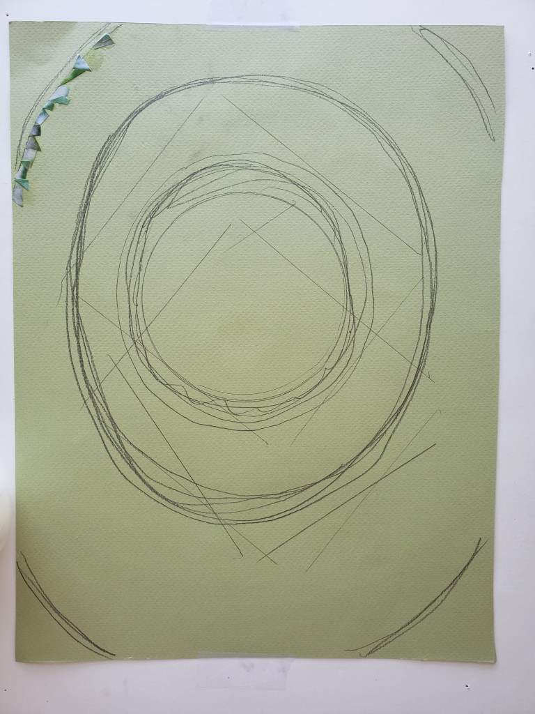
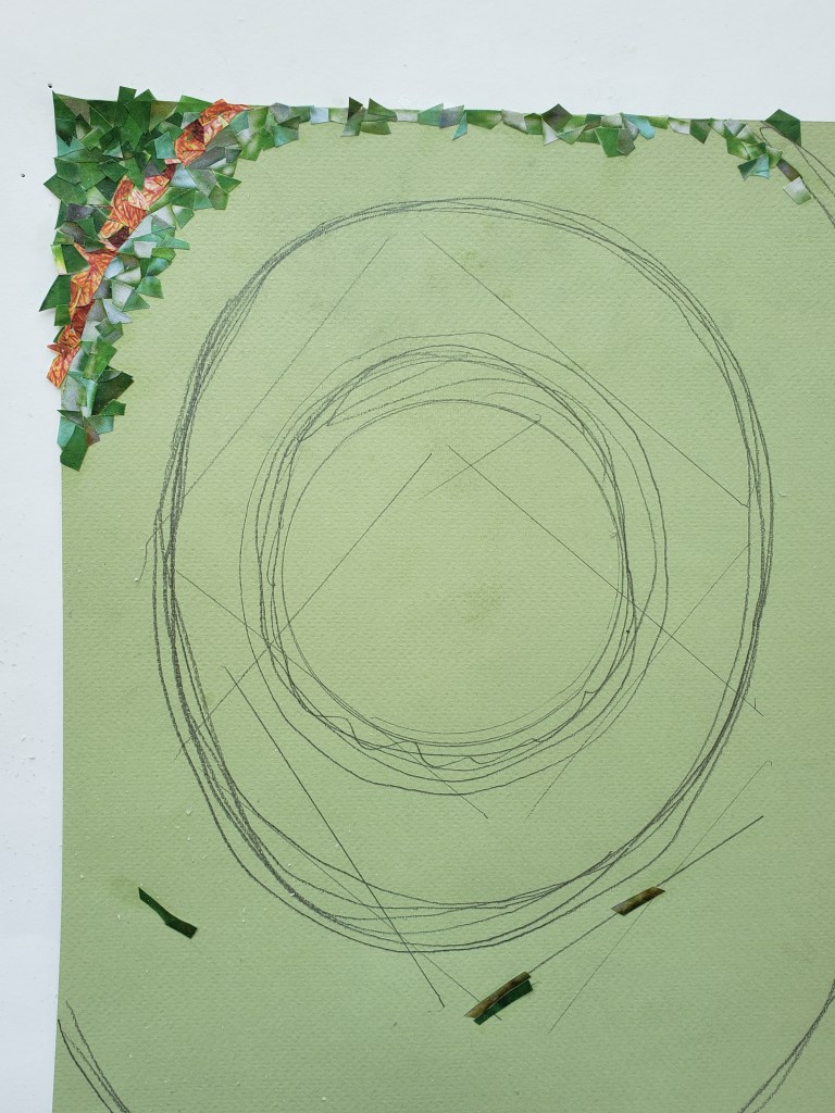
I have started another painting. This one is on French cotton paper. Between rain and general dampness in the air, the weather has not been obliging me. I have had to takes days off.
In the interim, as usual I draw while working more on my next collection of stories & essays.
Here are a selection of quick sketches & musings done over past week.
When I first started seriously painting, I used a French cotton paper. I did not realize it at the time, but it is far less forgiving than the paper which I currently use (which is non-cotton).
I made the switch when the already up there price raised even more. There was much experimentation before I found the paper which became my main one.
In cleaning my tabouret draws, I came upon an unopened block of French Cotton paper. As my skill has increased from when I originally had used it, I was interested to see what I could do with it now.
My preference with cotton paper had always been cold pressed, but even with this, there is more tooth to the paper than what I currently use. This gives a sort of chunky effect when portraying flesh, watercolor impasto.
I enjoyed using this paper and I will work my way through the block but to my surprise I now prefer my current non-cotton paper. The cotton paper does not blend as easy, so getting effects I want with cotton paper will now make it “easier” with my preferred paper.
Often when you read a biography on artists, in any medium, I have noticed a commonality. There seems to be a career sweet spot. This is when they have established their voice, have an audience and can comfortably exist while serving the process. They are not necessarily as big as they will become.
What makes this the sweet spot is the ability to still 100% follow one’s own North Star. No consideration is given towards audience nor critic expectations. New directions can be taken, old ones dropped.
The tragedy of all of this is that this phase is often recognized by the artist only well after the fact.
I am lucky to recognize that I am in the sweet spot. With no forced upon restrictions nor expectations, I experiment. Even when it is a direction I decide not to go in, this freedom fosters evolution.
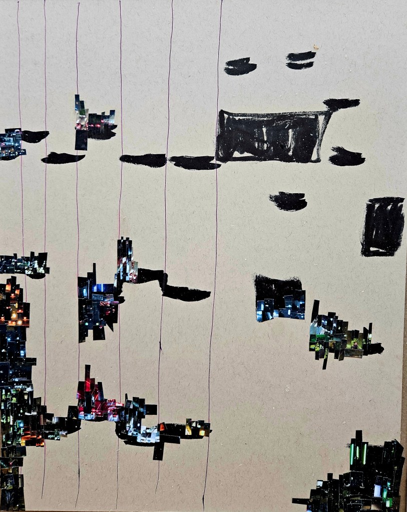
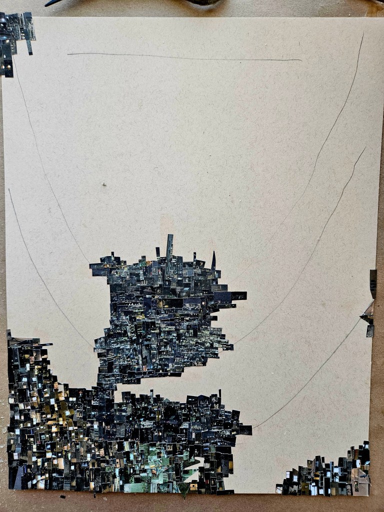
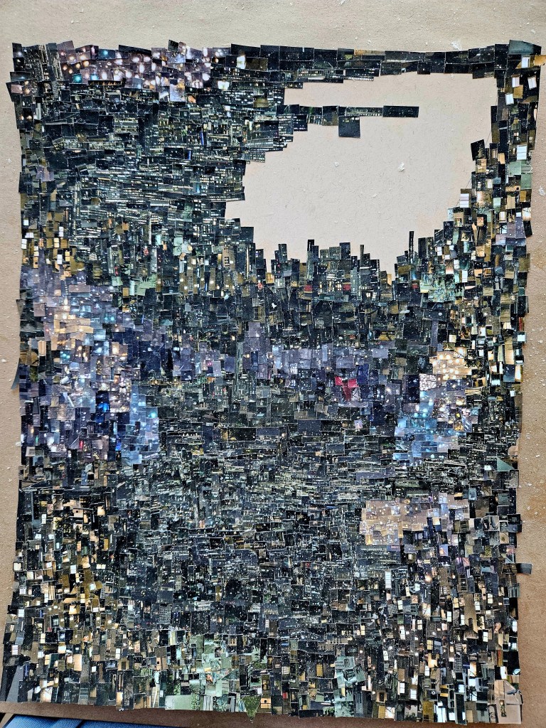
My last Cinefield®, I wanted to make more rhythmic than previous ones. With this one, I wanted a greater density. I went with a more limited color palette as to make it more noticeable. I tried several new things with this piece which will now just be part of my regular process.
With all my Cinefield® works, I only use photos which I personally took. Another different thing for this one, I only used two photos (in general with these works I don’t use too many, but this is even less). The piece is 11×17 inches. No digital magic just scissors and adhesive applied with a tiny brush.
Errata: copyright. People, especially with visual work, prominently display copyright notices. Definitely copyright your work, before you post it anywhere, before you submit it anywhere. However, the watermarks and notices are a distraction and according to many gallerists and editors I have spoken with, the mark of an amateur. To have the notice on edge of paper, it can be clipped off. To have giant watermark, your are wrecking effect of your piece.
Some might complain that to copyright everything one puts out can be cost prohibitive. With drawings, things where an artists hand is so blatantly present, it is not necessary. As for the rest, it actually makes an artist assess their work better. No one hits a bullseye each and every time. If you are considering copyrighting a work w/its accompanying fee, you have to be more honest with yourself.
Copyright is not a forcefield which will prevent people from lifting an image you created. It gives you a quick recourse to take back what is yours. Generation Instagram feels that if it is online and they like it, it’s a victimless crime to use it as content. Copyright allows you to get it back quicker or really drop the hammer should someone actually be monetizing one of your creations.
There was a slight gap of time between my Cinefields® . As much as I enjoy them, they are very time consuming and when in the process of creating them, they dominate my studio space.
For what would be the last one before returning to Europe, I wanted to stretch myself. I only used two photos which I knew would limit the color palette.
Not necessarily apparent, this is my most rhythmically complex piece. I wanted to present flowers of light. Vast unfurling urban fields for people to look at and do their own journeys.
As is always the case, I only used photos which I personally took. There is no digital magic, I used the traditional method of scissors and adhesive applied with a brush.
Blinky 11×14 (The photos do not give the sense of it, but each piece is tiny!)
Errata: There has been much talk of artificially created art. This, along with fact generation Instagram does not feel taking work they find online for their own content/page a crime, makes copywriting one’s work more important than ever. However, most gallerists, agents and collectors I talk to all feel to emblazon a work w/ copyright notice is mark of amateur. It also ruins the work. If someone wants to “borrow” your work, they are just going to crop the notice off or sometimes not even that. Then why copyright? Because it gives you quick recourse for when you do find someone using your work. I am not blasé about my work being taken, of course it’s upsetting but that notice is no deterrent. It will make whomever react quicker when you come across your work out there somewhere. It’s worth paying the fee, filling out the forms.
I now have two printers. One is black and white and used just for text. The other is a high-grade/hi def photo printer for my visual work.
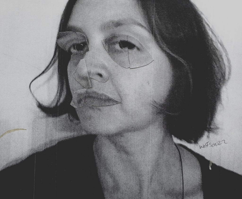
As I went to print up the first of these 8’s I forgot to toggle the switch so that it printed on regular paper in black and white. I actually liked it and so am including it here. The other black and white image was an element of chance occurrence, I lifted the paper up and the unfastened components formed the face. It’s looser than my intentional 8’s but I still liked it.
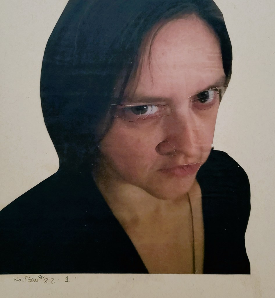
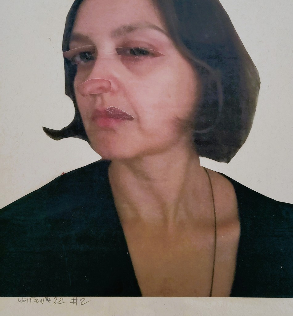
I am always seeking models for the series as it continues to be ongoing. When I am not the one taking the photos, they are done specifically for me (as opposed to found images). There’s no digital magic just my trusty scissors and adhesive applied with brush.
this was by chance composition when all parts not glued down slid during moving paper
This was my most labor intensive piece. I am very fortunate to have the luxury of what I refer to as “wiggle room” which means no deadline, no audience or collector expectation. Untethered from these things, I can explore and evolve.
Regardless of how accomplished a finished Cinefield® ends up being, I always feel as if I have come away having learned something new. The desire to evolve and go one better as to best deliver an emotional payoff being my raison d’être.
This piece is 11×17. Like all my Cinefield® every i mage used are from photos which I personally took. There is no digital magic. I used the traditional method of scissors and adhesive applied with a brush.
My collage work in a very short amount of time became part of who I am. I lamented the fact that for longer trips/residencies I would not be able to do them. I began to investigate ways to perhaps make it happen.
The easiest thing would be to just use magazines/newspapers from wherever I was. This didn’t appeal to me as I have always prided myself on only using images from photos which I personally took. I researched pocket printers.
My Cinefield® are very time consuming and how to get the images aside, I had already had it in my head that were I able to do them on the road I would go far smaller as it would render a trip pointless were I to spend entire time alone in studio working on a piece. I also have other creative things that I want to do while on the road and the way my normal Cinefield® are made would have eliminated that possibility.
Another practical aspect of going smaller is that all the pocket printers I was finding seemed to utilize types of film. I did not want the raw materials to become cost prohibitive in constructing them.
For obvious reasons it was important that the photos not be laminated which eliminated many of the choices.
I found a device which literally fits in jacket pocket and feels solidly built. It connects to phone via blue-tooth which allows me to use any/all my own photos. The film is not exorbitantly priced although I will stick to my normal paper when not on the road.
My in general goal for doing pieces on road is small in size and utilizing no more than one packet of film per piece. Time wise, no more than two days working on it as this will allow me to also paint, write and absorb wherever I am in the world still.
The small size allows me to also do other things for the hour or so at a time that I am pressing a piece (basically laying heavy books atop it to get rid bubbles).
The film required a completely different touch and technique. In general I have only done several smaller pieces. Surprisingly, they are harder to do than normal size. There is less room to create rhythm/tension & release. What were already small piece often need to be made even smaller.
This is my first piece using the pocket printer. As always, it’s only images from photos which I took utilizing my trusty scissors and adhesive applied via brush.
It is 4×5 inches. surprisingly, it only took seven photos (the photos for pocket printer are about the size of a business card) I did it in two days. I was pleased with result and the fact that I pretty much met all the “rules” I had in mind.
addendum:
The news is bleak. The internet is fertile grounds for scams masquerading as charities or people who want to help. A hero of mine, José Andrés has a charity whose goal is to feed those in need. It eschews any politics for the basic notion that you can change the world by feeding everybody. This charity is not solely concerned with the Ukraine, although they are boots on the ground there now. Over the past few years, wherever there have been natural disasters he and his colleagues could be found trying to help out via feeding those who are hungry for whatever the reason.
I recommend to all to at least take a look at their site as it’s worthwhile.
Once again, I sought to challenge myself with my Cinefield® as to avoid lapsing into mere mannerism. As with my last piece, I went with a limited color palette, in this case one reminiscent of some of the submariner greens Degas used. I also stuck to sea changing via my cutting, only one image.
I was pleased with the results. As is the case with all my work, I only use images which I personally took the photo(s) of. There is never any digital magic as I utilize the traditional method of my trusty scissors and adhesive applied with a brush.