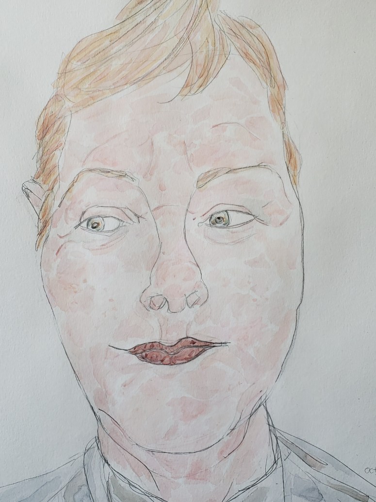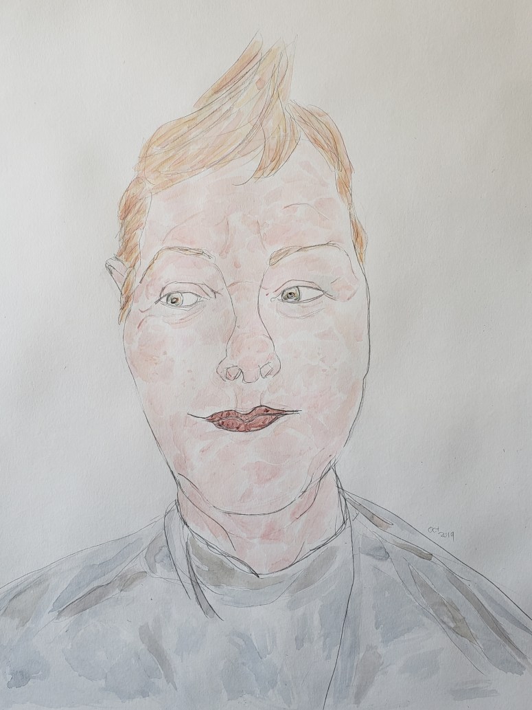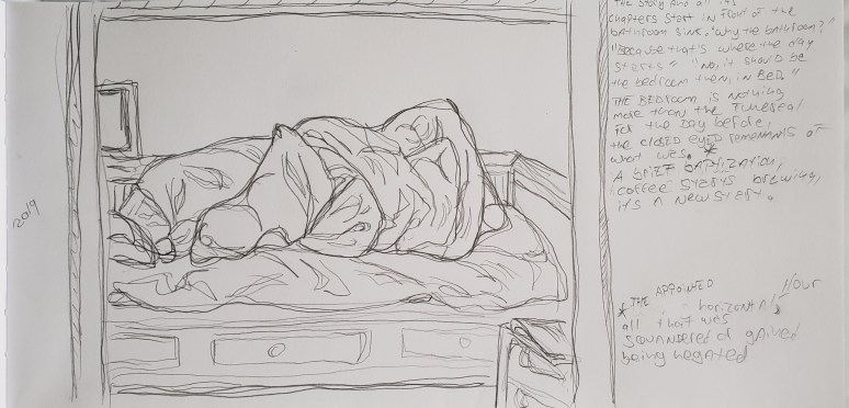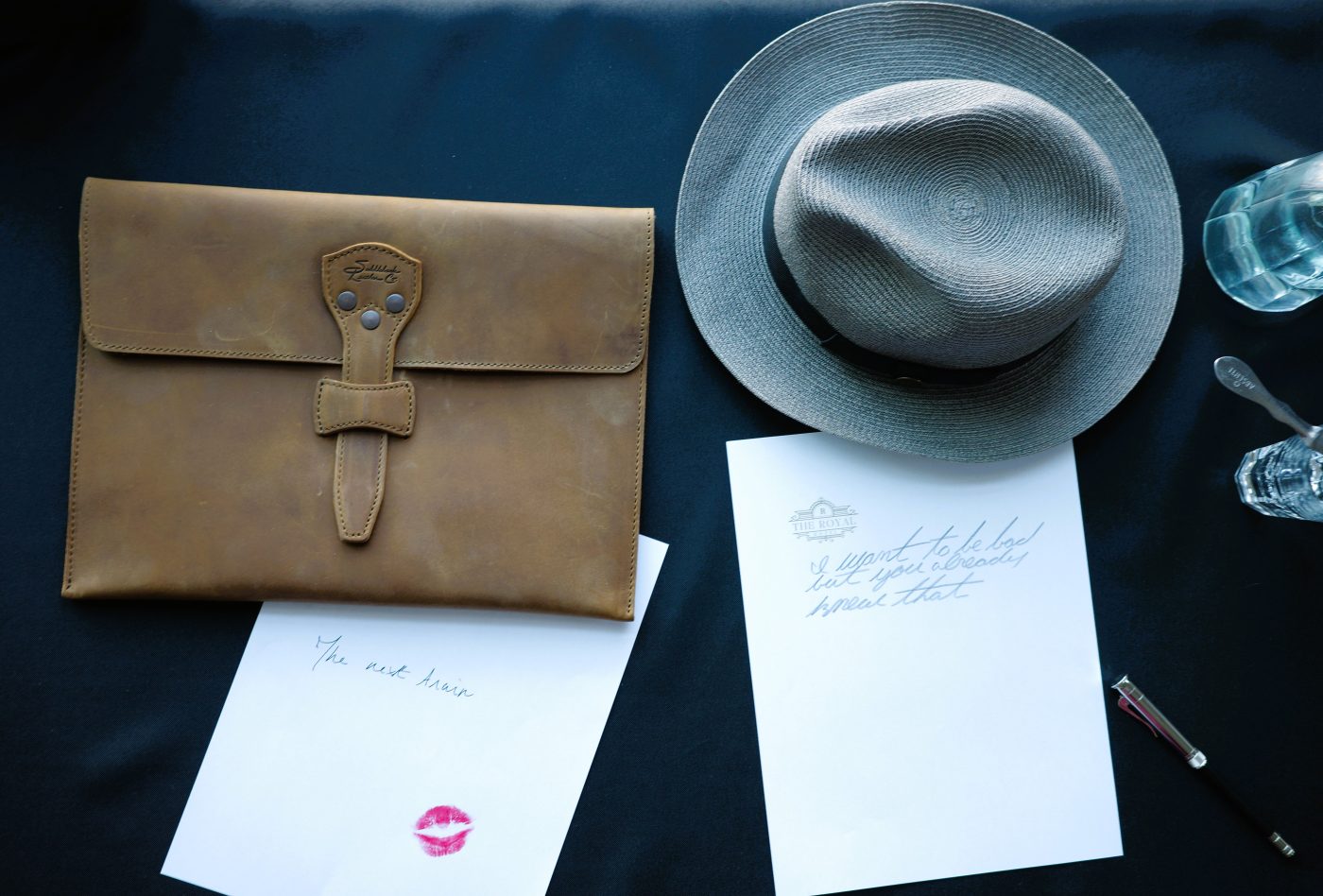
After painting for a few years and garnering some chops, i notice that while my voice is ever present in my work(s) different paper have their own inherent properties. The characteristics each paper brings to a piece is akin to a spice intentionally added to a dish for a desired effect.
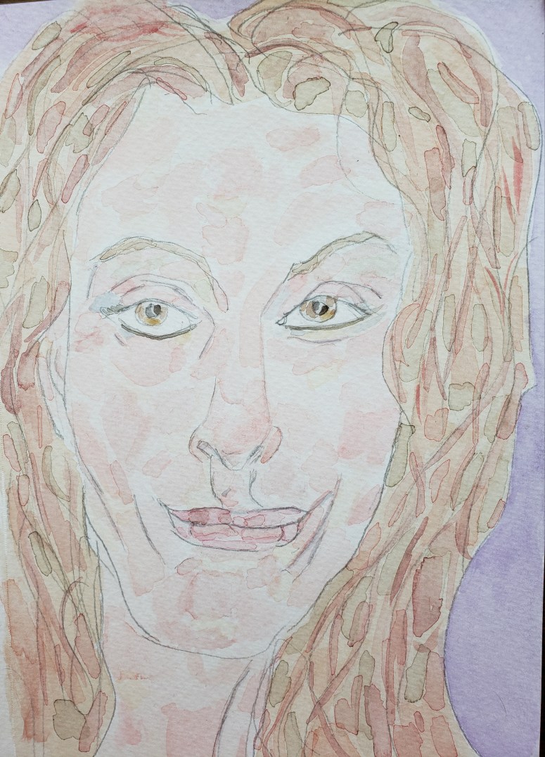
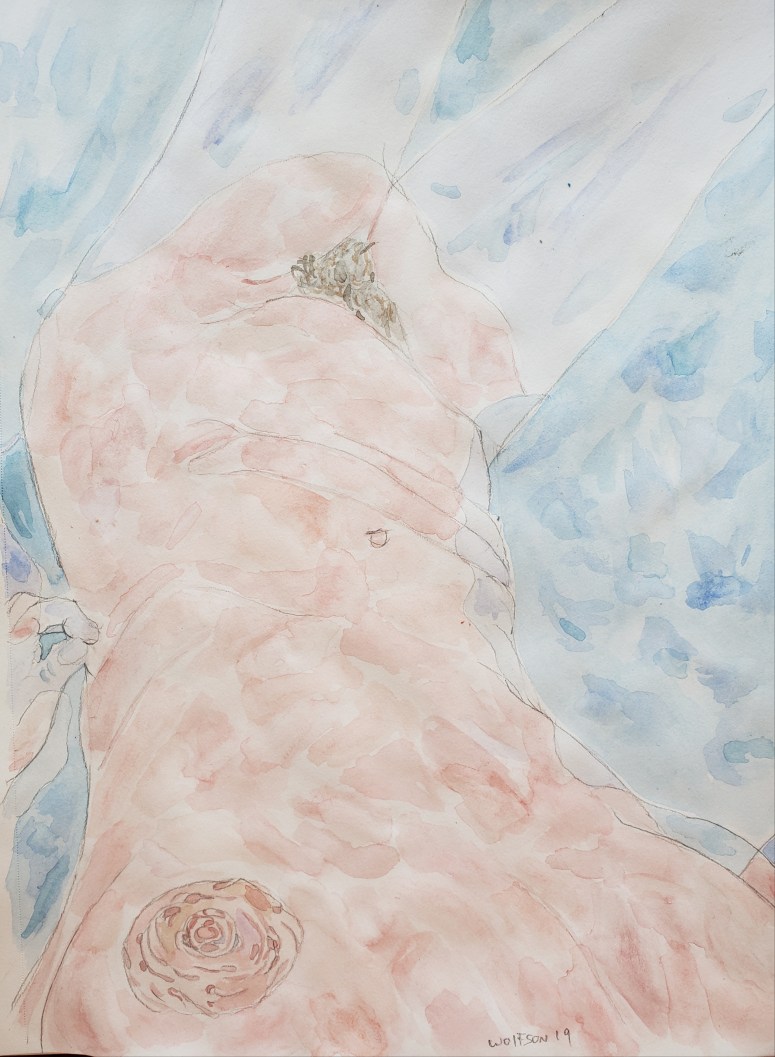
Here are two pieces I did in same week:
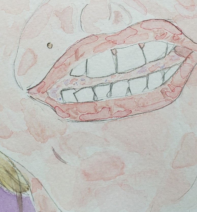
“Hey” 5.5×8.5 Watercolor & Paper
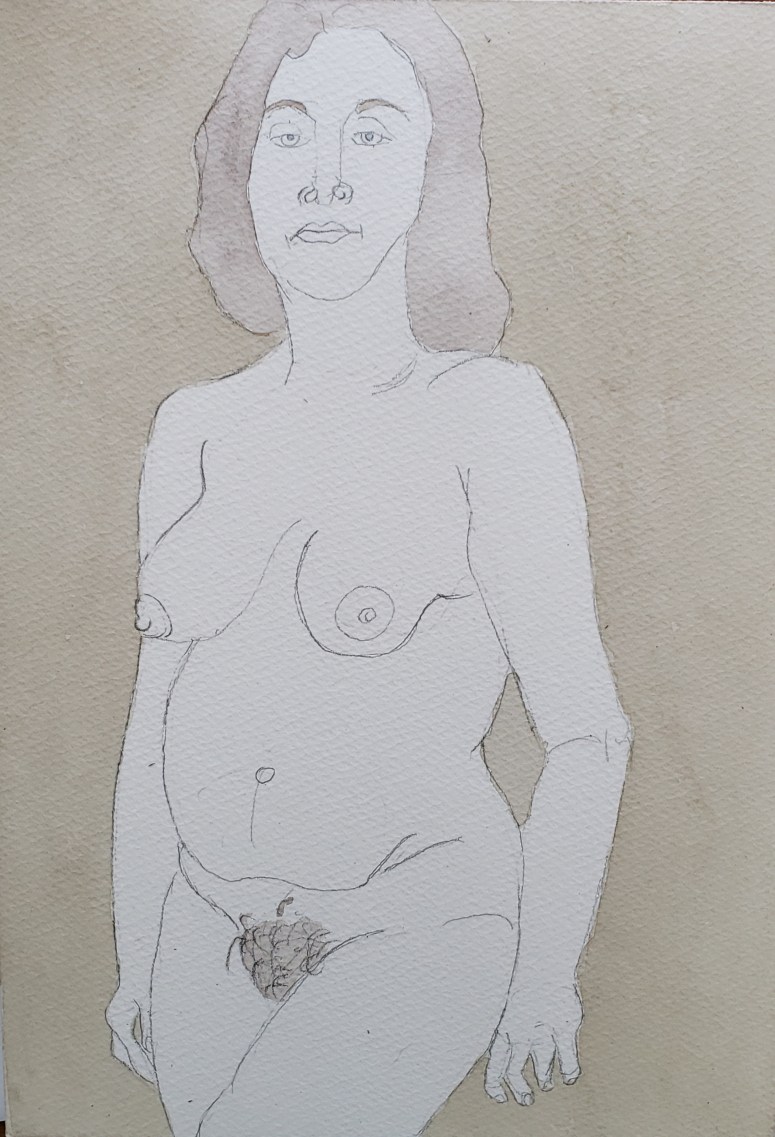
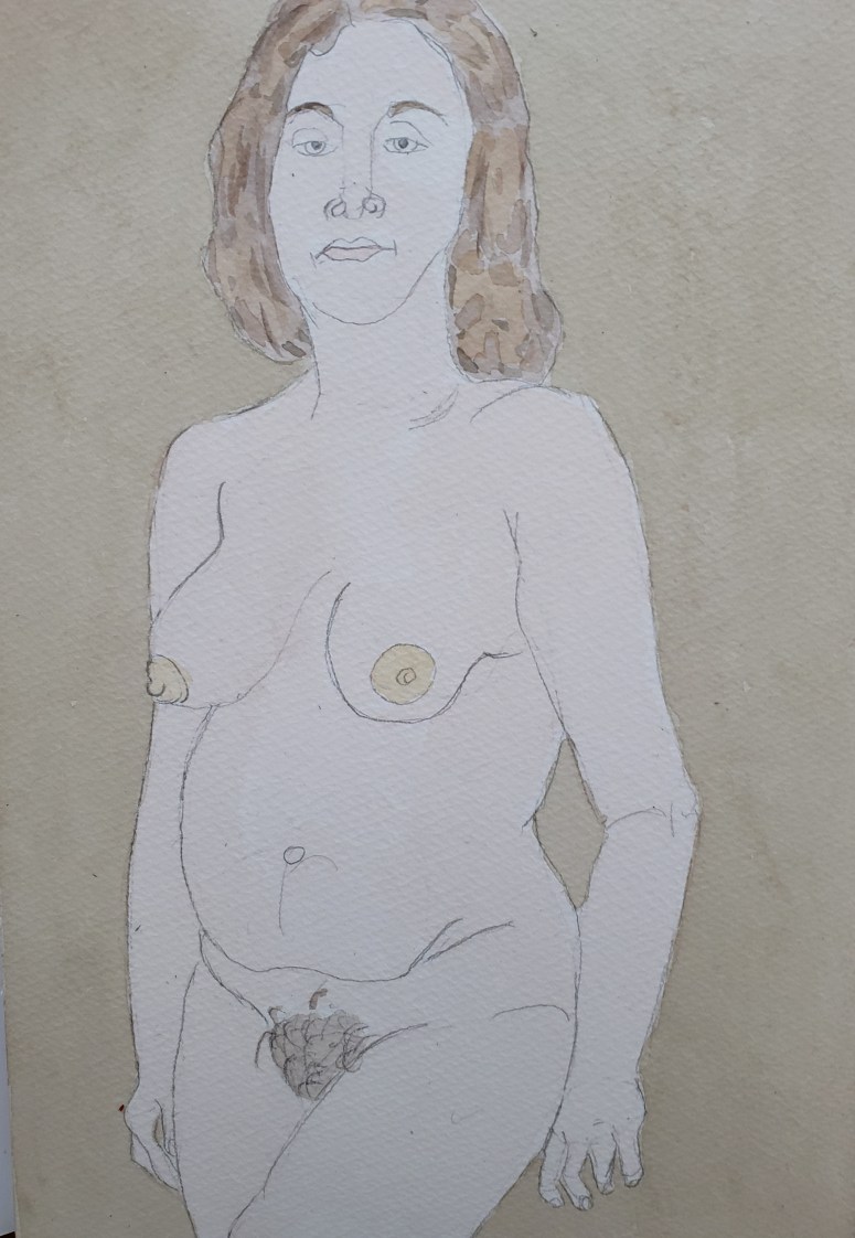
“Soak” 9×12 Watercolor & mutli media paper