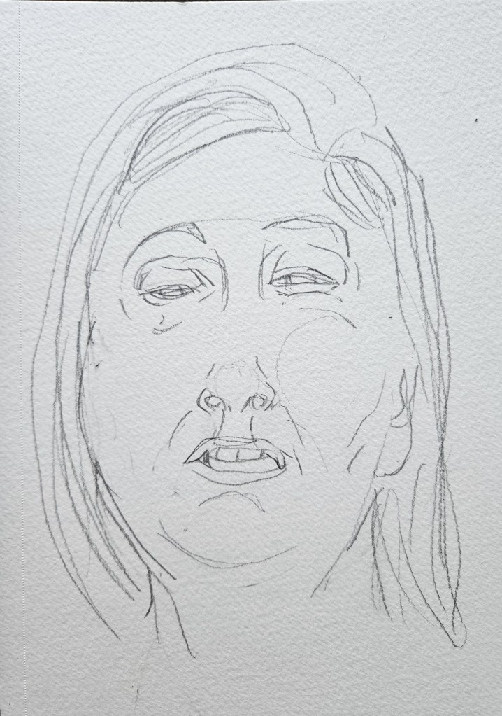
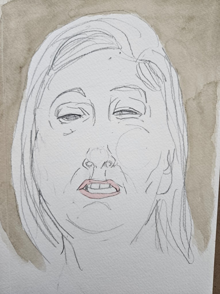
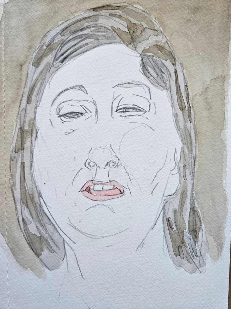
My painting output has been going at a steady tempo which is both pleasing and a little surprising given all else I am in the middle of doing.
In chaotic times it is important that artists regardless of medium do their work. It offers up a reminder that there are things which unite us all and which we can aspire to. Great works of art transcend and outlast the times in which they were made allowing each successive generation to reassert their humanity. All of those seemingly grandiose ideas aside, at the very least they can serve as a brief respite from the daily grind.
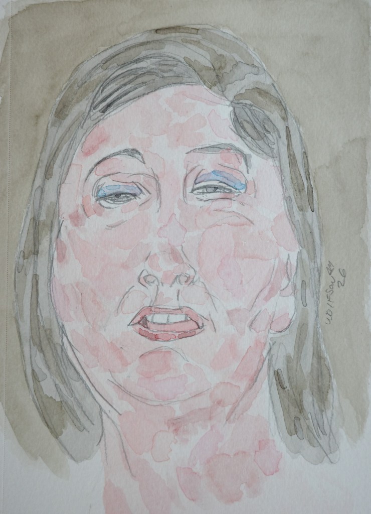
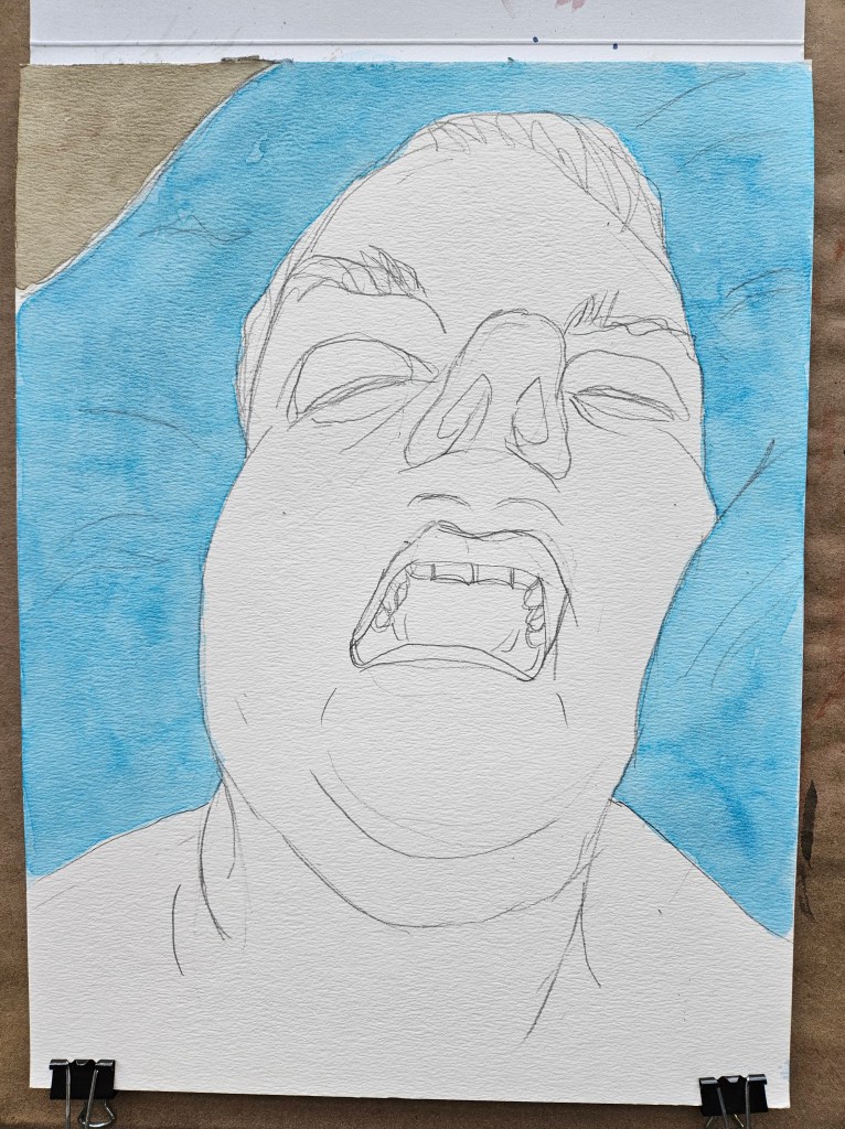
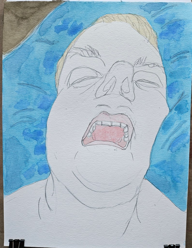
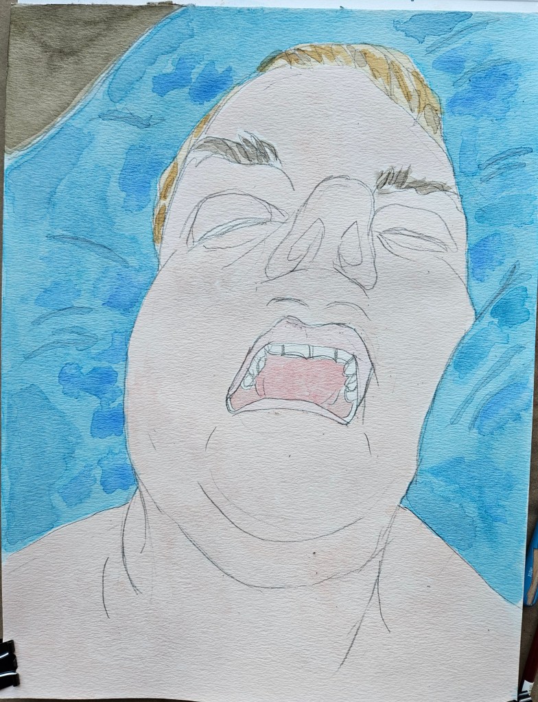
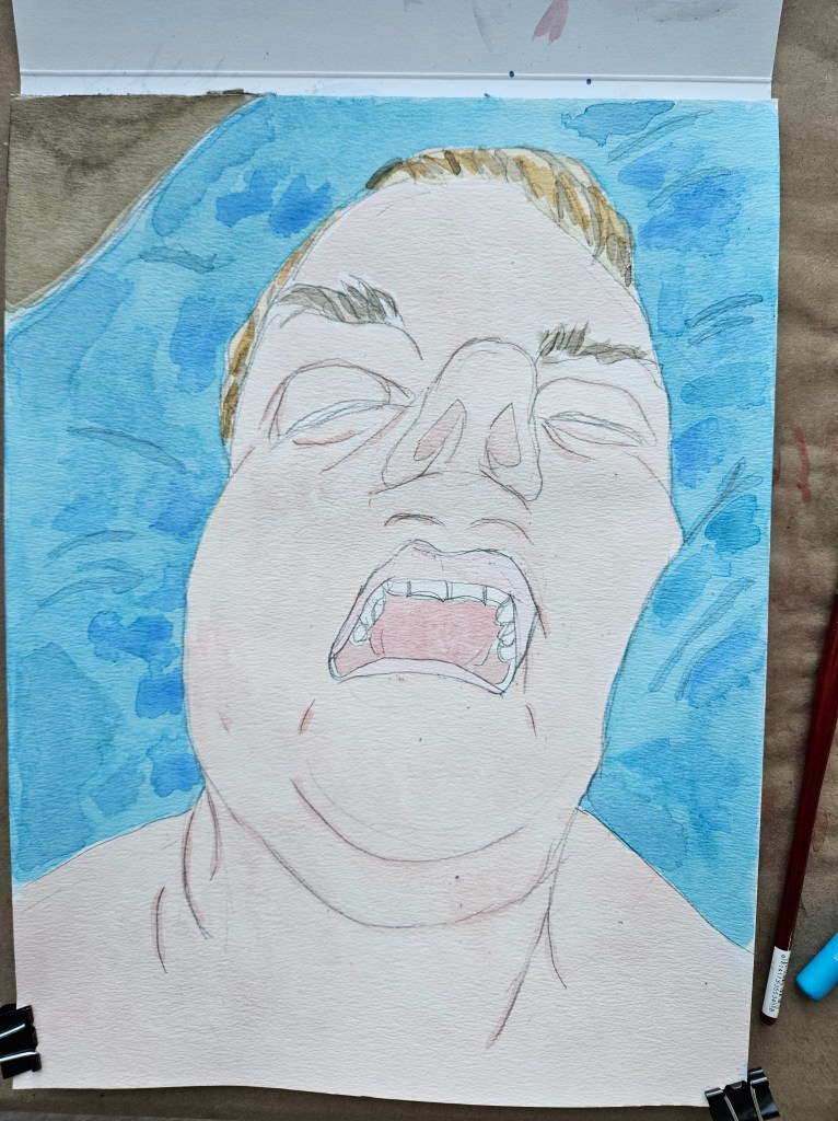
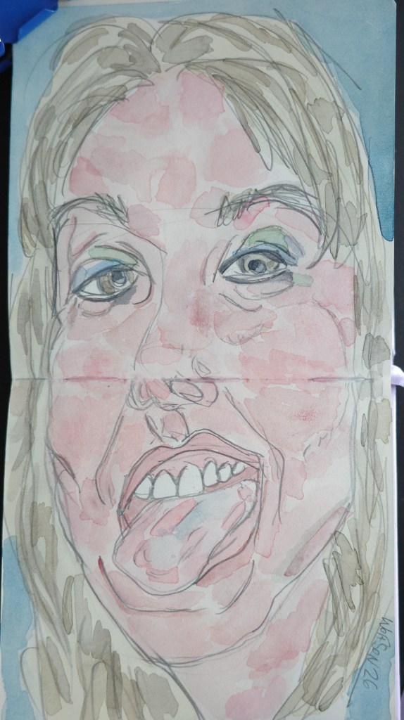
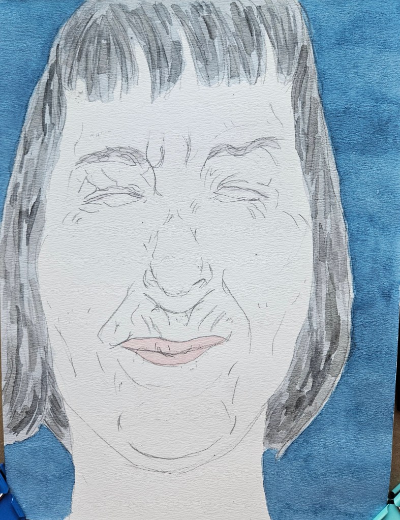
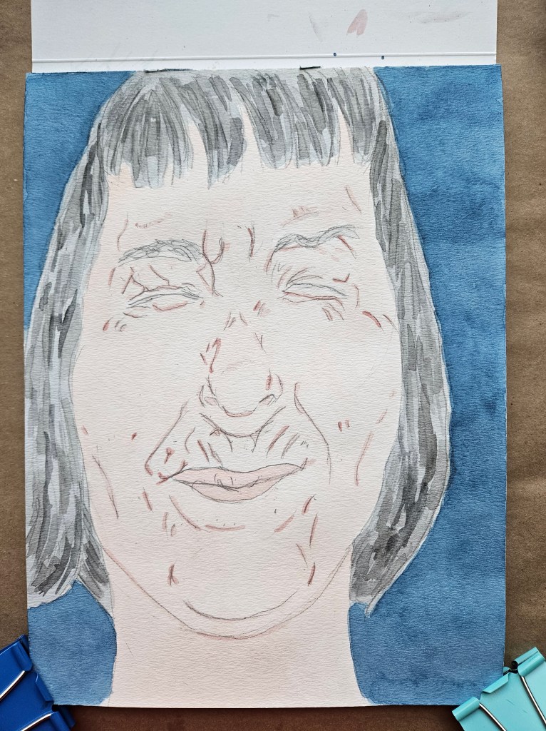
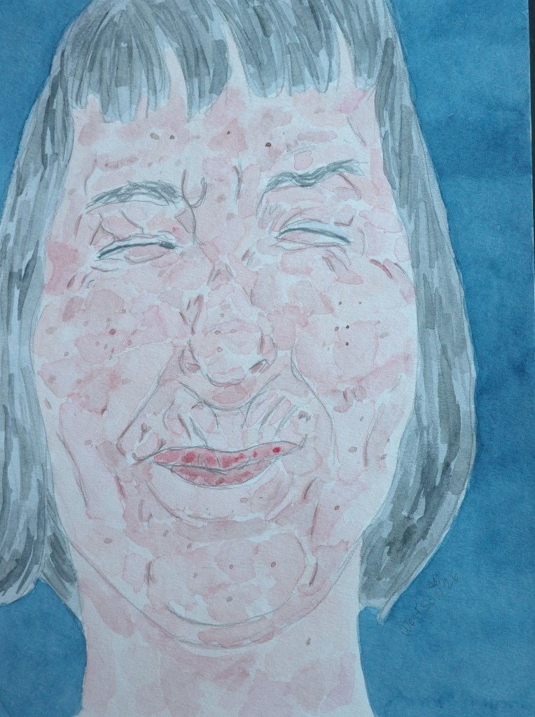
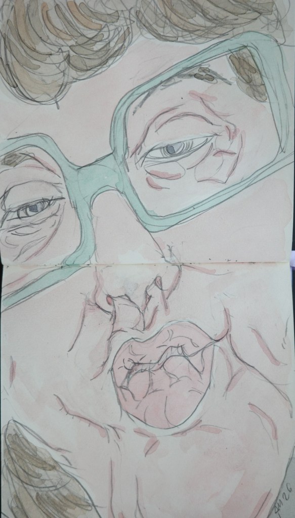
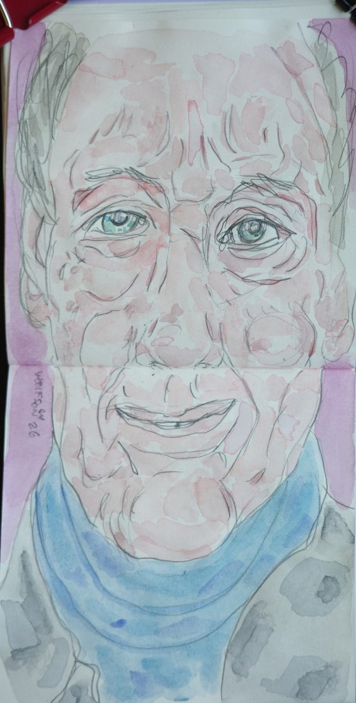
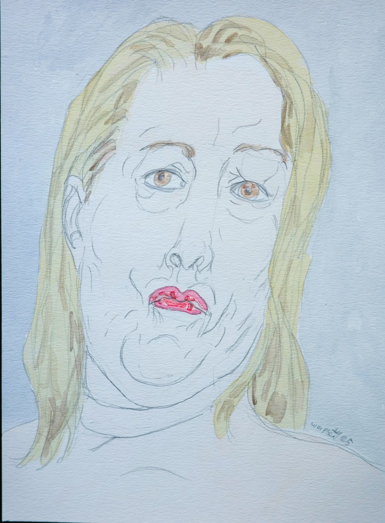
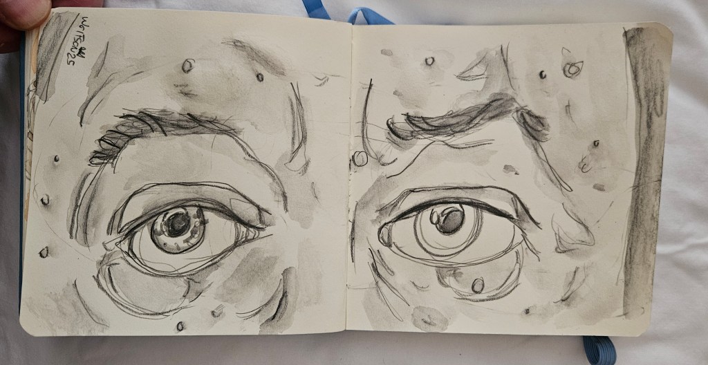
MD 5×5 watercolor & paper
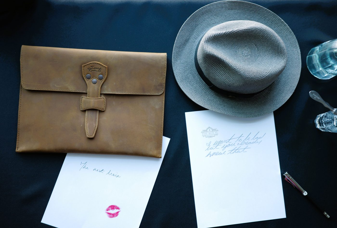
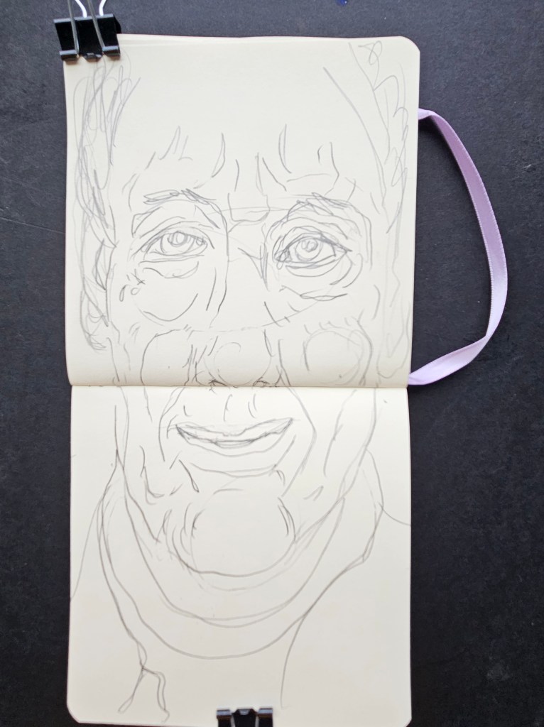
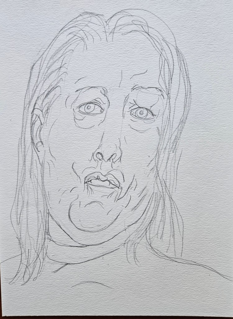
AD my ever present Talen Art Creations Multi Media pocket Pad 4×4 inches
There was an article recently about the two most influential modern artists. It got me thinking about the nature of art’s current influence. Art has become specialized. People still flock to museums but the casual viewer is there because of the totem they have made of any given artist, the mythos as it applies to them.
Picasso was important to his peers because of how he freed them up to pursue their own North Stars. The appeal now? He has become a sort of shorthand for being able to do whatever you want, seemingly effortlessly and make money, scribble on a napkin to pay for a roomful of people’s dinner at a four star restaurant, grab a collector/gallerist or peer’s wife by the breast and have everyone laugh and clap. It holds great appeal for people who aspire to become famous from nothing more than becoming an influencer or reality television star.
Picasso was an ass for sure. But credit where credit is due, he spent the majority of his day working in front of an easel and when not directly applying brush to canvas it was one of the things foremost on his mind.
People now admire Picasso not for what he did, nor what he freed up in others but because in their minds he was sort of proto reality start/influencer. They think of all they could do if they could be Picasso-like, not realizing that you can’t wish to be sui generis and still live the life you live now as you live it. That is the wish though and artists have become a totem divorced from what their reality was.
Painting has suffered the same divorce from reality. People have grown used to looking at art online often the artist’s hand/brushstroke is not as apparent and sometimes digitally smoothed out. A.I has made it worse, images made to look “real” quoting if not outright reproducing famous paintings & images do not even attempt to appear made by human hands.
These factors combined with the fact that everyone has a cellphone with which to photograph the minutia of their lives and how to look at and enjoy a painting is forgotten.
The casual viewer does not want to see the artist’s hand, they want machine like perfection as seen on their screens or phones. A painting is judged “good” now by how close to hyper realism it is. If a painting of a face can’t be mistaken for a photo then it is not good. (to me 99% of the hyper realism stuff is all technique and no soul. You forget it a soon as it it not in front of your face).
The only exception to all this seems to be some of the well known paintings, Van Gough, Monet’s waterlilies et al. With those though appeal is artificial story the viewer has told that they insert themselves into.
I was at a museum in Paris looking at one of these well known paintings and a twenty something woman stood next to me with the corners of her mouth turned down. I had to ask what was wrong. She showed me the image of the painting we stood before on her phone. She looked down at it then up. She showed me the image on the phone then waved her hand as if swatting away an insect at the painting;
“What’s all that?”
It was the impasto strokes of the brush on canvas.
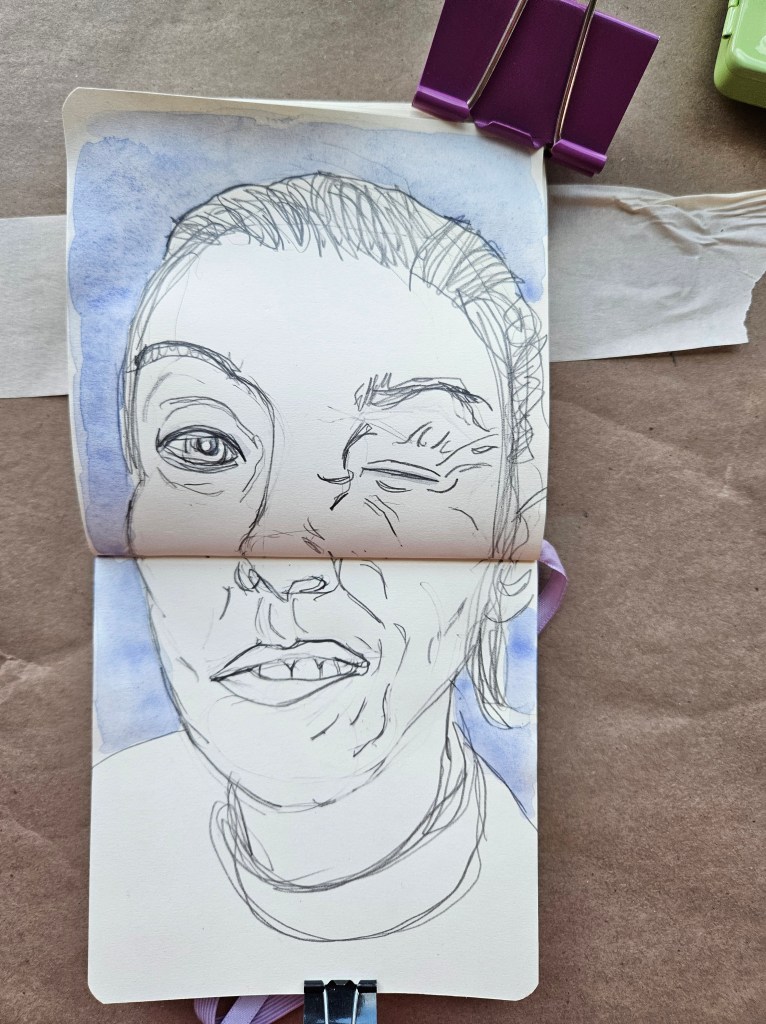
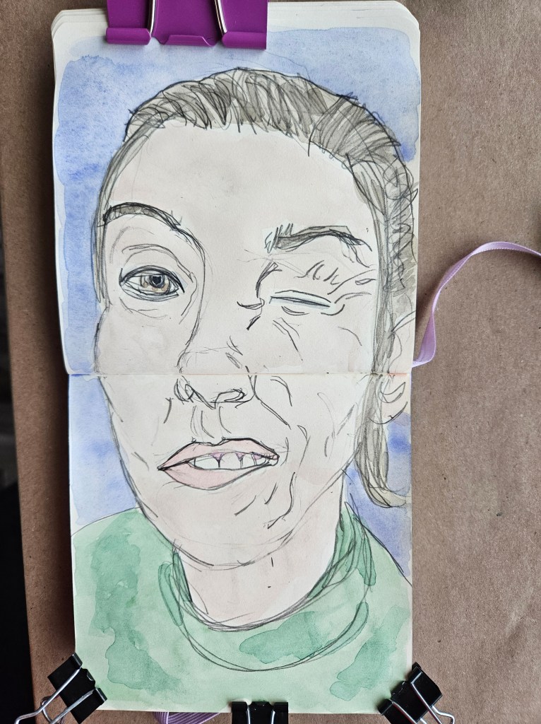
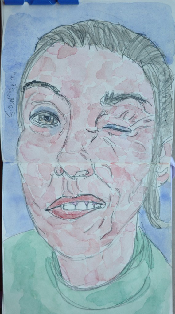
For my works, I want my pieces to look like the subject but to also capture the truth of the moment before me. I am not afraid for a painting or drawing to look like painting or drawing. This is simple but important advice I would give any painter.
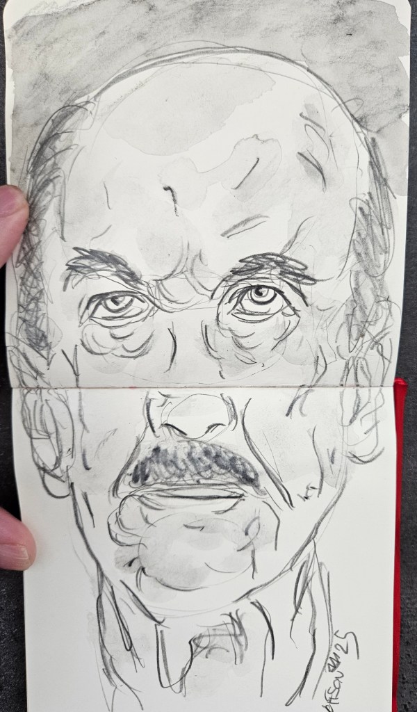
Spaghetti Night 9×12 inches Rembrandt cold pressed fine grain
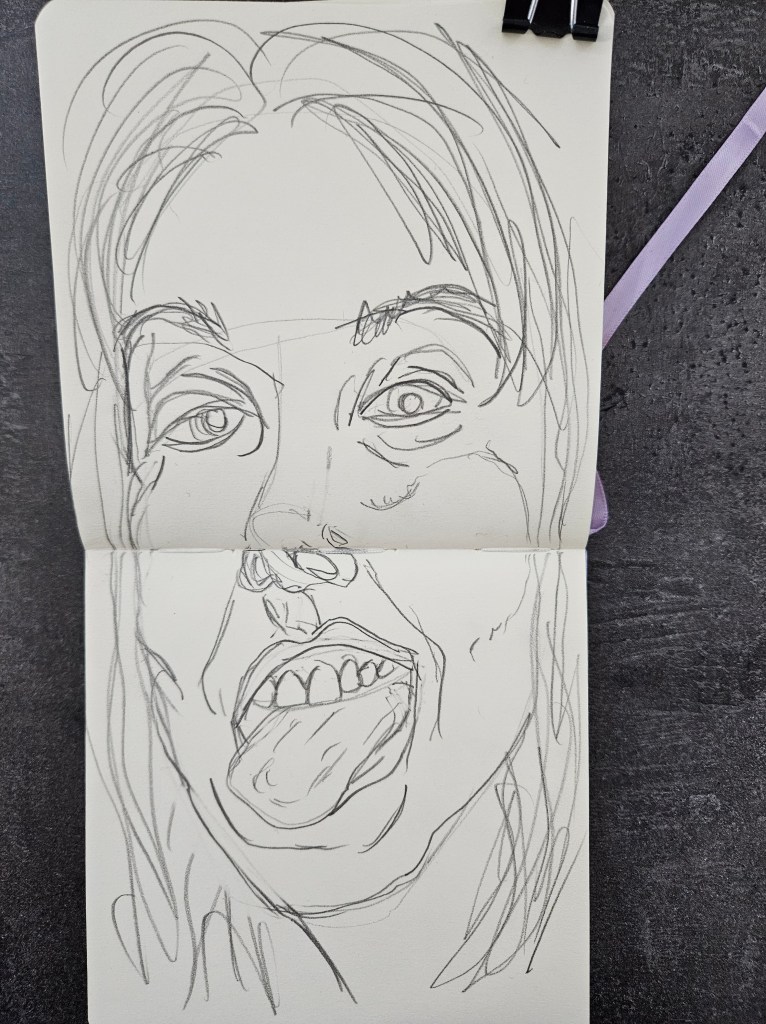
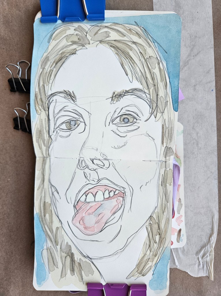
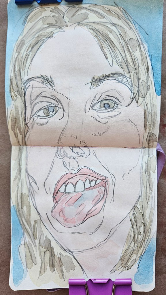
Tongue my ever present Talen Art Creations Multi Media pocket Pad 4×4 inches
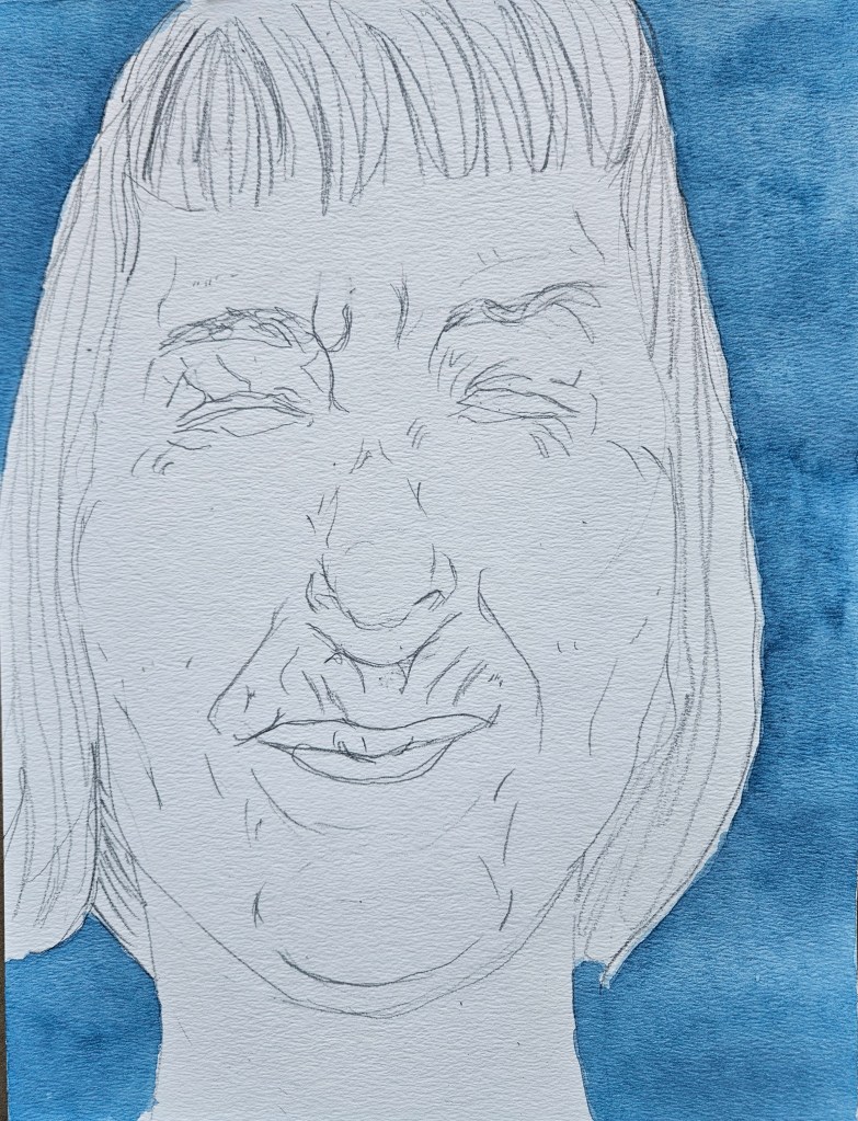
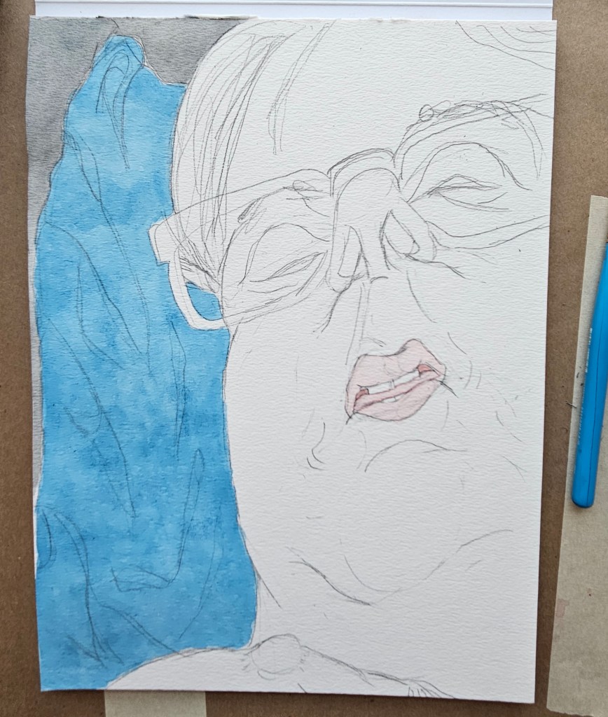
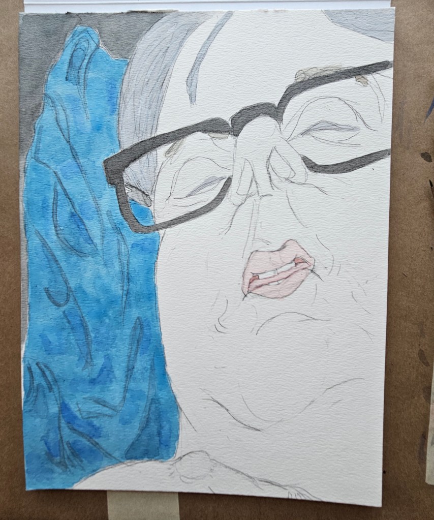
As I continue to edit my novel I have been able to go back to painting. As has always been the case, I like to mix it up a little as to avoid stagnation. This is achieved by giving myself little challenges, different types and sizes of paper and in this case for the second and third painting, only using paint left in the palettes.
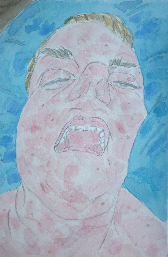
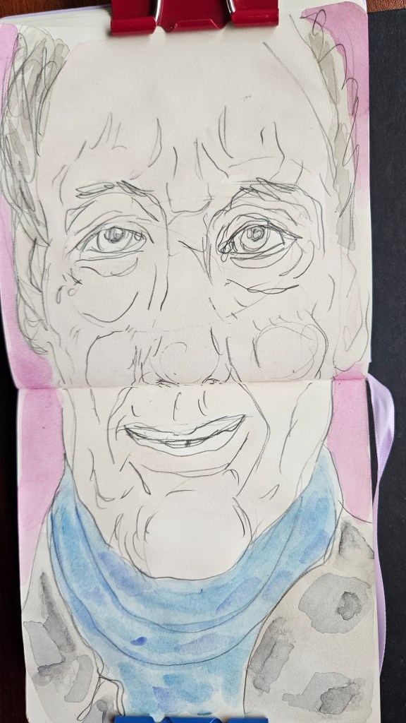
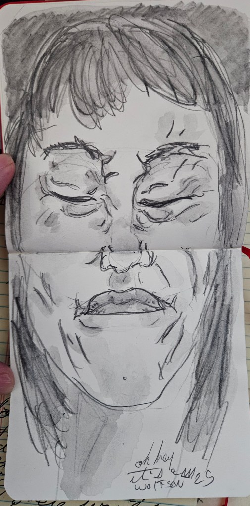
Myself 5×8 cold pressed watercolor paper with my normal studio paint set up
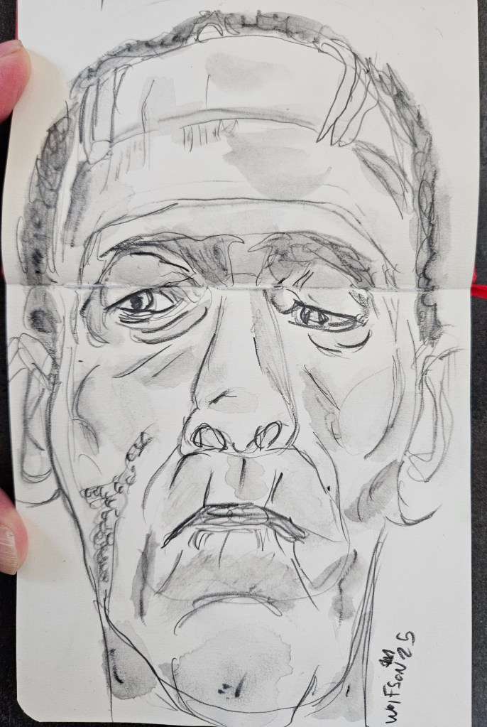
Truth or Dare I used my ever present Talen Art Creations Multi Media pocket Pad 4×4 inches
Sandy I used my ever present Talen Art Creations Multi Media pocket Pad 4×4 inches
Duke Ellington famously said that there are only two types of music, good and bad. Now more than any other time it is easy to explore. This is a freedom more should take advantage of as there could be something out there waiting for you that is currently lazily being written off as “Nah not my thing” .
Although seemingly far removed from what people know as my musical taste, i do enjoy Robin Trower. He mixes virtuosity with an emotional cadence. While this is not the first thing I reach for nor remotely indictive of my taste, when in the mood it hits the spot.
I used my at home watercolor set up & Talen Art Creations Multi Media pocket Pad 4×4 inches
Always looking for subjects to draw paint, email me for details
Just back from a trip where I was able to take photos to serve as fuel for my next Cinefield®. I lucked out and was able to get so much raw material it will allow me to do two which will lead me right up until next spring ( I won’t work on them back to back, taking a well needed break between which accounts for some of time frame)
While working on my Cinefield®, of course I will still draw every day and do my water soluble graphite work in pocket pads but this will be last painting for a while as my studio will become dominated by tiny confetti like pieces of paper laid out on sheets.
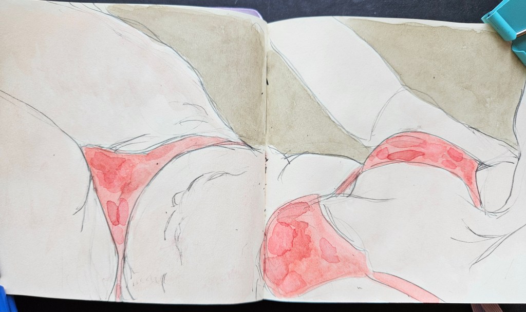
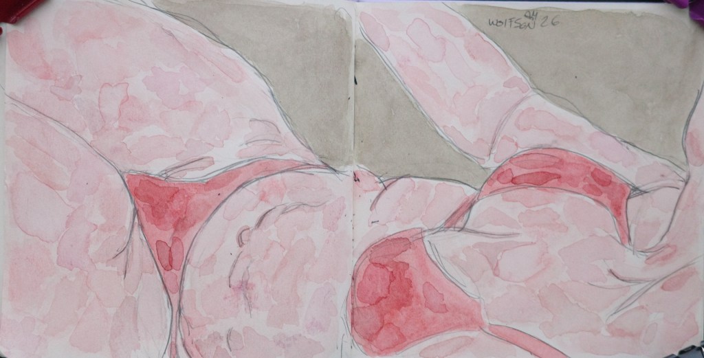
For this piece I wanted to try something a little different. I made the flesh appear without the volume and mass letting the lines tell that story of the body. I was very pleased with the results and enjoyed the challenge of going against my usual preference. That is one way for an artist to avoid falling back on pet-licks for a piece.
Unfortunately with my last trip, I did not get any photos which would serve as the raw material for my Cinefield® work. I legitimately miss working on them, which lasts until I am two weeks into one and I start to see little pieces of paper confetti in my dreams.
I continue on with painting. This piece is 9×12 Rembrandt paper which was given to me by Royal Talens. It is professional grade cold pressed 100% cotton. I have often used French cotton paper and that absorbs pigment quicker which makes it less forgiving in regards to blending or correcting a spot. As with all professional grade equipment, it becomes less which is better and more a matter of personal preferences.
“Color always occupies me, but drawing preoccupies me” Delacroix
“Drawing is the basis of art. A bad painter can’t draw but one who draws well can always paint.” Arshille Gorky
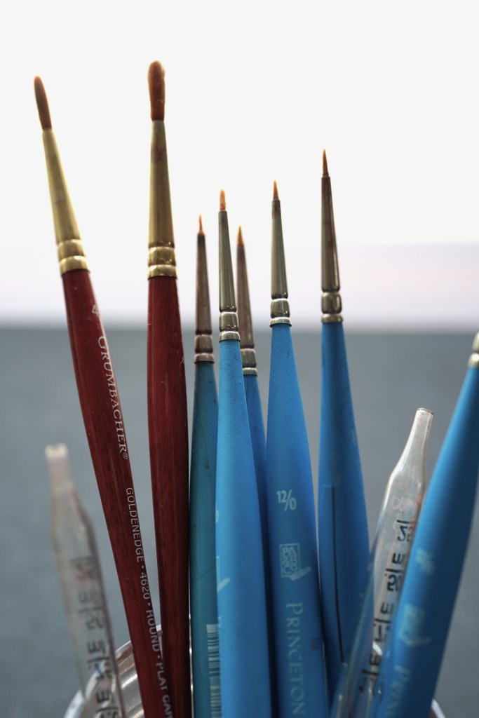
I always have a pocket pad on me, usually 3×5 inches, and then a slightly larger one in my ever present book bag. When I travel, what pads and accoutrements I have depends on length of trip, location and what else I will have going on while on the road.
It took me many years of trial and error but I have my trip equipment selection process down pat. For the past month or so I have been writing about equipment given to me by Royal Talens. My current go to pad is by them, but I had discovered it long before they had sent me anything, Talen Art Creations Multi Media pocket Pad 4×4 inches
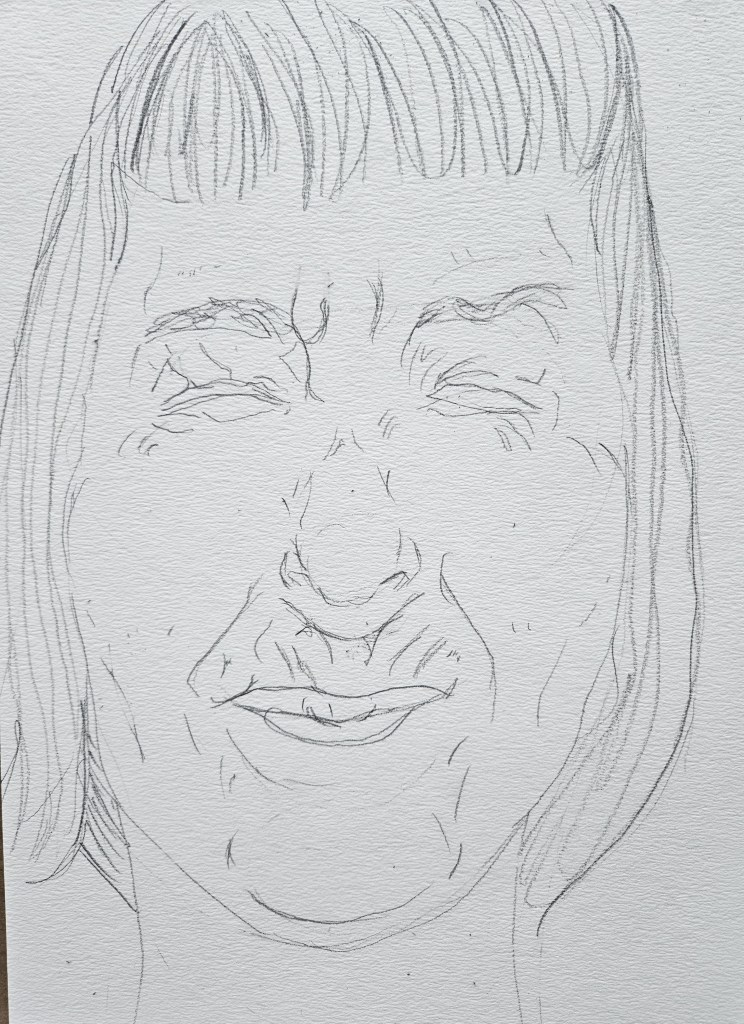
I have never looked at drawing as a second class citizen in comparison to painting. No matter if I have spent the day painting or doing some of my other visual works, I draw an hour a night, every night. This woodshedding is akin to a musician practicing scales, but also one of my greatest pleasures in life.
I initially discovered water soluble graphite by complete happenstance. Once I had the mechanics down, I was able get painterly effects. When I work on my Cinefield® pieces, I can not draw as an under construction Cinefield® piece slowly dominates the space of my studio. But, I also do not want to let too long go without painting, which I end up missing.
Water soluble graphite work is the same as painting but in all greyish black tones. I can use my witting desk and do a piece in one session. I may not be able to paint but this was very close. Unexpectedly, I found that as I added to my graphite technique it helped my painting and vice versa.
I was just on the road and while it was a short trip, I had a lot going on. With this is mind I knew I would have no opportunities to paint. I brought my water soluble kit. Another important aspects of this medium which I like it how compact it is. 2x graphite sticks, a sharpener and one watercolor travel brush. I can literally put it in a coat pocket. If at a cafe I use a mineral water cap, in hotel one of the plastic cups to be found by the gratis bottles of dasni for water to dip brush into.
Now that I know the paints properties, I have added them into my permanent studio & travel palettes. They have seamlessly integrated in and so my next step is to try them with various types of paper.
When I Initially became serious about my painting, I was mainly using blocks of cotton watercolor paper. This is not ideal to travel with. I had found that it was also very sensitive to weather, one season in Paris it seemed to rain for almost a month and each layer of paint took forever to dry and it didn’t blend as well. These factors plus the increasing price of my preferred brand made me start to explore.
I ended up for a long stretch using a spiral bound pad of Canson watercolor paper. Easy to travel with, not cost prohibitive and of good quality.
In art, I am completely self-taught so I do not know how it may be for other artists, but I see the size a piece is meant to be in my head before ever touching brush to paper. I began to envision works both smaller and bigger than the Canson pad. While continuing to use it, I tried other pads too, preferring the pads over blocks as they are easier to travel with.
On the road my go to pad has been Talen Art Creations Multimedia Pocket Pad 4×4 inches. What I like about it is that I can use it for my Lyra water soluble graphite pieces, watercolors or just drawing. It eliminates my having to have multiple pads in my bag. I do still always have my trusty 3×5 pad in pocket regardless.
At home I mix it up size wise going all the way up to 11×17 size.
In my exploration of the added paints to my palette with various papers I decided to first try them with my old favorite the Canson pad.
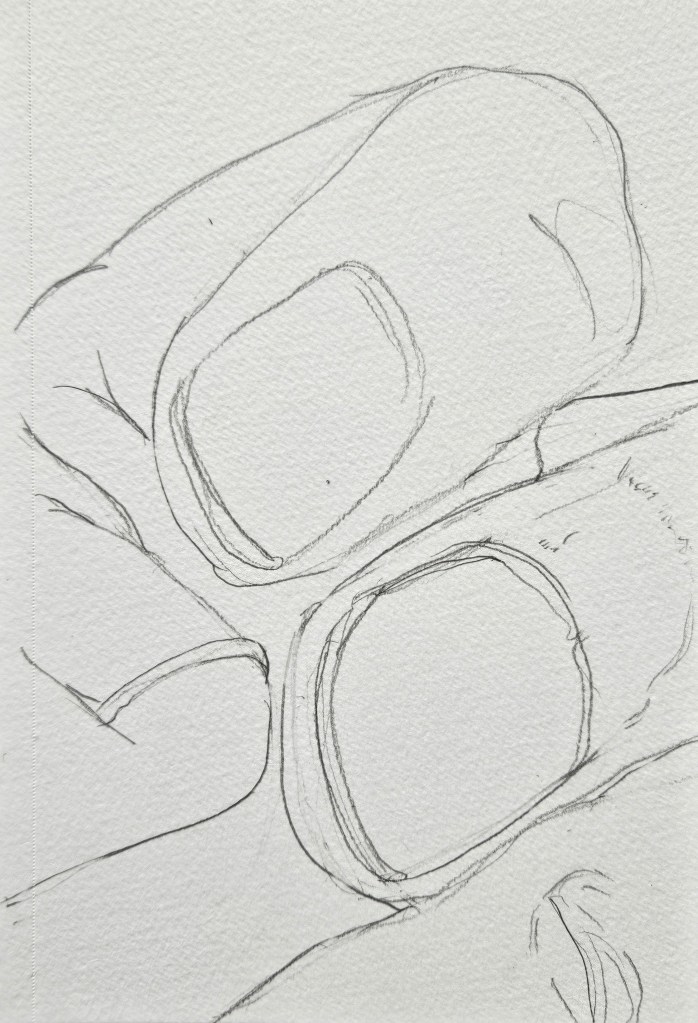
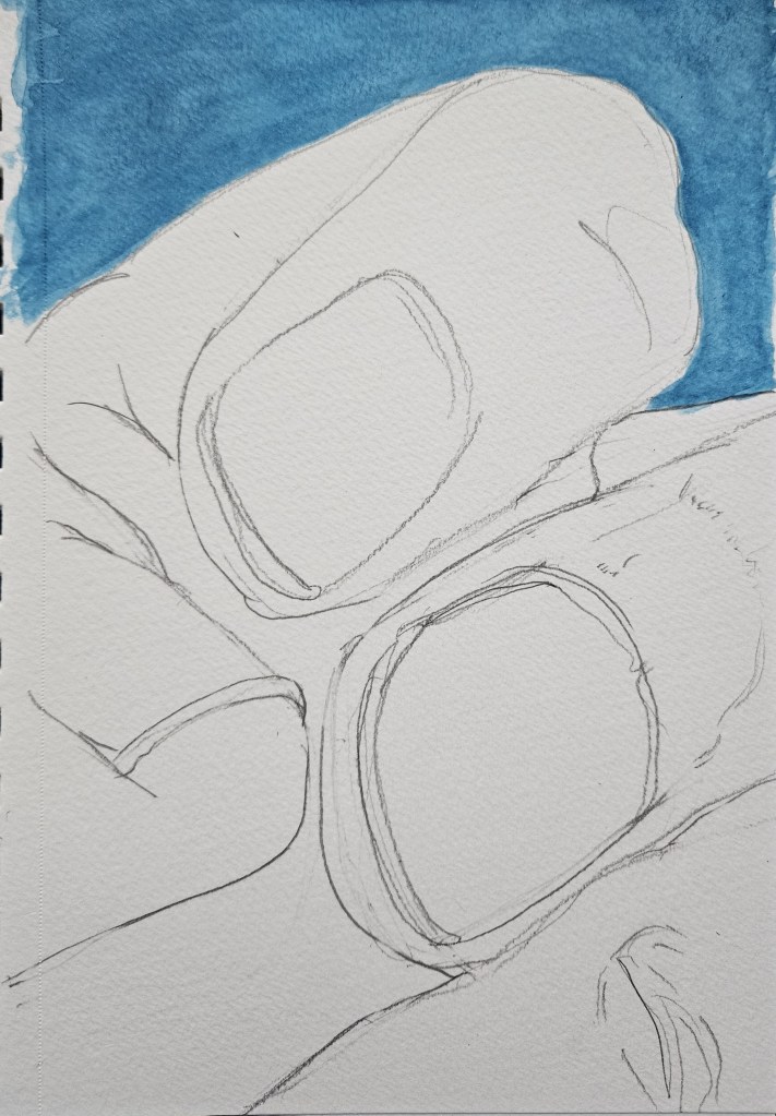
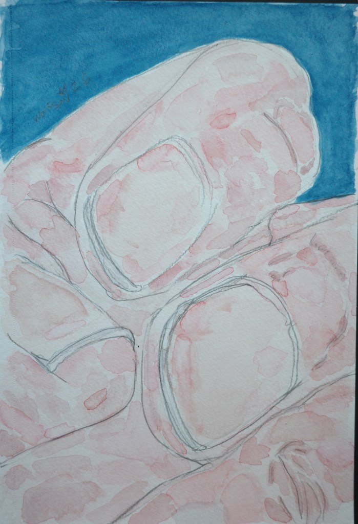
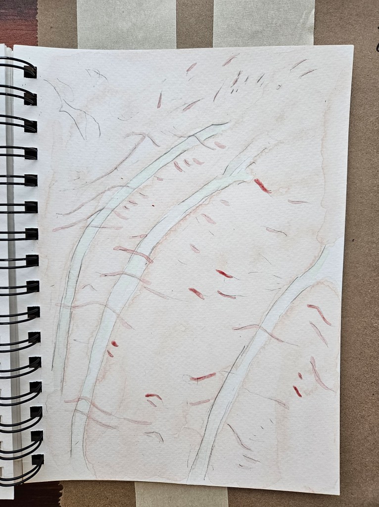
In doing an extreme close up it presented an interesting challenge. To be able to show volume and mass without the help of showing the outline of the hand which would have served as a guide/clue to the viewer’s eye. The piece is almost abstract. Keep looking, you notice the volume and mass, keep looking you notice little things with each new viewing.
Back of Hand
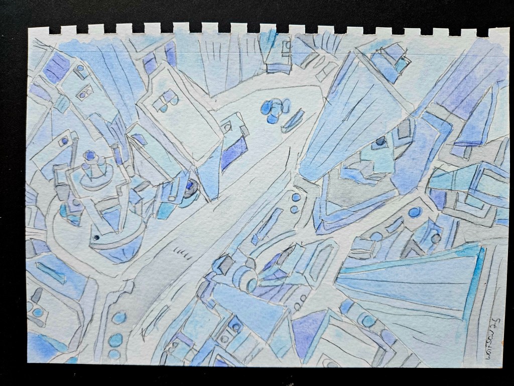
I have done a lot of portraiture of late but have also always enjoyed doing cityscapes. I want a style but never mere mannerisms and a key to this is to always be challenging myself. I decided to do a cityscape, a nice challenge on a smaller sized paper, especially as it has been a while since I have done one.