If you look at some paintings & drawings by both Matisse and Picasso, they are child like. This is not a pejorative term though. When Matisse painted his wife reclining on couch, you knew you were seeing a woman in kimono on couch but one would never study anatomy via this type of piece, it was not (hyper) realism.
Emotion ruled out over technique.
Picasso would occasionally lay on the floor and paint with his children. There is a purity in when a child does art, they do not get hung up on rules and restrictions. He wanted to capture a spark from this.
Both men had said something along the lines of an artist should create with the seriousness of a child at play.
I had read some biographies where burgeoning painters at young ages were given blocks of cheap paper to let loose on. This was a sort of test by parents, the paper was inexpensive so if the child gave up, as children sometimes do with things which they show initial enthusiasm for, it would be no big deal.
Impulsively, while restocking needed art supplies, I bought myself a block of cheap newsprint paper.
I am currently working on my next short story/essay collection and a small painting.
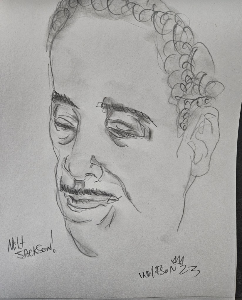
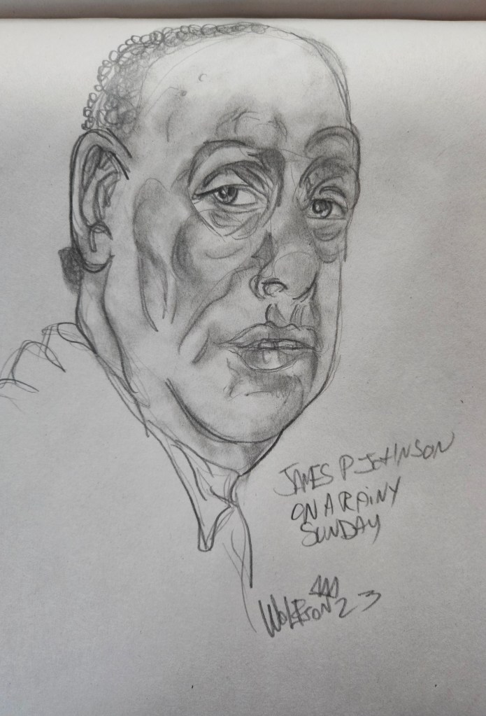
A for fun project, I decided to do a page or two every day in this block, but each piece had to be loose. It’s just daily doodles 9×12 newsprint paper. I am earnest in this, like a child.
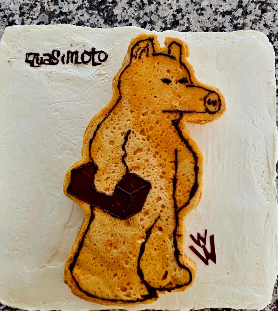
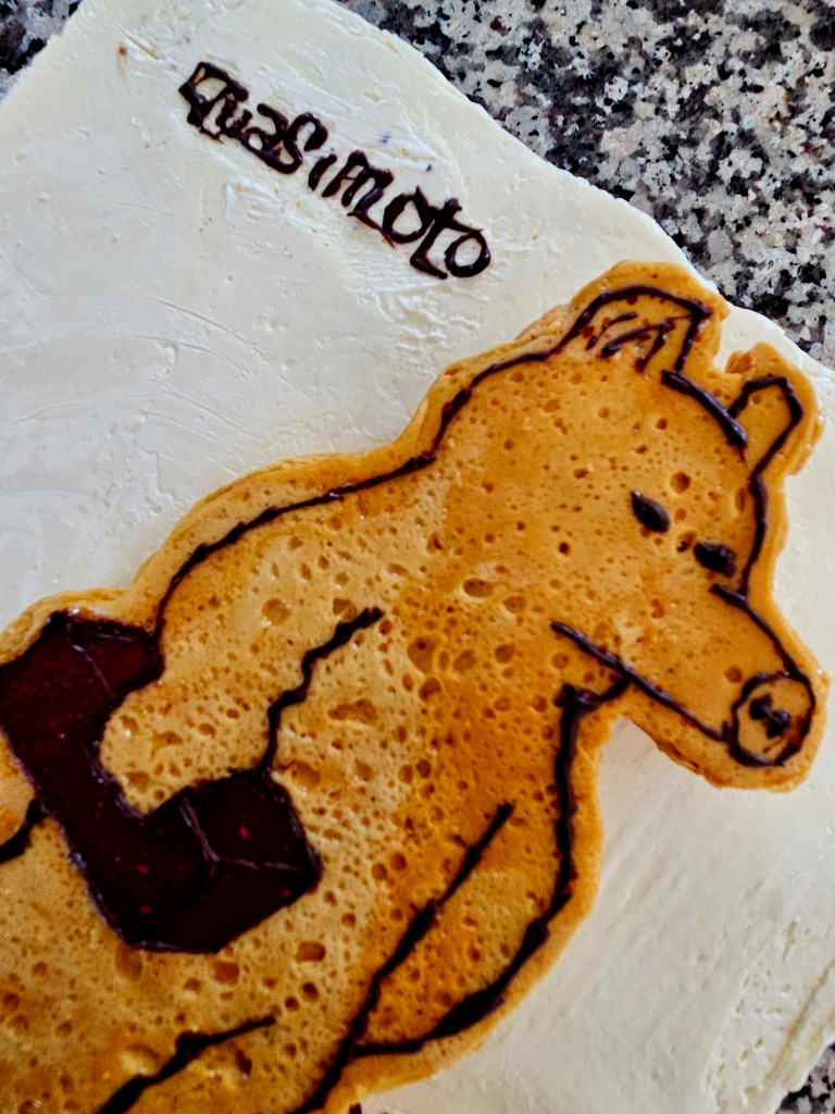
It’s that time a year again. I am lucky enough to get a birthday cake from The Caketts. Music remains my main source of inspiration and outside of serving the creative process, my main passion.
Every year the cake is musically themed. I have no say in what it will be, although obviously it’s music I like.
The first cake I ever got was reproducing The Rolling Stone’s Let It Bleed album cover but with cats replacing the lads.
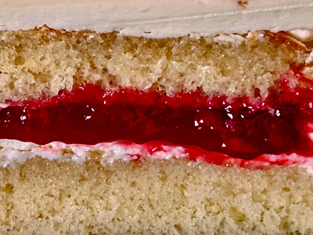
One eats with their eyes first. Aside from that obvious pleasure, the cakes themselves are very good. The flavors are always unique. This year’s (Miles Davis/Gil Evans Sketches of Spain album cover) was a Manhattan flavored cake. With the bits of bourbon macerated cherry to be found within combining with everything else going on, the cake was patisserie-decadent enough to easily be expected to be found in Vienna.
Everything is made from scratch, no prebought sheet cakes, no stencils. Even all frostings are made by hand, nothing shooting out of plastic tubes, aisle five thank you kindly.
These are all the cakes over years so far, in order. (W/later cakes my name is watermarked on photo. This might seem overly cautious but w/first photos i Put up of a cake, people just put it on their Instagram w/no attribution where it garnered thousands of views. Insult to injury, in one case, person who reposted knew me but w/pic put that they forgot where they had come across this. In general, if you didn’t create it ask person who did. Or at very least, link to their site. It’s basically stealing other wise.)
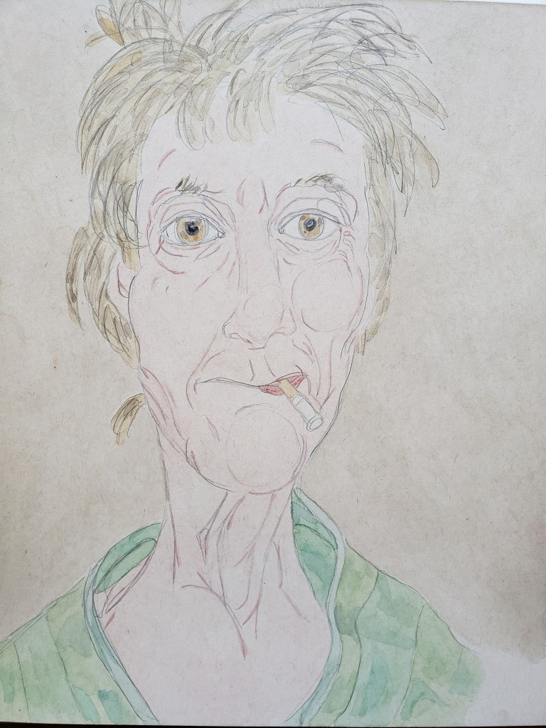
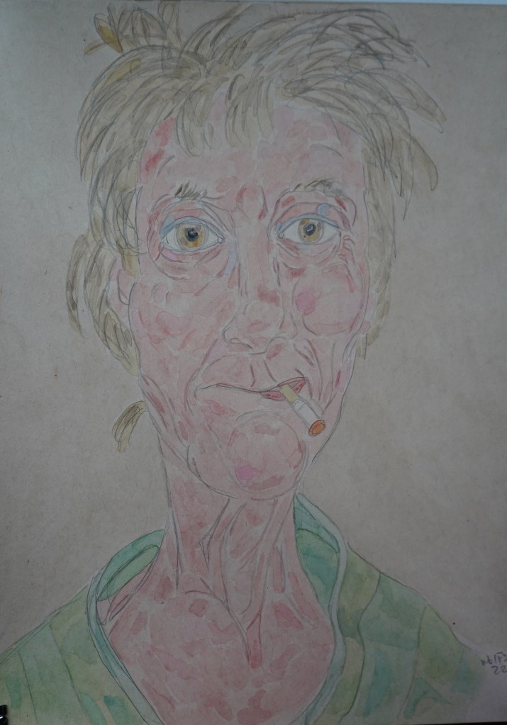
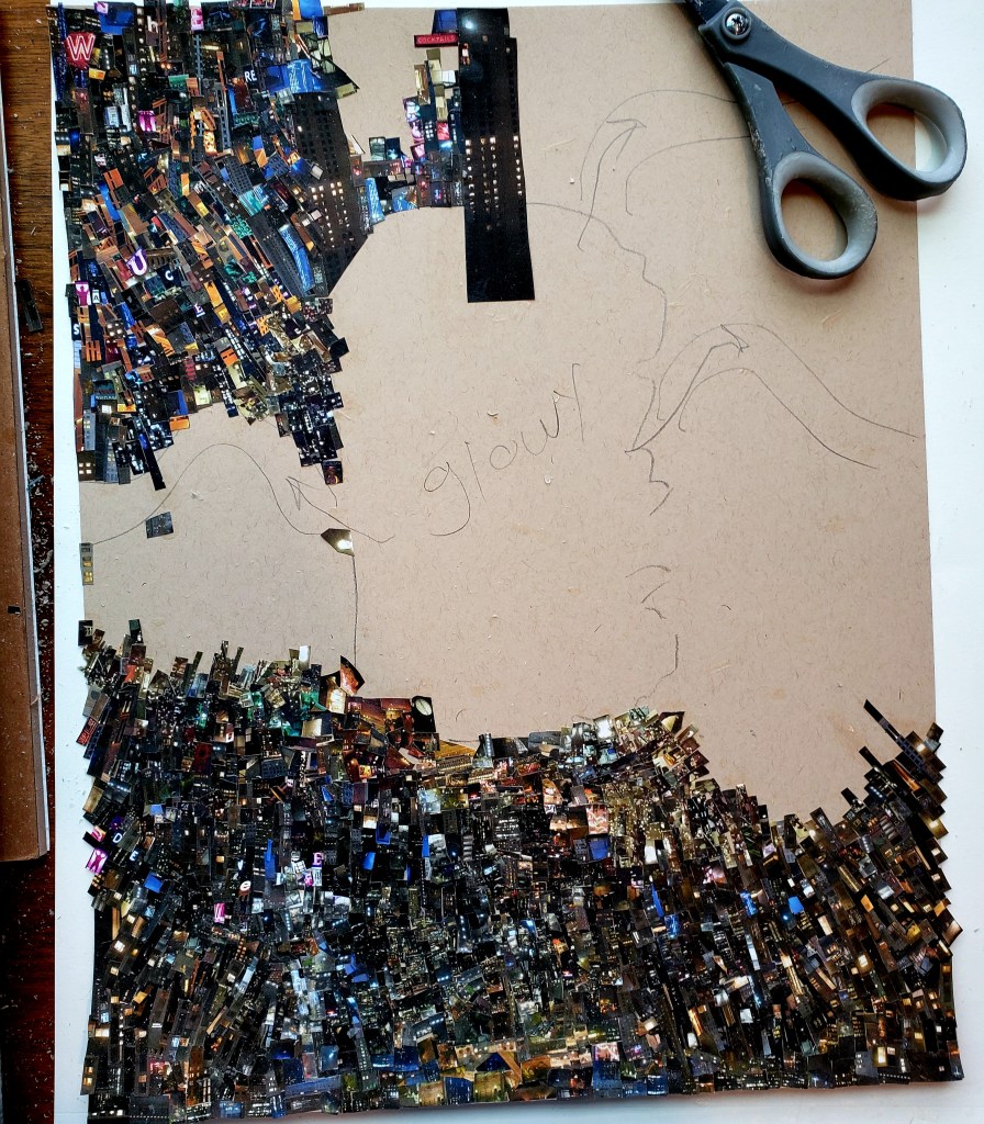
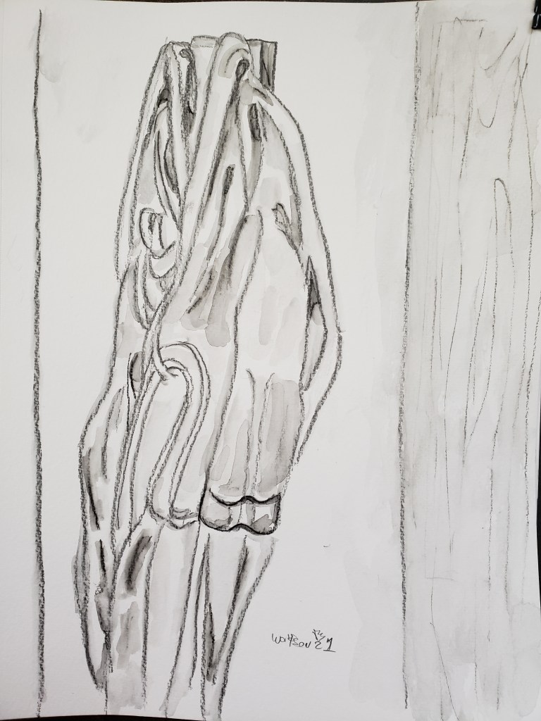
I had been in the middle of a full sized Cinefield® when my computer of six years gave up the ghost. This rendered my needed printer into an expensive paper weight. I switched to doing a painting. This is 11×14 watercolor & tan paper.
“Maggie” 11×14
errata thought on the elderly: In media & especially television, a shorthand for “old people” they often will reference big band music (usually Duke Ellington or Benny Goodman). A few Rolling Stones albums just hit their 50th anniversary mark. If you do the math, an “old” person was not swinging their gal arround on the dancefloor to “Take the A Train” but rather Hendrix’s electro lament for a decades turmoil & new found freedoms.
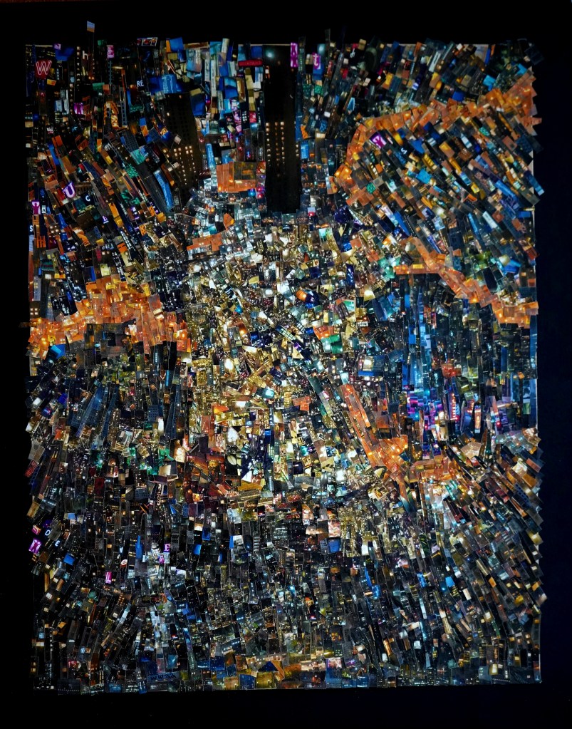
I am currently in the middle of finishing up a labor intensive full sized Cinefield®. My cover for the latest Funki Porcini album Where the Sauce is Deluxe has been as enthusiastically embraced as the album itself. I have received queries about whether the piece or prints of it are available for sale.
I am not ready to part with the original and my initial thought of prints of it made me worry of a loss of intensity, reducing down my work to becoming akin to something one would buy at IKEA et al.
I was presented with the idea of making one print only available to the public. this idea appealed to me as unlike with the current trend of NFTs, here was a work of art one could have and hold. Only doing one copy makes it so that one is not merely buying a slightly pricier, better quality poster.
Of course it would be nice for this piece to find a home but the other part of my motive for this posting is to save anyone with questions about the piece some time.
Here is all the pertinent information:
This piece was used as the album cover by Funki Porcini’s same-named album (2022).
All the images were from photos that I personally took. There was no digital magic/manipulation. I used the traditional technique of scissors & adhesive applied with a brush.
There will only be two prints of this made, one of which will remain uncirculated in my personal archives.
The technical specs are as follows:
– 24×30 inches Printed on Archival semi-matte photo paper 95 lb.
– Cold press mounted and Custom Framed with Museum Glass in a Black Metal Frame
Throughout my oeuvre, emotion is my ultimate goal. I want the viewer to feel something. Music is my main source of inspiration regardless of subject matter or even medium.
I have pretty big ears, never restricting myself to one genre nor era.
Although I lean towards jazz & classical I do have some categorization defying things in heavy rotation too. Things like Kruder & Dorfmeister, Kina Rao and Funki Porcini.
Funki Porcini is an absolute favorite to whom I have listened to for years. His music encapsulates various moods. In lieu of one sonic voice ever present on every album which can lead to a feeling of heard one heard them all, he offers up instead, technique which he uses to great effect to create dense dreamlike works.
My Cinefield® vary, from cityscapes to floral explosions to abstracted colors and shapes. The commonality being their density and dreamlike quality.
I now have the pleasure of one of my Cinefield® being used as a cover for the forthcoming full length album by Funki Porcini. Both share the same title. As is always the case with my Cinefield®all the images I used were from photos which I personally took. There is no digital magic, just my trusty scissors, I applied adhesive with a brush. One difference in my methodology was in only listening to a specific soundtrack comprised of a pile of albums including the new one and a few other favorite of his as I worked. The piece is 11×14 inches.
I will put up details on where the album is available once its out.
Cinefield® – Where the Sauce is Deluxe 11×14
There is a special multi-night gig associated with this going on:
We will be doing the album launch with the Laserium at commonground in Coventry, four nights 28-31st January.
Artistic evolution is my constant mantra, with emotional resonance being my goal. I achieve if not both then at least the first by constantly challenging myself. I never want people to look at my work and after seeing a few pieces feel they have seen them all. Nor do I ever want to become the “…” guy in regards to what my voice is saying via images I use to do so.
Semi recently I started mixing it up with my Cinefield® works as I had previously been doing with my drawings & paintings.
The challenge I presented to myself this time was to use only one image and one of a limited color palette.
The initial wave of Pop art was portraying common objects or scenes, things which could easily be considered lowbrow of plebeian. It was not the objects portrayed which made a work Pop art, it was an ironic emotional detachment. Someone like Wayne Thiebaud often gets lumped in with the Pop artists for his wonderful paintings of cakes and other sweets. However there is painterly intent and definite emotion involved. He is not pop
He followed in tradition which started with the impressionists of showing objects that they encountered every day. Drinks and drinkers were often used as subject matter as cafes were de facto ‘offices” for artists and dealers.
Le Buver d’Absinthe (1859) by Edouard Manet
L’Absinthe (1876/6) by Edgar Degas
Buveur d’Absinthe (1901) by Pablo Picasso
Painted Bronze (Two Ale Cans) 1964 by Jasper Johns.
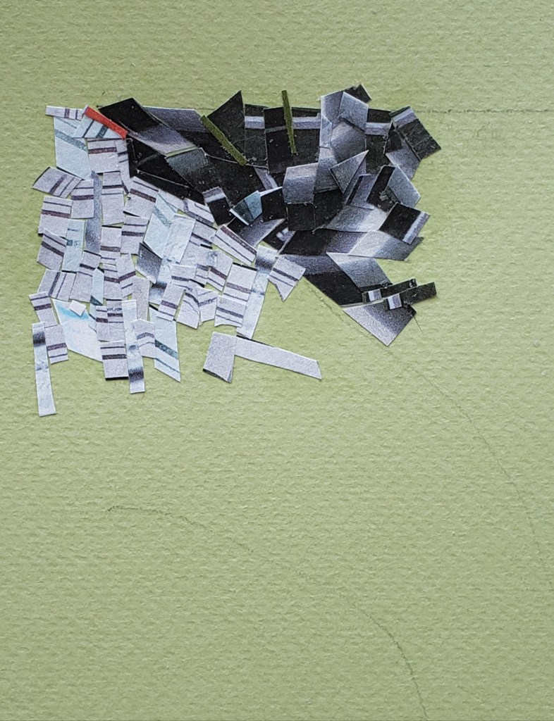
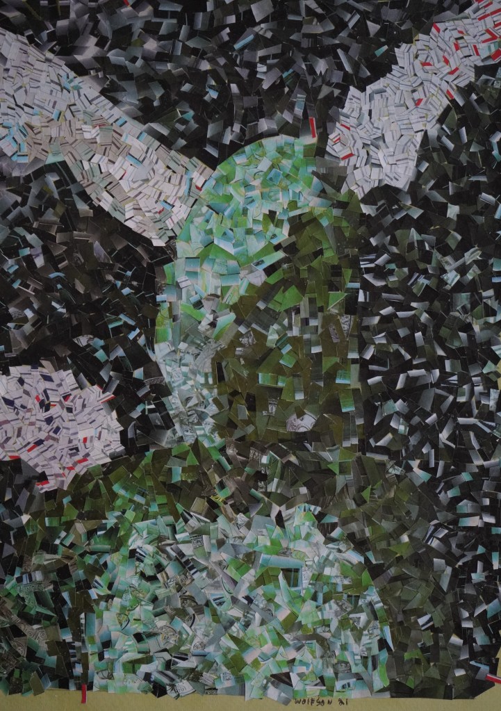
It occurred to me after I started my piece that I was working, a link in a long chain of artistic tradition. I had previously done flowers, faces and cityscapes and it was the novelty of subject which initially appealed to me though, not the tradition. Before anyone accuses me of pretension, I had gotten both a bottle of good whiskey and one of Absinthe for my birthday. I tried photographing the whisky bottle first but it was just a dark brown with no color variations, I next tried the Absinthe which worked better, this being my only impetus for using it.
I took three photos, not moving the bottle but standing in front of it, besides it and behind it. As is true with all my Cinefield® work, I only used photos that I personally took, working no digital magic. I used my trusty scissors and adhesive applies with a brush.
The work is 7×10. Soundtrack György Sándor playing Batrok’s Mikrokosmos books III-IV, kini Rao (various), Sun Ra Lanquidity.
Addendum: People are still under the impression that Absinthe was illegal either because of the wormwood or the high alcohol content. Neither of which was true. Some politicians in France had major interests in certain vineyards and importers/bottling concessions. Absinthe was cheaper and lasted longer so workers turned from wine to that. The outlawing of Absinthe was first and foremost a financial consideration.
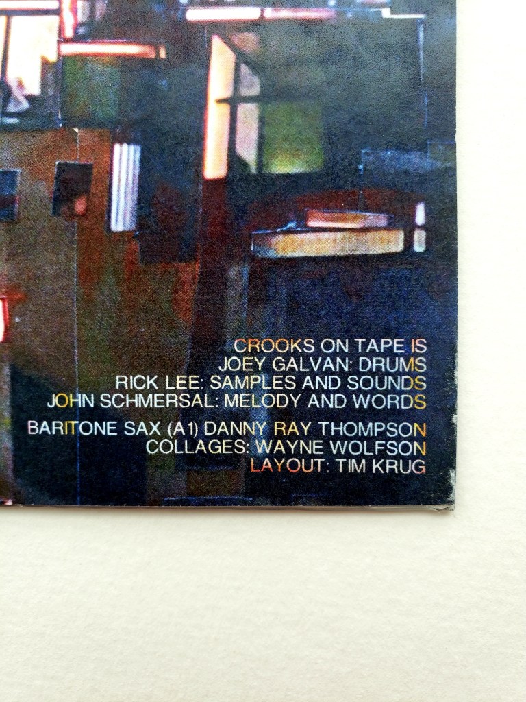
I have been a fan of the music of John Schmersal since his days in Brainiac. Each of his subsequent bands has been different, the commonality being his ability to be genre defying, throwing whatever he enjoys into the mix.
He revisits one of the bands which also features Joey Galvan (drums) and Rick Lee (samples & sounds) both of whom possess equally cool musical pedigrees.
They just released a limited edition ep Prime Time / More Dismay on Blind Rage Records which features special guest star DANNY RAY THOMPSON from Sun-Ra on baritone sax.
It is a special picture disk. I had pleasure of doing the front & back cover plus the actual image on the disc all, of which are from my CINEFIELDS®
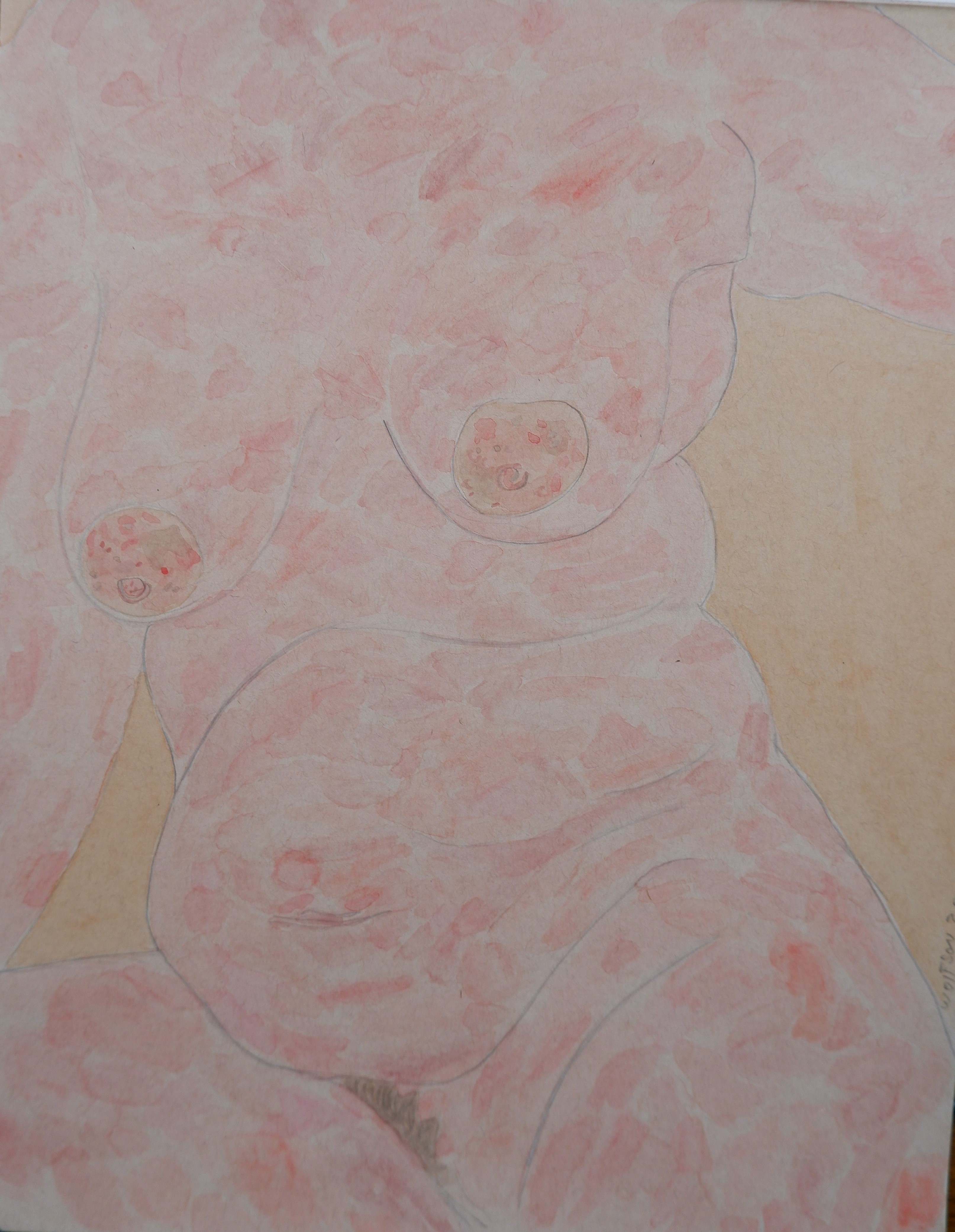
Now twenty days past my second vaccine, I can start dealing with things which had been on hold for year plus. The vents in my studio needed flushing/servicing. Because of this, I could not do a painting nor start a CINEFIELD® which would put sheets of tiny cut out components everywhere.
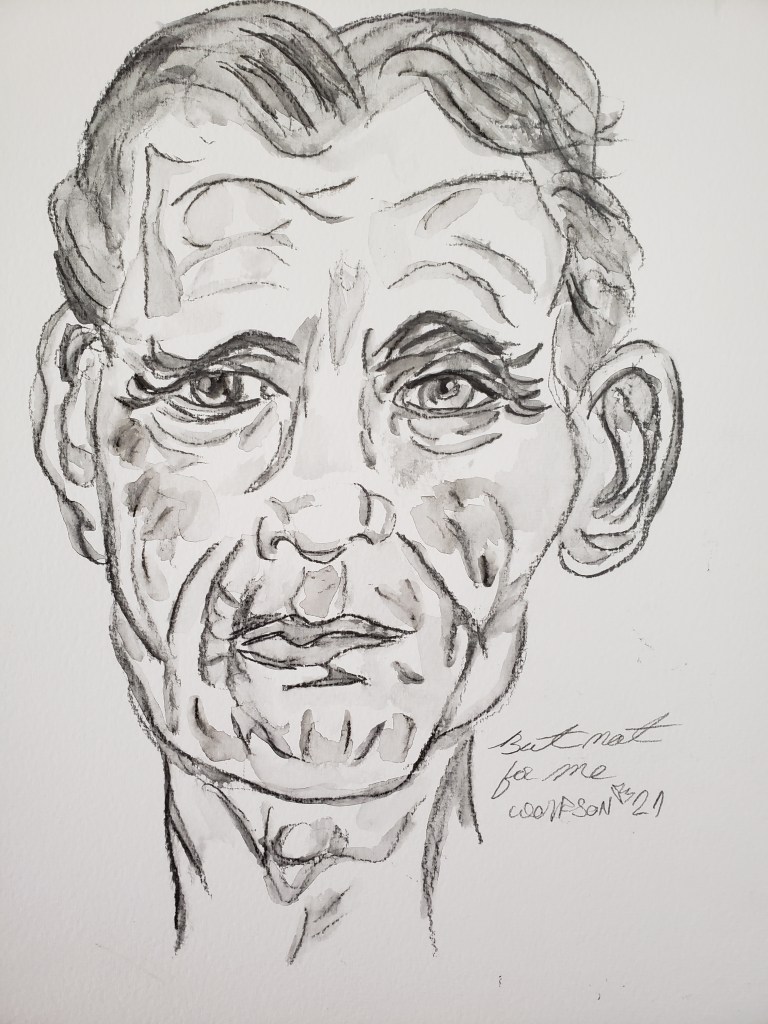
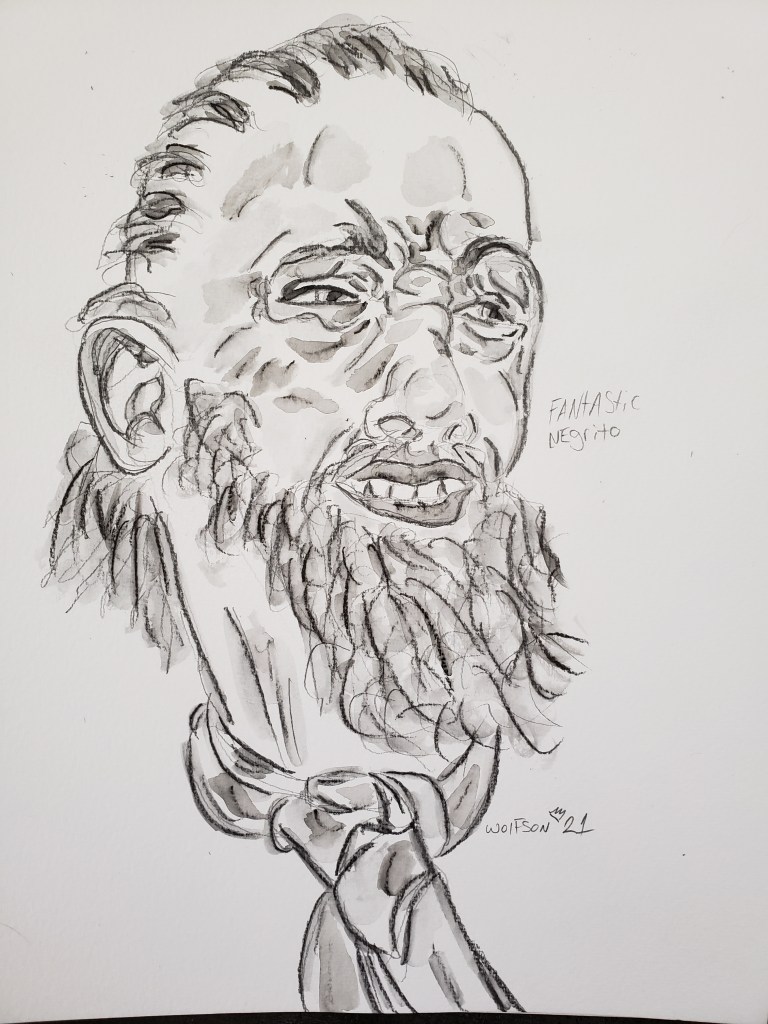
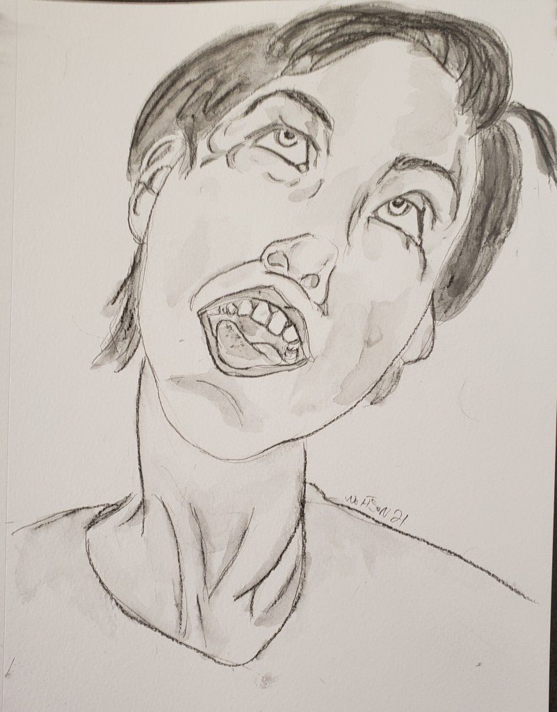
I did my nightly drawing but also continued to hone my Lyra chops. This was perfect medium for my situation as it was like painting but each piece was one session after which I could put equipment away.
Studio is back up and running and i have started a new CINEFIELD®. As these are time consuming, i decided to post some more of my Lyra pieces.
A painting of a woman (or anything) is not a woman but rather a thing unto itself, offering up an emotional pay off not limited to the specific real life moment of the subject. The subject is merely the starting point. Art allows for a great myriad of feelings to come forth, more than a photo. Onion like in layers, of emotional cadence, there is also the injection of the artist’s voice to the subject. This allows a viewer to return to a piece multiple times, finding new things and creating a different narratives in their head.
Emotion should not strive to encompasses any type of perfection, the same with beauty. I always aim for a truth in my work, honesty inherently being beautiful. Emotion, even the seemingly “negative” ones appeal to me to portray for this same reason.
This is my third tan paper piece. I was very pleased with it. It is my voice, the same effect as a musician switching instruments to play a different type of song.