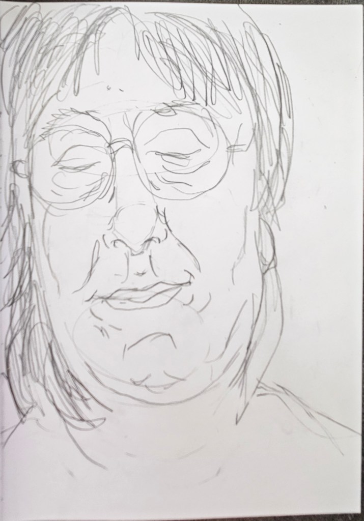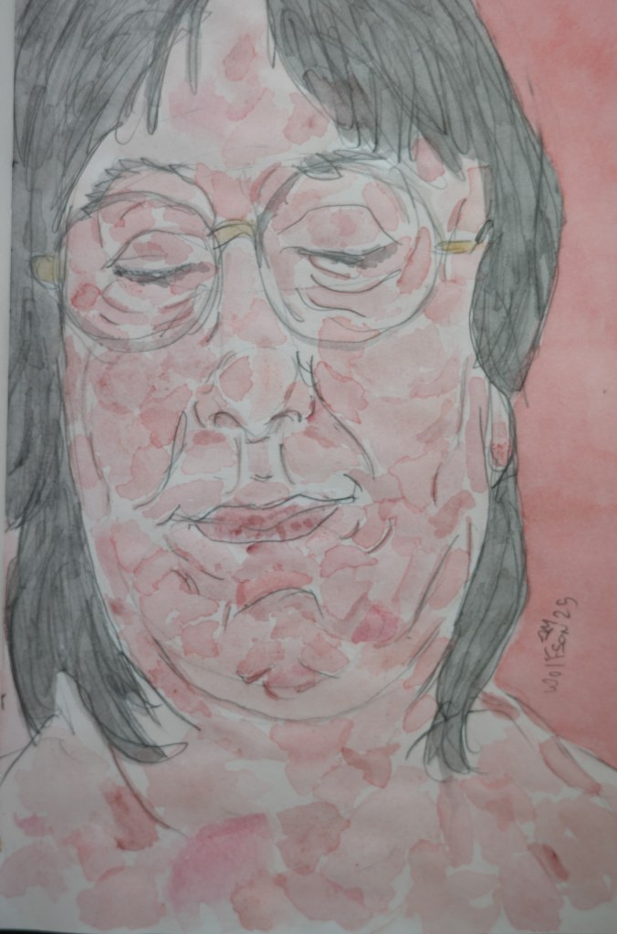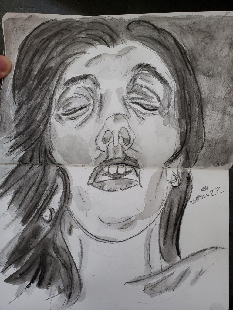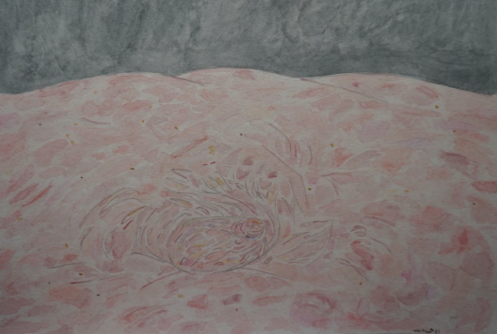
At least until Mid-July I will not be able to take photos to use as raw material for my Cinefield® work. I continue to happily paint, enjoying myself. As I am locked into a groove, this piece too was done in my Talens Art Creation Multi Media 4×4 inches pocket pad.
Watercolor & paper 4×4 inch Pad


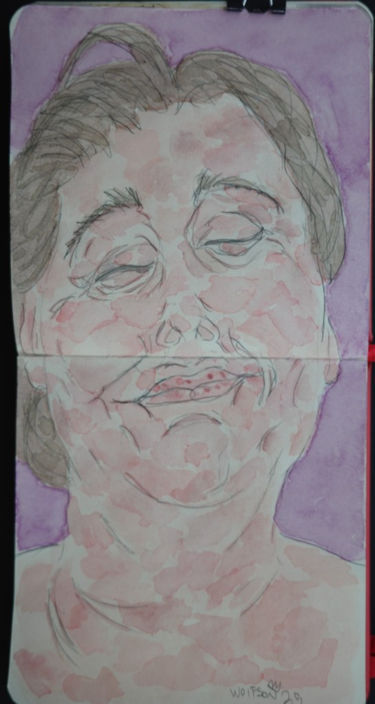
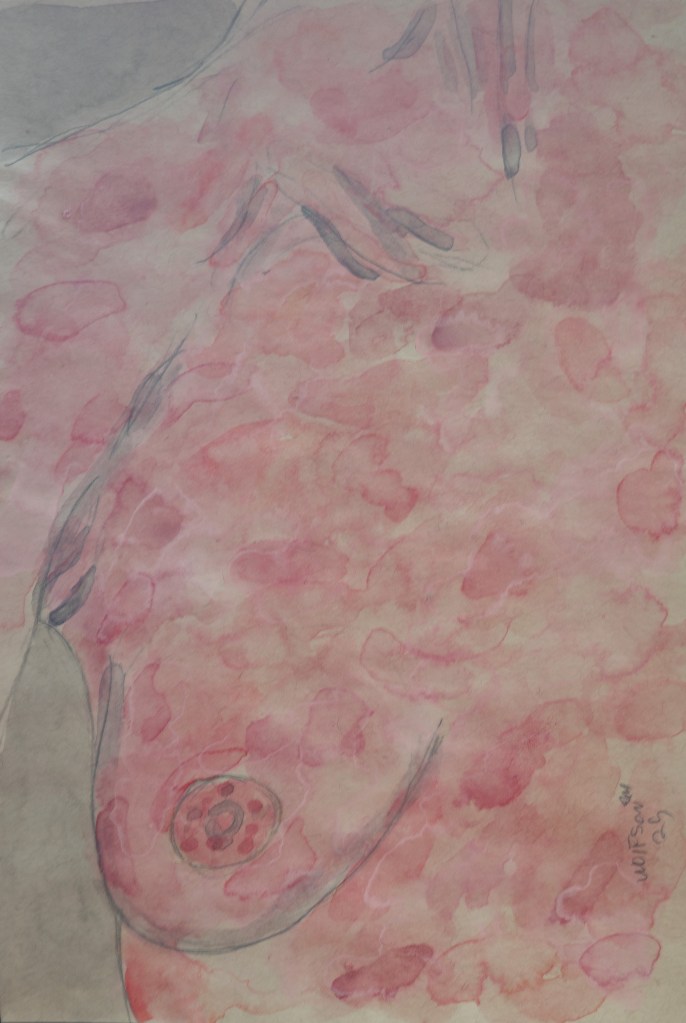
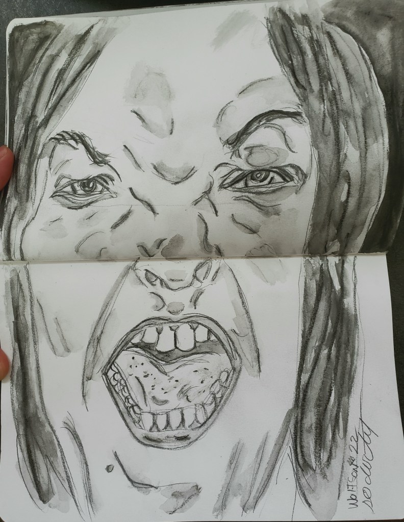
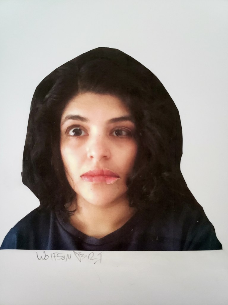
I had a little bit of paint left in my palette. I also had few of a different style I had bought while doing residency in Paris. These have a different style of pigment and look to them. I decided to do a loose experiment. Unfortunately, I grabbed the wrong pad of paper. I have a tabouret drawer for every style I use. Some are for different mediums but look the same unless you take a beat and read cover. I meant to use multi-medium paper which can be used with watercolors and other wet mediums.
Instead I ended up with regular tan toned sketch paper. This meant that among other handicaps I could not do my proper blending. I decided to continue on anyways. Despite it being my first time with the paints and the wrong paper for the wet medium, I was pretty pleased with result, especially for a first foray.
Quick painting 5×7 Tan toned sketch paper.