New Licks

David Hockney just passed away. He had works which I admired but he also had things which by general opinion didn’t hit the mark. That is fine, it doesn’t detract from the powerful works. Regardless of medium, one of components of what makes an artist great is growth/evolution and the willingness to continue to explore and take chances.

In the age of social media the personal goal of an artist has now become “fame”, to have a high number count on social media. Regardless of era and medium the true first goal of an artist is to create an individualized voice which emanates from their work.

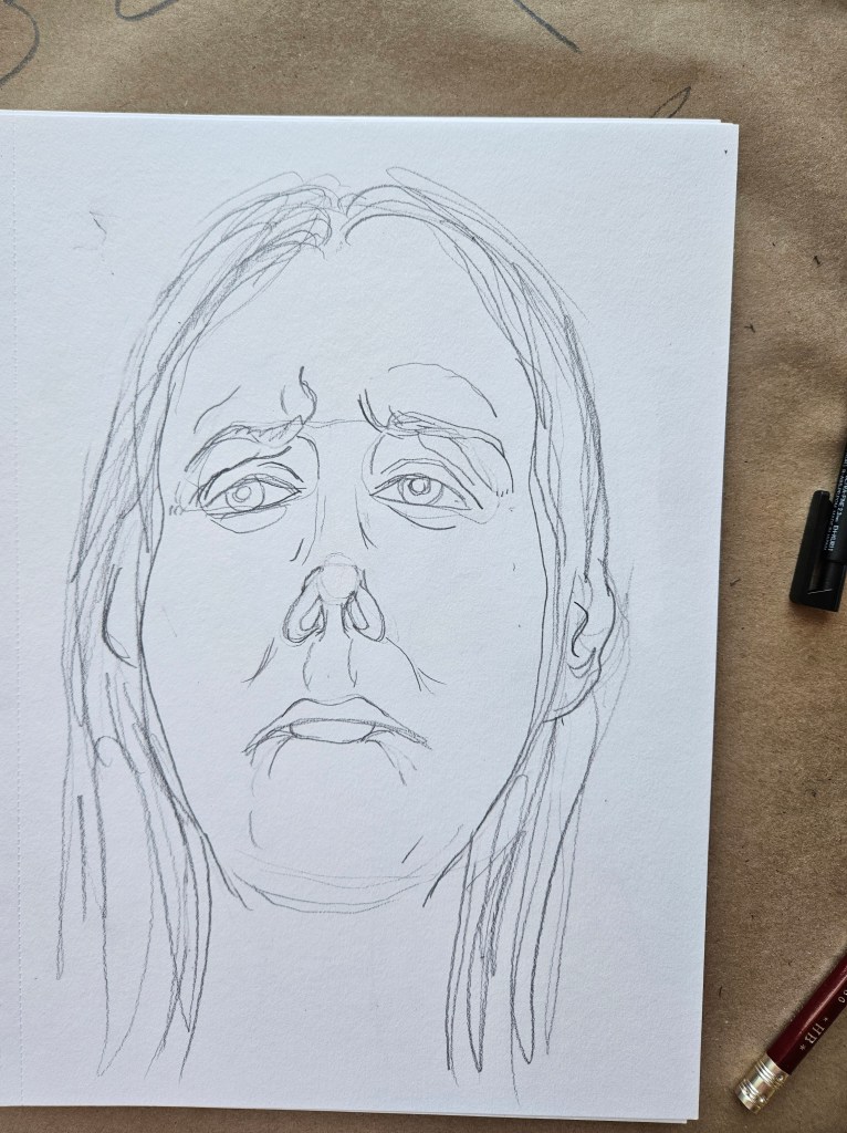
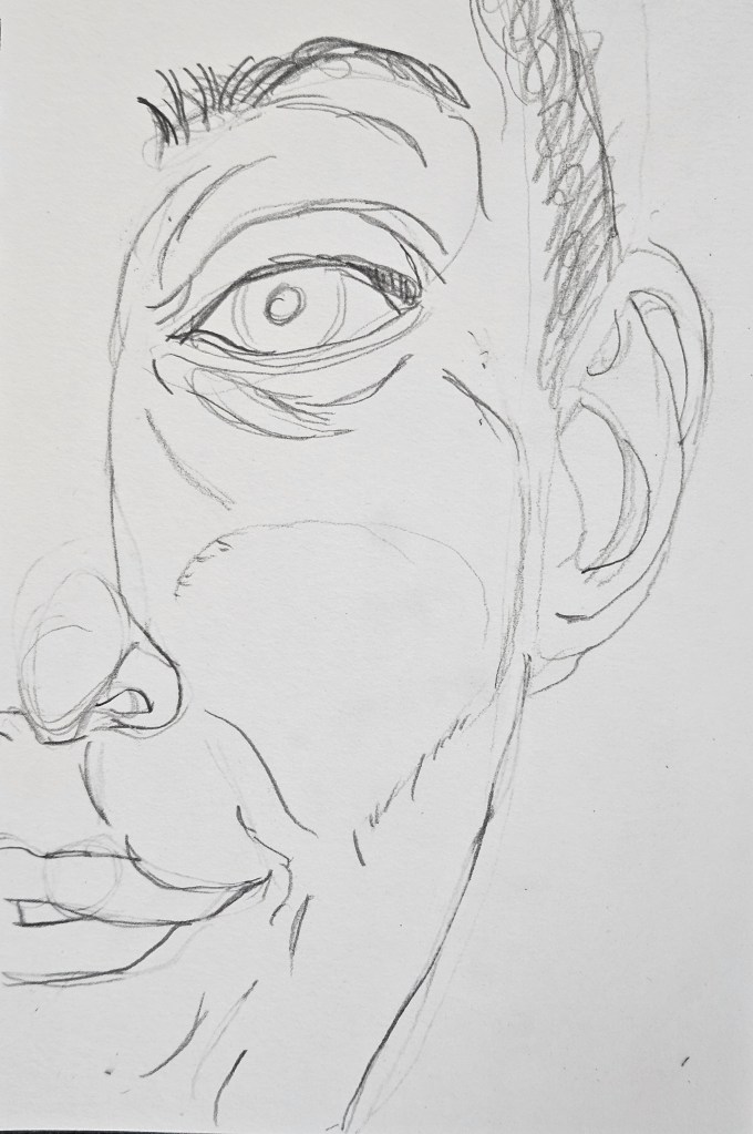
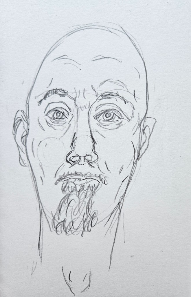
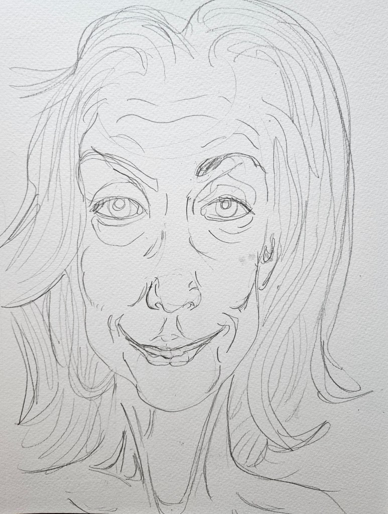
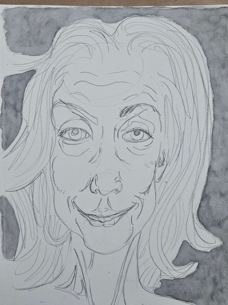
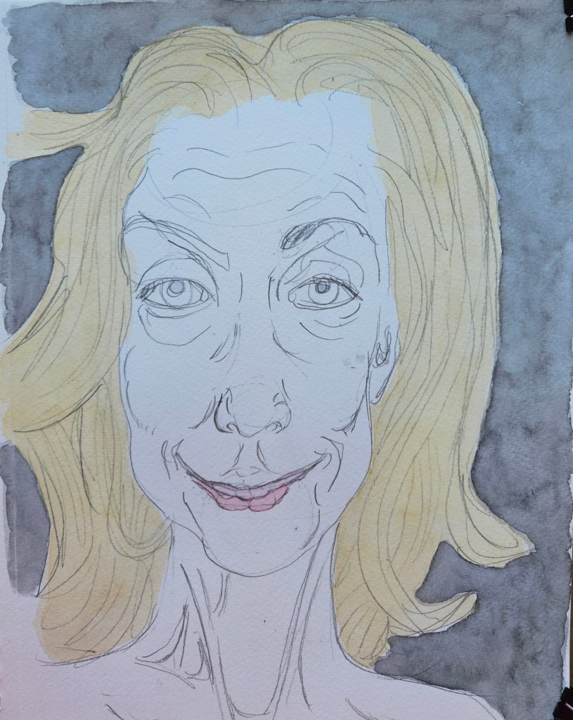
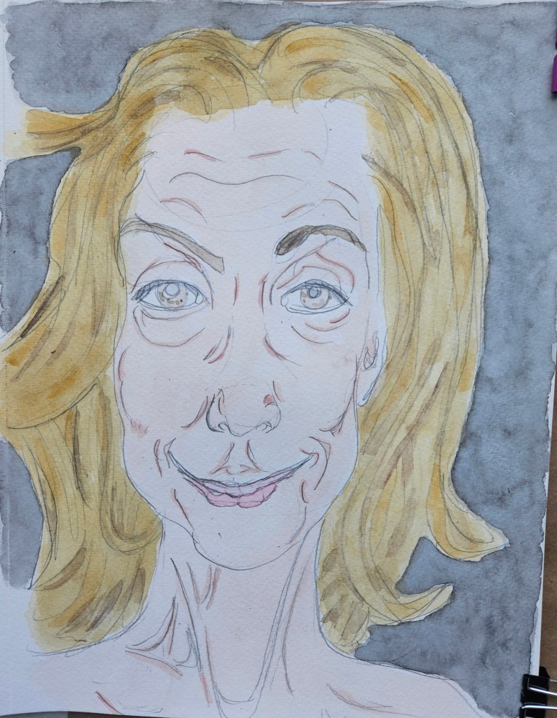
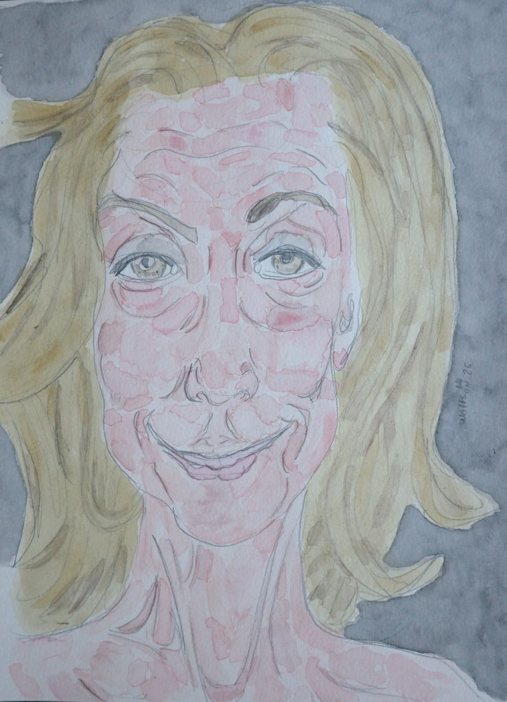
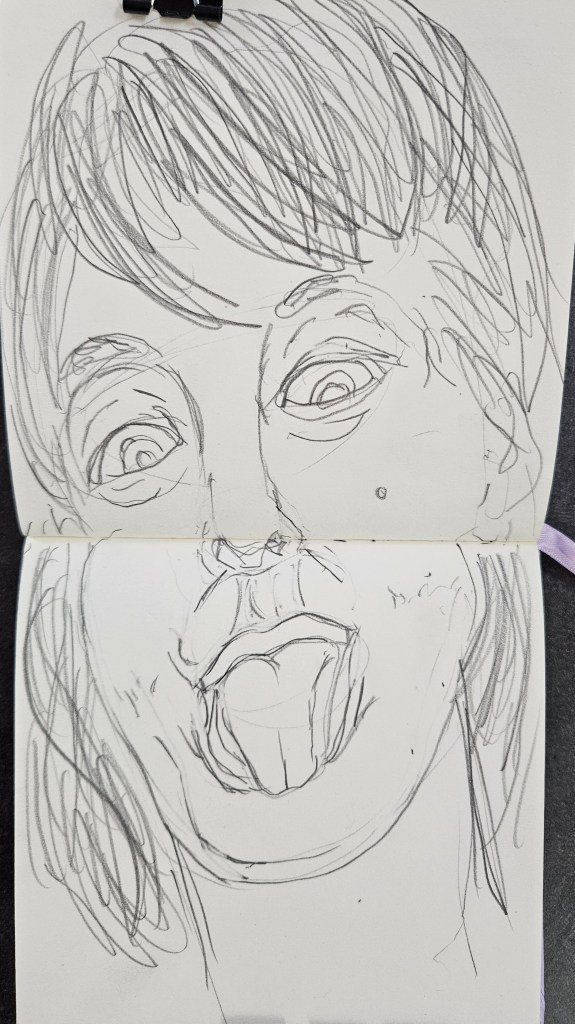
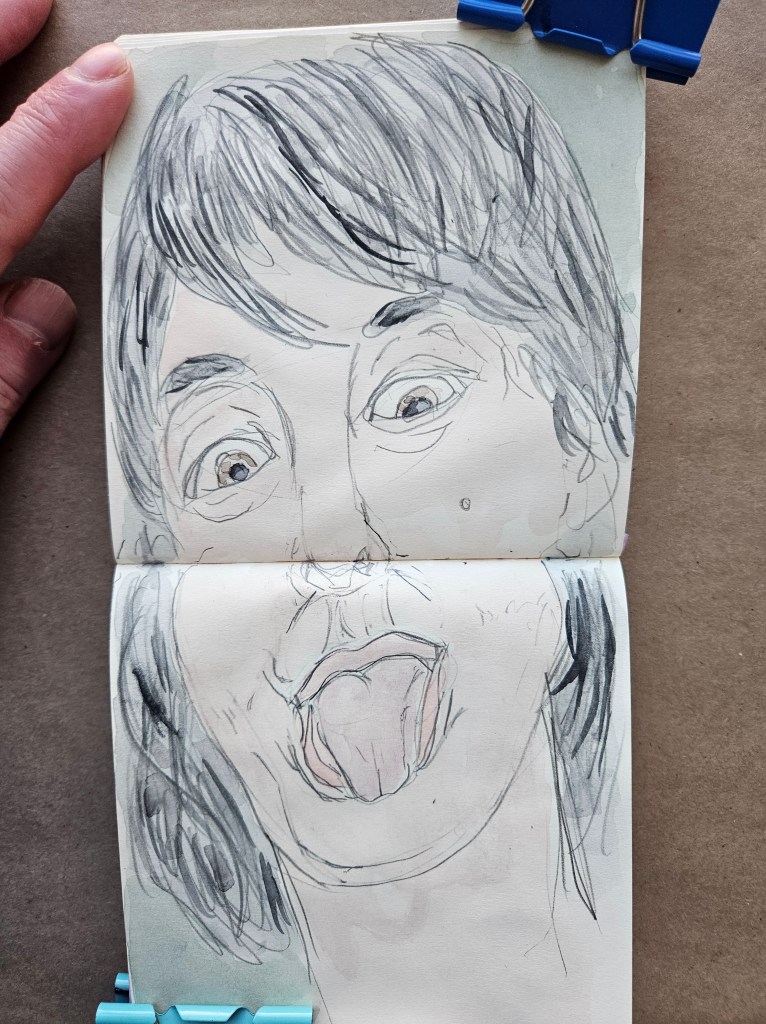
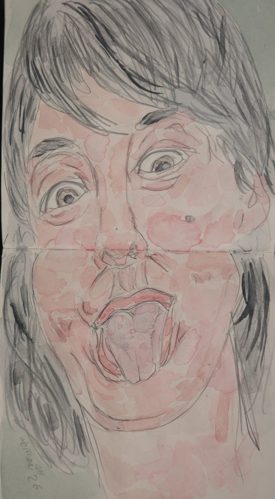
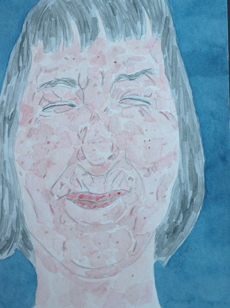
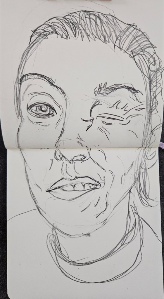
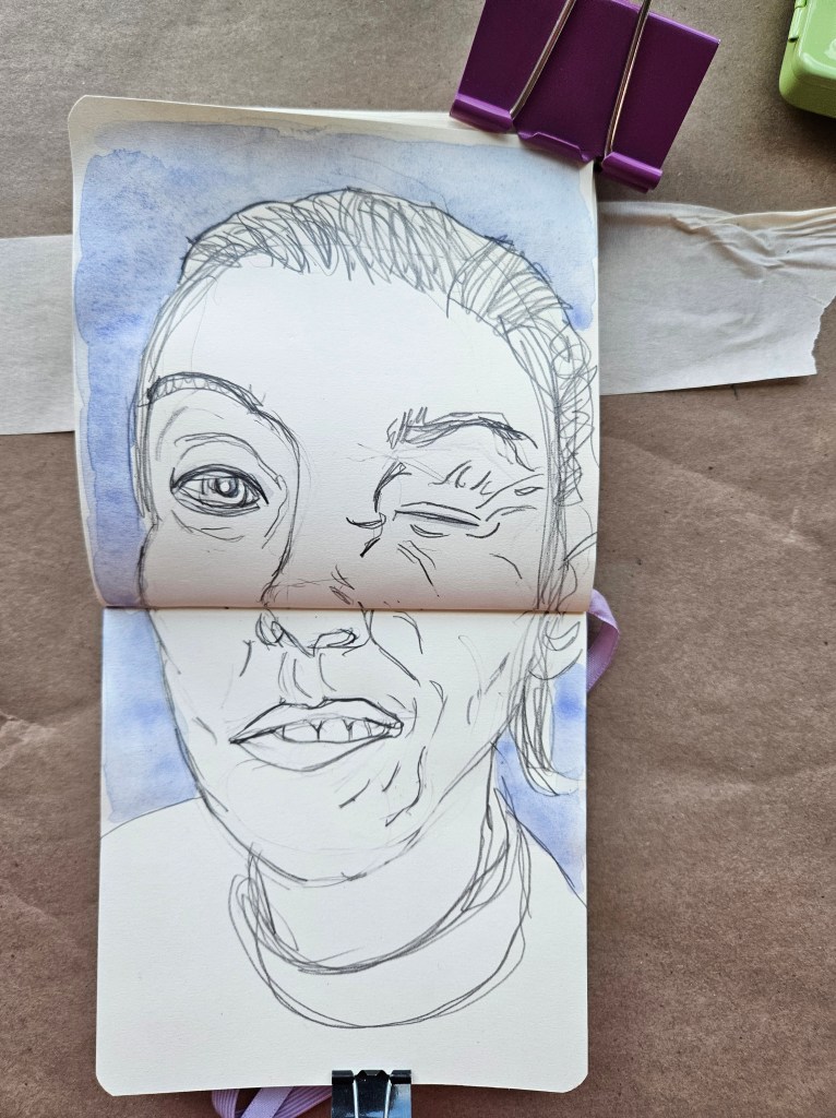
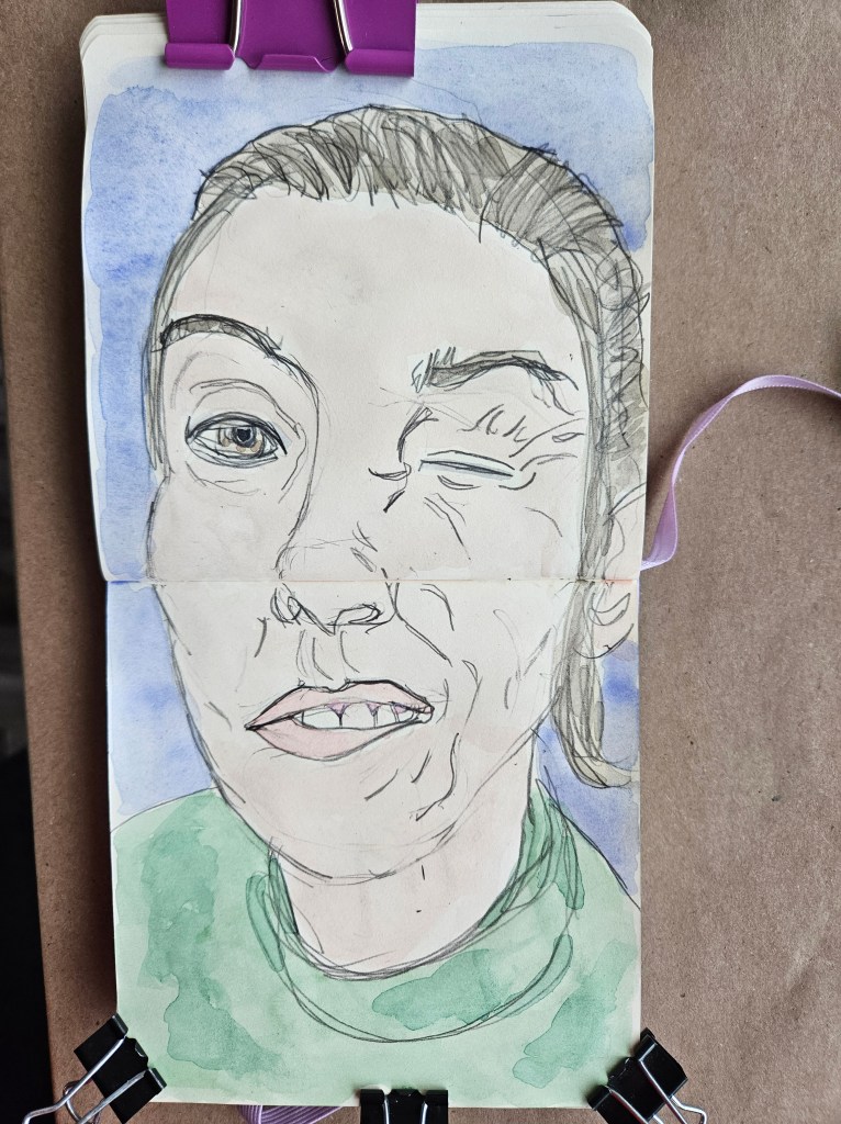
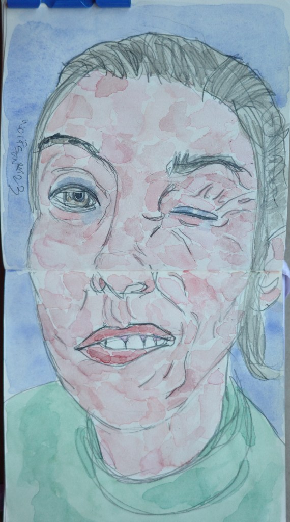
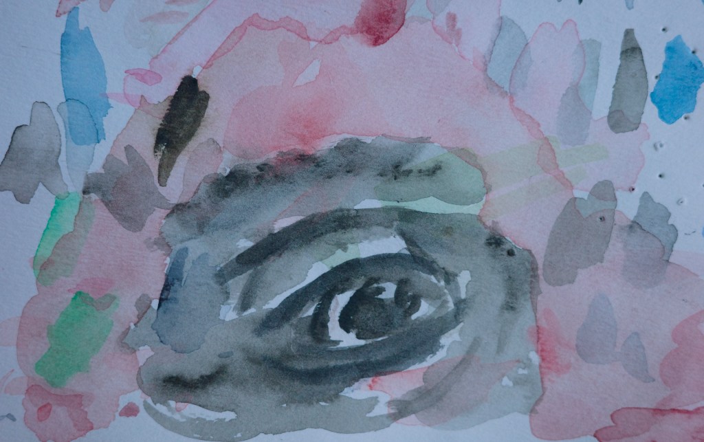
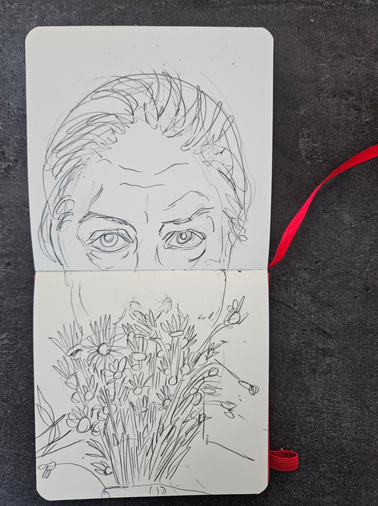
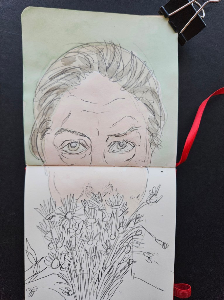
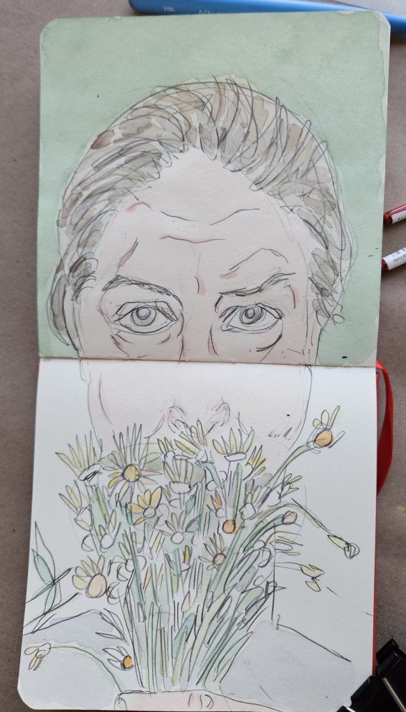
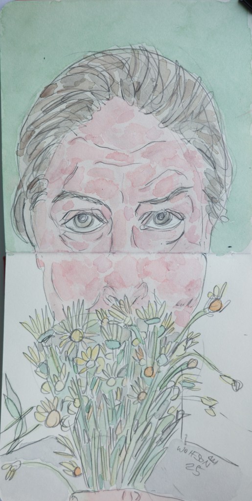
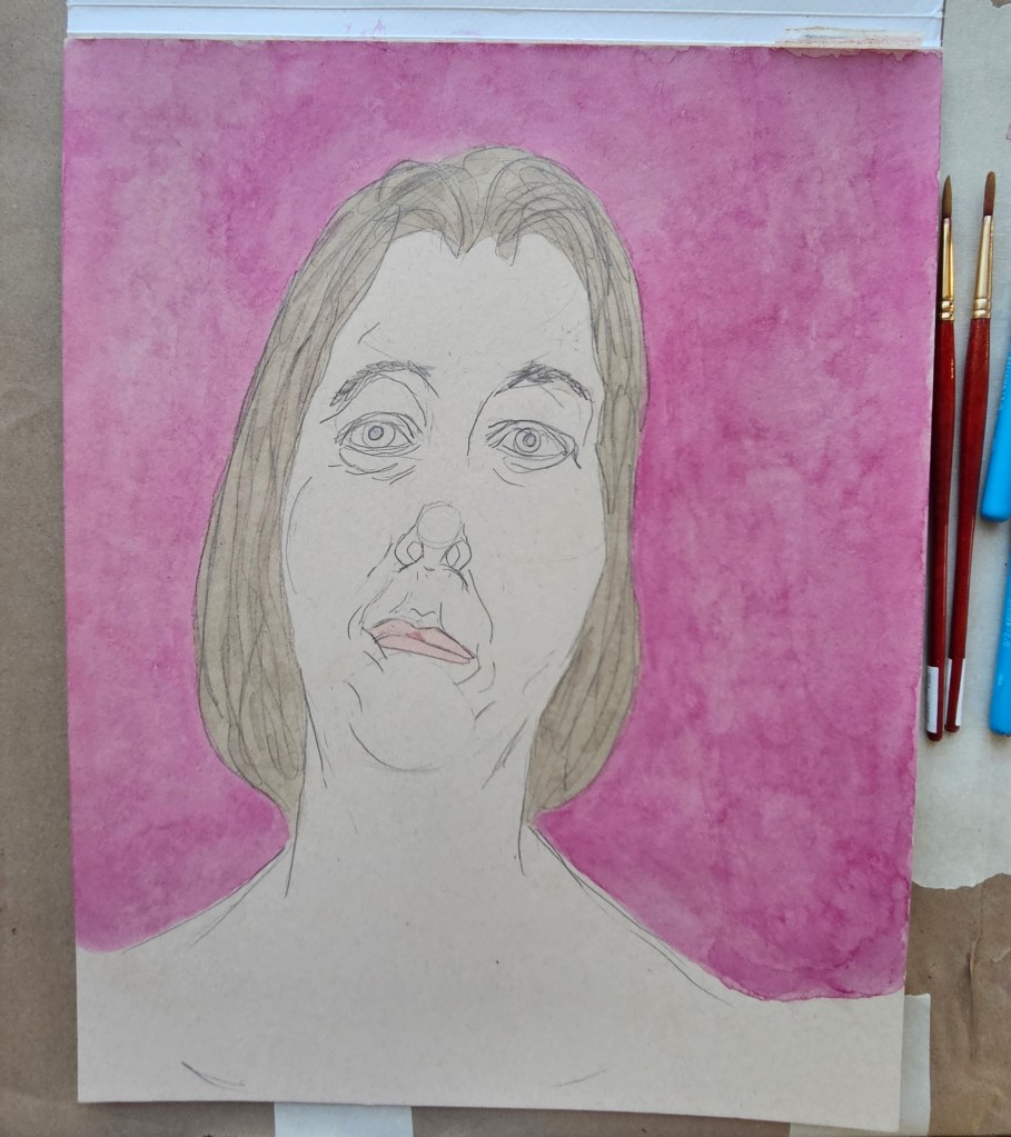
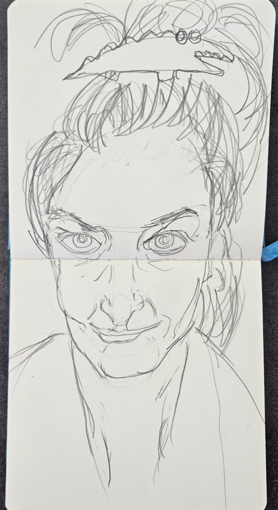
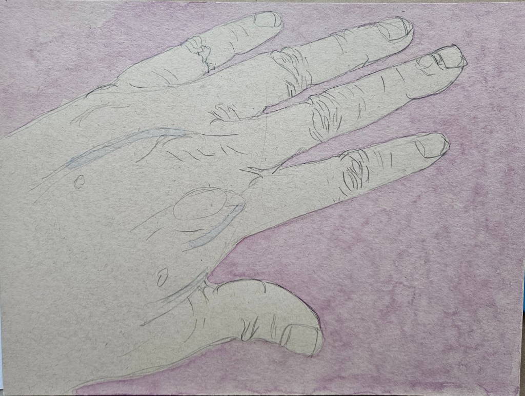
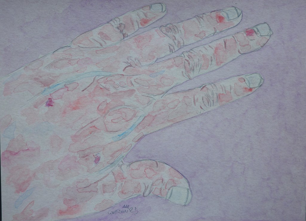
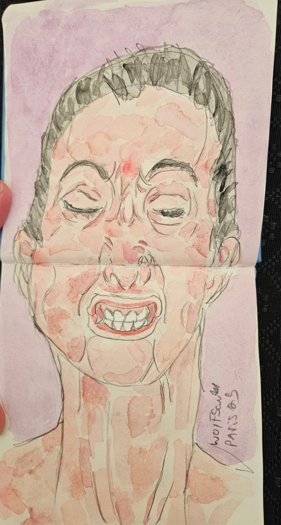
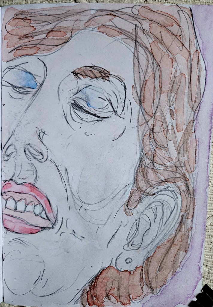
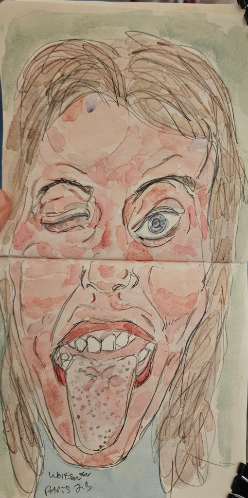
I want a voice, a style but to never lapse into mere mannerism. One way to avoid this is to constantly challenge myself, using different paper, different pens different sizes of paper and even switching between mediums. To some extent always be one part student, one part explorer

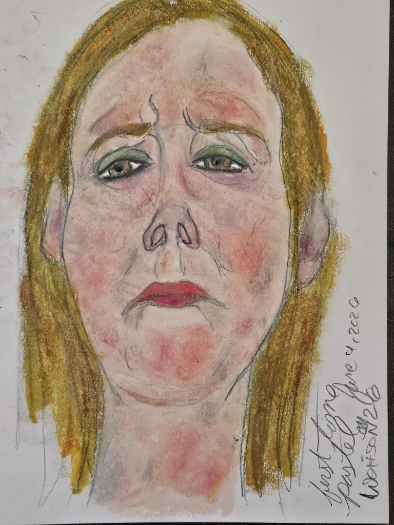
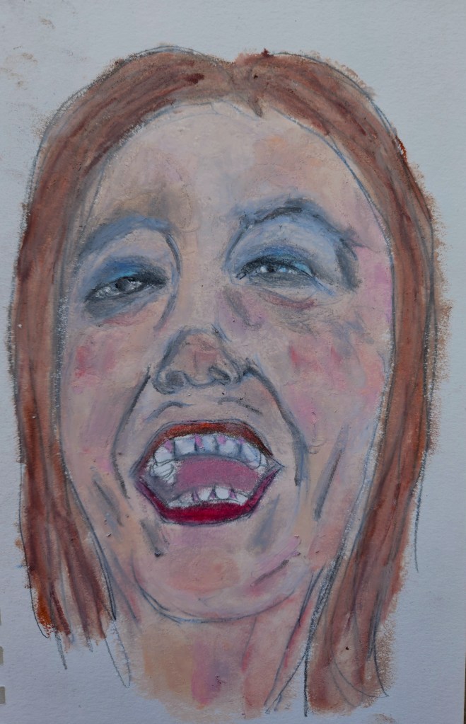
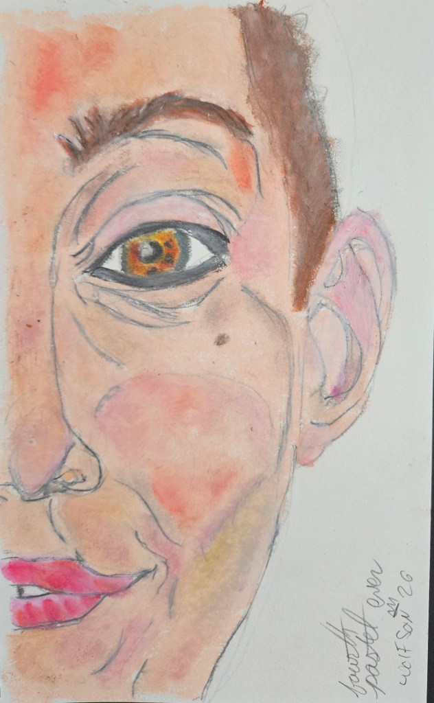
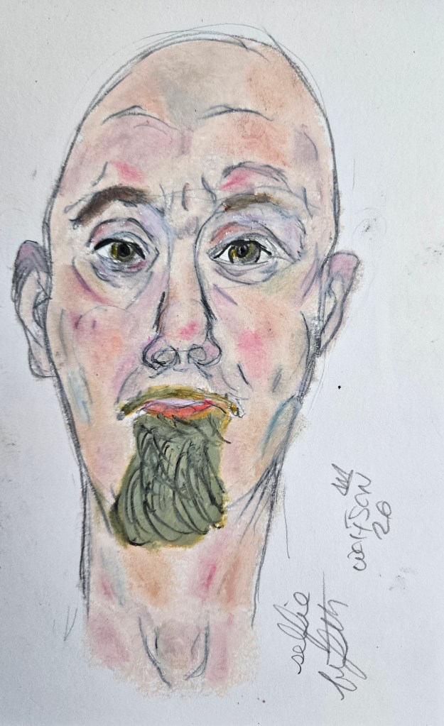
Randomly, I decided to try my hand at soft oil pastels. Like everything I do, i am self taught. I enjoyed the medium and right out of the gate got some of the effects which I had in mind. In two days I did five pieces, all 5×5 or 5×7 inches.

For any work, an artist’s voice i s ever present but medium does to some extent dictate the cadence. Miles had certain horns which he only used for ballads. I always see a piece done in specific medium before even starting. The pastels gave me an expressionistic density different from my painting and different from my lyra works. i like all the mediums and will continue to switch between them as to continue to evolve. I was pleased with the results but am also sure as I continue to use the pastels I will get even better.
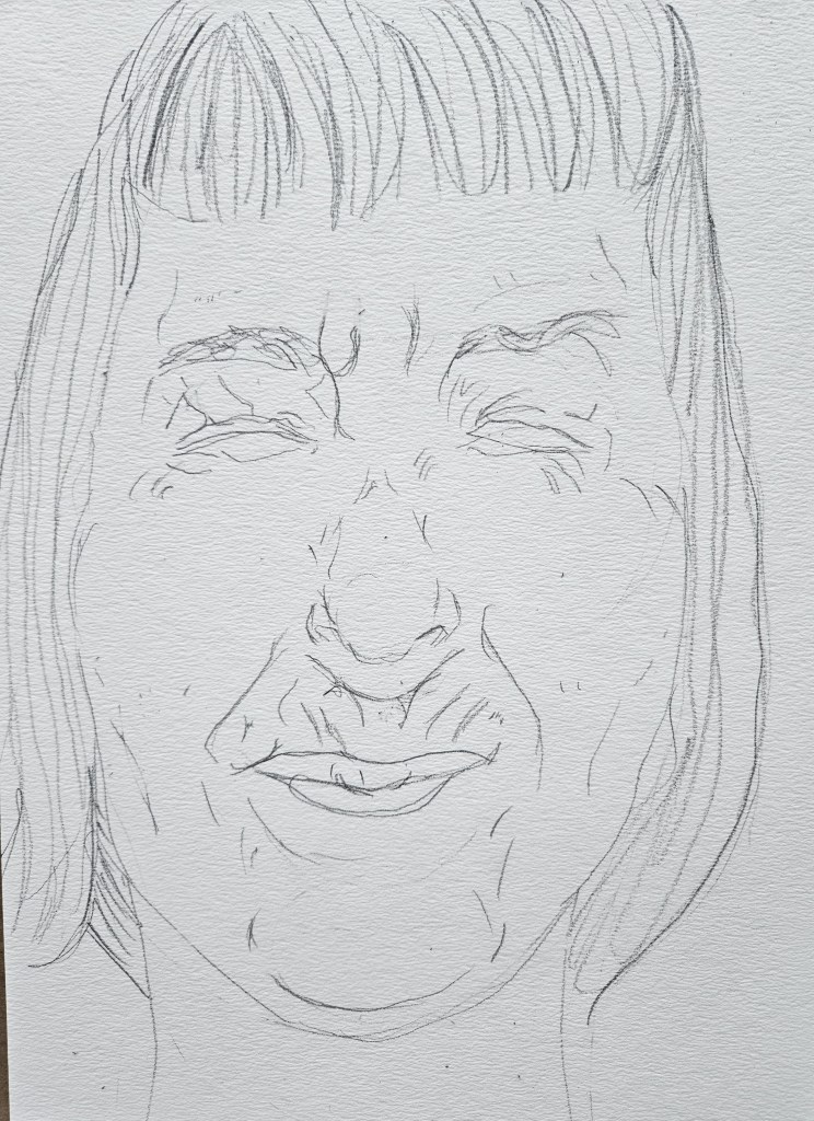
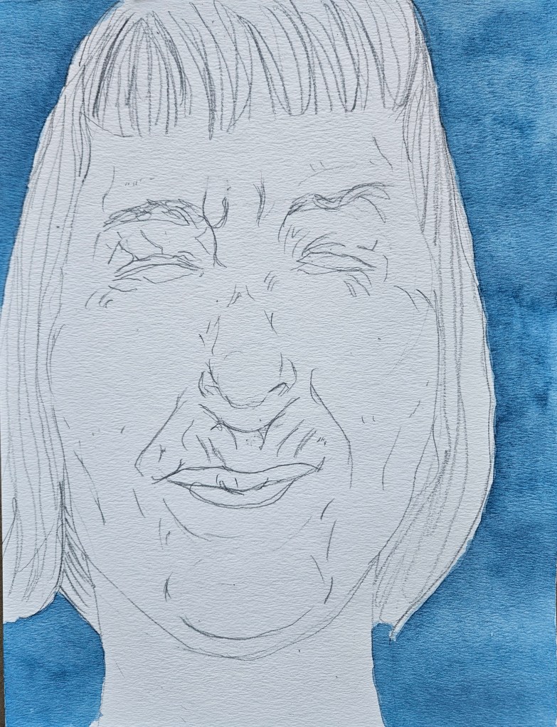
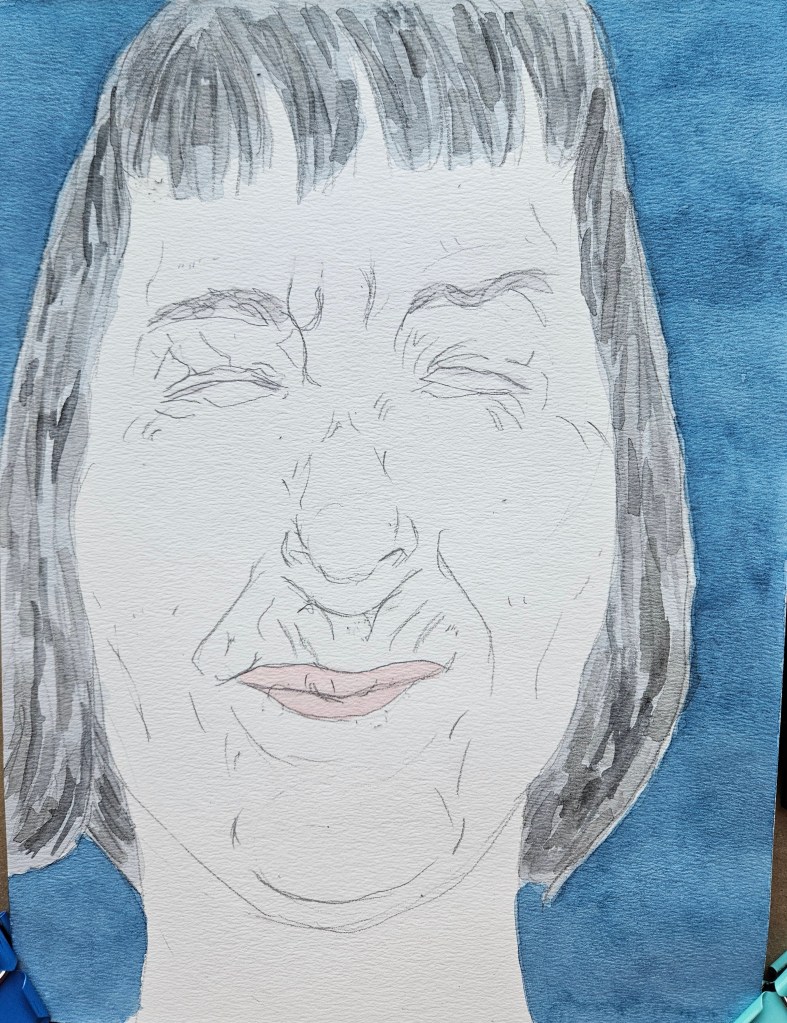
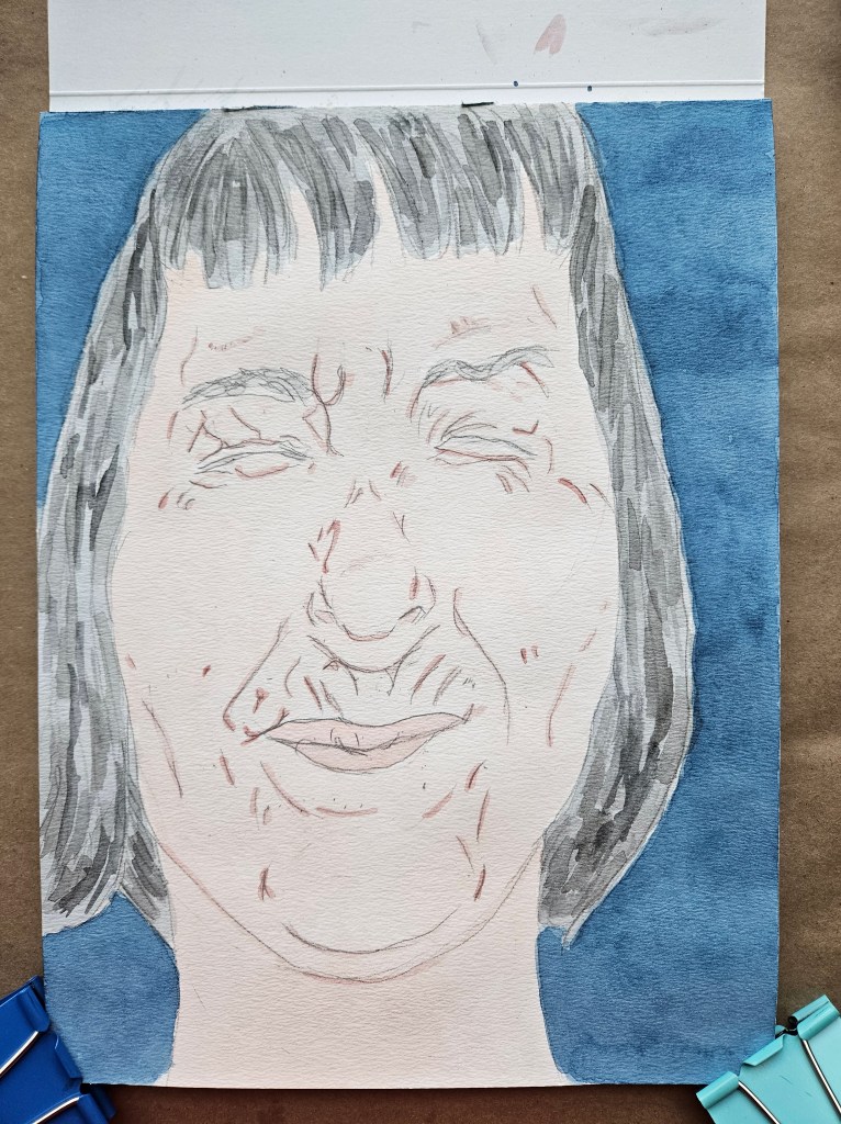
First

Two Songs About Two Women

I went through some of the tabourets in my studio, not that they were in any sort of major disarray. It was more a tightening up of the organization and despite how much I shake things up as to remain limber in using different types of paper I knew there were some pads which lay in the drawers forgotten about.

After the brief time it took to reorganize, randomly I grabbed a pad. A 9×12 which is not a size I often use and which looked squatter than its measurements. Foer both pieces I used my usual studio set up of half pan paints.

NH 9×12 Watercolor & Paper

Mumbai. (She was also from Mumbai but did not merely play at being a DJ & good person.) Talen Art Creations Multi Media pocket Pad 4×4 inches

Advice to artists you prob. don’t want to hear:

Any artist, especially one just starting out on their journey wants validation. To have someone who is not a friend nor family accept a work provides sort of boost. It assuages the doubt that one will be able to “make it” as an artist and also provides a safety barrier from the naysayers.

However, there are a lot of online journals and blogs out there which simply look terrible. Artists still place their works on them as it is a sort of validation. This always surprises me. An online journal/blog which looks terrible is akin to going into a restaurant which has a bad smell.

An insult to injury is the new trend of a lot of these wanting a submissions fee or asking to “buy me a koffi”. You would be better served just doing your own thing under your own power. Often the fee is explained as you are paying for the venues bandwidth or maybe the editor’s time in choosing who will appear. The reality of this is you are paying for validation, the venue’s money is made from the fees collected. You are paying for the “honor” of temporarily working for the venue.

Do your own thing. It may not feel as good or exciting for the ego but most of these online journals no one has heard of anyways and the decisions makers behind them often have no or little foundation.

There are some good journals to be found out there still, they are not all crap just dont depend upon them for validation.

Furious Pure is good, editors who are articulate and serious and diverse talent too. (disclaimer I was featured in issue 8 but I will continue to read each new issue)

A Couple of Songs

Still in edit mode for novel. Did two paintings in-between all the rain,

Pebs 9×12 inches Rembrandt cold pressed fine grain

Gum I used my ever present Talen Art Creations Multi Media pocket Pad 4×4 inches

Bonus: Was cleaning my brushes and did a loose scrap paper Self Portrait with built up paint.

Promise / Flowers

An amazingly busy but rewarding week. I decided to do two small paintings. My paint set up in the studio is now a mix of several companies professionally rated half pans.

Once one is at a certain point quality wise, it becomes a matter of preference which is dictated by the artist’s style but also the inherent properties of the equipment. In explaining this concept to a fellow jazz-head I gave the analogy that it is the equivalent of Miles and his horns. No matter what he played on, his distinctive voice was ever present. However, he did have certain horns he used for ballads, for cookers et al. In this way it is a collaborative effort between artist in equipment. So it is with the various papers and the set up of watercolor half pans I utilize.

Both these pieces are done on Talen Art Creations Multi Media pocket Pad 4×4 inches

Annabeth / Croc Clip

Just in time to once again hit the road, I have now integrated the new paints which I had been trying out permanently into my studio & travel palettes.

Of course I have note added all of them but that is just matter of color preferences in what I use for my work. I have found that once a thing, be it whisky, paint et al is of a certain quality it is not a matter of which is better but more personal preference.

Certain brand’s colors are better for specific things than others i.e one brand’s red or pink better for base coats in showing skin while another better for showing bruises, capillaries et al.

Now that I know the new paints, i have started experimenting with them on all different types of paper.

Annabeth first time using tan paper w/my new set up. Strathmore Toned Tan Mixed Media Paper 11×14 184 lbs

Croc Clip Talen Art Creations Multi Media pocket Pad 4×4 inches

If interested in what comprises my new paints see previous four posts which give details

The Pugilist (selfie)

I decided to break things up a little and use different paper for this piece. It is 11×17 Tan multi-media paper. I was very pleased with the results.

The Pugilist (selfie) 11×17 Tan paper & watercolors

Paris Painter II

The lighting in my new studio is different, but I feel I have a handle on it now. I am well into the swing of things. I’ve mostly been using my semi new to me pocket pad for painting. Drawings been spread out all kinds of paper. 4×4 inches

I discovered a new to me paint company. They have been around since 1830. Among many greats, Matisse and Renoir got their watercolors from them. They remain very artisan. Just looking at the paints you see the difference in pigments. They also have proprietary colors.

paints are not paints, each hue has its own distinct properties and then this varies even more from company to company.

Not knowing if I would like them, I just bought five to try. This is why on my first piece skin doesn’t have volume & mass I usually achieve. I instantly liked the paint, it handles diff than anything else I have used. Decided to go all out, new 5×7 paper, new paint.

Maestro. One my fave statues in all of Paris.

Birthday

I have noticed lately that there are a lot of museum shows & installations “walk through a van Gough painting” type of things using projections and other tech. I am sure this will attract revenue. For anything which is lazy, bad or dare I say plebeian, there are intelligent people out there ready to supply articulation as to justify it. The gimmick as (art) museum show; “This will attract those who don’t usually go to museums.” It is not so much bringing culture to those who normally would not bother but rather a transmutation of it into something akin to the latest block buster movie.

The problem with this is that it makes the artist/work besides the point. It is spectacle as focus and not artist work/intent. The deeper problems with this, as it is many people can not stand in line to get their coffee without keeping their head bent down in their phones as to be blasted by digi-sensations as to distract them from their five minute wait. A Picasso-laser show type thing is further contributing to a complete lack of the public’s ability to “merely” stand and look at a work of art. All art regardless of era and medium has a component of contemplation to it. We are perhaps a few years away from people going to one of the great museums of the world, standing in front of an immortal piece; a Renoir, a Velazquez et al impatiently waiting for the razzle-dazzle to begin.

When reading about art, depending upon where you live, there is a lack of the ability to go out and actually see the painting or works by a specific artist. The internet is good to look something up and get the gist of it, but it can not compete with the real thing. There is a difference. Looking at works mainly online, going to mutli media mutations of an artist’s work have changed what looks “right” or “good” to a modern art audience. They do not want to see brush strokes or other evidence of an artist’s hands which are a part of their voice. A smooth machine like perfection as encountered online, on postcards is what is now preferred.

One could imagine Soutine talking to a gallery owner or museum director and being told “Don’t worry, we will smooth down the rough edges digitally…”

You can’t fight progress nor the populist bent but merely offer an alternative for this willing to explore. The ability to portray flesh in all its beautiful imperfections is something I will never tire of.

“Birthday” watercolor on tan paper 11×14