Cinefield® Go,Baby Go

My collage work in a very short amount of time became part of who I am. I lamented the fact that for longer trips/residencies I would not be able to do them. I began to investigate ways to perhaps make it happen.

The easiest thing would be to just use magazines/newspapers from wherever I was. This didn’t appeal to me as I have always prided myself on only using images from photos which I personally took. I researched pocket printers.

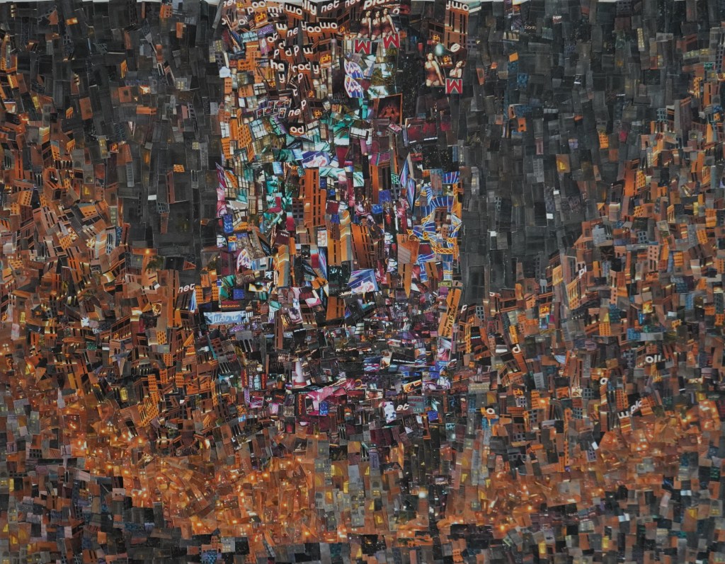
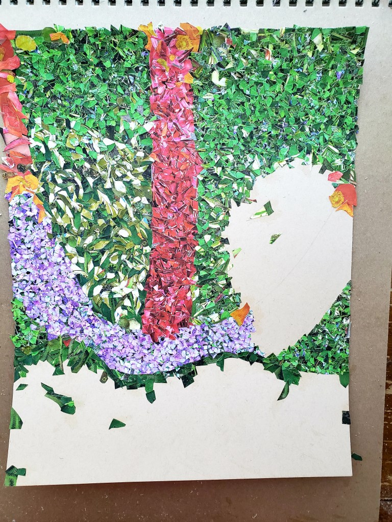
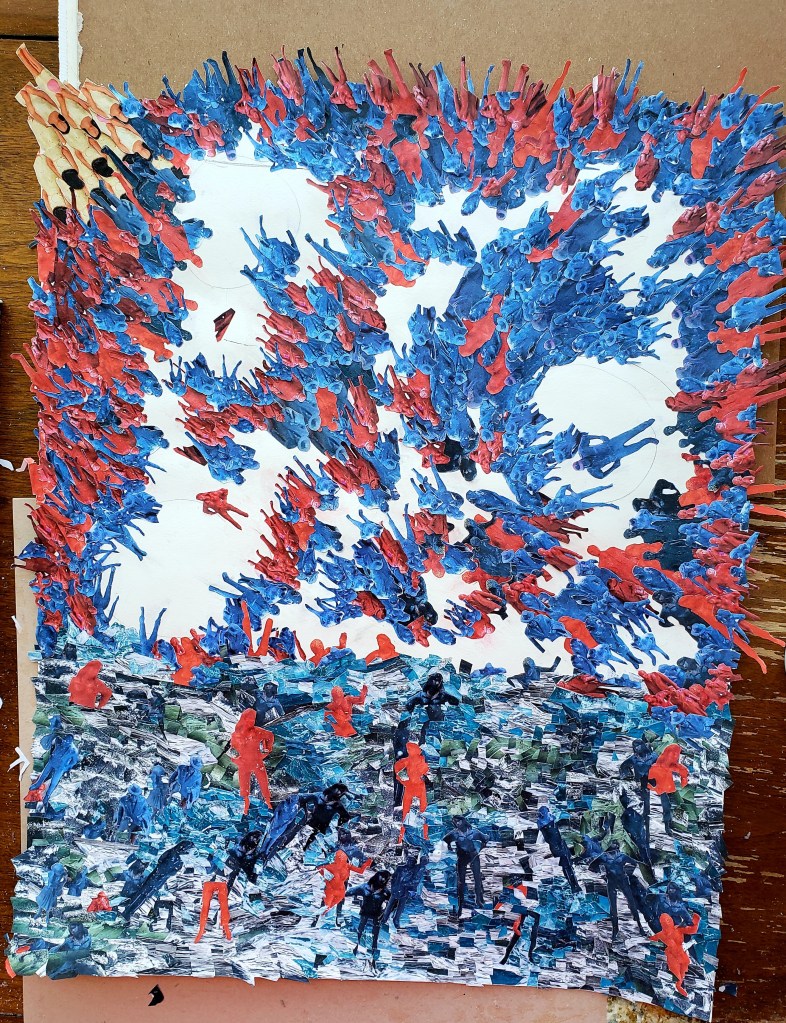
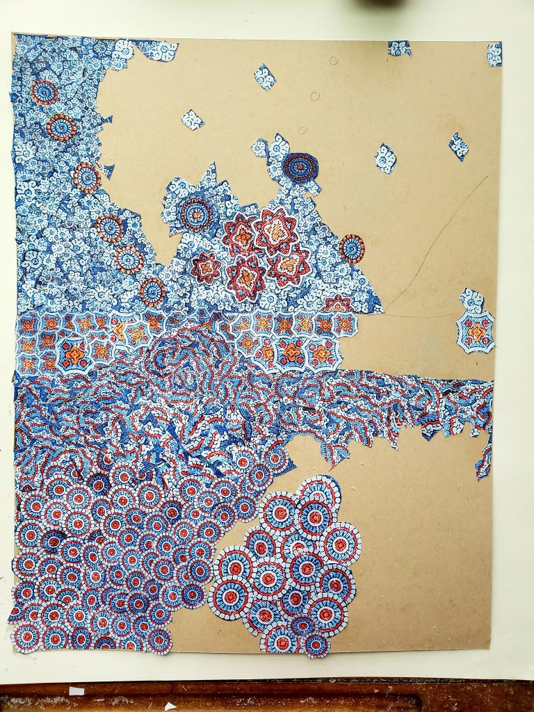
My Cinefield® are very time consuming and how to get the images aside, I had already had it in my head that were I able to do them on the road I would go far smaller as it would render a trip pointless were I to spend entire time alone in studio working on a piece. I also have other creative things that I want to do while on the road and the way my normal Cinefield® are made would have eliminated that possibility.

Another practical aspect of going smaller is that all the pocket printers I was finding seemed to utilize types of film. I did not want the raw materials to become cost prohibitive in constructing them.

For obvious reasons it was important that the photos not be laminated which eliminated many of the choices.

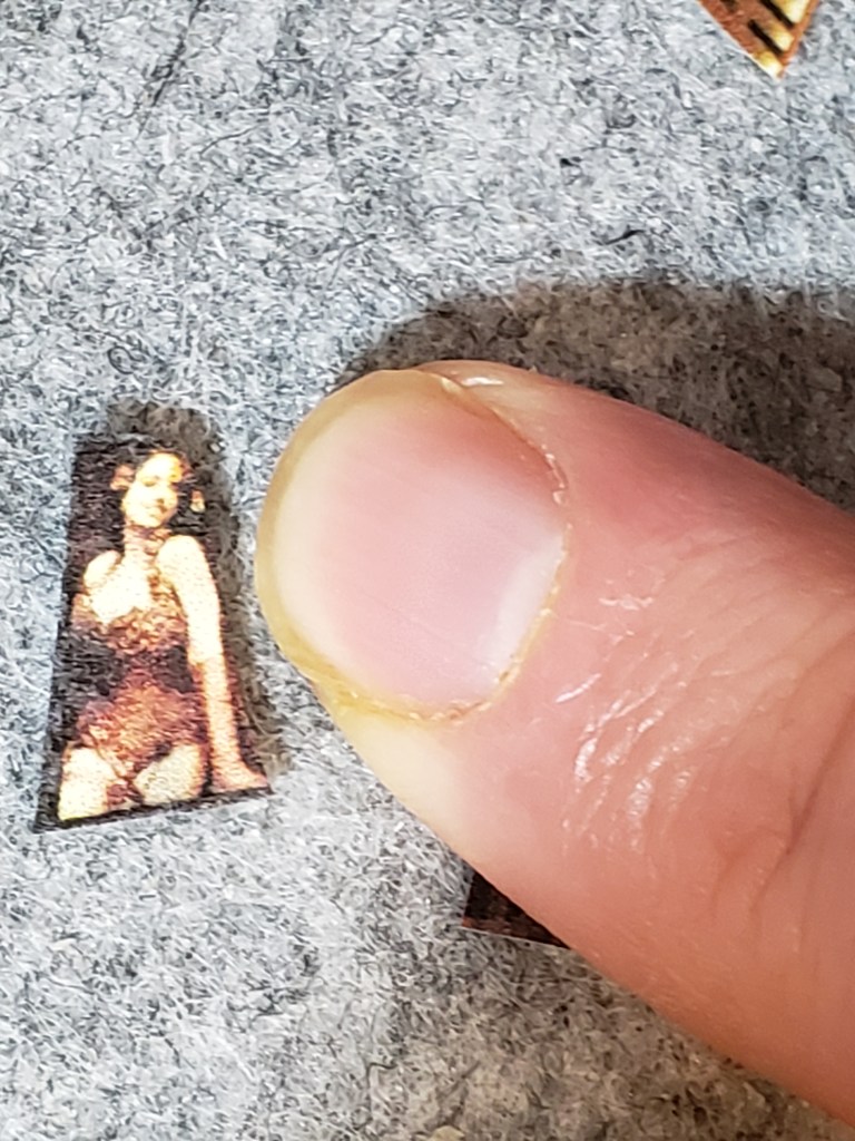
I found a device which literally fits in jacket pocket and feels solidly built. It connects to phone via blue-tooth which allows me to use any/all my own photos. The film is not exorbitantly priced although I will stick to my normal paper when not on the road.

My in general goal for doing pieces on road is small in size and utilizing no more than one packet of film per piece. Time wise, no more than two days working on it as this will allow me to also paint, write and absorb wherever I am in the world still.

The small size allows me to also do other things for the hour or so at a time that I am pressing a piece (basically laying heavy books atop it to get rid bubbles).

The film required a completely different touch and technique. In general I have only done several smaller pieces. Surprisingly, they are harder to do than normal size. There is less room to create rhythm/tension & release. What were already small piece often need to be made even smaller.

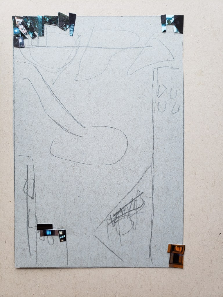
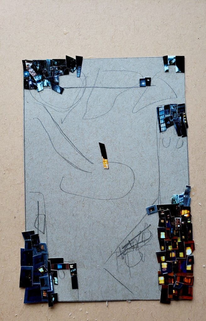
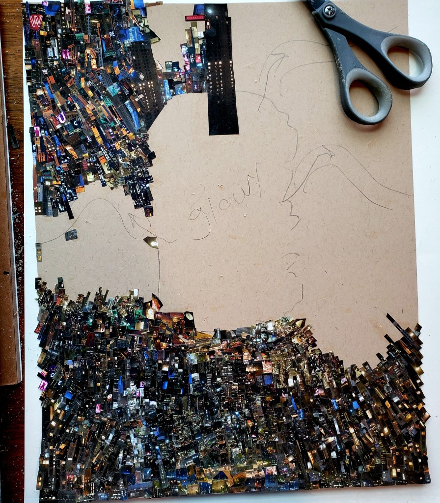
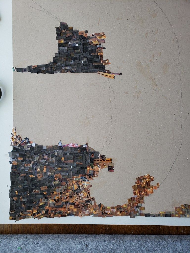
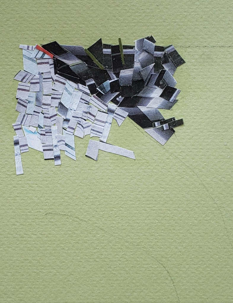
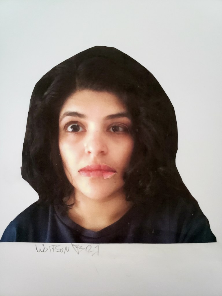
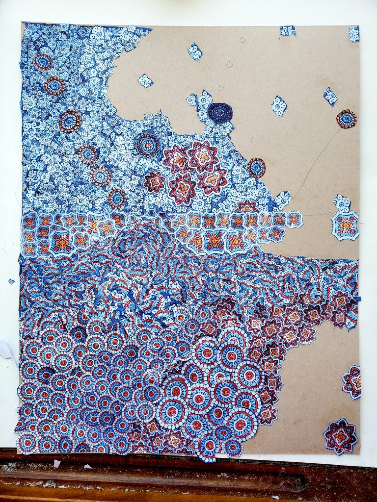
This is my first piece using the pocket printer. As always, it’s only images from photos which I took utilizing my trusty scissors and adhesive applied via brush.

It is 4×5 inches. surprisingly, it only took seven photos (the photos for pocket printer are about the size of a business card) I did it in two days. I was pleased with result and the fact that I pretty much met all the “rules” I had in mind.

addendum:

The news is bleak. The internet is fertile grounds for scams masquerading as charities or people who want to help. A hero of mine, José Andrés has a charity whose goal is to feed those in need. It eschews any politics for the basic notion that you can change the world by feeding everybody. This charity is not solely concerned with the Ukraine, although they are boots on the ground there now. Over the past few years, wherever there have been natural disasters he and his colleagues could be found trying to help out via feeding those who are hungry for whatever the reason.

I recommend to all to at least take a look at their site as it’s worthwhile.

https://wck.org/

“Cinefield® Go,Baby Go” 4×5 inches

Cinefield® – Where the Sauce is Deluxe

Throughout my oeuvre, emotion is my ultimate goal. I want the viewer to feel something. Music is my main source of inspiration regardless of subject matter or even medium.

I have pretty big ears, never restricting myself to one genre nor era.

Although I lean towards jazz & classical I do have some categorization defying things in heavy rotation too. Things like Kruder & Dorfmeister, Kina Rao and Funki Porcini.

Funki Porcini is an absolute favorite to whom I have listened to for years. His music encapsulates various moods. In lieu of one sonic voice ever present on every album which can lead to a feeling of heard one heard them all, he offers up instead, technique which he uses to great effect to create dense dreamlike works.

My Cinefield® vary, from cityscapes to floral explosions to abstracted colors and shapes. The commonality being their density and dreamlike quality.

I now have the pleasure of one of my Cinefield®  being used as a cover for the forthcoming full length album by Funki Porcini. Both share the same title. As is always the case with my Cinefield®all the images I used were from photos which I personally took. There is no digital magic, just my trusty scissors, I applied adhesive with a brush. One difference in my methodology was in only listening to a specific soundtrack comprised of a pile of albums including the new one and a few other favorite of his as I worked. The piece is 11×14 inches.

I will put up details on where the album is available once its out.

Cinefield® – Where the Sauce is Deluxe 11×14

There is a special multi-night gig associated with this going on:

We will be doing the album launch with the Laserium at commonground in Coventry, four nights 28-31st January.

Tickets HERE

1/29/22 The album is now out and available via all the usual digital platforms (amazon, bandcamp et al) bandcamp link:

https://funkiporcini.bandcamp.com/album/where-the-sauce-is-deluxe

These are not the small trusty scissors but the cut last minute chad ones


Cinefield® Tiny Annie Two Trips

After finishing my last Cinefield® I started a painting. Weather conspired against me with heavy fog & rain. As they do not require same light situations, I switched to doing another Cinefield®. I wanted to make this one look painterly, a further evolution of chops & (artistic) mission.

It proved to be a labor intensive piece. At 11×14 it took me longer to do than some of my far larger pieces. As is always the case, I only used images from photos which I personally took, utilizing my trusty scissors and adhesive applied with a brush. There is no digital magic done after the fact. This is a personal favorite of mine, not just within my Cinefield® work but for my entire oeuvre.

This was by no means the smallest size of pieces I dealt with for this work

Cinefield®-Van Dyne Annulated

Once again, I sought to challenge myself with my Cinefield® as to avoid lapsing into mere mannerism. As with my last piece, I went with a limited color palette, in this case one reminiscent of some of the submariner greens Degas used. I also stuck to sea changing via my cutting, only one image.

I was pleased with the results. As is the case with all my work, I only use images which I personally took the photo(s) of. There is never any digital magic as I utilize the traditional method of my trusty scissors and adhesive applied with a brush.

Cinefield®-Van Dyne Annulated 9×12

CINEFIELD®- Bottle of Absinthe.

Artistic evolution is my constant mantra, with emotional resonance being my goal. I achieve if not both then at least the first by constantly challenging myself. I never want people to look at my work and after seeing a few pieces feel they have seen them all. Nor do I ever want to become the “…” guy in regards to what my voice is saying via images I use to do so.

Semi recently I started mixing it up with my Cinefield® works as I had previously been doing with my drawings & paintings.

The challenge I presented to myself this time was to use only one image and one of a limited color palette.

The initial wave of Pop art was portraying common objects or scenes, things which could easily be considered lowbrow of plebeian. It was not the objects portrayed which made a work Pop art, it was an ironic emotional detachment. Someone like Wayne Thiebaud often gets lumped in with the Pop artists for his wonderful paintings of cakes and other sweets. However there is painterly intent and definite emotion involved. He is not pop

He followed in tradition which started with the impressionists of showing objects that they encountered every day. Drinks and drinkers were often used as subject matter as cafes were de facto ‘offices” for artists and dealers.

Le Buver d’Absinthe (1859) by Edouard Manet

L’Absinthe (1876/6) by Edgar Degas

Buveur d’Absinthe (1901) by Pablo Picasso

Painted Bronze (Two Ale Cans) 1964 by Jasper Johns.

It occurred to me after I started my piece that I was working, a link in a long chain of artistic tradition. I had previously done flowers, faces and cityscapes and it was the novelty of subject which initially appealed to me though, not the tradition. Before anyone accuses me of pretension, I had gotten both a bottle of good whiskey and one of Absinthe for my birthday. I tried photographing the whisky bottle first but it was just a dark brown with no color variations, I next tried the Absinthe which worked better, this being my only impetus for using it.

I took three photos, not moving the bottle but standing in front of it, besides it and behind it. As is true with all my Cinefield® work, I only used photos that I personally took, working no digital magic. I used my trusty scissors and adhesive applies with a brush.

The work is 7×10. Soundtrack György Sándor playing Batrok’s Mikrokosmos books III-IV, kini Rao (various), Sun Ra Lanquidity.

Addendum: People are still under the impression that Absinthe was illegal either because of the wormwood or the high alcohol content. Neither of which was true. Some politicians in France had major interests in certain vineyards and importers/bottling concessions. Absinthe was cheaper and lasted longer so workers turned from wine to that. The outlawing of Absinthe was first and foremost a financial consideration.

Crooks on Tape

I have been a fan of the music of John Schmersal since his days in Brainiac. Each of his subsequent bands has been different, the commonality being his ability to be genre defying, throwing whatever he enjoys into the mix.

He revisits one of the bands which also features Joey Galvan (drums) and Rick Lee (samples & sounds) both of whom possess equally cool musical pedigrees.

They just released a limited edition ep Prime Time / More Dismay on Blind Rage Records which features special guest star DANNY RAY THOMPSON from Sun-Ra on baritone sax.

It is a special picture disk. I had pleasure of doing the front & back cover plus the actual image on the disc all, of which are from my CINEFIELDS®

CINEFIELD® Return

After a year plus of sheltering in place, one of the first things I did when at liberty to go out again was to restart taking walks. In finding a positive from a negative, the little things now all seemed fresh, new & beautiful. The palms, ferns and other tropical plants which grow up out of the sidewalks looked fantastic to my thirsty eye. The tiny architectural flourishes to be found on various older buildings previously unnoticed, now interesting and meriting a stop to look.

I am in no huge rush to go back to bars or even restaurants. It is my now twice daily walks which have made me once again start to feel among the living. I went to the local farmers market, half a second of apprehension from now finding myself among so many people again. The flower merchants with their plastic buckets offering sprays of color.

It is beauty not merely seen on my computer monitor nor emerging from the end of my hand onto paper that lets me know that I am returning to life.

This piece is 11×14. As always is the case, all the images are from photos I personally took ( in this instance from walks in park and farmers market). There is no digital magic, just my trusty scissors and adhesive applied with a brush.

Cinefield® – Dante

I never want to repeat myself. There are some of my direct peers whose works I enjoy but after knowing them for a few years came the feeling that once you had seen a few of their pieces, you have seen it all. One way to sidestep this is by constantly mixing things up, leaving one’s comfort zone.

For myself, I do this by shaking up my methodology, intentionally putting aside things which I know will work procedurally or which I have done already a few times.

I always like to have my work possess a sort of open ended quality so that the viewer feels that there is a story within but it is up to each person to decide what it is.

This time I changed that up making a work which is intentionally programmatic.

The two books i return to time and again over the course of my life are Homer and Dante. I am far from the first artist in visual arts or letters to find inspiration within the pages of these two works. The appeal for all of us is that they offer so many possibilities of dramatic moments. And even two artists showing the same scene will present two completely different works.

I did not choose a specific scene from Dante. Instead, it is the idea of him following the shade of Virgil, seeing all the shades in their free falls on their way to the various rings.

I only used images for which i personally took the photos. The very bottom section is water rather than flames/lava. I felt that any kind of flame thing would be a little too on the nose, also i had not taken photos of any flames. As always, there is no digital magic. I just used my trusty scissors and adhesive applied with a brush.

Sheltering in place (still), I used whatever materials I had in hand. With all the figures, I got some cardboard, from packages delivered and constructed a little stage. I then painted it white. I painted each figure, applying different coats as to get color variations of darker and lighter blues and reds. I then took photos of the figures from various angles as to have it seem a myriad of different types of people rather than merely the five or six. Top views, side views etc, further create the effect of many types of people on their way to the deserved rings.

I always have a design in mind beforehand and primitively sketch it out. More often than not, as I am actually creating the piece, i tighten up the design. This piece originally had several clock faces from photos i took of the great clock at the Musée d’Orsay. I was going have a row dark blue versions of the girl seen in upper left corner as if the line were falling off top each clock to join all other shades. I was so pleased with the effect of depth and movement in the background of the vast crowd, i decided against it, feeling that it would detract.

The piece is 14×17

In the Eights: Six Sisters

I had been working on a large project and so knew doing a full scale Cinefield® was not possible. I get equal enjoyment from my ongoing “In the Eights” series. Their benefit being that they do not take up as much studio space and so I can do them at same time as something else.

For this series within the series, I had the pleasure of Kini Rao posing for me. She fully embraced my ethos of truth is beauty and her pieces are all the more stronger for it. No digital magic is used, just my trusty scissors and adhesive applied by brush. Each one is roughly 3×5

I am always considering new models for the series. If interested send me an email.

In the Eights: Six Sisters

Cinefield® – Bing-Bong

Over the course of the past year have adopted the rhythm of doing a  Cinefield® then a painting (while maintaining steady flow of nightly drawings & 8’s). At the start of a painting it rained for days off and on. I put it aside, the novelty of doing so being in itself of value for my creative process.

I started a new Cinefield® , the creation of which I do not need sunlight for.

Even though the shapes are lush and abstract, I wanted to see if I could achieve an open ended, open to interpretation sense of narrative.

“Bing-Bong” The piece is 11×14. As always all the images are from photos I personally took. There is no digital magic just my trusty scissors and adhesive applied by brush.