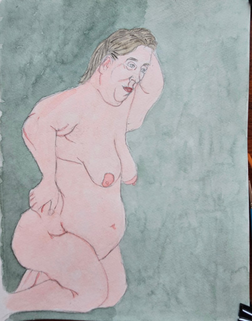
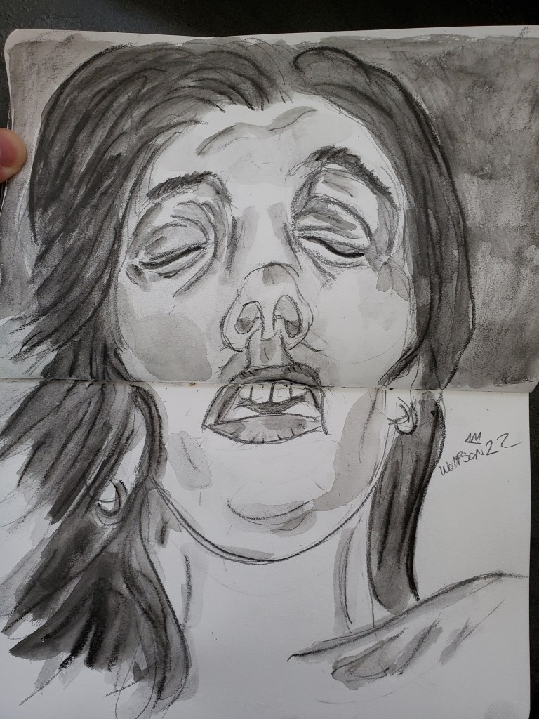
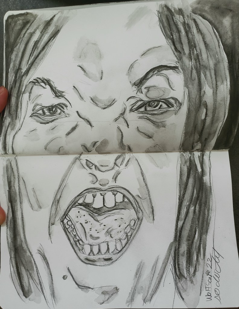
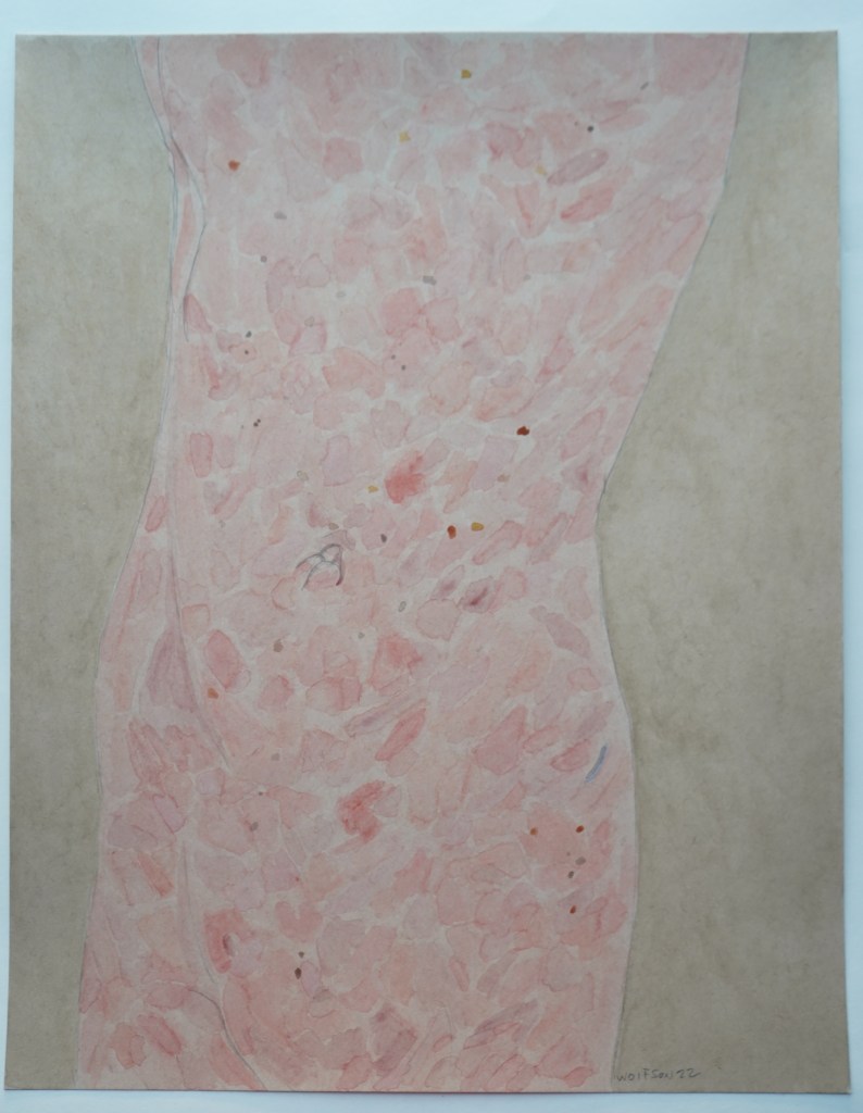
Among my greatest pleasures is to portray flesh with paint. It is not a salacious thing, it need not be a nude. I’ve done many hands and other body parts. I have done closeups on things so that they verge on abstractions, the viewer initially not knowing what they are looking at.
This is an aspect of painting which consistently keeps me engaged. The wonderment of it, one starts with a flat two dimensional square or rectangle. With pencil & brush you conjure up not only volume and mass but the suggestions of warmth as blood rushes to the surface in areas or through the veins. It is akin to a sort of magic trick and no matter how many times I do it, I still marvel at it.
I switch the types of paper I use as to avoid lapsing into mere mannerisms. With everything else that I do creatively, there are still times that certain types of paper or pencils fall to the wayside temporarily.
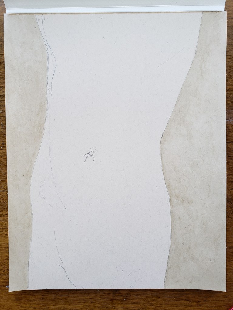
This piece is 9×12 and on a white paper which was main one I used to use most of the time. I have finally circled back to it once again. After such a long break, the one which had been the de rigueur found itself the new-thing challange.
I was very pleased with results.
L 9×12 Watercolor & Paper
I am always looking for interesting things to draw/paint. If you think you have something email me.
Unintentionally, my last three paintings form a cohesive series. The news continues to be bleak. It is the responsibility of all artists to do their thing. Not necessarily art with a message but putting forth things of beauty as a reminder that there are things out there bigger than ourselves. And more importantly, not everything need be connected to a “Us versus them” issue.
As I cool down on use of some of my other social media sites I had a revelation. Just because you disagree with someone or even if they are legitimately wrong, it’s often not worth yelling back. You are not going to change hearts and minds. Even if in the right, more often than not it is just adding to the cacophony, feeding the pervading negative zeitgeist.
All art regardless of medium is a way to look towards better days, here’s hoping I see you there.
There’s been much talk lately of the negative effect on teens body images via social media. I do not disagree with this. However, the internet has always had a tenuous grasp on reality. People of every age add filters to their face/body when posting photos, all kinds of other tweaks. Then there is the side-stand duckbill face, the de rigueur for an entire generation of women when doing selfies. Eventually. this pose and look will be viewed with same amusement as footage from bygone eras where men’s hair is overly brill creamed to the point of looking plastic.
To me, the truth has always been beautiful. The truth is unavoidable too. One can apply as many filters as are available but at some point you are going to have to go out in the real world as you really are. These things, the importance of trends et al, only have the power of the importance which we give them.
The beauty of truth is why I largely prefer to use subjects (friends et al) that I know for my work. The trust placed in me means that they can relax, eschewing any overly academic or glam poses. Even after all this time, one of my greatest pleasures is to portray flesh via paint. Sometimes, I still feel like the musician marveling at the notes that they are making.
Hello all. This is my first painting of ’23. It took me longer to do than usual on account of the weather. I finished it with only a day and half to spare before hitting the road.
I currently have a few projects going, including a unique sized CINEFIELD® from paper I cut down myself. It’s taking slightly longer than expected as I am trying several new things. Even with all going on, I still draw & woodshed every night.
Lyra graphite sticks have become a favorite medium. It allows for painterly effects and a touch not dissimilar to that of watercolor. I am into all the mediums which I use, but my favorite two are drawing and painting. The Lyra pieces combine aspects of both of these mediums.
This was a small piece of multi medium paper. It’s close up of Jimi Hendrix. I enjoyed doing an unorthodox compositional balance in 3×5 inches
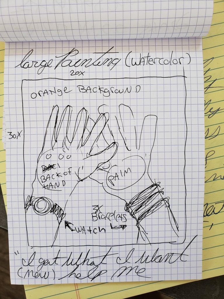
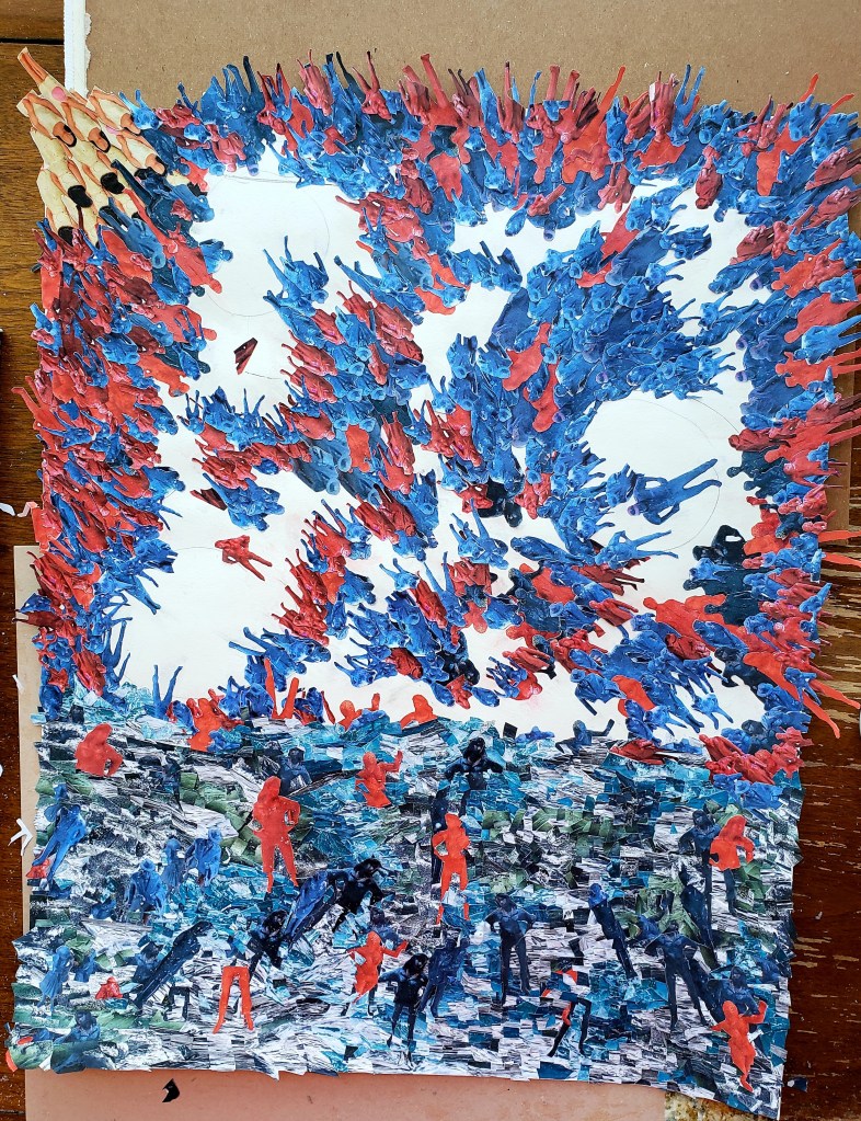
I do not often paint large pieces. There’s a completely different physicality involved. The way I have always worked, when I see a piece in my head before starting out, included in this vision/conception is its size. If I envision it small, it’s not merely a matter of using larger paper to make it big. I can only make a thing as I saw it in my head.
With Victory I saw it big.
I enjoy the challenge of leaving my comfort zone. Most of my paintings are 11×17, this one would be 20×30. I have a large wooden easel. It has heavy brass machinery. I pull on a loop below the ledge upon which the canvas sits to raise or lower it on the wooden axis. There is a wooden crossbar on the bottom which connects the two front legs of the large tripod.
While painting the lower section of the piece, I sit on a stool leaning forward. My feet rest on the crossbar. It feels as if I am on a ship, brush in hand. Seas calm, seas stormy, call me Ishmael.
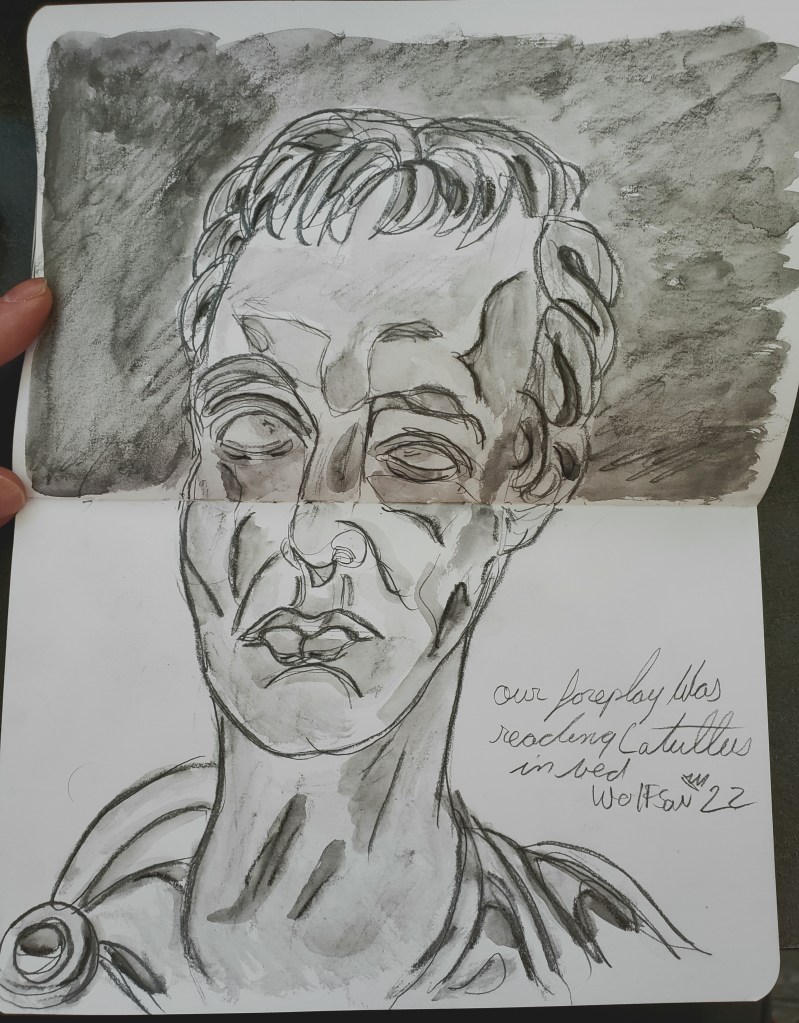
“You made me beautiful” she said upon seeing the finished piece.
It was, but I just painted what I saw. With all my portraiture I go for a sort of raw reportage. If I see it, it appears in the piece. I never airbrush out (so to speak) any imperfections nor do i exaggerate any by way of settling scores. To me, all truth is beauty.
I always want people to be able to return to a piece and see new things. This is why traditional beauty has always bored me. The little quirks and imperfections make it real, make it interesting. The organics of a piece is often helped by only using people I know as subject matter. The trust allows for natural body language and facial expressions. There are some great yet unknown painters out there whose work’s power is diminished by coming across as overly academic or all the cheesy glam poses. I don’t worry about the beauty aspect, but rather the realness.
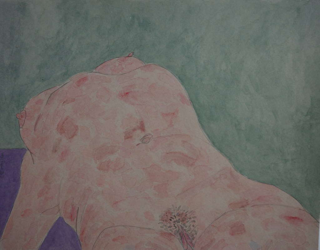
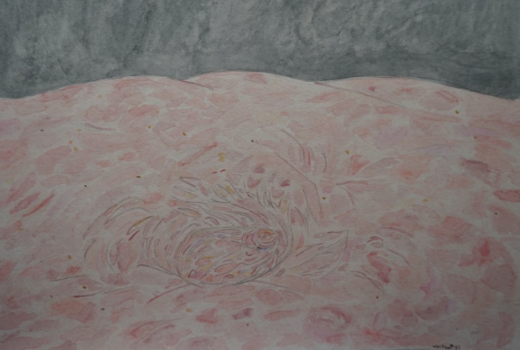
This piece is 11×14 inches. Watercolor on brown paper.
Once again I tried to change things up a little. I used a heavy stock brown paper 11×14 inches landscape oriented.
Throughout my oeuvre I had done paintings of close up of body parts. The challenge of this to varying degree is that if one does a super close up of an arm or belly without the outline of limbs/silhouette, it’s not necessarily easy to know what as a viewer, one is seeing.
Without visual guidelines, it’s tougher to show volume & mass of a body. This is one of the challenges I enjoy. If I can make the viewer feel the curve of a part without showing the edge, then it’s “easy” when doing an entire body or section.
Another aspect of this which I enjoy is that even when really nailing the volume and mass effect of the skin, there’s a sort of abstract property to the piece. I like the concept of a viewer enjoying these types of works just for the colors and effects rather than the “Does it look like this person?” aspect which can occasionally be a distraction. This piece is not as tight a zoom as I sometimes do for this type of work.
Another Song About a Girl 11×14 Brown Paper & watercolor
I got some new paper to try for both my lyra pieces and watercolors. While the results with the Lyra were good, I much prefer my usual paper for the medium. I then decided to try doing a watercolor piece with it. And while I am very pleased with the results, with this too I prefer my usual paper. For both mediums though, the results were good enough that I will use up the pad, switching off between it and my preferred paper.
One of my great pleasures in life is portraying flesh in paint. I never tire of making volume and mass appear on what started off as a flat white square.
This piece is 7×10 “Marlina”
addendum: Deracine Magazine has new summer issue out, It has one of my early-proto “In the Eights”. The magazine has a clean minimalist design and is worth checking out
I never want to repeat myself. There are some of my direct peers whose works I enjoy but after knowing them for a few years came the feeling that once you had seen a few of their pieces, you have seen it all. One way to sidestep this is by constantly mixing things up, leaving one’s comfort zone.
For myself, I do this by shaking up my methodology, intentionally putting aside things which I know will work procedurally or which I have done already a few times.
I always like to have my work possess a sort of open ended quality so that the viewer feels that there is a story within but it is up to each person to decide what it is.
This time I changed that up making a work which is intentionally programmatic.
The two books i return to time and again over the course of my life are Homer and Dante. I am far from the first artist in visual arts or letters to find inspiration within the pages of these two works. The appeal for all of us is that they offer so many possibilities of dramatic moments. And even two artists showing the same scene will present two completely different works.
I did not choose a specific scene from Dante. Instead, it is the idea of him following the shade of Virgil, seeing all the shades in their free falls on their way to the various rings.
I only used images for which i personally took the photos. The very bottom section is water rather than flames/lava. I felt that any kind of flame thing would be a little too on the nose, also i had not taken photos of any flames. As always, there is no digital magic. I just used my trusty scissors and adhesive applied with a brush.
Sheltering in place (still), I used whatever materials I had in hand. With all the figures, I got some cardboard, from packages delivered and constructed a little stage. I then painted it white. I painted each figure, applying different coats as to get color variations of darker and lighter blues and reds. I then took photos of the figures from various angles as to have it seem a myriad of different types of people rather than merely the five or six. Top views, side views etc, further create the effect of many types of people on their way to the deserved rings.
I always have a design in mind beforehand and primitively sketch it out. More often than not, as I am actually creating the piece, i tighten up the design. This piece originally had several clock faces from photos i took of the great clock at the Musée d’Orsay. I was going have a row dark blue versions of the girl seen in upper left corner as if the line were falling off top each clock to join all other shades. I was so pleased with the effect of depth and movement in the background of the vast crowd, i decided against it, feeling that it would detract.