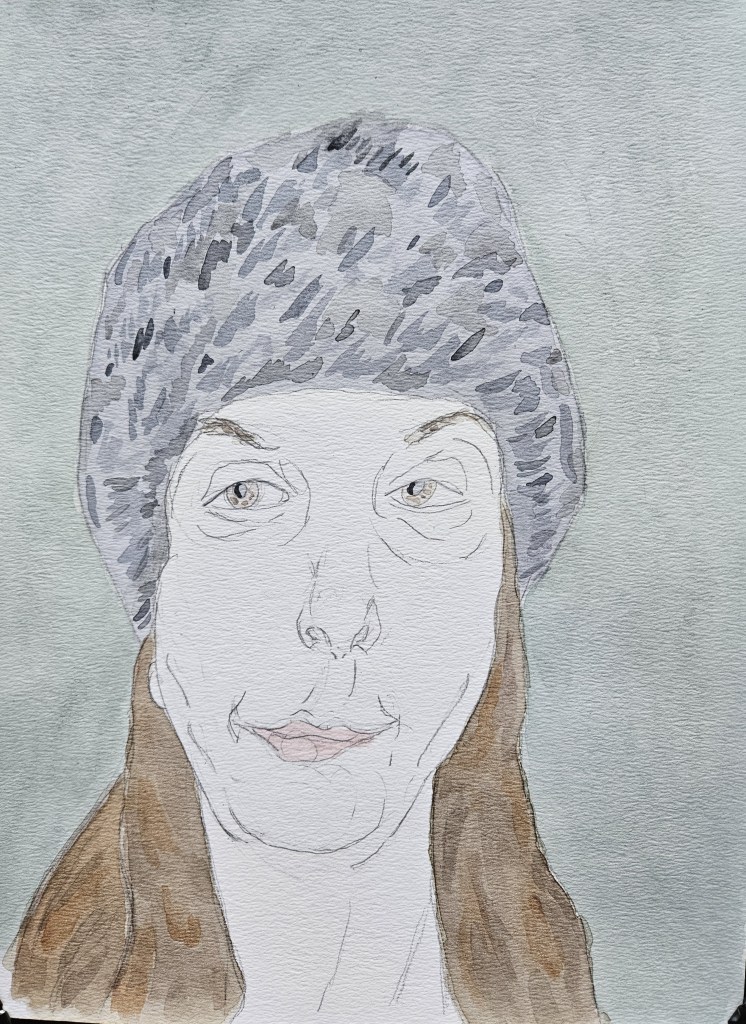
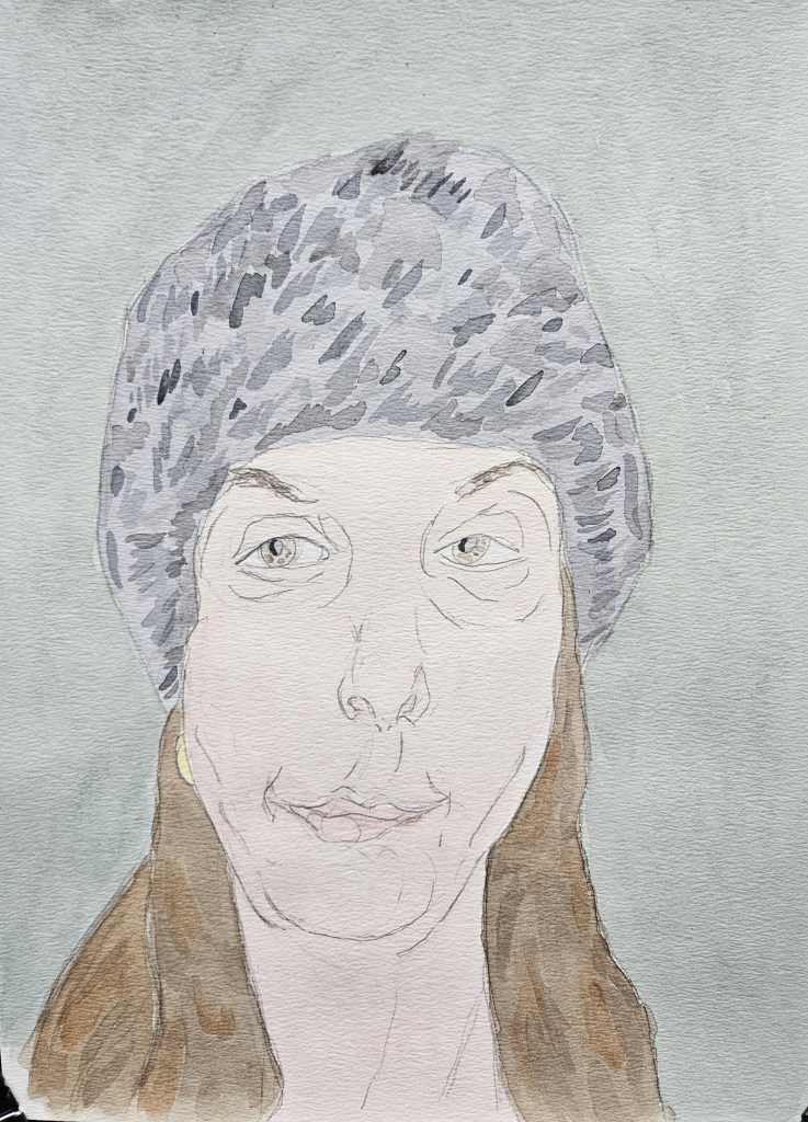
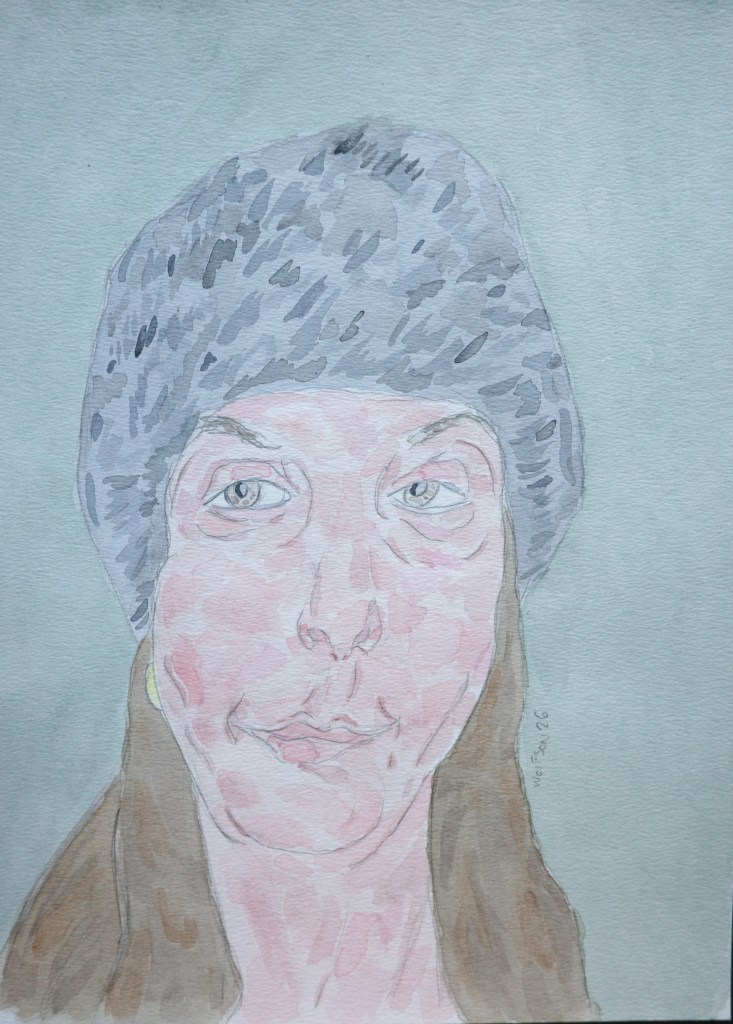
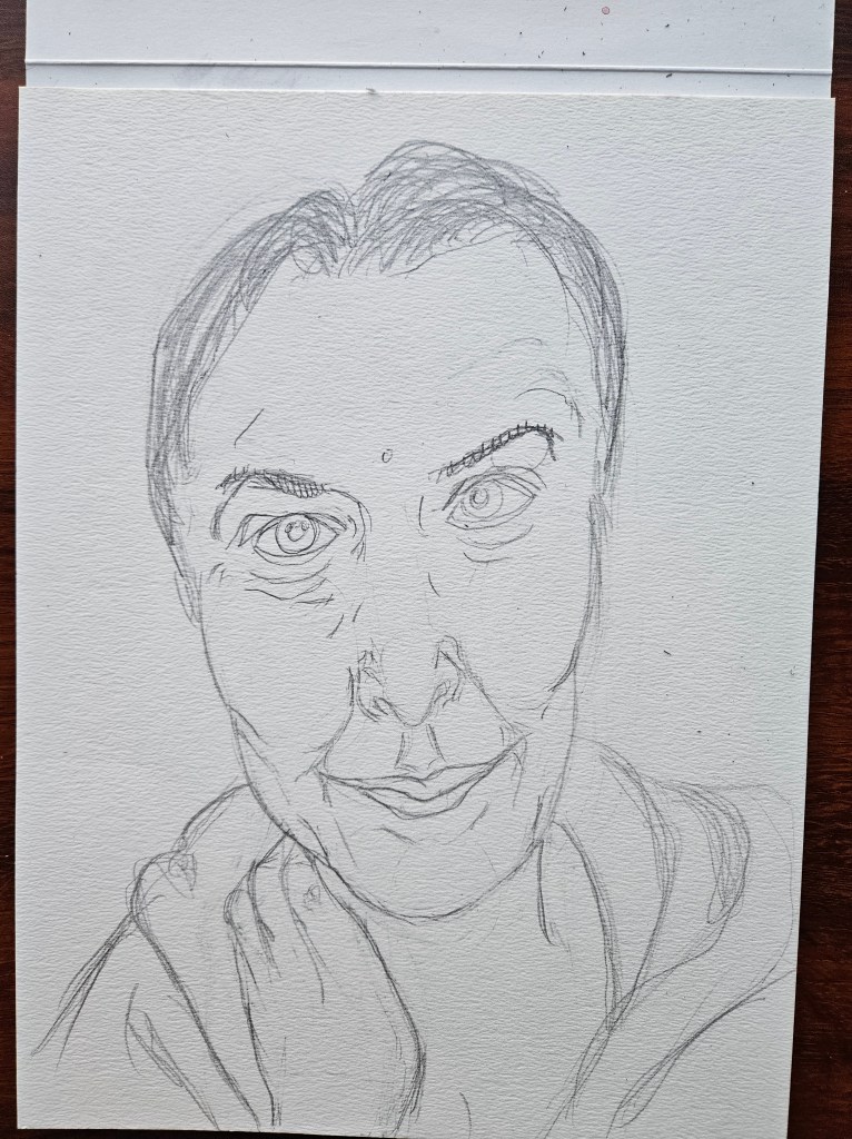
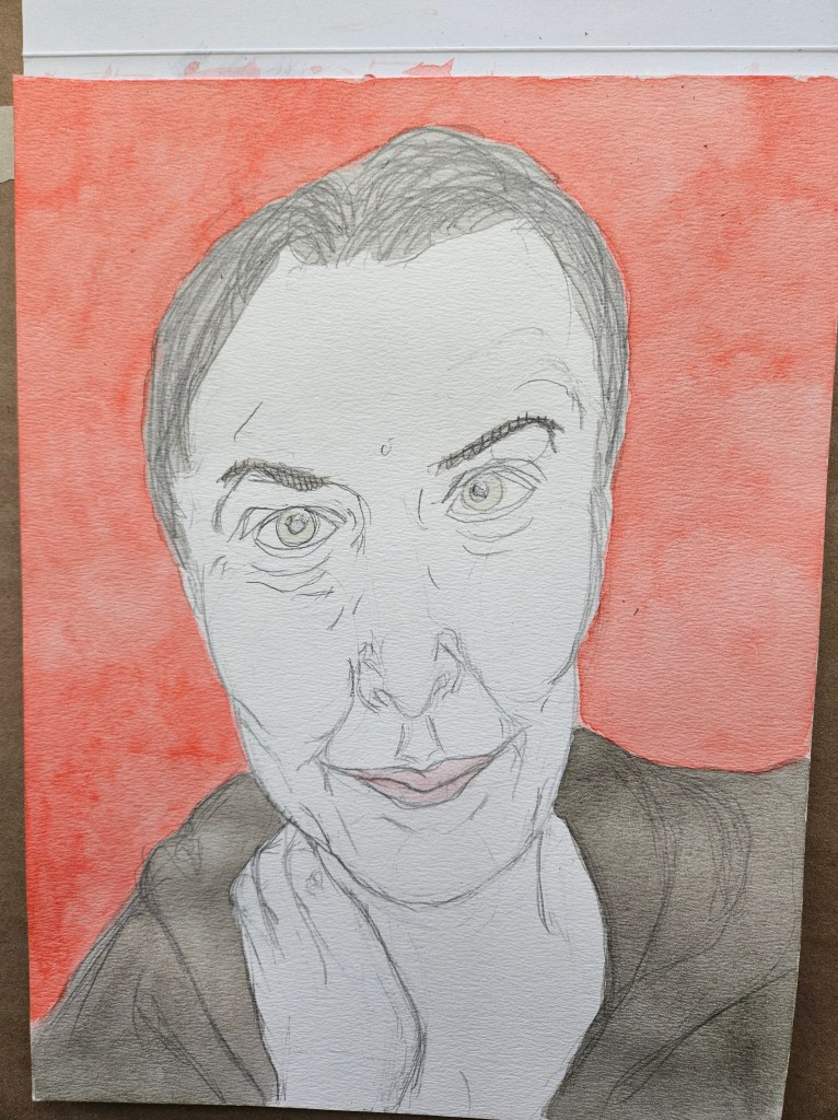
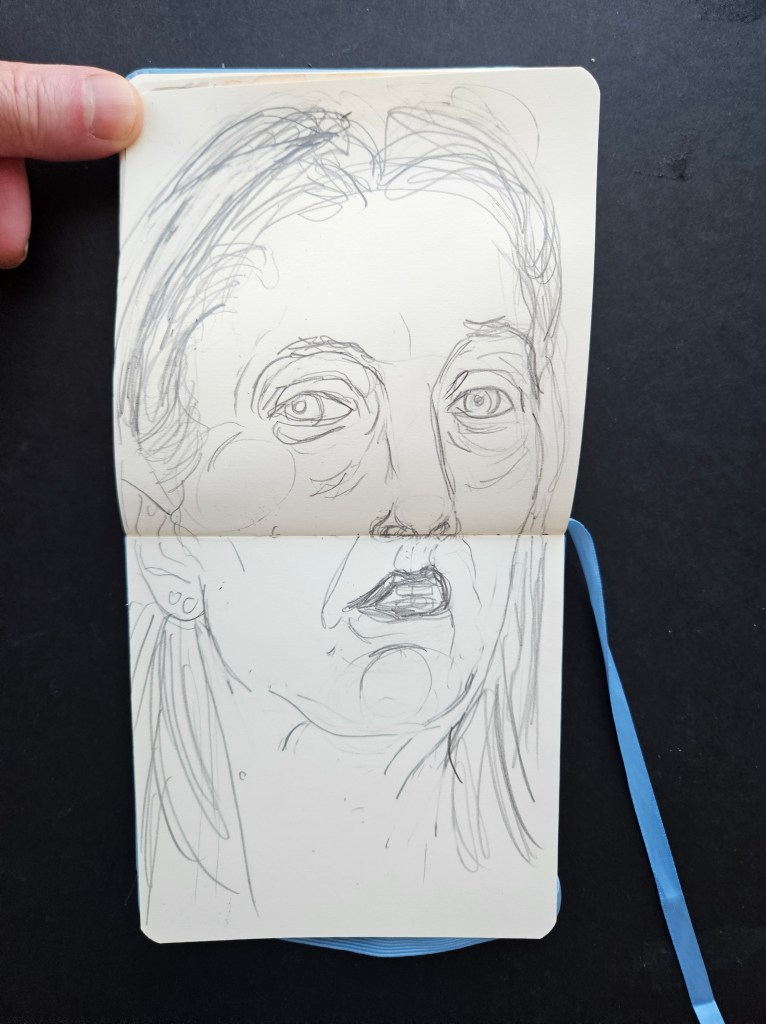
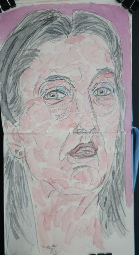
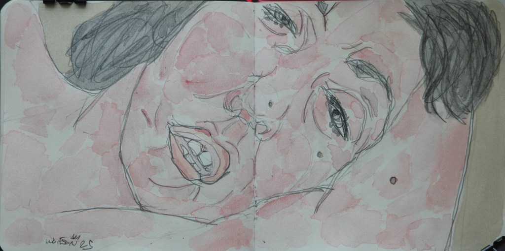
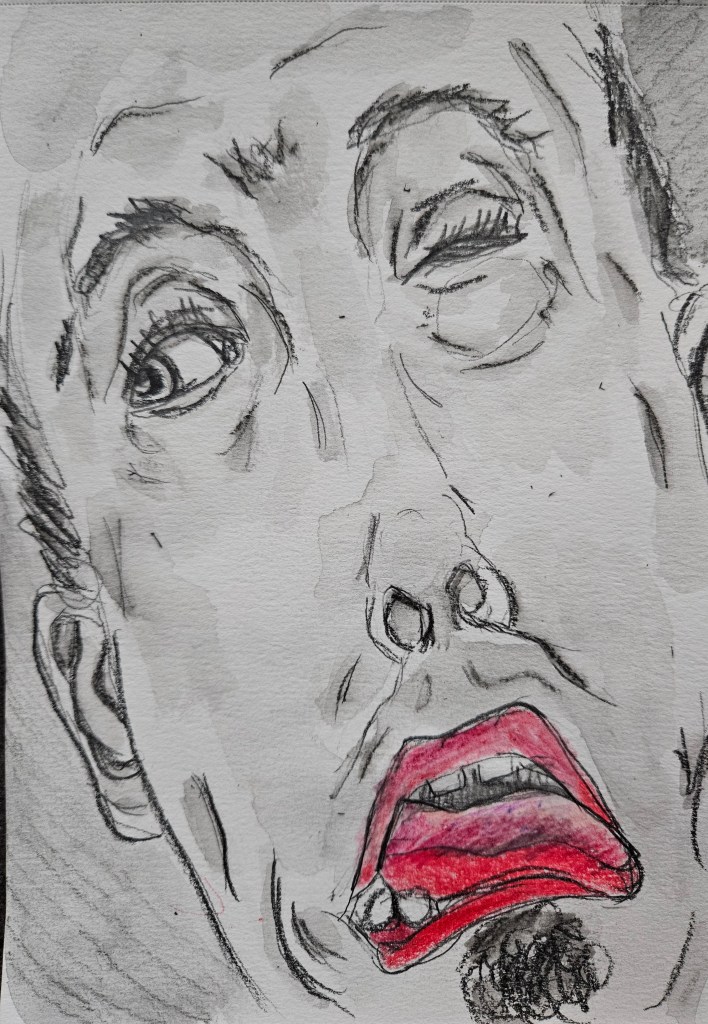
My first painting of 2026. It is 9×12 Rembrandt Cotton Paper, cold pressed. For paints, I used my studio set up which is a mix of companies, all professional grade.
I am always looking for people to draw/paint. I get my share of unsolicited submissions. More important to me than “beauty” or the typical idea/portrayal of it is an emotional honesty. That allows me to convey emotions that will keep the finished work interesting in the audience’s mind, long after the viewing of it is done. It is odd when I receive photos of people in traditional academic poses or overly glammed out ones. For the academic poses, it is how one is “supposed to” learn to draw bodies & anatomy. It is a sort of trap since it is establishing a foundation within the artist which will lend an air of be stilted or overly academic in future works.
The impressionists were revolutionary not merely because of their use of colors and effects of ambient shadow and light. An equal important aspect was that they were among the first to eschew having the subject matter be historic/biblical/mythic. Instead they painted one another or friends and denizens of their neighborhood going about their daily lives. (Courbet and Millet were proto impressionists )
The lives which they conveyed when viewed now sometimes seems of another world but the canvas still radiates emotions, the beauty is not trapped under museum glass. It is because it all comes from real experiences and emotions.
For both artist and model, do what is real and the truth for you. I am fortunate to have an inner circle that trusts me and whom I have painted for years. They trust me enough to not merely give me their idealized version of themselves. I have always said that truth is beauty. This is part of an overall technique which is how I work and that many painters have utilized:
Everything for an artist is impressions which is then transmuted into expression via the work.
As I am in the middle of writing my next novella, sometimes I day dream which is an articulation of extraneous ideas that I will not use as to be able to concentrate better.
I day dream as I clean my studio. There’s a vague idea that I have had of an artist who has all the equipment he needs to do his thing and in variety. In his mind’s eye, this makes him “rich” as he let’s slip at a bar (This leads to trouble).
When I first started doing visual work, I used the pages of the newspaper (for the youngsters: this was like a twitter news feed but accurate and truthful, made from thin slices of a tree, which showed up on your doorstep every morning) I used black and red markers as to be able to see my drawings.
I then graduated to blocks of cheap paper filling every page on both sides.
Slowly, I worked my way towards legitimizing the need of good equipment. Initially, i was thrifty out of necessity, i.e using pencil extenders as to squeeze every drop out of a pencil.
Fast forward, I can now afford whatever I want for equipment, i can buy things merely to experiment with etc. I still use pencil extenders and observe other economical practices, not because I have to or even because I am cheap. It is a sign of deep affection for serving the process.
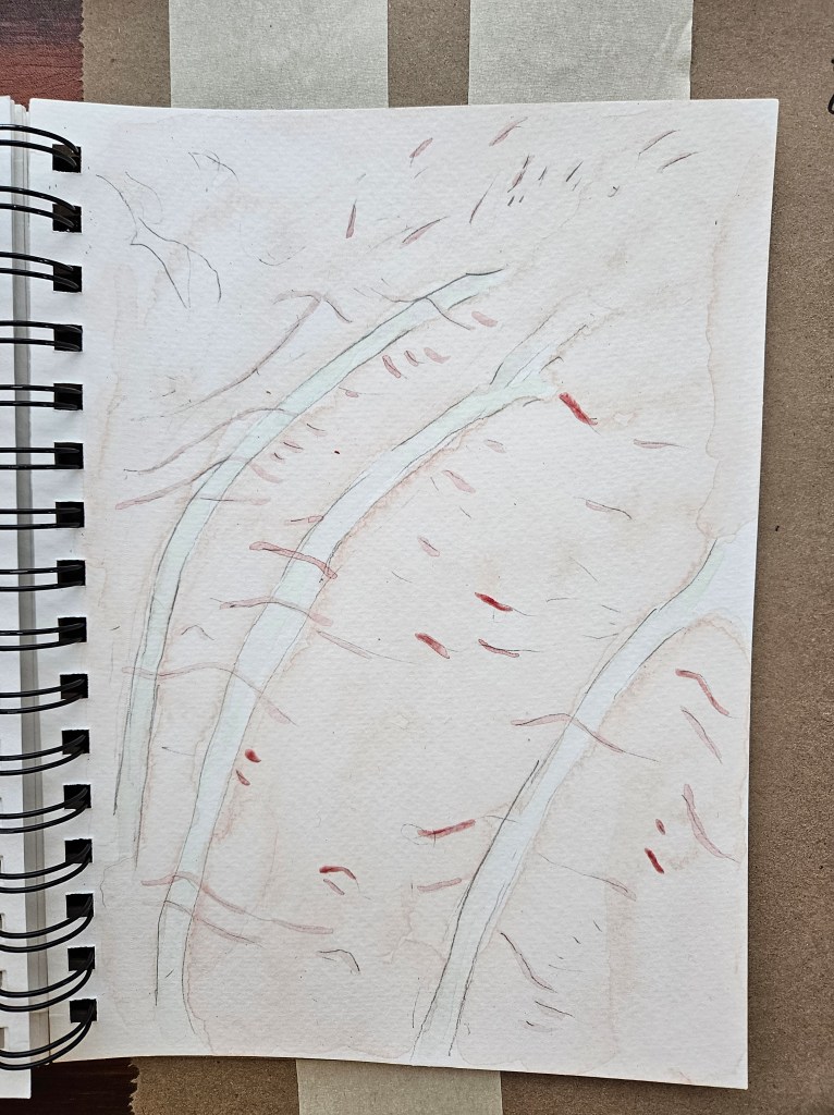
When working on a painting, the amount of paint which I use at most only takes up two ten slotted porcelain palettes. Not much but I often find myself when a painting is completed with a little bit paint remaining.
I started the practice of doing a smaller painting with remaining paints in my trusty Talen Art Creations Multi Media pocket Pad 4×4 inches. Nothing is wasted and it often presents some manner of stimulating challenge for me. It’s my version of what great chefs like Paul Bocuse did in their every part of the animal philosophy.
The Mark Watercolor & Rembrandt 9×12 cold pressed fin paper
Gerd Talen Art Creations Multi Media pocket Pad 4×4 inches
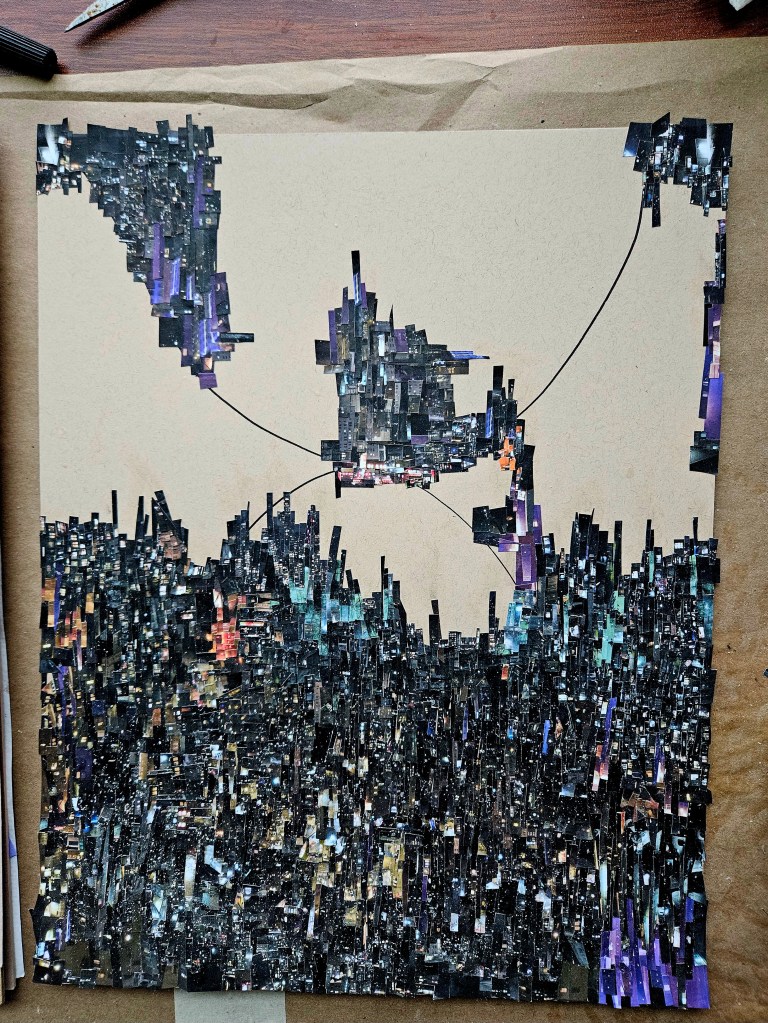
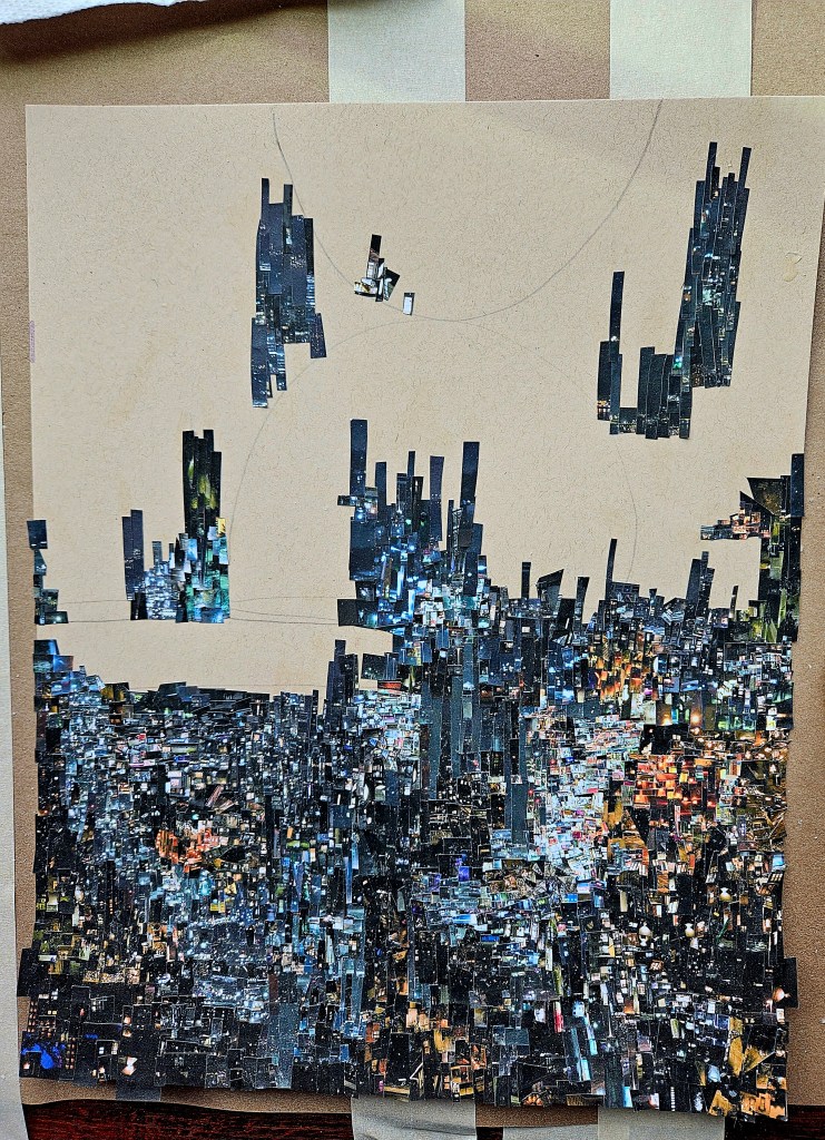
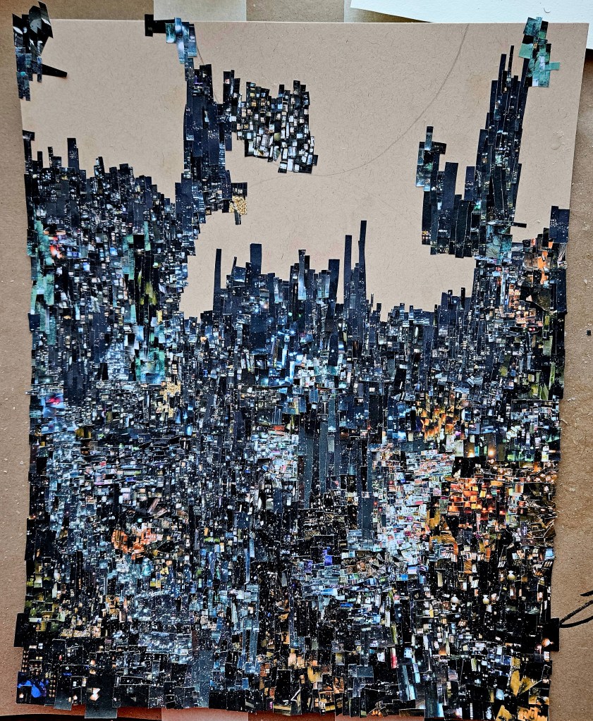
Finally finished my latest Cinefield®. For each one, my ambition is to make it better than the last in some way. In this case, it is my most rhythmically complex.
I seek to engage the viewer via creating works which offer new things to be noticed with every view. Ideally, I inspire (and maybe even awe) but if I only offer a momentary respite from the unpleasant aspects of daily life, then it’s all well worth it.
Aside from the labor intensive aspect of each Cinefield®, other information:
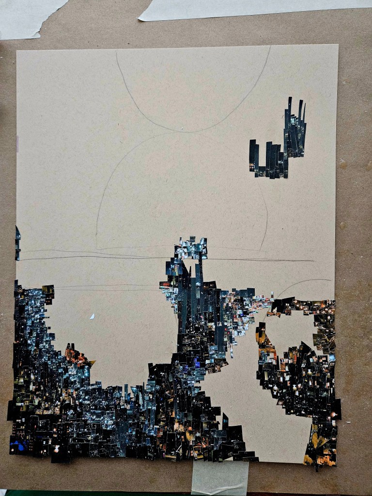
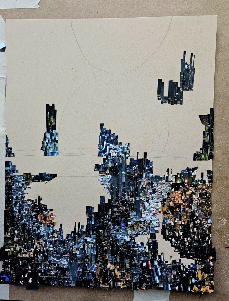
Each piece is comprised of one or two photos which I personally took. There is no digital magic, I use the old school method of my trusty tiny scissors and adhesive applied with brush on an 11×17 inch piece of heavy paper.
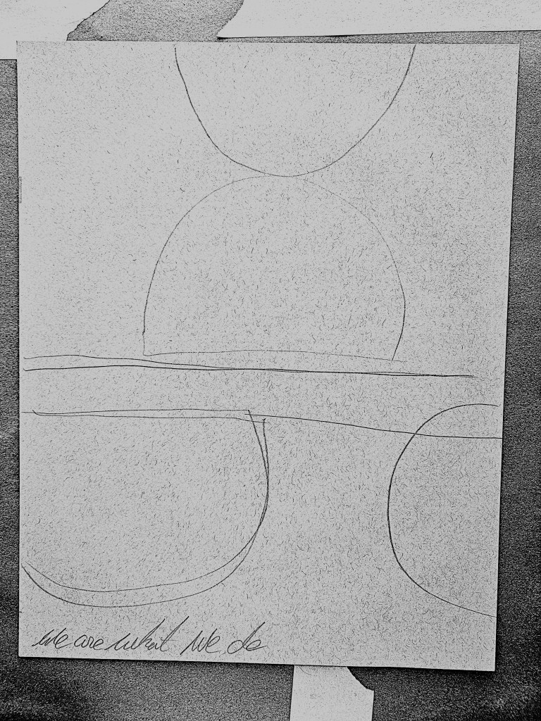
I always see the design in my head ahead of time. However, what piece is put where is in the moment improvised. I do a basic schematic on the paper the fine details reside within my inner eye. I also put a phrase which ultimately becomes hidden by the mosaic. The inspiration for this was the beautiful movie The Phantom Thread in which a master tailor did similar thing with his couture. There is such a call for meticulous detail in what I do and it’s so painstakingly executed that I have always likened it to the little old man making amazing shoes on Saville Row type of thing so these two things inspired me.
I cut up the photos into tiny, tiny pieces and they are carefully lain out on sheets. I look at the sheets as I work selecting what goes where in that moment. Do not ask me how i know, I just feel it, each selected piece seems right for where it is placed. The entire thing is very labor intensive, i see tiny paper snow flurries in my dreams often when halfway through a piece.
The work is copywritten and not for use without permission.
Now that I know the paints properties, I have added them into my permanent studio & travel palettes. They have seamlessly integrated in and so my next step is to try them with various types of paper.
When I Initially became serious about my painting, I was mainly using blocks of cotton watercolor paper. This is not ideal to travel with. I had found that it was also very sensitive to weather, one season in Paris it seemed to rain for almost a month and each layer of paint took forever to dry and it didn’t blend as well. These factors plus the increasing price of my preferred brand made me start to explore.
I ended up for a long stretch using a spiral bound pad of Canson watercolor paper. Easy to travel with, not cost prohibitive and of good quality.
In art, I am completely self-taught so I do not know how it may be for other artists, but I see the size a piece is meant to be in my head before ever touching brush to paper. I began to envision works both smaller and bigger than the Canson pad. While continuing to use it, I tried other pads too, preferring the pads over blocks as they are easier to travel with.
On the road my go to pad has been Talen Art Creations Multimedia Pocket Pad 4×4 inches. What I like about it is that I can use it for my Lyra water soluble graphite pieces, watercolors or just drawing. It eliminates my having to have multiple pads in my bag. I do still always have my trusty 3×5 pad in pocket regardless.
At home I mix it up size wise going all the way up to 11×17 size.
In my exploration of the added paints to my palette with various papers I decided to first try them with my old favorite the Canson pad.
In doing an extreme close up it presented an interesting challenge. To be able to show volume and mass without the help of showing the outline of the hand which would have served as a guide/clue to the viewer’s eye. The piece is almost abstract. Keep looking, you notice the volume and mass, keep looking you notice little things with each new viewing.
Back of Hand
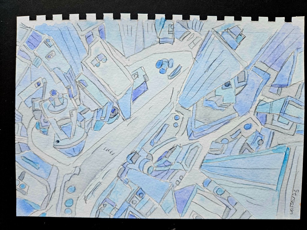
I have done a lot of portraiture of late but have also always enjoyed doing cityscapes. I want a style but never mere mannerisms and a key to this is to always be challenging myself. I decided to do a cityscape, a nice challenge on a smaller sized paper, especially as it has been a while since I have done one.
I was lucky enough to be sent, with no strings attached, new equipment to try by Royal Talens. Over the next month or so I will be using and writing about what I was sent.
First up: Van Gough half pan watercolor set (24x half pans). These are artists’ grade. Artist’s grade is not necessarily “lesser” than professional, once you are past student grade it becomes much more matter of what you are going to do with them and your technique.
The half pans come in a white plastic case. Despite being 100% plastic, it feels substantial. Some artists prefer plastic palette cases as they do not dent and are easier to clean.
The half pans fit into slots instead of there being one long metal slot or rut with metal crimps which bend over the edge of the half pans to hold them in place. These always loosen over time even if you do not remove the half pans often. It also has two slots which included a narrow natural sponge and a #6 Van Gough selected filament brush.
Crimp style
slot style
The lid is attached on an integrated hinge and opens to lay flat. The inside of the lid divides into six sections which can be used as palette.
Each half pan has easy to see/read info on the color located both on its side and top, the latter which pulls off like a snack pudding.
The color selection is several hues of red, yellow, blue, brown, green, orange, a gray and one white.
Usually, I eschew using gray regardless of the company. I find that they lean too towards blue or the truer gray has a murky/cloudy look. This gray has a light blueish undertone but is perfect, especially if depicting hair.
The paper I was givn is Rembrandt watercolor 9×12 140lb. It is an artist’s quality. 10x sheet, cold pressed.
The paper is secured via a glued top in pad stye. It has a soft cover and hard cardboard back. Only the top is secured, as I worked on a painting at end of each session there occurred minor curling. Once the paper was dry, I weighed it down overnight and next day it was fairly flat. I also tried using small clips in each corner and just leaving it. Both ways allowed me to get to work again easily. Once the painting was completely done and I cut it off the pad there was some minor curling. I let it dry and at the end of day put a few heavy books on it over night and next morning it was flat.
This is a heavy paper and would be great for anyone who does the wet-on-wet technique. It is a clean natural white which doesn’t distort the nature of the paints. I do pencil outlines of what I am going to paint and when applying the eraser it didn’t tear nor drag, there was zero pilling of the paper as can sometimes occur with other brands.
My technique is to fill the slots of white porcelain palettes with water. Then using a damp brush mix in the paints.
These paints mix in smoothly. It is very easy to darken the hue via dipping the brush back into the half pan or to lighten the hue by diluting the palette section with water.
On the paper it gives true color representation right away as opposed to having to wait for it to dry a little. The paper allows for blending to achieve volume and mass, for example when portraying flesh. I found it behaves very similar to the 100% French cotton paper I sometimes use. It is a little more forgiving if one is quick enough, to fix any minor mistake.
With my style of painting, I found that when working on a face, I must give time in between brush strokes for them to mostly dry as to keep it from running. Once one has timing down, which doesn’t take too long, it is far from a hinderance.
I have always incorporated several brands into my palette. I will definitely be adding some of this set into my palette. The ones which are not making the cut, it is not about the quality but rather they are just colors I do not use and I only have so many available slots.
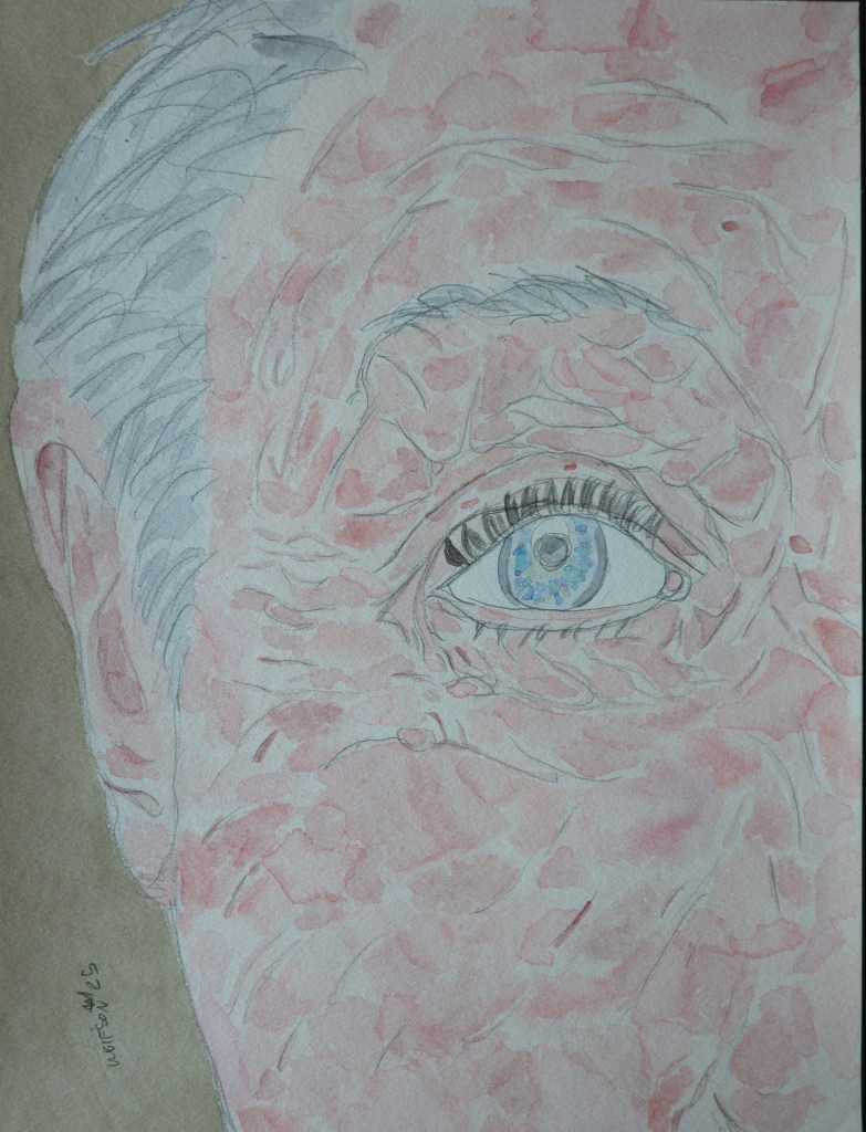
“Blue Eye” 9×12
“Tagliatelle” Talen Art Creations Multi Media pocket Pad 4×4 inches
Finally finished my latest CINEFIELD®. Although it felt as if it took forever, I am very pleased and proud of the results.
The entire piece is from a single photo which I personally took and then printed up many times. I used my trusty pair of (tiny) scissors to cut out the pieces and then glued them to 11×17 piece of paper using adhesive and small brush.
My goal was to offer up a work that one could go back to many times and notice a new thing each time. I always have the design in mind beforehand but which piece I use where is completely discovered in the moment. I cut out sheets of tiny shapes which are arranged on a table by what will become the work. In this way you can look at all my complex CINEFIELD® as completely improvised.
(I’m the Charlie Parker of collage)
Northern Symphony 11×17 (C) Wayne Wolfson. Not for use without permission
Addendum: I used to live in a city that often had weekend “art walks” or art & wine block party type things. There would be kiosks for photographers etc who had “art” but each thing was reproduced hundreds of times and in various sizes. There is nothing wrong with this so long as you realize it is less buying art and far more in line with buying a postcard/poster/print.
I have CINEFIELD® prints available but each print is only done twice and one of the two is for my own archive. My site goes into all technical details. I have gotten emails asking what is available as the site currently only lists a few as available. If there is a Cini you are interested in get in touch with me, it could be that I just had not had prints made yet.
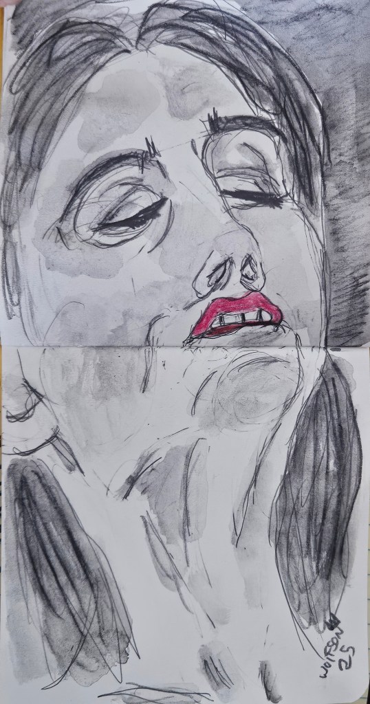
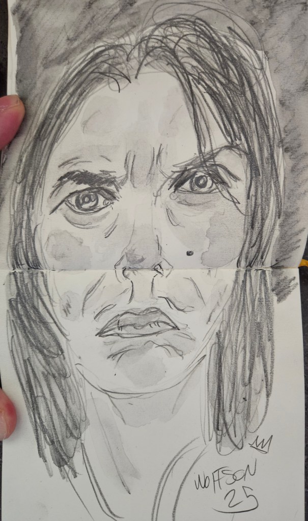
Full ahead into my next Cinefield®. Of course still drawing every day. I do not seek out things with a specific vibe. I would like to think that when not portraying someone from within my circle, I am a sort of spokesmen for those who have slipped through the cracks, the lonely, forgotten and outsiders.
My regular subjects intuitively know I enjoy that sort of convulsive beauty. I am fortunate that they trust me to present me with such honesty.
Poet laureate of the forgotten & ignored or from within my circle, either way, it’s raw reportage. I do not seek to beautify nor take down any subject.
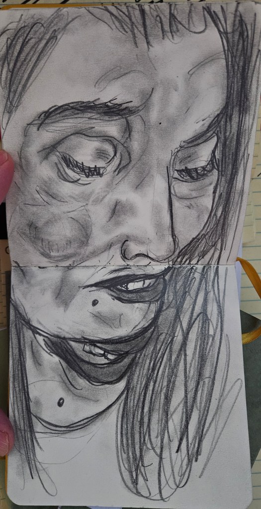
All pieces are quick sketches in my trusty pocket pad.
I am always looking interesting things to draw, email me if you think you have something.
Among my greatest pleasures is to portray flesh with paint. It is not a salacious thing, it need not be a nude. I’ve done many hands and other body parts. I have done closeups on things so that they verge on abstractions, the viewer initially not knowing what they are looking at.
This is an aspect of painting which consistently keeps me engaged. The wonderment of it, one starts with a flat two dimensional square or rectangle. With pencil & brush you conjure up not only volume and mass but the suggestions of warmth as blood rushes to the surface in areas or through the veins. It is akin to a sort of magic trick and no matter how many times I do it, I still marvel at it.
I switch the types of paper I use as to avoid lapsing into mere mannerisms. With everything else that I do creatively, there are still times that certain types of paper or pencils fall to the wayside temporarily.
This piece is 9×12 and on a white paper which was main one I used to use most of the time. I have finally circled back to it once again. After such a long break, the one which had been the de rigueur found itself the new-thing challange.
I was very pleased with results.
L 9×12 Watercolor & Paper
I am always looking for interesting things to draw/paint. If you think you have something email me.
The news is bleak. One can take their pick as to why this is an apt description. It is during these times that artists in every medium have a duty, do your thing. You need not insert political message nor program of the zeitgeist into your work.
Creating something for others to experience via one of the senses serves as a reminder. It’s easy to forget that there are things worthwhile outside of the current strife, there are things bigger than ourselves which are more important, culture in all its forms. Culture seems almost to be an insult now in some quarters, it’s now wedded to elitism which is a different thing.
Things which seemingly are not one of life’s necessities, such as art, offer the chance to get out of our own heads. At a minimum, art & culture can be a brief respite from the grind of daily life. It’s always my hope to be able to offer this via my work.
“B” Watercolor & French Cotton Paper 5×7
I am always looking for interesting things to draw/paint, drop me a line if you think you might have something.
I have started another painting. This one is on French cotton paper. Between rain and general dampness in the air, the weather has not been obliging me. I have had to takes days off.
In the interim, as usual I draw while working more on my next collection of stories & essays.
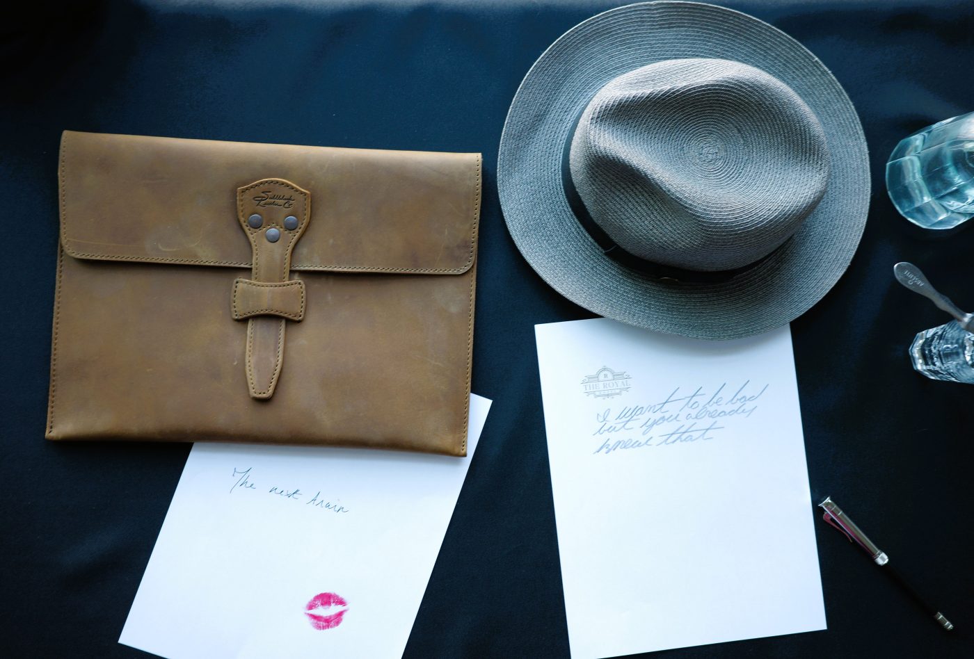
Here are a selection of quick sketches & musings done over past week.