The painter Phillip Guston said that when one paints, at first everyone you know is in the studio with you and one by one they drop away until you are left only with the painting. I understand that, the pleasure of serving the process, everything else is temporarily suspended, where will the painting end up etc etc.
I am in the middle of typing up all my notes & stories from Europe. The visual work that I do, it is work but it isn’t. I have been going at a steady clip with my paintings but not because of any specifically set tempo. The visual work becomes a respite from the challenges of other things. Ideally, if nothing else my work offers people a brief cessation from the doomy bleakness of the news.
My paint palettes are now exactly as I want them, incorporating professional grade half pans from several companies.
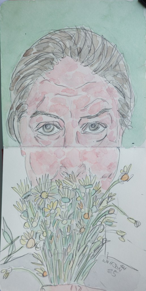
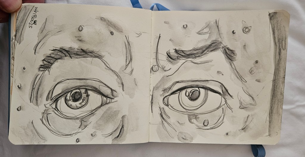
This piece is 9×12 watercolor & Rembrandt cold press/fin grain 140 lb
An amazingly busy but rewarding week. I decided to do two small paintings. My paint set up in the studio is now a mix of several companies professionally rated half pans.
Once one is at a certain point quality wise, it becomes a matter of preference which is dictated by the artist’s style but also the inherent properties of the equipment. In explaining this concept to a fellow jazz-head I gave the analogy that it is the equivalent of Miles and his horns. No matter what he played on, his distinctive voice was ever present. However, he did have certain horns he used for ballads, for cookers et al. In this way it is a collaborative effort between artist in equipment. So it is with the various papers and the set up of watercolor half pans I utilize.
Both these pieces are done on Talen Art Creations Multi Media pocket Pad 4×4 inches
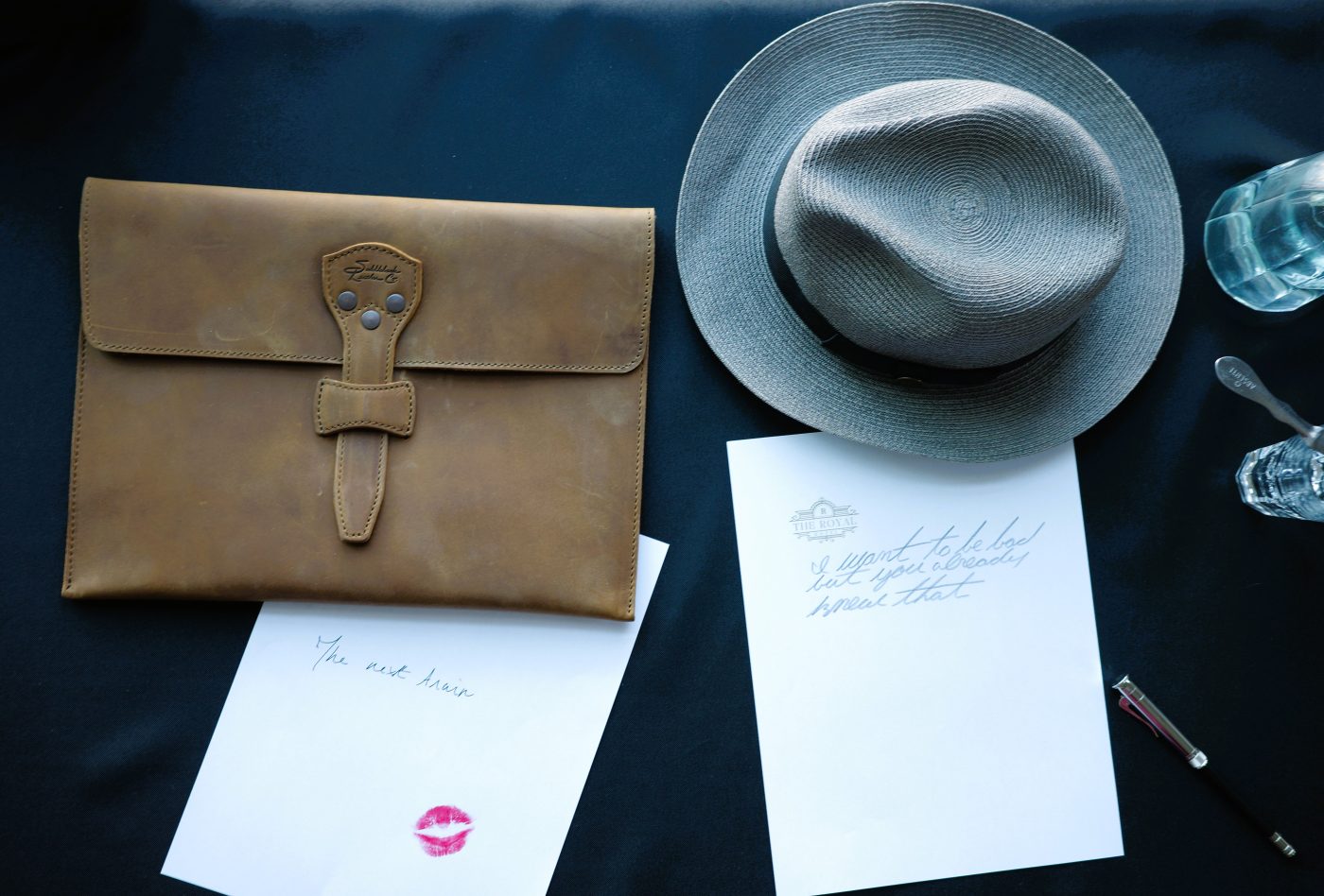
Unfortunately with my last trip, I did not get any photos which would serve as the raw material for my Cinefield® work. I legitimately miss working on them, which lasts until I am two weeks into one and I start to see little pieces of paper confetti in my dreams.
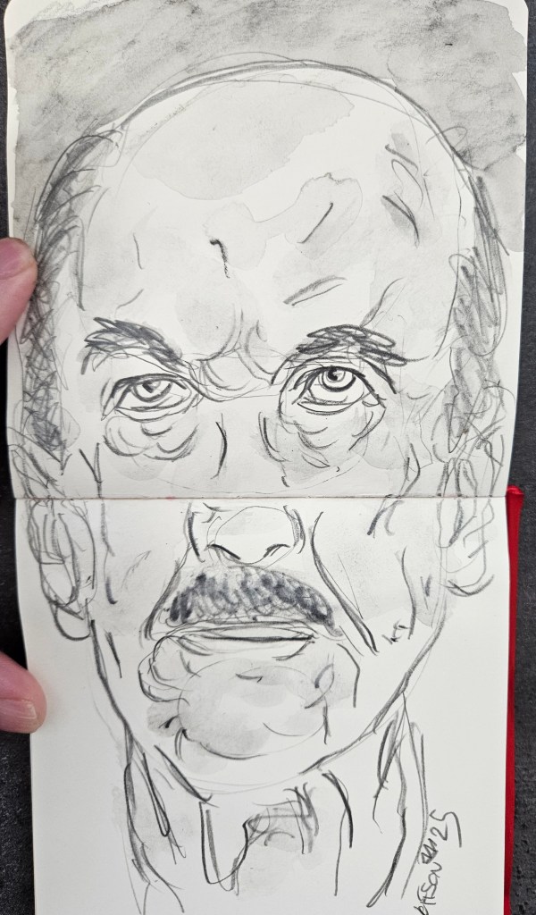
I continue on with painting. This piece is 9×12 Rembrandt paper which was given to me by Royal Talens. It is professional grade cold pressed 100% cotton. I have often used French cotton paper and that absorbs pigment quicker which makes it less forgiving in regards to blending or correcting a spot. As with all professional grade equipment, it becomes less which is better and more a matter of personal preferences.
“Color always occupies me, but drawing preoccupies me” Delacroix
“Drawing is the basis of art. A bad painter can’t draw but one who draws well can always paint.” Arshille Gorky
I always have a pocket pad on me, usually 3×5 inches, and then a slightly larger one in my ever present book bag. When I travel, what pads and accoutrements I have depends on length of trip, location and what else I will have going on while on the road.
It took me many years of trial and error but I have my trip equipment selection process down pat. For the past month or so I have been writing about equipment given to me by Royal Talens. My current go to pad is by them, but I had discovered it long before they had sent me anything, Talen Art Creations Multi Media pocket Pad 4×4 inches
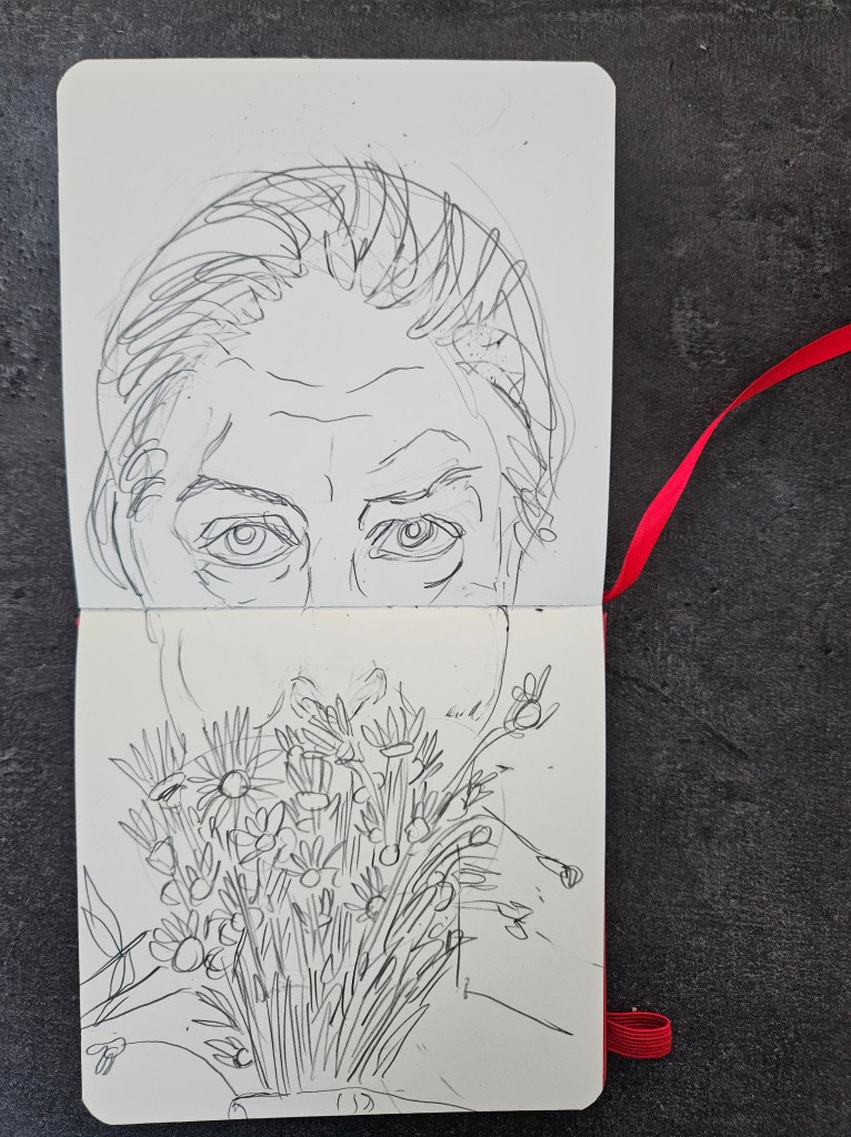
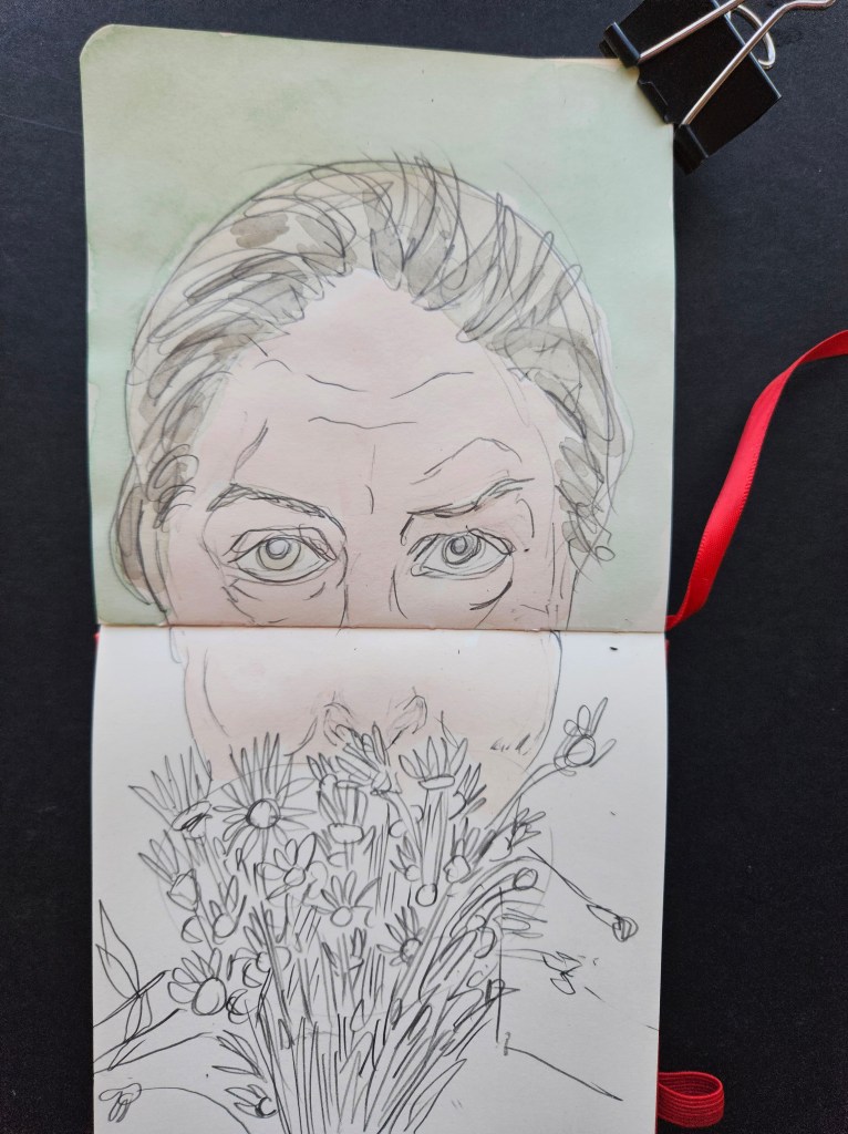
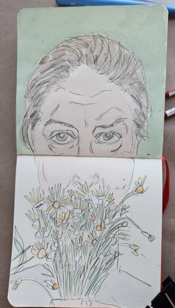
I have never looked at drawing as a second class citizen in comparison to painting. No matter if I have spent the day painting or doing some of my other visual works, I draw an hour a night, every night. This woodshedding is akin to a musician practicing scales, but also one of my greatest pleasures in life.
I initially discovered water soluble graphite by complete happenstance. Once I had the mechanics down, I was able get painterly effects. When I work on my Cinefield® pieces, I can not draw as an under construction Cinefield® piece slowly dominates the space of my studio. But, I also do not want to let too long go without painting, which I end up missing.
Water soluble graphite work is the same as painting but in all greyish black tones. I can use my witting desk and do a piece in one session. I may not be able to paint but this was very close. Unexpectedly, I found that as I added to my graphite technique it helped my painting and vice versa.
I was just on the road and while it was a short trip, I had a lot going on. With this is mind I knew I would have no opportunities to paint. I brought my water soluble kit. Another important aspects of this medium which I like it how compact it is. 2x graphite sticks, a sharpener and one watercolor travel brush. I can literally put it in a coat pocket. If at a cafe I use a mineral water cap, in hotel one of the plastic cups to be found by the gratis bottles of dasni for water to dip brush into.
Just in time to once again hit the road, I have now integrated the new paints which I had been trying out permanently into my studio & travel palettes.
Of course I have note added all of them but that is just matter of color preferences in what I use for my work. I have found that once a thing, be it whisky, paint et al is of a certain quality it is not a matter of which is better but more personal preference.
Certain brand’s colors are better for specific things than others i.e one brand’s red or pink better for base coats in showing skin while another better for showing bruises, capillaries et al.
Now that I know the new paints, i have started experimenting with them on all different types of paper.
Annabeth first time using tan paper w/my new set up. Strathmore Toned Tan Mixed Media Paper 11×14 184 lbs
Croc ClipTalen Art Creations Multi Media pocket Pad 4×4 inches
If interested in what comprises my new paints see previous four posts which give details
Now that I know the paints properties, I have added them into my permanent studio & travel palettes. They have seamlessly integrated in and so my next step is to try them with various types of paper.
When I Initially became serious about my painting, I was mainly using blocks of cotton watercolor paper. This is not ideal to travel with. I had found that it was also very sensitive to weather, one season in Paris it seemed to rain for almost a month and each layer of paint took forever to dry and it didn’t blend as well. These factors plus the increasing price of my preferred brand made me start to explore.
I ended up for a long stretch using a spiral bound pad of Canson watercolor paper. Easy to travel with, not cost prohibitive and of good quality.
In art, I am completely self-taught so I do not know how it may be for other artists, but I see the size a piece is meant to be in my head before ever touching brush to paper. I began to envision works both smaller and bigger than the Canson pad. While continuing to use it, I tried other pads too, preferring the pads over blocks as they are easier to travel with.
On the road my go to pad has been Talen Art Creations Multimedia Pocket Pad 4×4 inches. What I like about it is that I can use it for my Lyra water soluble graphite pieces, watercolors or just drawing. It eliminates my having to have multiple pads in my bag. I do still always have my trusty 3×5 pad in pocket regardless.
At home I mix it up size wise going all the way up to 11×17 size.
In my exploration of the added paints to my palette with various papers I decided to first try them with my old favorite the Canson pad.
In doing an extreme close up it presented an interesting challenge. To be able to show volume and mass without the help of showing the outline of the hand which would have served as a guide/clue to the viewer’s eye. The piece is almost abstract. Keep looking, you notice the volume and mass, keep looking you notice little things with each new viewing.
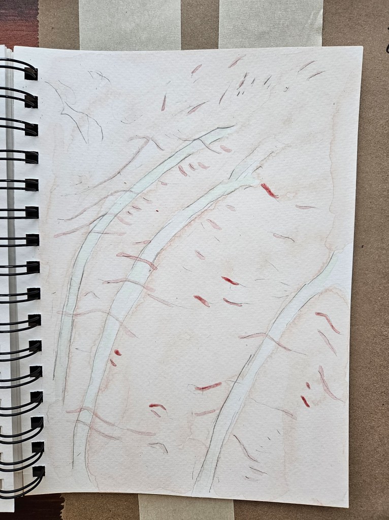
Back of Hand
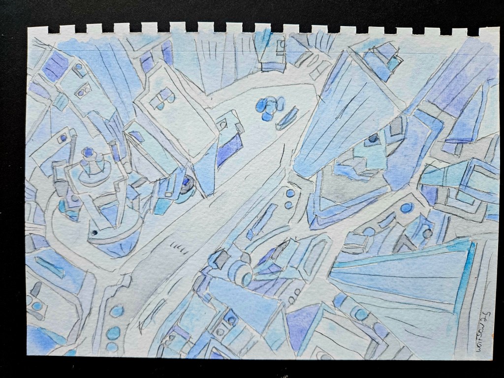
I have done a lot of portraiture of late but have also always enjoyed doing cityscapes. I want a style but never mere mannerisms and a key to this is to always be challenging myself. I decided to do a cityscape, a nice challenge on a smaller sized paper, especially as it has been a while since I have done one.
Royal Talens were nice enough to give me some supplies to try out (no strings attached). My initial, more technical posts can be found on these two links:
For these two pieces, I used half pans from the two sets sent to me which I previously wrote about, incorporating them into my preexisting palettes which include half-pans by Sennelier, Schmincke Horadam and Charvin.
Once at the professional level paint quality/grade wise, it is not about which is better. It is not even necessarily about brand preferences. I have found each brand had specific qualities and properties which dictate what I will use. I equate it to cooking. One can have favorite spices, but it would not make sense to use them in certain dishes.
The new paint sets have certain colors which regardless of brands I do not find myself reaching for often. For the colors most utilized, I have absorbed in the hues from these new sets into my palette boxes.
These two pieces illustrate how seamlessly they work when mixed with other brands on a painting.
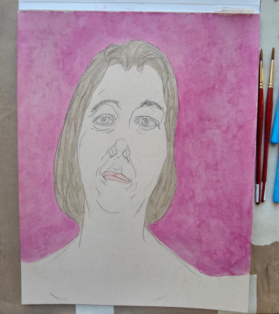
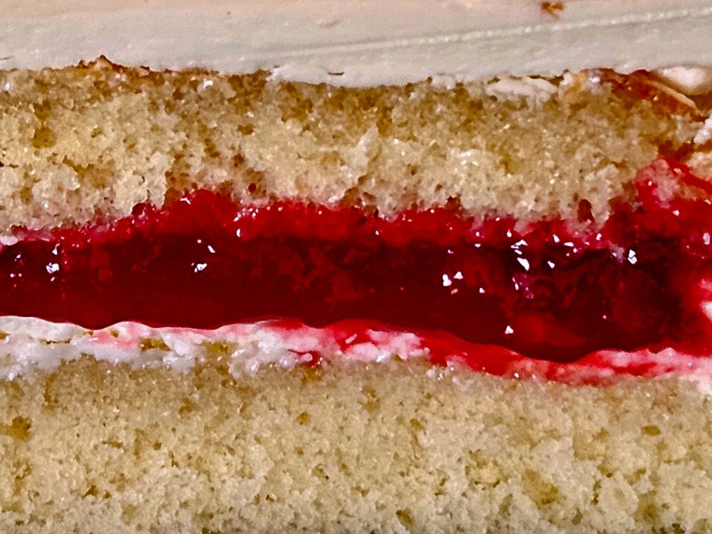
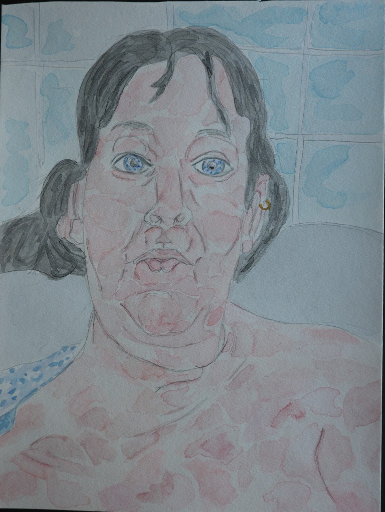
Bath 9×12 Rembrandt watercolor paper 140 lb cold press. Fin
Lucky Shirt Talen Art Creations Multi Media pocket Pad 4×4 inches
Royal Talen was nice enough to send me equipment to try out (no strings attached). This is the next round of things I tried.
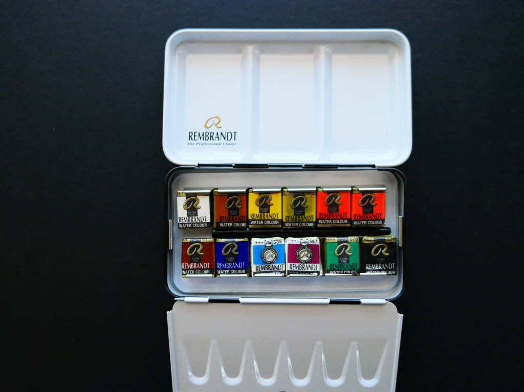
Rembrandt half pan set. The Rembrandt line is professional grade. The pigments are triple ground and suspended in gum arabic. The colors really pop and appear even with every brush stroke.
This set is twelve half pans. They come in a hinged black metal palette box with the logo on the lower left corner. It is compact enough to fit in a coat pocket and has a sturdy build. Two long struts cradle the half pans. Individual metal clamps hold each half pan in place. The entire strut is made to pop out, ease of doing so facilitated by two small handles at either end. This is so that you can replace the cradle once crimps are too loose.
(all pics by me)
Some painters have specific configurations for various subjects and places that they work. They have multiple cradles which they leave loaded up in work specific arrangements. One is popped out or in easily as needed.
There is a hinged metal cover that goes over the half pans when the box is closed. When the palette box is open it lays at an angle. This is a mini paint palette to mix or wet brush. The lid of the palette box can also be used as a larger three section palette or to hold water.
On the underside is a finger loop to hold the box while working plein air. In Paris, on Rue Mouffetard I have seen an aquarellist run a thick elastic through the loop, attaching it to her drawing board.
Some people intentionally want to work from a limited color palette. Others have travel in mind where luggage is often a factor. The size of this kit is perfect to suit either motive. This kit practically demands that one get out there, be it someplace in nature or an out of the way spot on the street, or perhaps a café table and get to work.
I do mostly portraits/ casual faces so some of included colors I would infrequently reached for. I did try all of the colors, they were all noticeably vibrant, easy to darken or lighten using an eye dropper and water (in a porcelain palette).
The kit comes with a travel brush/ A Rembrandt 110 Red Sable. This is a better-quality brush than is often included even with the bigger names in paint companies. It has a cap to protect it when not in use. It cleans up easily with water and watercolor brush soap.
There are water brushes which are a brush with fatter barrels into which you add water. Anyone who does street or café painting could use the kit as is in conjunction with a waterproof pen to create street scenes.
Draw the scene and use one or two colors to stand for in light and shadow (i.e. light blue for the front of a building, dark blue for the side in shadow).
The exciting thing about this kit is the possibilities. Two water brushes, a pocket pad, pencil and the palette box all could easily fit into two jacket pockets or the small section of a backpack.
The thing I have always liked about half pan sets is their portability. It is easy to swap out colors for ones preferred or as they run out, to replace them. Even though not all the colors included in this box were to my preference, I had already been using Rembrandt in my permanent studio set up. All the colors share the same properties and quality.
This set did get me enthused again about doing still life’s which in my body of work had sort of fallen by the wayside.
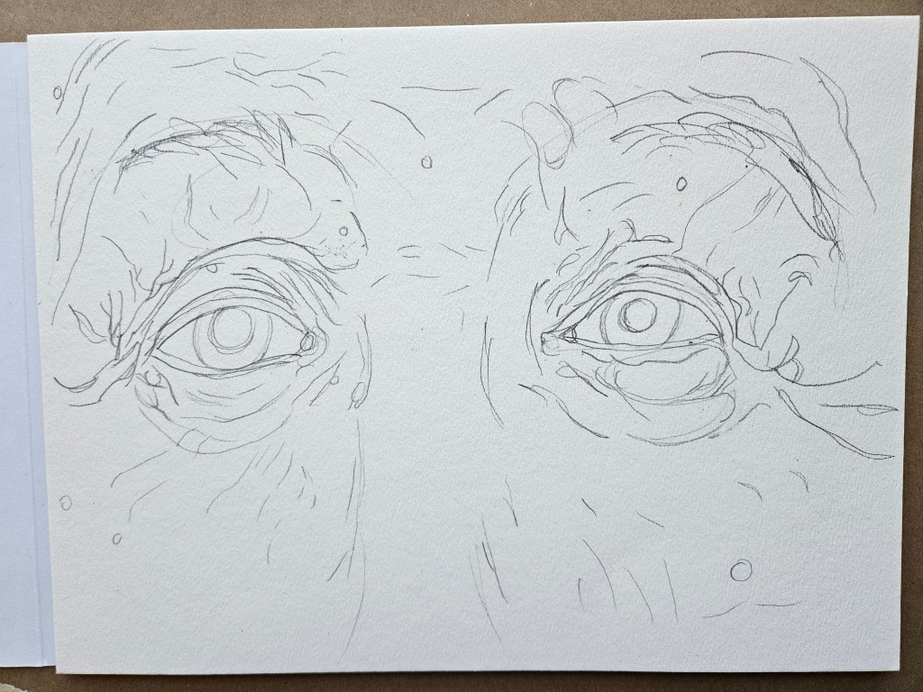
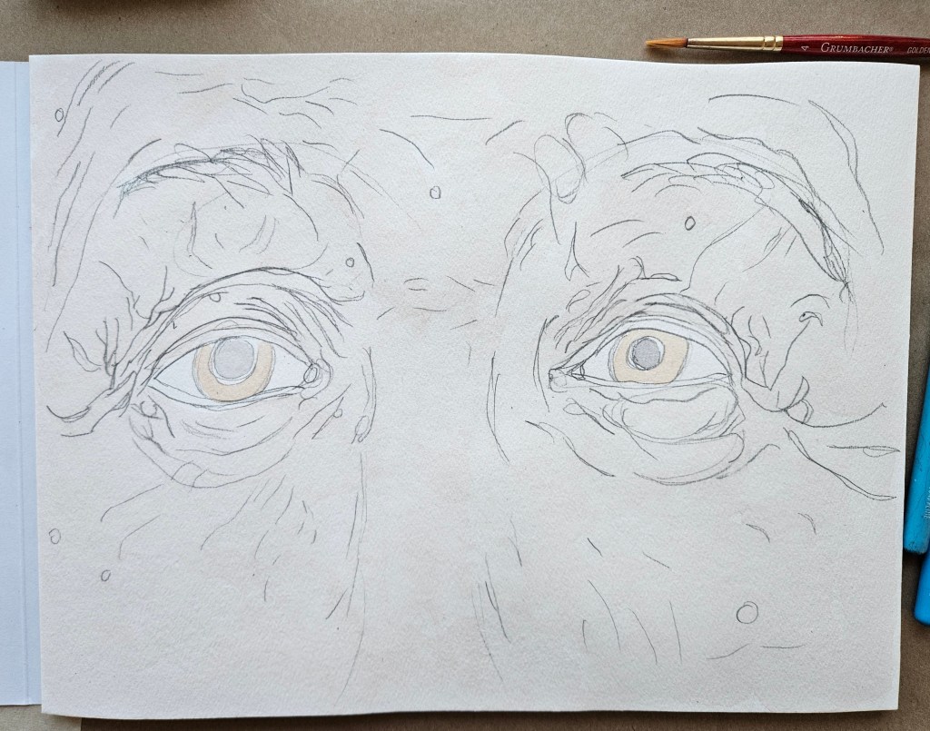
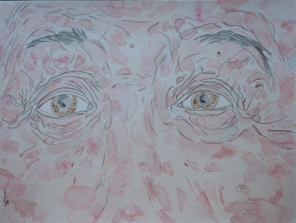
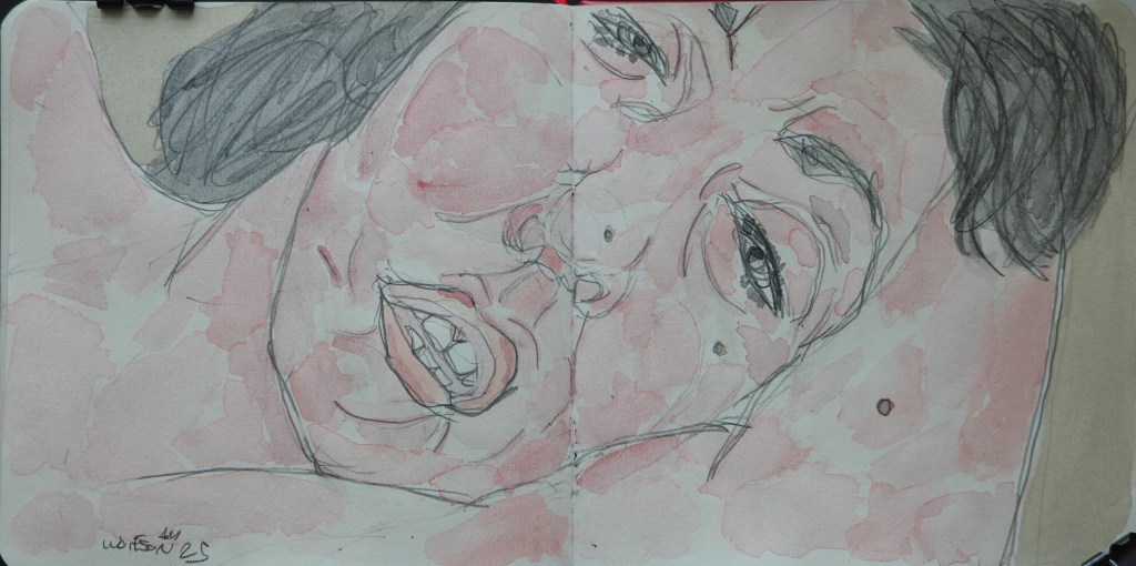
“Brown Eyes” 9×12 Rembrandt watercolor paper 140 lb cold pressed
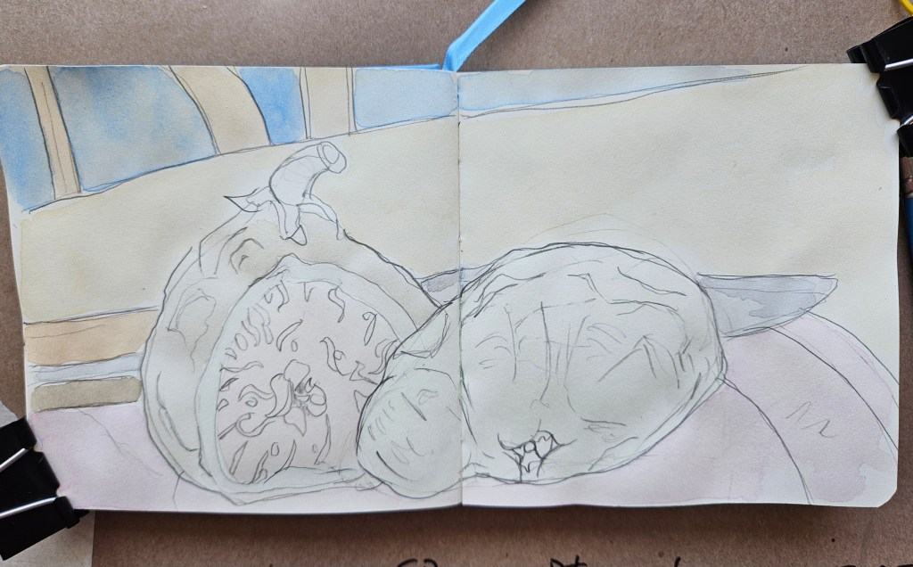
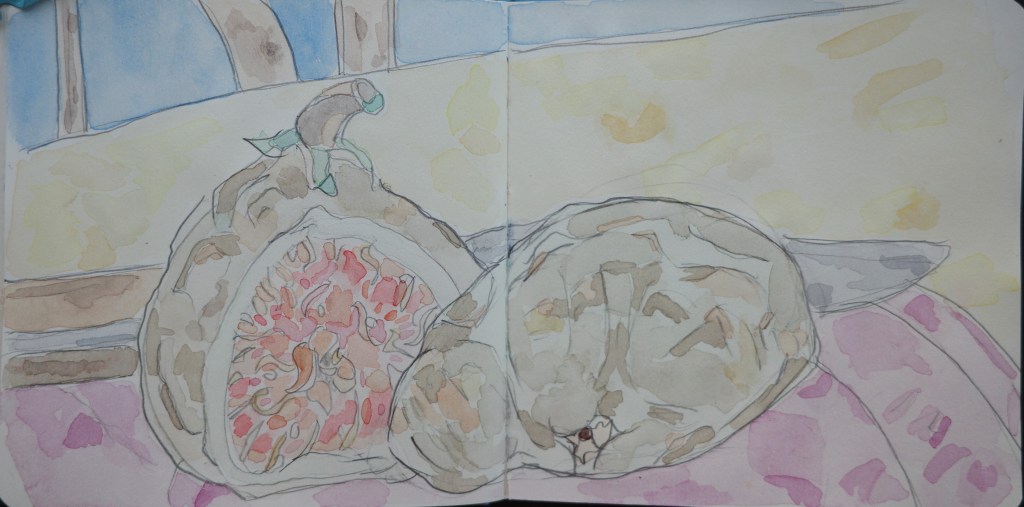
“Fig” Talen Art Creations Multi Media pocket Pad 4×4 inches
I was lucky enough to be sent, with no strings attached, new equipment to try by Royal Talens. Over the next month or so I will be using and writing about what I was sent.
First up: Van Gough half pan watercolor set (24x half pans). These are artists’ grade. Artist’s grade is not necessarily “lesser” than professional, once you are past student grade it becomes much more matter of what you are going to do with them and your technique.
The half pans come in a white plastic case. Despite being 100% plastic, it feels substantial. Some artists prefer plastic palette cases as they do not dent and are easier to clean.
The half pans fit into slots instead of there being one long metal slot or rut with metal crimps which bend over the edge of the half pans to hold them in place. These always loosen over time even if you do not remove the half pans often. It also has two slots which included a narrow natural sponge and a #6 Van Gough selected filament brush.
Crimp style
slot style
The lid is attached on an integrated hinge and opens to lay flat. The inside of the lid divides into six sections which can be used as palette.
Each half pan has easy to see/read info on the color located both on its side and top, the latter which pulls off like a snack pudding.
The color selection is several hues of red, yellow, blue, brown, green, orange, a gray and one white.
Usually, I eschew using gray regardless of the company. I find that they lean too towards blue or the truer gray has a murky/cloudy look. This gray has a light blueish undertone but is perfect, especially if depicting hair.
The paper I was givn is Rembrandt watercolor 9×12 140lb. It is an artist’s quality. 10x sheet, cold pressed.
The paper is secured via a glued top in pad stye. It has a soft cover and hard cardboard back. Only the top is secured, as I worked on a painting at end of each session there occurred minor curling. Once the paper was dry, I weighed it down overnight and next day it was fairly flat. I also tried using small clips in each corner and just leaving it. Both ways allowed me to get to work again easily. Once the painting was completely done and I cut it off the pad there was some minor curling. I let it dry and at the end of day put a few heavy books on it over night and next morning it was flat.
This is a heavy paper and would be great for anyone who does the wet-on-wet technique. It is a clean natural white which doesn’t distort the nature of the paints. I do pencil outlines of what I am going to paint and when applying the eraser it didn’t tear nor drag, there was zero pilling of the paper as can sometimes occur with other brands.
My technique is to fill the slots of white porcelain palettes with water. Then using a damp brush mix in the paints.
These paints mix in smoothly. It is very easy to darken the hue via dipping the brush back into the half pan or to lighten the hue by diluting the palette section with water.
On the paper it gives true color representation right away as opposed to having to wait for it to dry a little. The paper allows for blending to achieve volume and mass, for example when portraying flesh. I found it behaves very similar to the 100% French cotton paper I sometimes use. It is a little more forgiving if one is quick enough, to fix any minor mistake.
With my style of painting, I found that when working on a face, I must give time in between brush strokes for them to mostly dry as to keep it from running. Once one has timing down, which doesn’t take too long, it is far from a hinderance.
I have always incorporated several brands into my palette. I will definitely be adding some of this set into my palette. The ones which are not making the cut, it is not about the quality but rather they are just colors I do not use and I only have so many available slots.
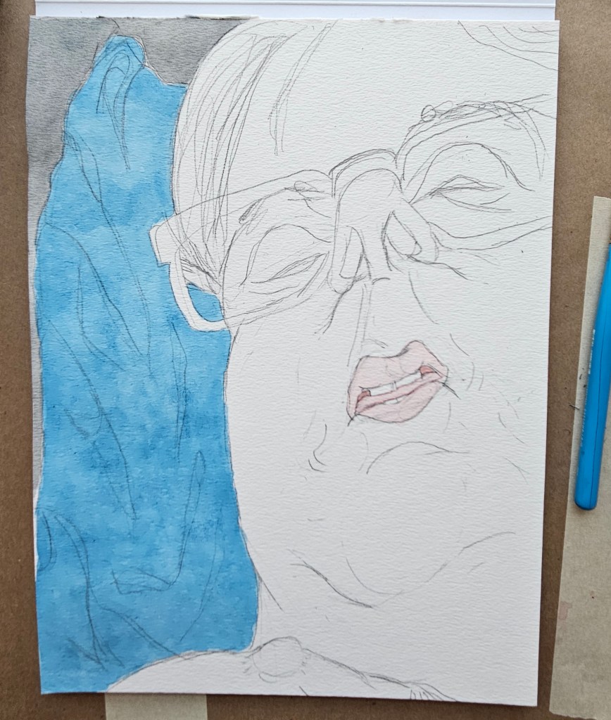
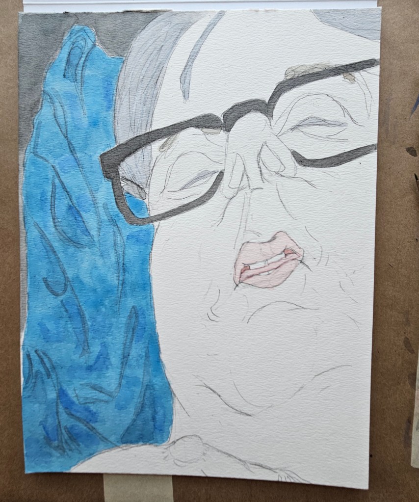
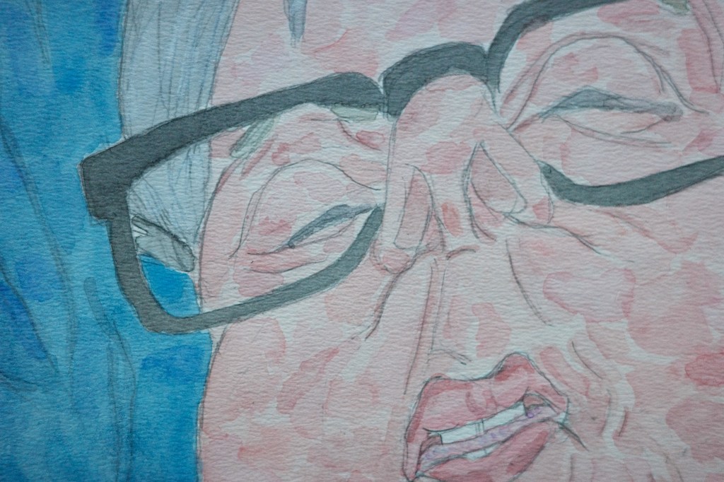
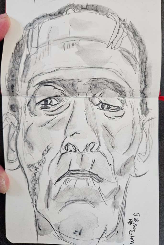
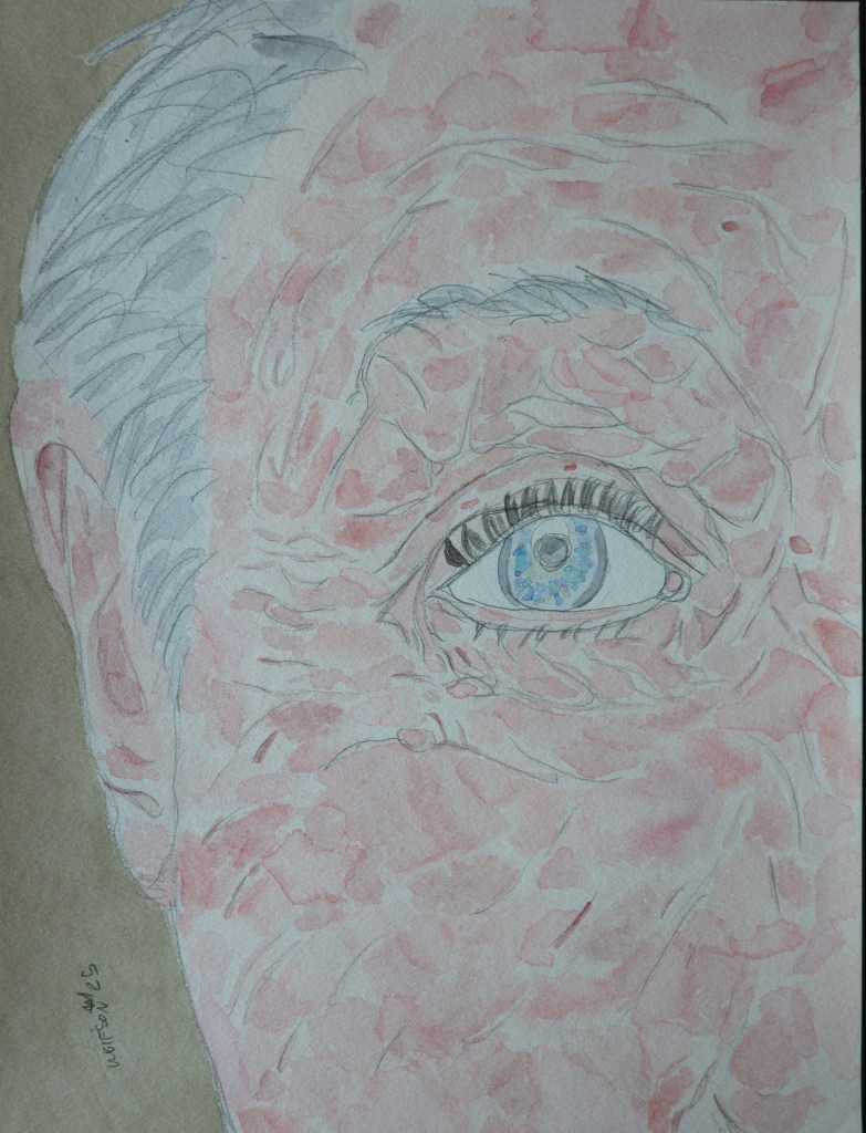
“Blue Eye” 9×12
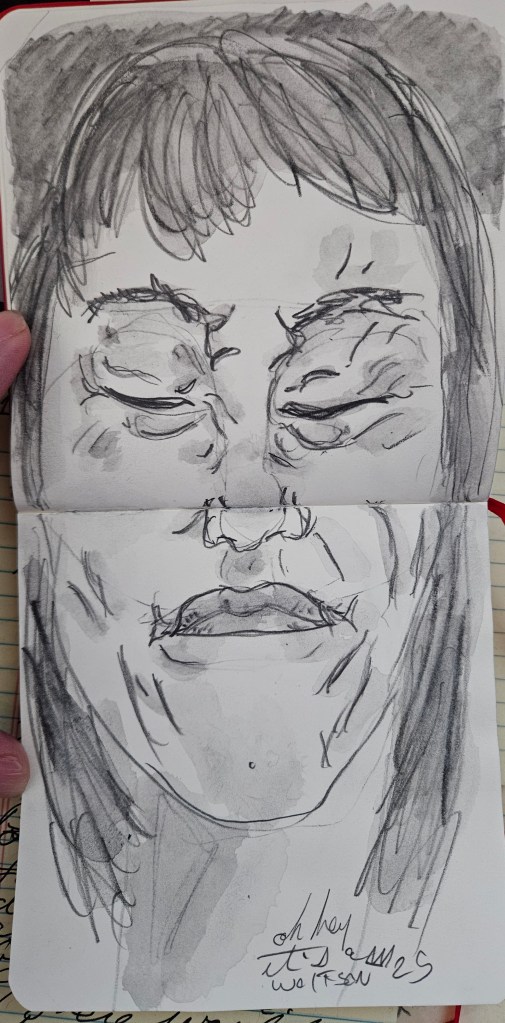
“Tagliatelle” Talen Art Creations Multi Media pocket Pad 4×4 inches